

The infographic below released by the Obama administration (here) is a good example of using the full arsenal visual techniques to make your point stand out.
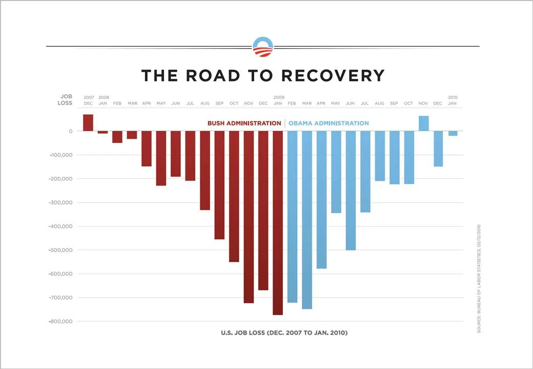
- Use fat columns to make the trend stick out (much better than a thin line, earlier post here)
- Use recognizable, contrasting colors
- Pick a metric that is favorable (monthly job loss)
On the Fast Company site, Prof. Charles Franklin put out a second graph depicting exactly the same data, but using a different metric, cumulative job loss:
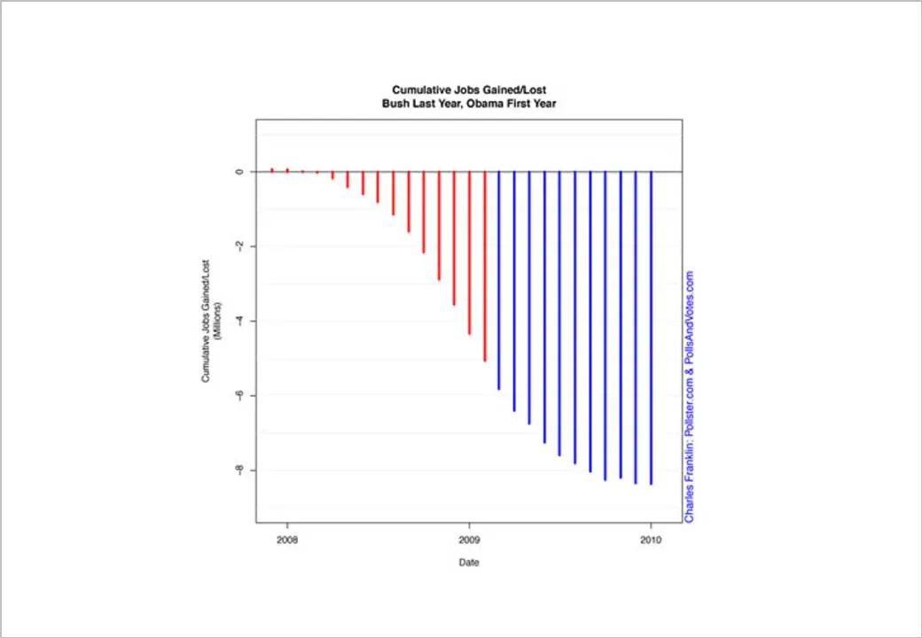
The formating of the graph is a bit improvised, but it shows the power of picking the right metric. Someone speed-reading a newspaper first notices the sea of blue, and a trend that does not seem to reverse.
Fast Company seems to have taken down the story, so I had to source Franklin graph from Google chache. Thank you Ellen Daehnick for pointing me to this.