SlideMagic Blog

Frequent updates about all things presentations since 2008. Subscribe to never miss a post.

RSS
all posts

Category Presentation design

·Design

Optical illusions - the brain just sees what it expects to see

Another example of how the brain just fills in the missing blanks . Unless you are one of the 0.7% of people who suffer from schizophrenia, you are unable to instruct your brain to see the hollow side of the rotating mask.

Remember the lazy visual brain when designing slides. The brain tends to follow lines in the reading direction, and sometimes finds it hard to spot the word “not” in a sentence, just to name a few examples.

I can recommend the book “Brain Rules” if you are interested in learning more about how the brain absorbs (and does not absorb) information.

Thank you Orli Naschitz and Dep for pointing me to this.

·Design

Retro formats

Here is an unusual presentation format. Hand-draw your slides, photograph them, and paste them back on slides. I like it.

Let Out the Creative Beast

·Design

Frankensteining a slide deck

Frankensteining”, what a brilliant verb! Most people have been tempted to stitch together a slide deck quickly by yanking slides from old and/or other people’s PowerPoint presentations.

  1. Open all presentations, go to slide sorter mode
  2. Copy and paste any slide that looks vaguely relevant into a new file. It is even cooler when you know this little trick on how to preserve formats when copying slides across.
  3. Re-shuffle the order of the slides and add agenda tracker pages
  4. Skip the bit about practicing
  5. Done in 1 hour and 34 minutes

It will not be surprising that the end result is not a good presentation. It is not your story, you do not completely understand it, and if you do not understand it, the audience won’t either.

The better way to Frankenstein:

  1. Sketch your story on a piece of paper
  2. Add simple slides to support the key elements of the story
  3. Go back to the graveyard of old slides to add backup slides where you need them (“here is the full architecture of our global CRM system, as you can see it is really complex” [* click next slide *])
·Delivery

Boring conference panels

The panel session with the CEO of Twitter bored the audience in a recent on-stage conference interview. And Mark Suster recently wrote another excellent post about conference panels.

I have sat through so many boring panels in business conferences here in Israel. The boring panel recipe:

  1. Try to find as many prominent individuals as possible to feature as speaker on the conference invitation flyer
  2. These people are busy, so you do not require a lot of preparation from the panelists
  3. Get a verbose moderator: long panelist introductions, long questions, [short answer], long recaps of the answer

An easy way to fill 45 minutes, but not a very good way for the audience to spend its time. You cannot wing a presentation, you cannot wing a discussion panel. I wonder why it is that most people go to conferences to meet people in the coffee breaks.

·Design

Why school text books are so boring

School text books and many business documents are written with the content creator in mind. Organized in sections, a clear structure nicely summarized in a detailed content page (or a PowerPoint agenda tracker). We make a point, provide supporting arguments, repeat the point, go back to the tracker page, open the next section, repeat. Perfectly organized, perfect logic. Studying equals forcing your brain to memorize a sequence of bullet points against its will. (“Hey, the first letters of each point make the word A-P-P-L-E when I swap the last 2 bullets!”)

Stories are sequential, they are not designed to reference back to later by jumping to section 3. Stories have no tracker pages. Stories arrange their points in such a way that they are most interesting and memorable, maybe the most important message does not come first. Stories use analogies.

I am not advocating to abandon all structure in presentations. But still, have that school text book in mind when designing your next series of slides. Maybe your 30 minute presentation should be a story, maybe your 200 page final document should be a text book.

·Data visualization

Putting data labels where they work best

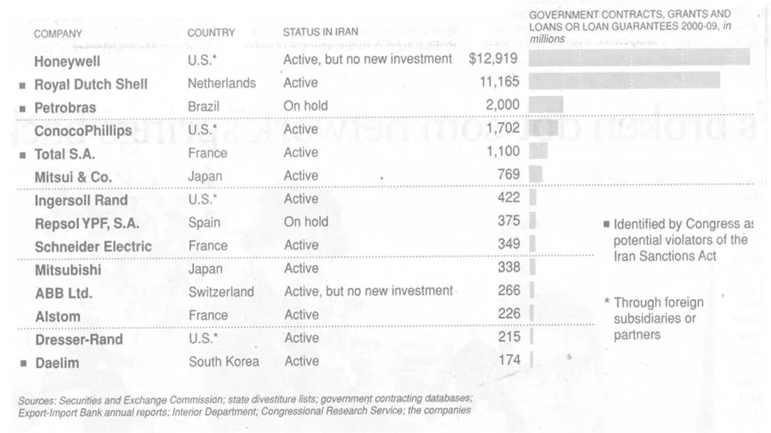
In consulting firms such as McKinsey, there are very strict rules about formating slides. Data labels for example are always placed outside the horizontal bar. The chart below (ripped out of its context from this NYT article) uses a different approach:

The data labels are placed next to the horizontal bars where you would expect the axis labels to be. I am fine with this approach. The relative size of the bars gives a global view of the order of magnitude of the values, and for whomever is interested the data labels provide the exact values.

·Advertising

Teflon headlines

This ad is a good example of how your brain adjusts reality to what it thinks it should look like. I read this sentence the first time as “Don’t drink if you drive”, a familiar slogan.

I find myself doing the same thing when reading headlines full of buzz words and jargon in PowerPoint slides. Skim over it, and see whether there is something more interesting to be seen on the rest of the slide. A teflon headline, it definitely did not stick.

Try this book “Brain Rules” if you are interested in finding out more about how the brain processes information. Ad via Ads of the World.

·Design

If you can't explain it, you don't understand it

The best way to prepare a presentation is to practice on a complete (but intelligent) outsider. Even (maybe especially) if your audience consists of industry experts.

You see this often in pitches of technology startups to venture capitalists for fund raising. The entrepreneur is an expert. The VC audience knows a thing or two about technology. Buzz words, generic truths, and jargon fly through the room. The message did not come across…

Any intelligent person should be able to understand your story in 15 minutes, even if she does not have any background in your specific field of expertise. If she does not get the point, it is your fault, not hers.

·Data visualization

One of my investor presentations in the public domain

Almost all presentations I design are highly confidential. Presentations of publicly traded companies to stock analysts are an exception. Recently I supported Psion in designing their 2009 preliminary results presentation.

Most of you will remember Psion as one of the pioneers of PDAs and the Symbian operating system. After some M&A transactions, Psion today is a leader in the field of rugged portable devices used in ports, in warehouses and by police forces, just to name a few customer segments.

Back to the presentation:

·Design

VC pitch: don't spend time/slides on the obvious

Time is precious when pitching to a venture capitalist (VC) for funding your startup. Don’t waste it on things the VC is already convinced of. Examples:

  • Common beliefs, i.e., in 5 years from now people will be downloading dramatically more data to their mobile devices than they do today. This can be conveyed in 1 slide, or you can spend 15 minutes on it, showing all possible research that point to the same answer.
  • Specific VC beliefs. If a VC has told you in previous meeting that she is a true believer of - let’s say - the software industry moving into the cloud, you can save yourself the effort of trying to convince your audience of that point. Someone else did it for you.

One important note about common beliefs though: they could be wrong! If your perspective deviates from what everyone else is copying form each other, you (obviously :-) ) should spend time/slides on it.