SlideMagic Blog

Frequent updates about all things presentations since 2008. Subscribe to never miss a post.

RSS
all posts

Category PowerPoint

·Design

Review of the live pitch to Mark Suster

Venture capitalist Mark Suster has a blog with a large following, and is also active in producing video about venture funding and startups. A few days ago he hosted a live startup pitch for funding on his show. As I said before, I am a big fan of making (at least part of) the fund raising process more public. The 53 minute video is embedded below, I watched it and give some of my thoughts.

I have great respect for these entrepreneurs to be vulnerable and go with their pitch on video, and they were probably a lot more nervous than when sitting a conference room without a camera. I have made the comments below a bit sharper on purpose, in the hope that other people pitching for VC money can learn from them. In part I am helped by my Dutch/Israeli cultural environment where people use a slightly more direct style than in the US.

Look how Mark is forming an opinion about the business right in the first seconds. What is it that we talking about? Many investor presentation deck hold off the answer for too long.

The opening sentence full of buzz words gets cut short. Mark starts paraphrasing “Right, so you are a sort of eBay/Etsy widget for blogs”. It is indeed a better way of saying things, but hidden in this comment, Mark is already hinting at his major concern about the business. The presenters could have come out with a snappy/high-energy “OK, that you call it like that for now, but we have something amazing under the hood that makes us stand out in the middle of all these eCommerce giants, advertisers, and affiliate programs.”
Continue reading →
·Hacks

An iCloud-style cloud in PowerPoint

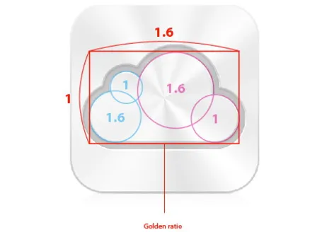
I often need a cloud shape in PowerPoint to draw a network diagram. The standard PowerPoint cloud is not very pretty. Here is a way to construct a new cloud shape in the style of the logo of the iCloud service by Apple.

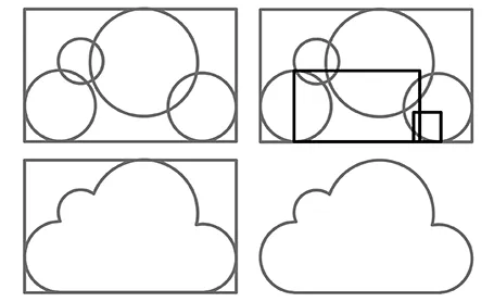
Takamasa Matsumoto originally discovered how the iCloud logo is infused with golden ratios. If you use these proportions to draw some basic shapes in PowerPoint, you can combine them using the shape union command (on the Mac right click the selected shapes, go into grouping and select union). You see that I use 2 extra rectangles to fill up the shape.

Here is the final result compared to the standard PowerPoint cloud shape, with heavier lines around the shape.

·Art

Learning from impressionists

Every presentation slide should have a clear organization, and direct the eye. Paintings are a good example. Have a look at this painting by Monet: The garden at Sainte Adresse. It is clearly divided in 3 horizontal bands, has a strong diagonal cutting across, and the flags and steam clouds from the boats  provide energy that leads the eye from left to right.

·PowerPoint

Think of yourself as an interviewer

Back in the old days at McKinsey, your interviewing skills as a consultant on a team would be evaluated roughly on 3 levels: 1) you got the piece of information you needed (the market for [x] is $1bn, 2) you managed to get an insight that was completely new to the team, and 3) you actually made the interviewee realize something she did not know before.

Great journalists know exactly what questions to ask at what time in the interview. The interviewer draws out the story of the interviewee.

When designing a presentation think of your self as the interviewer. If you design something for someone else, then you can take it literally. If you design something for yourself, imagine interviewing yourself in front of a big audience.

Poor interview question: what five pieces of research support the assumption about the target market size? Good interview question: what, I thought only 5 people need this product, give me a feel for why this thing is huge? Poor interview question: “Now that we have spent the past 30 minutes analyzing the market, let me ask you: what do you actually want to achieve?” Good interview question: “before we dive in, tell us quickly what your ambition is”. Poor interview question: “So let me re-phrase what I think your story is”. Great interview question: “But is your story not a bigger one if we draw the parallel with this?”

Then you will have hit level 3, the interviewee walks out of the chair with a different perspective, and the re-designed presentation will be more than a beautification of existing slides. Which interview do you want to follow to the end, and which one will you skip with the mouse or remote control?

Continue reading →
·Investor presentation

Investor presentation in HTML

Have a look at the DressRush investor presentation, an entire pitch deck written as a web site, in the public domain. Some of my observations.

I like publicly available investor pitches. It fits in the wave of increasing transparency in the startup funding market. (Check out Angel List). Startups can dramatically increase their access to potential investors by making part of their content public. The first stage of a fund raising round does not have to be the closed meeting room of the VCs that happen to be located in the same city as you are. Obviously you would not put your core IP, financials, or other sensitive strategic content in a public presentation. Another option would be to make the sensitive part of your investor pitch on your web site pass word protected.

I like these airy web sites. Lots of white space and information that you can scroll through freely, up and down. I actually first skim the whole site in a few seconds, then go back up to start reading in more detail. This is so much better than the nervous clicking on a small button in a SlideShare window (especially when people design slides that -click- break up -click- a sentence -click- in 5 -click- slides.

It is still tricky to design from this new medium though. The DressRush example uses beautiful muted colors (interrupted here and there by images and facebook logos) and takes an infographic approach to investor pitches. On certain pages it works, on others it does not. In whatever direction the technology develops, you still will need to eye of a good designer to get your investor pitch right, also in HTML.

Continue reading →
·PowerPoint

How to present a valuation

Hardly anyone puts a valuation number on a PowerPoint slide in an M&A negotiation or an investor pitch. In publicly quoted companies there are legal constraints, but most of all: a buyer is unlikely to believe a number put up buy the seller. So how do you as a seller get the buyer to move in the right direction using a presentation?

The answer is: teach and spoon-feed the right assumptions. Someone on the buy-side is going to construct an Excel valuation model of your business. Put yourself in her shoes and guide her through the process.

What components of value are there? The business units of today. The future growth of these existing businesses, but remind her to include growth options beyond that as well.

Valuation models are forward looking, financial data looks backward. So it is important to teach the buy side how to model your business going forward without giving the answer. Instead suggest how the sales of your business works (it is all about number of stores and sales per square meter). Suggest some non-financial growth rates, or give an indication of your store opening program. Explain how the cost structure works. We can support 50 more stores without adding cost to our head quarters.

Give the sell-side a quick refresh about the theory of calculating discount rates. What should be taken into account. What ranges of values do you see?

The best way to prepare such a presentation is actually to design a valuation model yourself without inside information. It teaches you the process the other side will go through.

Continue reading →
·Layout

Two ways to emphasize text

Method 1 - emphasize subject: you can apply all bold, italics and underline effects, increase the font size, and pick a nice bright red character color (make sure you use all effects at the same time)

Method 2 - de-emphasize background: cut out all the visual clutter and distractions so that the point you want to make just appears by itself.

Guess which one I prefer?

·McKinsey

Rubber stamping a business plan?

I had a phone call with a potential client yesterday. He needed an investor presentation but also was interested in a full business plan.

There are different documents that both are called business plan. One is a stack of files (spreadsheets, gantt charts, PowerPoint slides) that contains the company financials/budget, competitive analysis, and development mile stones. In short: real content. It does not have to look pretty.

The second one is a long document created in Microsoft Word in which market research data is copy pasted (IDC says our market is $1bn), the company opportunity is described with lots of buzz words, and so forth.

You need the first one, you can forget about the second type of business plan. They take forever to write, they take forever to iterate, and as a result they are always out of date. No one reads long written text. Brad Feld and others have called them obsolete.

My client admitted that the business plan job was simply a matter of writing up material that was already there. He was willing to invest lots of money and 2.5 months of work with a consulting firm to have the document rubber stamped, paying for the logo on the front page.

I think it is a waste of money, time, and effort. If the only thing the consulting firm does is write down stuff that already exists, investors will look right though it and judge the investment opportunity based on your content, not the way in which it is written. If it is market data you are after, pay for the market data directly, rather than by hiring a consulting firm in the middle.

Continue reading →
·Delivery

Preaching to the converted

A story from the early 90s. Back then I had recently joined McKinsey as a Business Analyst and got involved in recruiting presentations at Dutch universities to try to convince more engineers to apply for a  position. The slide deck covered it all: our offices, our expertise, our clients, our selection process.

Until one day we did a survey asking the audience to rank how useful this presentation was. The outcome: people already knew that we were probably very smart, worked with prestigious clients, were unlikely to starve because of lack of financial resources, and were very professional.

The questions the students had were: are you guys human or nerds, do you really have to work 80 hours a week, how on earth can a physics engineer be useful there? These questions you cannot really address on a slide, so we cut the introduction presentation to the minimum (to re-confirm what people already knew), and then switched off the projector and started talking about us as a person, and opening up the discussion for questions.

Preaching to the converted is a waste of time. Instead, use your presentation to address the issues the audience has.

·Delivery

Brutal honesty and a 5 second test

I am linking to 2 posts related to venture capitalist Vinod Koshla today.

The first is about brutal honesty in investor presentations by Michael Arrington. He argues that indirect polite language because people are afraid to turn down a startup is not helping anyone (including the pitching startup).

The second is a blog post by speech coach Jerry Weisman: the 5 second test. If your (test) audience fails to produce the point of a slide when you hide at after 5 seconds, the slide is too complex. An audience trying to figure out what a slide means is not listening to the audio track.

(Thank you Wouter Deelman for pointing this out to me)