SlideMagic Blog

Frequent updates about all things presentations since 2008. Subscribe to never miss a post.

RSS
all posts

Category PowerPoint

·Investor presentation

One-line investor pitches

In the first second you meet an investor, you want her to stop guessing what you are doing. Describe in a short sentence what you are about, then move on with the more detailed pitch. An investor who is guessing what you are about is not listening to you.

I pulled up the trending startups of last month on AngelList.

  1. These slogans are targeted at investors, not (potential) customers
  2. They do not contain buzzwords or fluff (at least 99% of them) and describe what you are doing (not one of these is enhancing the social browsing experience with sticky semantic and relevant content dissemination)
  3. They can be very descriptive about what a company is about. Often direct comparisons to existing companies are used as a short cut.
  4. Startups are not afraid to put these type of descriptions in the public domain. The benefit of interesting a large potential investor base far outweighs the thread of someone copying the idea (based on the slogan) overnight

Here are the first ones that come up:

  • A high-quality, low-cost 3D printer that works out of the box
  • Safe driver score
  • Everyone’s second job
  • Spy on competitor’s display ads
  • Detailed social analytics for marketers, brands and agencies
  • Meetup for mealtimes
  • The Internet, peer-reviewed
  • Video advertising platform for mobile apps
  • Check in your daily accomplishments
  • Evolving the user experience for web interaction
  • An augmented reality gamification platform
  • Simple social business CRM
  • Mobile customer service ratings
  • Daily deals matched with industry leading publishers through editorials
  • Market place for artisan food
  • Flipboard for documents
  • Pinterest for places - spots you love from people you trust
  • Yelp for health
  • Beautifully simple dashboards
  • Building the neighbor graph
  • Cloud-based platform for visual and statistical text analysis

Continue reading →
·Data visualization

Nothing wrong with manual charts

Automated charting is great if you want to analyze data quickly; grab an excel table and turn it into a chart with one click.

It is different in presentation design though. When you generate a chart in PowerPoint, the colors are off, there are ugly tick marks, the labels do not look right. In most cases, I create the chart almost entirely by hand. The only thing that PowerPoint does is generate the actual bars or columns, the rest is put on by me as text labels in the right place.

Usually a presentation only contains a few very important data charts, and they deserve the time to get them absolutely right.

·PowerPoint

In Paris early December (LeWeb'11)

I will be in Paris around the LeWeb’11 conference early December. Feel free to contact me if you would like to hook up in person.

·PowerPoint

Focus!

Here is a shape that I recently constructed to highlight that a company was doing lots and lots of things and all of it got focussed on just one area of expertise. The chart was not designed to read out the individual bits, but rather show that there are many, many, many aspects. Later, the presentation elaborates them one by one. You can see that I created the shape through a number of aligned triangles, alternating between the foreground color and white. Make sure that the biggest one is in the back, the smallest one at the front.

·Images

A camera in the hand of a kid

Slightly off topic topday. Here is a holiday gift idea for small children: a very cheap, simple digital camera with a huge memory card. The key is that the buttons are easy to use. The camera app on a discarded iPhone or iPod is still to fiddly for a small child to use.

The result is an amazing stream of pictures of the life of a child through her own eyes. Camera positions are low and subjects are interesting. Art work that she created. A castel that was built. Daddy checking email on his phone again and not paying attention to you. A nanny preparing the bath water. Mammy fixing car seats.

If you upload the camera images together with the ones you are taking, you get an amazing recording of family life organized with time stamps. Lower the resolution and the file size on the camera so she does not fill 4GB in 2 days though.

It is interesting to see that preserving visual memories does not really require pin sharp images with millions of pixels, it just needs someone to be there at the right moment, snapping the right image. Adults usually lose the moment. Your kid photographer will not.

·Layout

Text columns in PowerPoint

Sometimes, you need to fill a PowerPoint slide with text. These slides are obviously not meant to be presented on a big screen. Still, I make them now and then; a legal disclaimer on page 1 of an investor presentation, detailed bios of the management team in the back, or a page of text in a PowerPoint document that is meant for reading rather than supporting a live presentation.

It is difficult for the eye to follow very long lines of text, because when the eye has reached the far right end of the sentence it has to move all the way back and find the start of the line below it. This gets hard with long lines. Also, long lines of text look ugly. Print designers discovered all this centuries ago, and invented the text column.

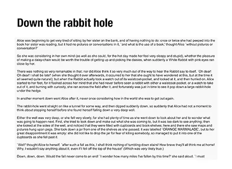
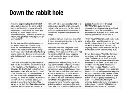
If you right click a text box in PowerPoint and select format text, you see that one of the options you can choose is columns (Mac). Play around with the number of columns and the white space in between them to get the desired effect. As an example, below are the opening paragraphs of Alice in Wonderland.

·Investor presentation

What is a good fund raising web site?

I see many startups pitching for VC or angel money early in their life. The investor presentation is often first piece of collateral that the company produces. The second one is a web presence and people ask me how it should look like.

A fund raising web site of a company that is not operating yet is completely different from one that provides a service and/or processes live transactions: it is a relatively static piece of fund raising content. The only visitors it is likely to get are investors you have met or heard about you checking out the company, or maybe potential users that have found out about you in the rumor mill. The web site should be designed with that audience in mind.

The content of an investor web site can be very minimal, look and feel should be highly professional. Let’s start with the look and feel.

  • URL. Make sure that you have the URL to your company name and that your sites uses it (and that you use it for your emails). This is check 0 of an investor to see whether you are actually real or not. Gmail addresses and Google sites do not score you any points here.

  • Template. The site needs to look like that of a serious company, not a MySpace social media profile. Just setting up a Wordpress blog in disguise (i.e., a blog template that is used as a static site) with a nice minimalist template should do (go to sites like Theme Forest to find one).

Continue reading →
·Delivery

Note to self: remove that name tag

I am just looking at pictures of myself while presenting and realize that I forgot to take of these huge white name tags that you always have to wear in conferences… Well, it happens to the best of us.

Another situation where this produces poor pictures: group photos. A nice scatter of bright white, flash-reflecting squares smiling back at you. When you are posing in a group picture, ask everyone to put the tag in their pocket for a second.

·PowerPoint

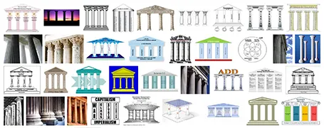
Over-used: the temple framework

The pillar template goes back to the early days of PowerPoint. A building structure is a useful concept to show that things are dependent on each other, and will already collapse if only one pillar is removed. Still, using a Greek temple will give your PowerPoint presentation that instant 1990s feel. I am not sure that is what you want…

·Delivery

Avoiding the answer is not an answer

A politician in a television interview can sometimes get away with giving an answer to a different question than the one that was asked her. Or filling time with some meaningless generic statements, after which a smile indicates that she is ready for the next question.

In a VC fundraising pitch (or an interview for a position) this does not work. If you think you need more time to get to an answer, think before speaking. You cannot parallel process coming up with an answer and speak coherently (both will be bad). If you hope that by repeating something what you said before you might manage to skip the difficult question, it will just bore the VC and make her impatient.

Sometimes it might be best to admit that you do not know or do not want to disclose it.