SlideMagic Blog

Frequent updates about all things presentations since 2008. Subscribe to never miss a post.

RSS
all posts

Category Layout

·Layout

Slide layouts and aspect ratio

The aspect ratio of a slide influences the type of layout you come up with. Over the years, presentation slide aspect ratio tend to follow the dimensions of computer screens. The first computers typically had a 4x3 screen ratio (80 x 25 characters of a punch card, sort of resembling an A4/letter format, and probably easier to design when you need to redirect electromagnetic beams in pre-LCD traditional televisions/monitors), while modern machines have wide screens in 16 x 9 ratios (the preferred format in movies).

A 4x3 canvas is very different from a 16x9 canvas when it comes to design (spoiler, I prefer the 4x3).

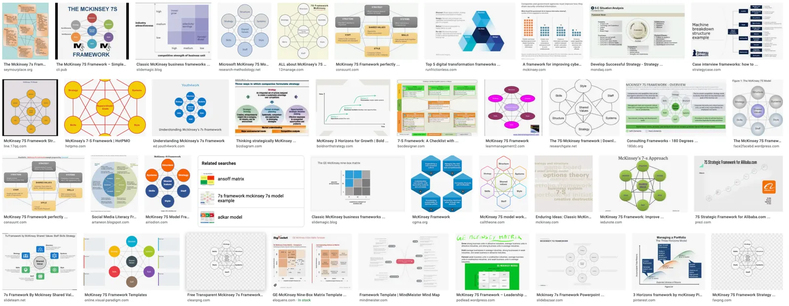
Most diagrams and frameworks work best when width and height are about the same. When you look at many of the classical management consulting frameworks, you can see that they were originally designed in a 4x3 aspect ratio. Modern interpretations simply stretch them out, making the whole thing look unbalanced.
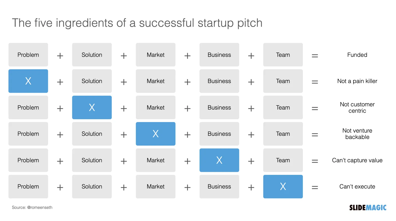
Process diagrams and tables on the other hand, work great in widescreen format. There is a lot of space for left-to-right steps or columns with information.

What to do?

  • There is nothing wrong with white space. If your diagram needs a 1x1 aspect ratio, put it in the middle of your 16x9 slide and resist the temptation to fill the left and right sides with text or other distracting clutter
  • Alternatively, consider putting the titles of your slide on the side, creating a mover vertical canvas for the body of your slide (SlideMagic can switch seamlessly between different slide title layouts).
Continue reading →
·Investor presentation

The five ingredients of a successful startup pitch

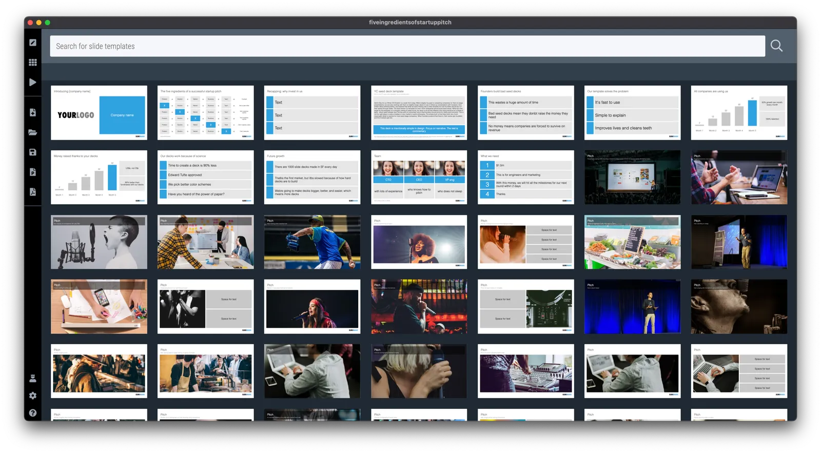
I added the slide used in this tweet to the SlideMagic library. In SlideMagic it is super easy to quickly create a grid with lots of boxes. There is a lot of redundant information on the slide, but the repetition on the other hand serves a purpose here.

Search for “pitch” in the SlideMagic app and it will pop up for you to use (alongside some other investor and musical pitch related slides).

·Layout

Do you need the table headings?

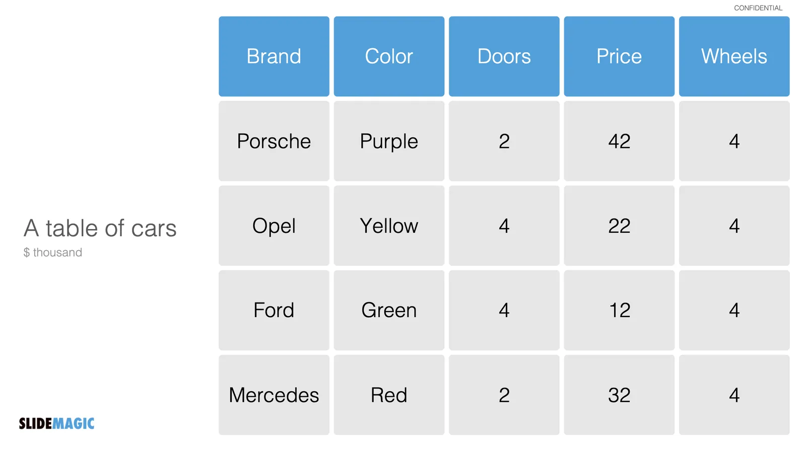
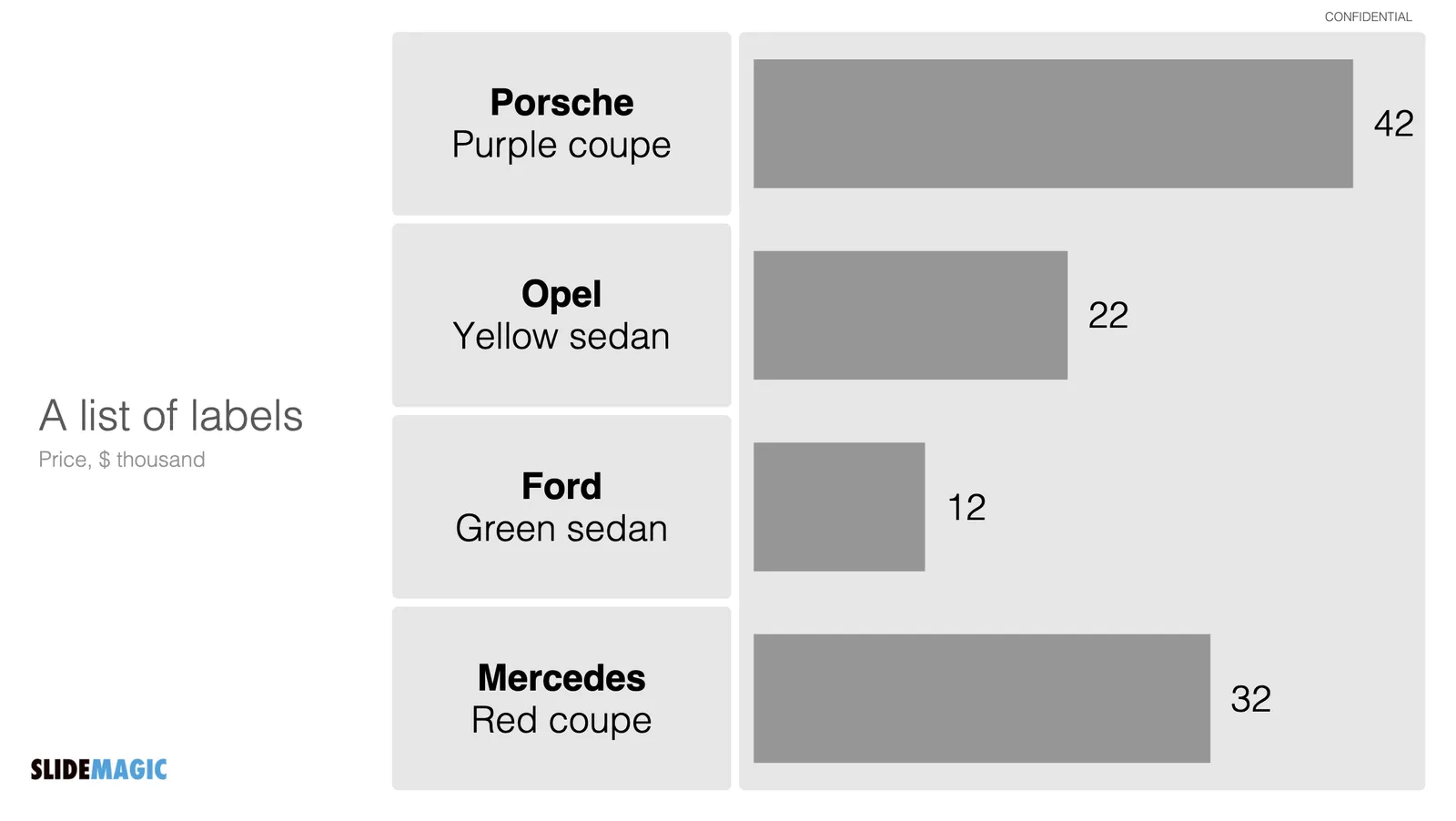
Spreadsheets and databases need table headings. Humans not always. Look at the two slides below

We know how to recognise car brands, colors. Pretty much every car has 4 wheels. Think of replacing the boring tables with cards or labels, making the slide easier to read, and creating more space for information that is more important to show.

Photo by Valdemaras Januška on Unsplash

·Layout

Dashboard syndrome

I am following a number of amateur statisticians here in Israel to get insight in how the vaccination campaign is going. This ‘underground’ information sources gives a for better picture of what is going on than the main news media can provide. A better explanation and earlier detection of trends.

Most of these statisticians use the same chart that they update every day. And I noticed that after a few weeks, you actually stop seeing how poorly the chart is designed, your eyes will zoom straight to that one figure that has been updated.

Stock brokers spot the latest share price instantly on a busy ticker board. Mathematicians see the crucial line in the proof on the blackboard.

You , the presentation designer, have become used to your own dashboard. It might be time to take a step back.

Photo by Neil Martin on Unsplash

·Layout

Emphasizing by de-emphasizing

Recently, a SlideMagic user asked for some help with adding “some more color” to a slide. (A table to be included in an internal strategy document).

My response was the opposite, rather than adding color and accents, I took things out. To make things stand out, you can either emphasize these things, or de-emphasize everything else.

Here is the starting point (confidential text removed). Btw., look how neat and organized it already looks, thanks to SlideMagic…

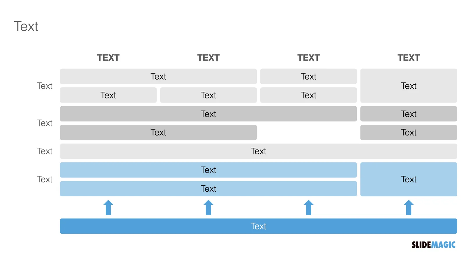
Below my suggestion:

The things I did:

  • Changed color accents
  • Grouped and de-duplicated text boxes that contained the exact same text
  • Changed relative heights of rows
  • Moved title category labels to the top
  • Added the arrows to visualize that the bottom item supports everything else
·Concepts

Psychology of young people pondering the COVID vaccine

I am intrigued by the dynamics surrounding how people make the decision whether to take the COVID vaccine or not. Unlike most other countries, people have the luxury to ponder this decision here in Israel. The government has a real communication challenge here.

We spoke about segments before. If you are a fundamental anti-vaxxer, or have severe doubts about the vaccine safety, you are unlikely to be convinced.

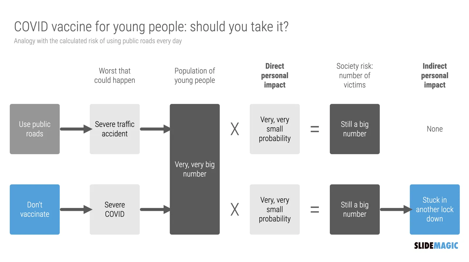
There is a segment of young people though that “can not be bothered”. The personal risk of getting severe COVID is very low. They consider it the same as joining public roads every day. You consciously take this calculated risk, knowing that the probability of getting stuck in a severe accident is very small, especially when you drive safely.

What people forget, is the indirect impact. Big number of people x tiny percentage is still a big number of people at country level. And filled up intensive care units, trigger more lockdowns, more closed restaurants, bars, parties, zoom schools, etc.

I compared the two scenarios in the chart below (search “COVID” in the SlideMagic app to use something like this logic flow in your own presentations for other topics, also put it in the web template bank, download it here).

·Layout

Knowing your audience

A follow-up on yesterday’s post about convincing the center when it comes to COVID vaccines.

Most people who create presentations are not marketeers or PR professionals. They hear people (including presentation designers like me), talk about how important it is to think about your audience when crafting slides. And when thinking about the audience, they don’t have much sophisticated data. Insights are likely to be basic: “They do not believe that we can get traction with our search engine that needs to beat Google”.

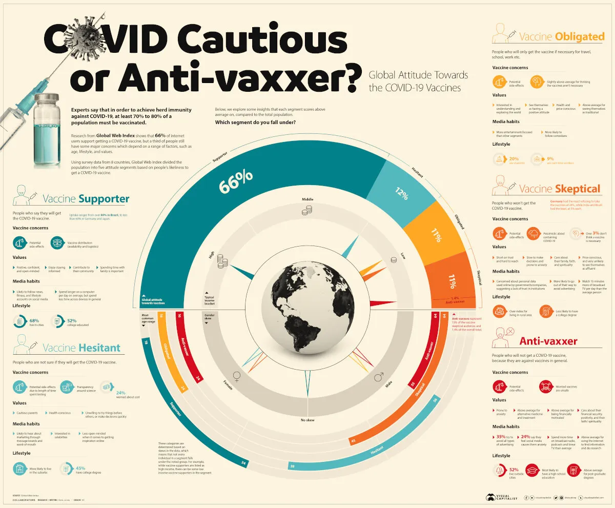
Global Web Index did research in people’s attitudes towards a COVID vaccine, the results of the findings are put in this visualisation by Visual Capitalist. The main message to me about this pretty but busy graphic is that it is complex, things are not clear cut.

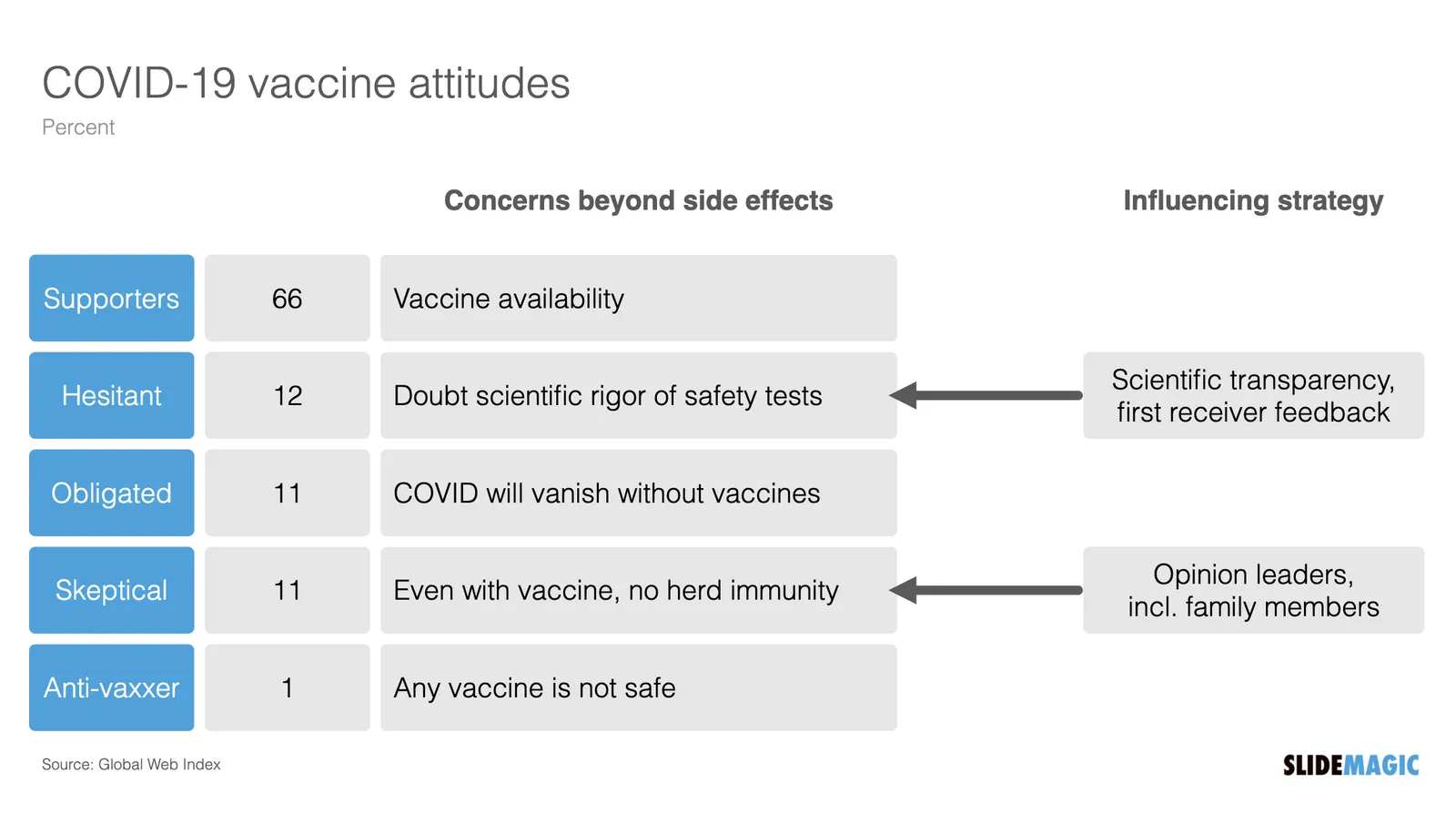
Here is my summary of the segments, and a possible communication strategy. (You can find this slide in the online template bank, or search for ‘covid’ in the SlideMagic desktop app)

Most business presentations will not have the luxury of a detailed audience analysis, but it is an interesting thought process of running through an imaginary one.

·Concepts

"Why are 2x2 so popular in consulting firms?"

I answered a question on Quora:

I can think of a number of reasons:

  1. A 2x2 is a nicer way to present options than a slide with 4 bullet points, a 5 dimensional space can get very complicated
  2. It forces you to think things through thoroughly for holes and overlaps, maybe you start with 2 options, add a third, take a step back and think what actually defines these 3 options, come up with the 2 axis, and then realise you overlooked option number 4 to be complete
  3. A 2 dimensional framework allows you to think about what happens if you move things around, and makes it easy to visualise.
  4. In most cases there are more than 2 dimensions to a problem, but it is hard to visualise (see point 1), and think about. The 2x2 forces you to choose the 2 most important dimensions.
  5. Cultural habit, if you are in a place that uses a lot of 2x2s, you will use it more often, it is a language that people understand easily.

SlideMagic has lots and lots of 2x2, 3x3 and other matrices as slide templates for your to get started. Download the app and get started.

·Layout

A faster way to edit slides

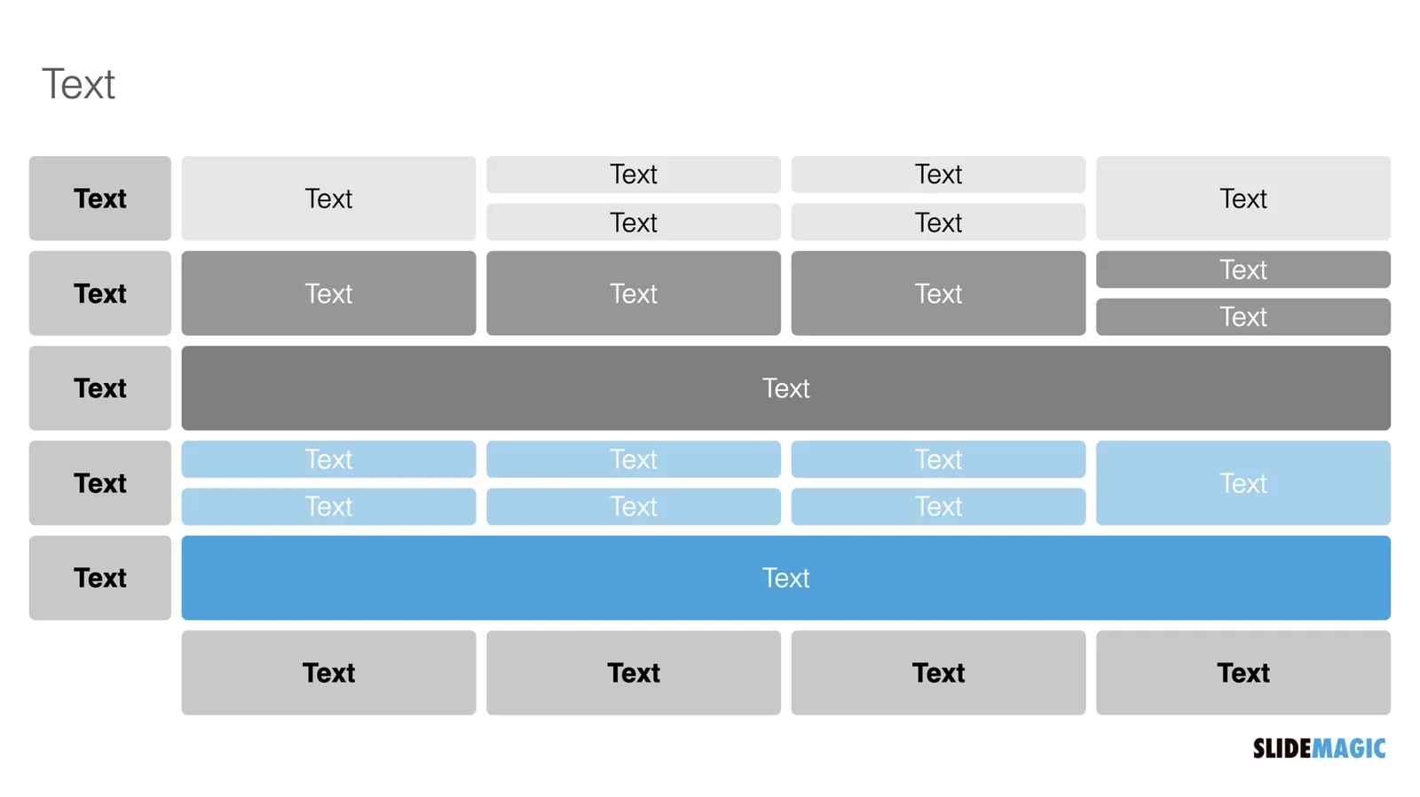
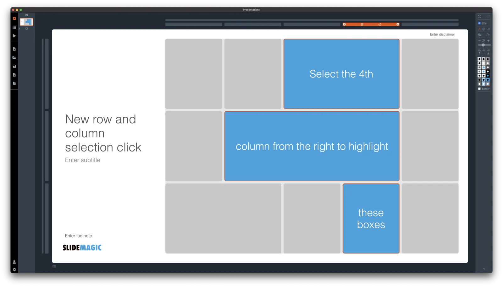
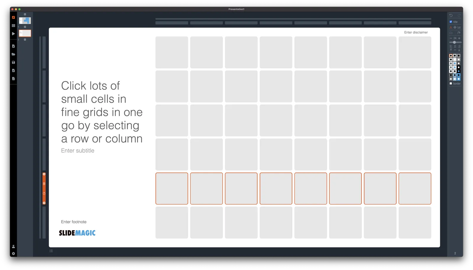
I have made more improvements to the SlideMagic user interface. Is is now easier to select multiple cells, especially in fine grids.

If you select a column marker at the top of the slide, all boxes in your slide that “touch|” the column will be become selected, and you can apply formatting to them in one go (for example, make them all blue).

The same applies for rows, click a row marker, and all relevant boxes in the row line up.

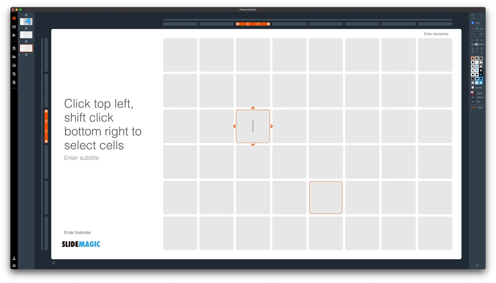
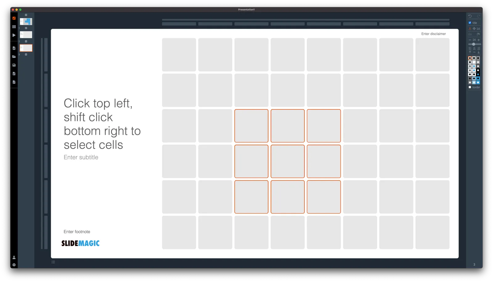
Finally, you can select whole areas of boxes by first clicking a top-left element, then clicking a bottom-right element, and SlideMagic will light up all the boxes that are in between. See the example below.

·SlideMagic

New 'no-title' layout

SlideMagic works with fixed positions for slide titles, subtitles, footnotes, and logos. Each slide looks organised, consistent, and the same.

Some slides call out for a slightly differently layout. Tracker pages for example. A simple text box that sites right in the middle of the screen. Up until now, SlideMagic would push these text boxes a bit down or to the right because of the required space for the slide title.

With a very simple check mark, I now created the option to remove titles from the slide on a slide-by-slide basis. It is a tiny adjustment to the user interface that can improve the look of layouts significantly. I am still putting a high hurdle when it comes to complicating SlideMagic. This is definitely not a complication!

While the user interface adjustment is easy, behind the scenes, there is a lot going on. Removing the the titles from a slide requires recropping of all the images on a slide. With SlideMagic’s new automatic cropping algorithm, this has now become possible. Imagine doing this for a slide with 40 client logos in a regular presentation design software, after which you come to the conclusion that the slide looked better with a title: re-cutting, re-cropping, re-distributing 40 images again. In SlideMagic, this is a button click.

You can check out the new features as of version 2.6.9

Photo by Boris Smokrovic on Unsplash