SlideMagic Blog

Frequent updates about all things presentations since 2008. Subscribe to never miss a post.

RSS
all posts

Category Layout

·Images

A team photo shoot in 2021

My wife and I organised a team photo shoot for the web page of our upcoming business. It had been a while since I did one.

Nice pictures can add greatly to the quality of your web site and/or presentation. Head shots are up to date, all look consistent, and best of all, you have an opportunity to take an image of the entire team together, given you the opportunity to show the energy that you are radiating as a group of people.

We decided to bring the professional photographer into our home rather than venturing out to her studio. Luckily, she was flexible enough to bring the required equipment. A photo shoot at home has the advantage that you feel more comfortable, and that you unlimited access to your wardrobe incase certain outfits/colours do not come across very well.

Ten years ago, many professional photographs were taking in front of the “gradient grey” screen. Fast forward to 2021, with Zoom calls in front of blurred bookcases, these backgrounds look very staged and dated. It makes the photo look like a high school yearbook picture.

They key thing the photographer brings is no longer the camera. It is the ability to engineer a relaxed pose of you, and even more importantly, get the correct light. A was amazed by how a modern “umbrella flasher” can give great image results in pretty much any lighting condition (so no longer the need for the studio).

While a woman can still dress up in a great outfit, I find that for men (me), wearing a full suit looks awkward, you get the “wedding groom” look on your corporate web site. Jacket/no tie, or a turtle neck work great.
Continue reading →
·Layout

Table layouts

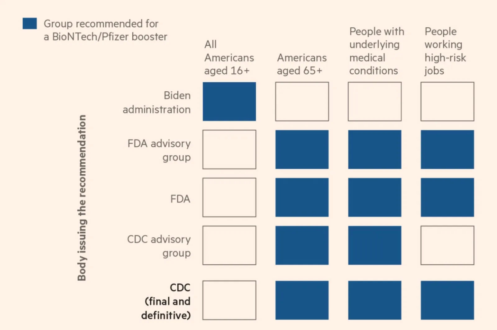
A boxy table caught my eye on Twitter:

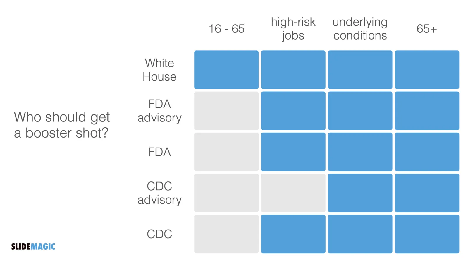
The biggest flaw in this table is the White House line, that suggests a separate group of people. Then, you can shift the columns around a bit, until you get this result:

·Layout

The live test

It can take a lot of time to get your presentation slide just right. However, once you got to that point, it should be super quick to recreate it. You can call this a ‘live test’. Take pen/paper, or open SlideMagic, and create the chart on the fly while someone is watching and listening. “We have 3 options, each has distinct pros and cons, I think number 2 is the best one”. If you are struggling to do this quickly and in a logical flow, your chart is probably too complex to be understood by a live audience. This is similar to a school teacher using the blackboard in the proper way.

·Data visualization

Rounding numbers in data charts

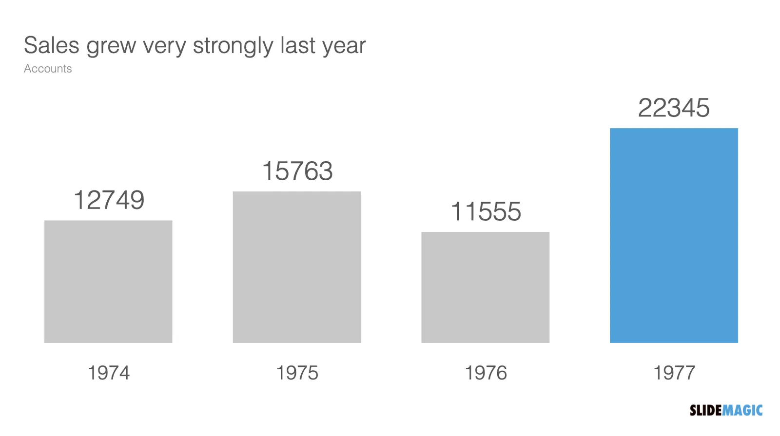
How to round numbers in a data chart? It depends. The chart below does not look very appealing

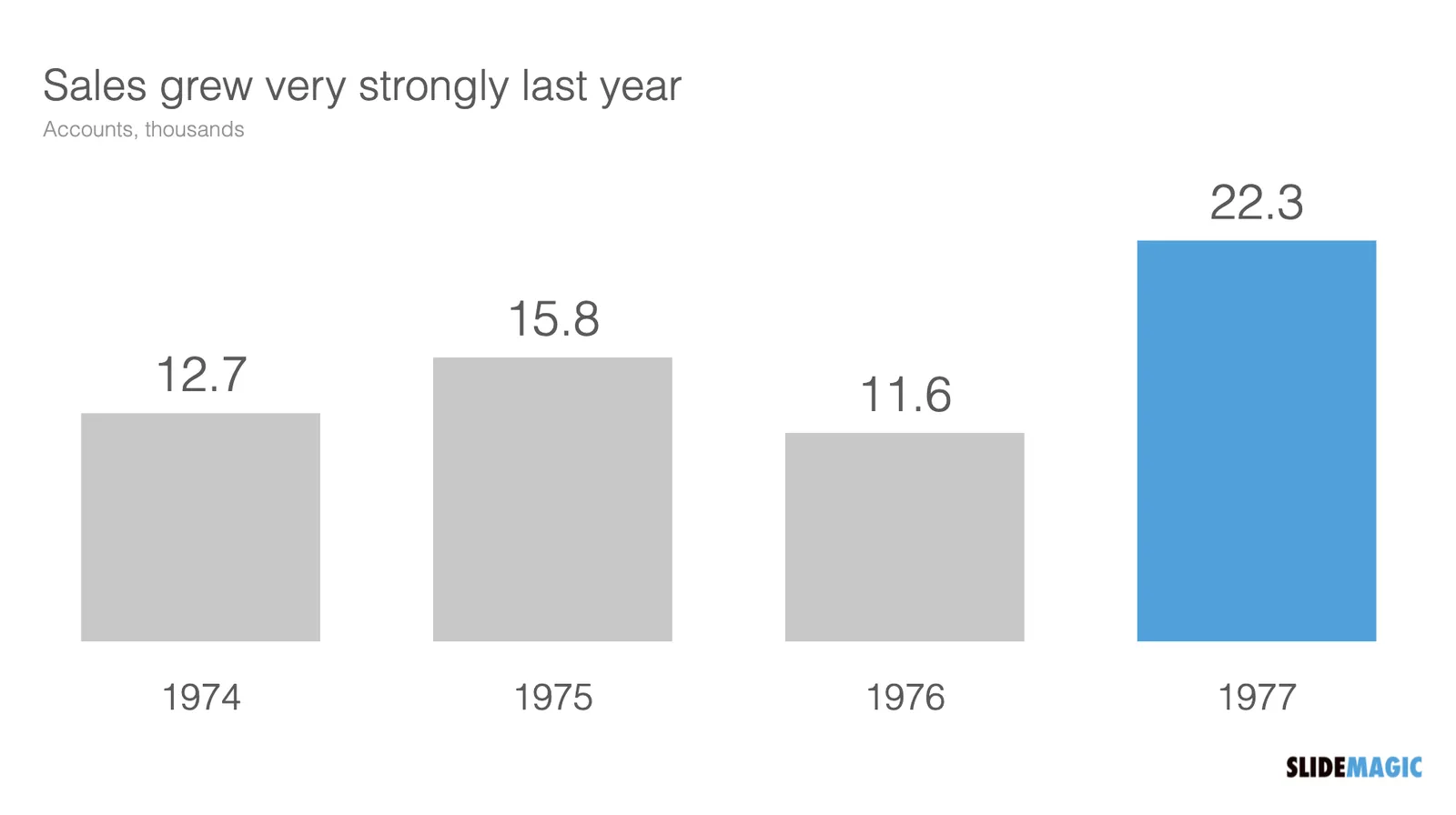
The numbers are hard to read. This chart can serve 2 purposes. Either show the trend in sales, or show the exact sales figures. To show a trend in sales, simply show the accounts in thousands, and round up to one decimal point:

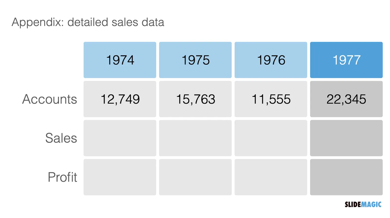
If you need to provide the actual precise sales data (for accounting or tax purposes), put it in an appendix slide that does not even pretend to show a trend:

·Layout

Visual math

Following my post from last week about pi, here is a link to a page full of beautiful visualisations of mathematical concepts. Often, a written formula is not the right way to explain math and proportions….

·Concepts

Scaling of data charts in SlideMagic

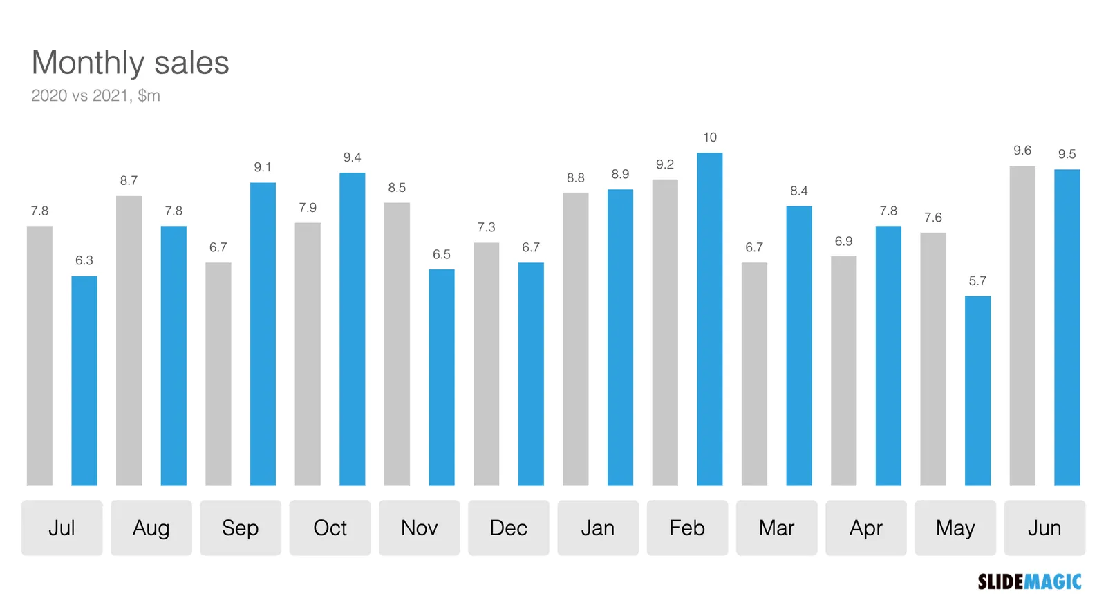
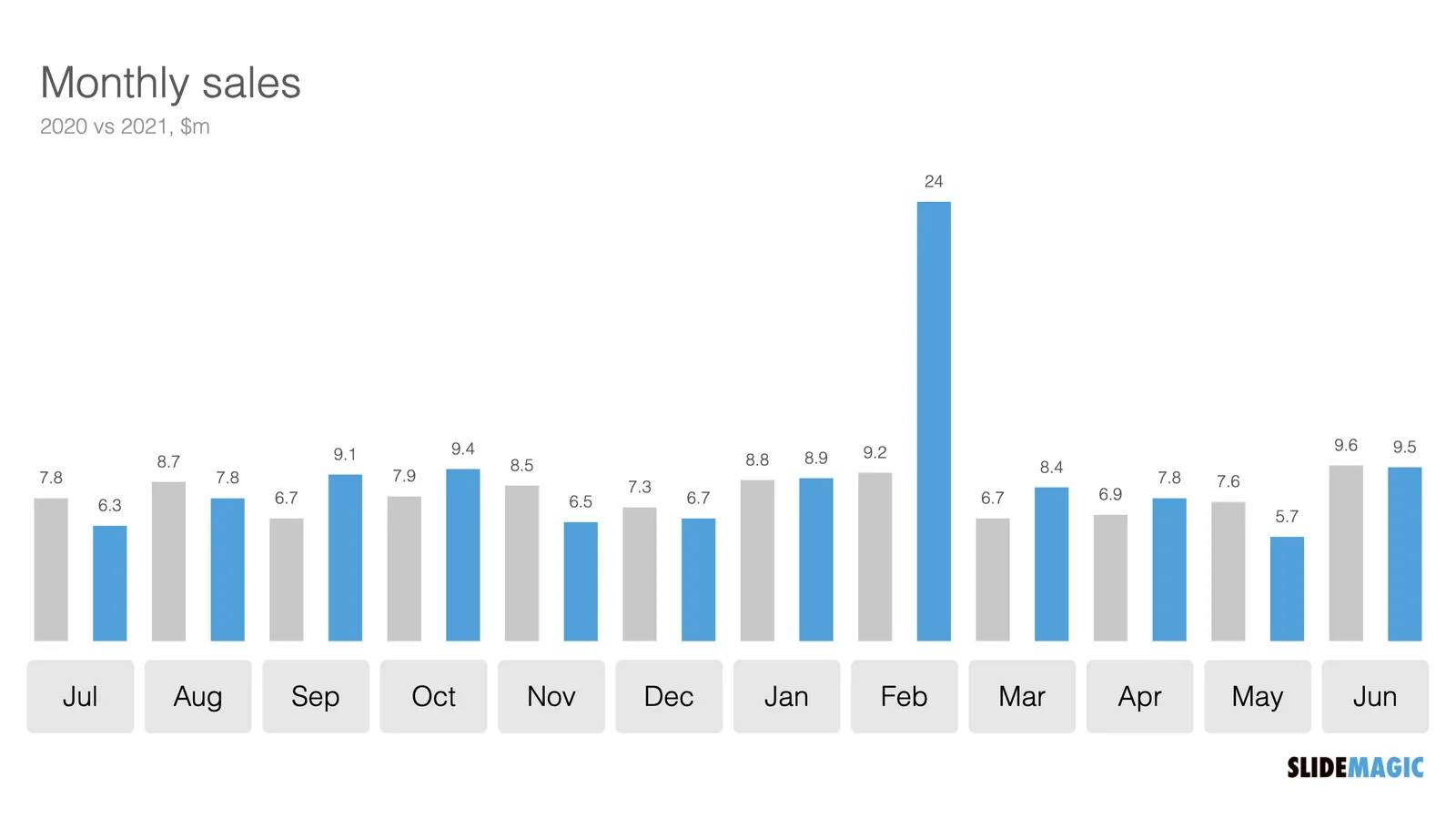
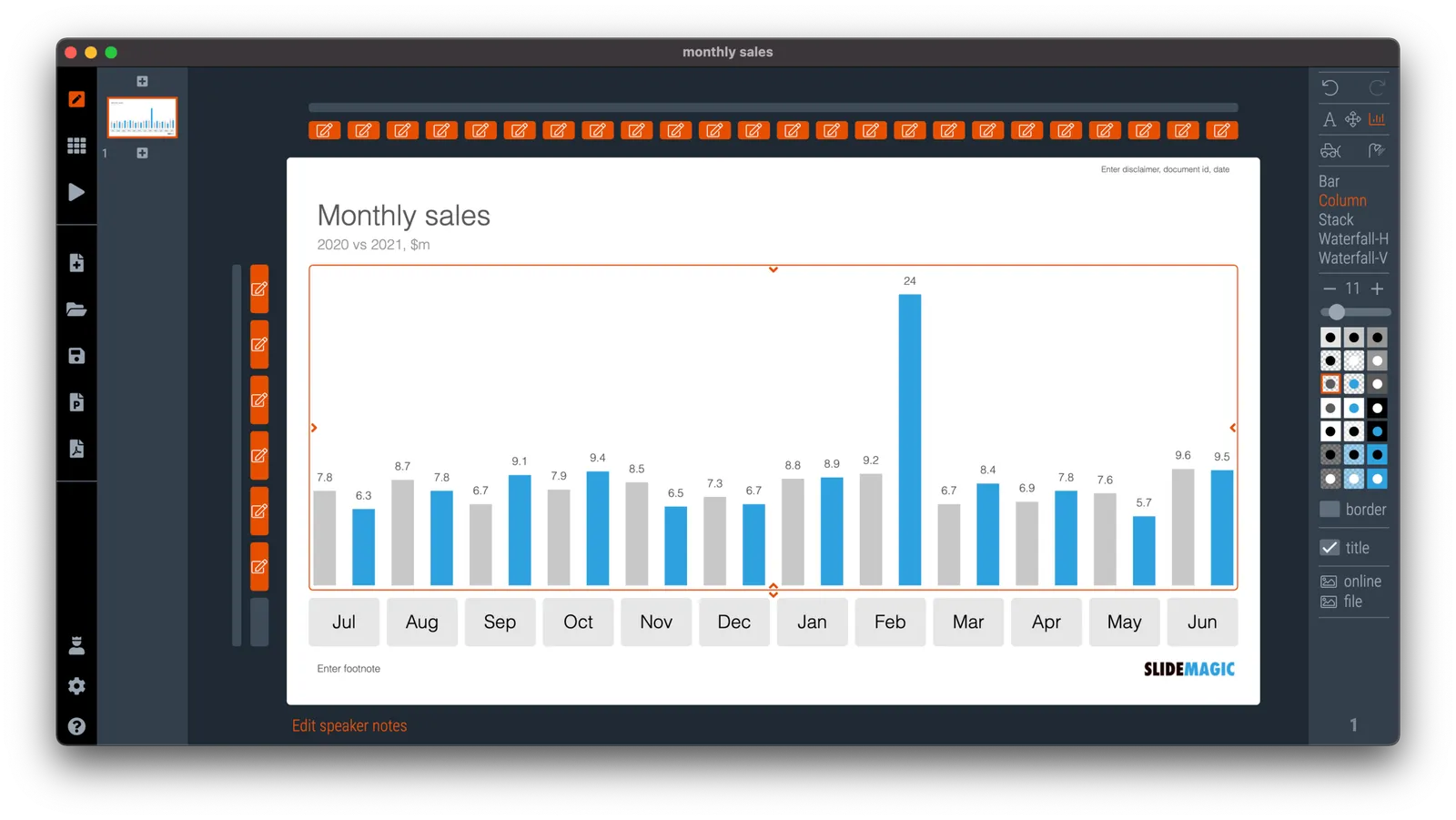
In SlideMagic, you do not have to worry about picking the right scale for your data chart. The entire chart adjusts itself to the numbers you type in. See the example below:

To make sure that a consistent scale is used for your entire chart, you need to place all your data points in one shape, instead of using multiple shapes for example for each month.

P.S. I have added this monthly sales comparison chart to the SlideMagic slide library so you can easily use it in your own presentations as well. Search in the app for ‘sales’ and it will pop up.

·Concepts

Shuffling

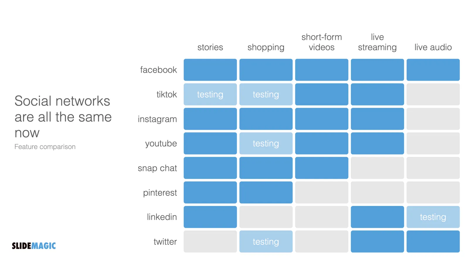
Another slide makeover. I will post the ‘after’ before the ‘before’, since the email delivery service sometimes does not render all the images I put in my blog posts…

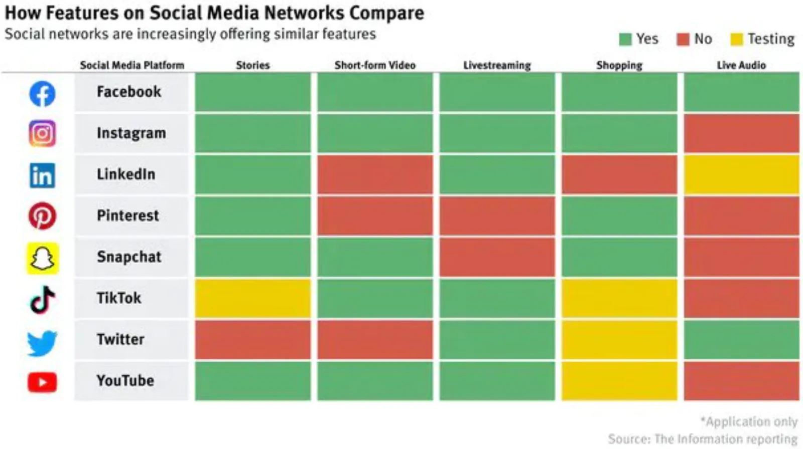
And here is the original, created by The Information

What did I change?

  • I shuffled rows and columns to get the biggest possible continuous space of similar blocks, this is visually more pleasing, and groups/ranks players in a better way. (Hmm, should have swapped Instagram and TikTok now that I look at it).
  • I changed the colors, the traffic light analogy does not really work here. The “yes” and “testing” should be very similar in color, while the “no” should be a clear gap.
  • I added a more punchy headline
  • I calmed the whole chart down by simplifying the legend and taking out the logos.

I have added the slide to our template bank. Users of SlideMagic (try it, there is a free version), can access the slide by searching for “social” in the template bank.

·Templates

An actual presentation as a template

Most companies have some sort of corporate PowerPoint presentation template sitting on the file system. It consists of a title page, some trackers, some bullet point layouts, some picture slides. The template probably looks ago, but as soon as employees start to use it, this is no longer the case.

Why?

  • Most templates are designed as an afterthought, after the logo, web site, letterhead and business card have been approved
  • PowerPoint templates are created by designers who understand graphics design, web/print design software, but NOT PowerPoint and as a result a lot of technicalities go wrong
  • But most importantly: templates are designed on a blank canvas, encouraging the designer to “do something” with all that white space.

A better approach: start with an actual presentation. The general company introduction, a product sales pitch, last quarter’s analyst presentation. Make that deck look perfect and put on the on the file system as a starting point.

  1. The template is designed around actual content, rather than content being forced to fit around a template
  2. Most companies need very specific templates. Consumer goods companies: products/packaging demos, market shares and sales across many channels, consumer research data. Pharma: scientific clinical trial data. Chemicals: process layouts, project maps. Consulting firms: fancy frameworks.

I am contemplating some new ideas for SlideMagic to make the above all a bit easier.

Photo by MagicPattern on Unsplash

·Layout

Better design for legal documents?

Contracts and other legal documents look horrible and are impossible to read.

Even documents produced by the world’s most prestigious law firms are basically Microsoft Word files in Times Roman font with hard coded formating (i.e., no style sheets or templates, but text is formatted directly to be centered, bold, italic.)

But the content is even worse than the design. Complicated sentences and unclear paragraph structures requires you to look for hidden clauses that could be hugely important for the meaning of the contract. (The legal profession probably has an interest in keeping it this way).

Two improvements:

  • Bring the design, the look and feel, back to 2021. Fonts, white space, paragraph hierarchies.
  • Add a non-binding layman “so what” summary before each paragraph, backed up by the legal code.

As a result contracts will be shorter to negotiate, and people might actually read the terms of use. I might have a look at the SlideMagic terms of use and see if I can give an example…

Photo by Patrick Tomasso on Unsplash

·Layout

Your own style

Musicians learn other people’s music, and then use it to create their own style. Architects, painters, writers, chefs, follow a similar trajectory. But even if you are not Beethoven, you have probably acquired skills this way. Carpenters, teachers, mechanics.

When it comes to presentations, use this process as well. Develop a (very small) set of slide layouts that you know how to use well. It becomes a visual vocabulary that you can use to express pretty much anything.

This is why people that spend some time at a management consulting firm can churn out all these slides without effort. This is why simply copying a slide template out of the blue and trying to fit it to your situation rarely gives good results.

SlideMagic has done the hard work for you. You get a consistent style that you can adopt as your presentation style, and each slide is simply a small tweak of a language you have learned to understand.