How to round numbers in a data chart? It depends. The chart below does not look very appealing
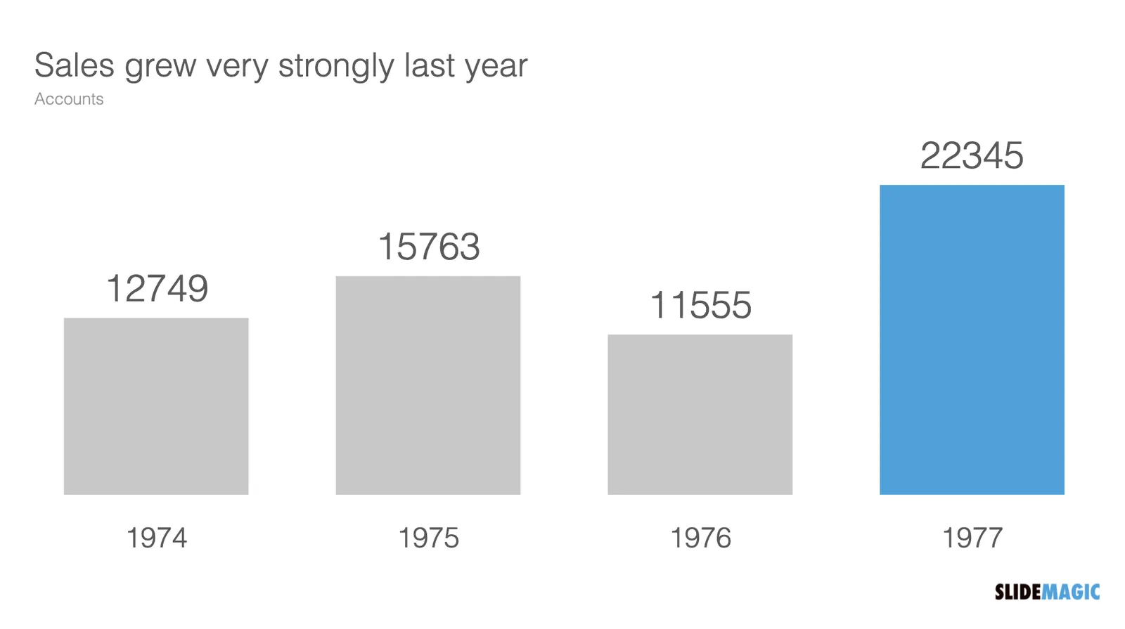
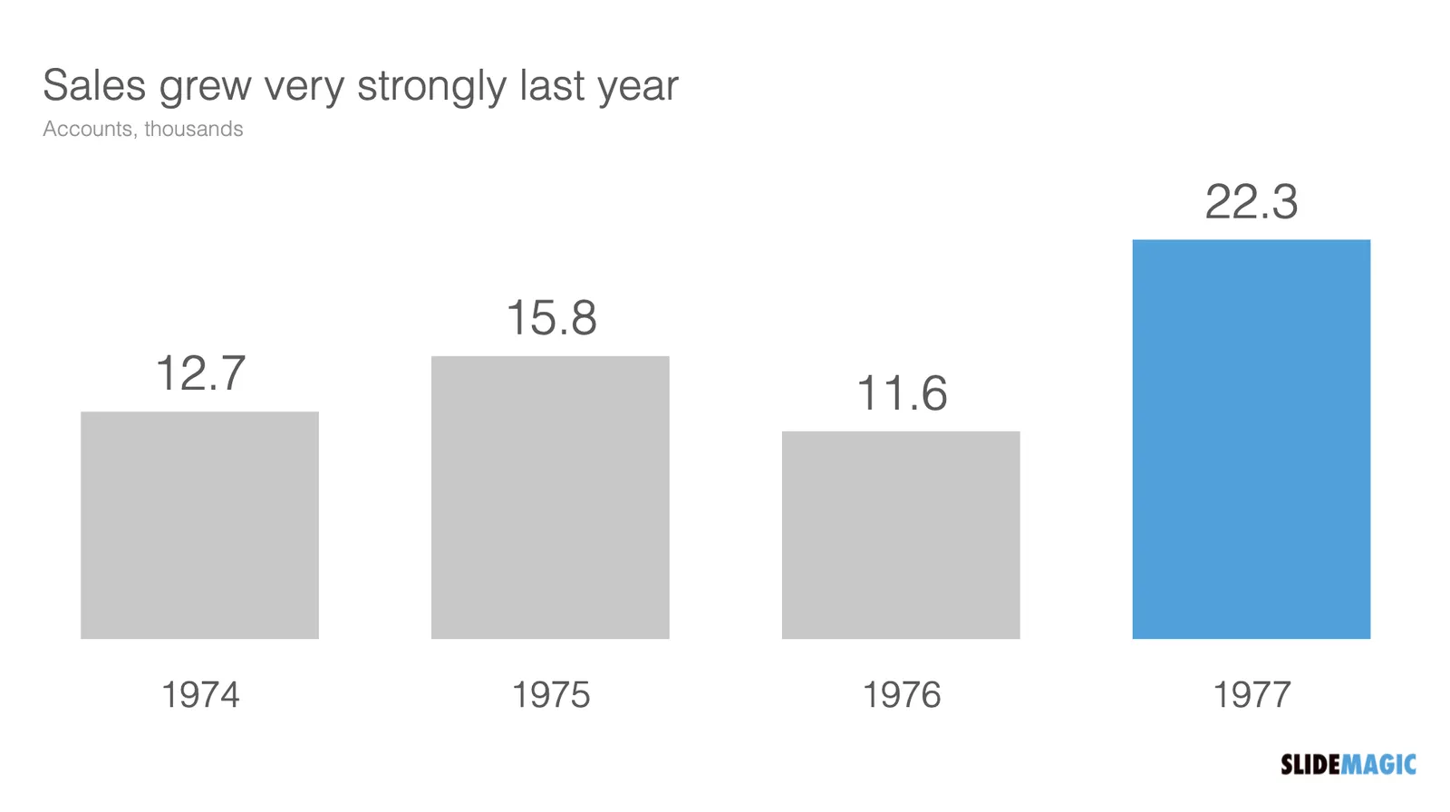
The numbers are hard to read. This chart can serve 2 purposes. Either show the trend in sales, or show the exact sales figures. To show a trend in sales, simply show the accounts in thousands, and round up to one decimal point:
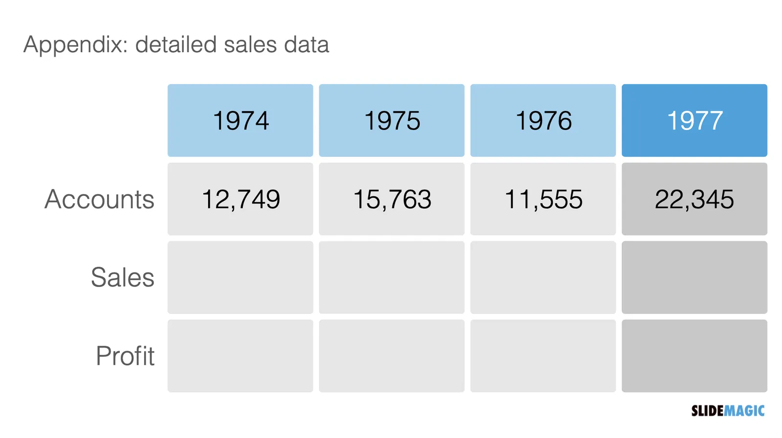
If you need to provide the actual precise sales data (for accounting or tax purposes), put it in an appendix slide that does not even pretend to show a trend: