SlideMagic Blog

Frequent updates about all things presentations since 2008. Subscribe to never miss a post.

RSS
all posts

Category Layout

·Concepts

Bullet points can be OK

Some readers of my blog have become paranoid to use bullet points in a presentation (a good thing), but there are actually situations where putting 3 short sentences on a page is inevitable, or even a good solution for a slide.

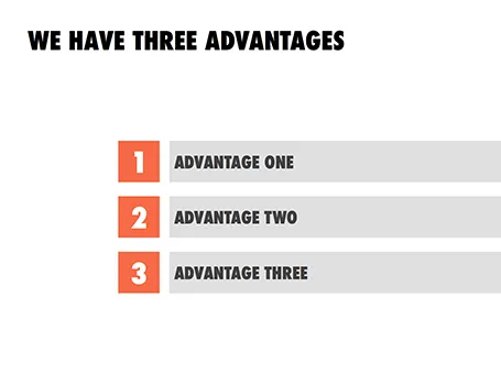
These situations are when you want to express that something has a number of components. Breaking up those 3 advantages and give them one slide each enables you to explain them clearly individually, but the audience loses the overall perspective of how they are related.

In those cases - yes, it happens to the best - I revert to 3 short bullets.  But there are a few things you can do to keep things interesting:

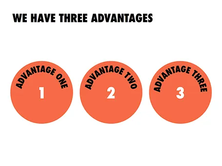
  • A massive visual anchor (like a big 1, 2, and 3) to show that you are talking about an overview slide
  • Really, really short descriptions just to introduce the ideas. The full explanations come in subsequent charts
  • Also, you can deviate from the traditional list and come up with other geometrical shapes ore layouts to make your three (short) points.
·Keynote

Page numbers?

Big graphical elements that are repeating on every page obstruct your slide design. Examples are legal disclaimers, company logos, banners, and yes: page numbers. I am not a purist here, and will most of the time put a tiny page number in light grey at the top right of the page. Too small for a keynote audience to see, but big enough to guide a page switch in a phone conversation.

·Images

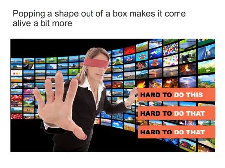
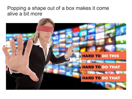
Pop out of the box

If you have a person or an object standing in front of a background, make it pop out a bit: increase the size, and fade the background.

·Data visualization

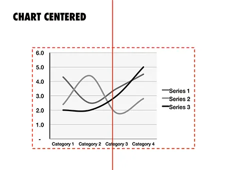
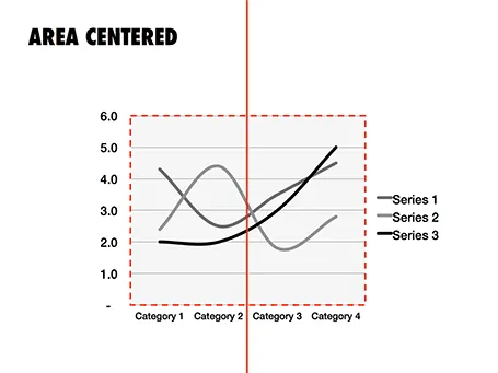
How to position a data chart

There are two ways to center a data chart on a slide: center the entire chart image including labels and legends, or center just the chart area, ignoring the labels. I prefer the latter.

·Layout

Food photography

Probably one of the few areas where visuals do not contribute to more effective communication is on restaurant menus. When I stand outside a place and see a menu with an image of a greasy hamburger on a laminated piece of paper I decide to move on, because I have eaten in too many bad restaurants that use food photography on their menu. My brain has hardwired the relationship: food image on menu -> bad food.

The greasy hamburger image effect also applies to slides. The second you put your first one on the screen, people compare that visual to the 1,000s of other presentation slides they have seen. If it is a list of bullet points, you have lost your audience before you uttered your first sentence.

(P.S. I think typography is a big opportunity for bad restaurants: cut down on the images, replace the laminated menus with pictures for nice heavy paper with freshly printed menus (new every day) using lots of white space and a chique font, and business will boom in your tourist trap. But hey, if you are willing to put in this amount of effort into your business, why not start improving the food…)

·Concepts

Nothing ever changes...

Here is a simple concept to visualize a problem that the cable television industry has: replacement cycles of hardware sitting in the people’s homes is really loooooong, especially compared to how often we upgrade our mobile devices. In this slide I used repetition plus cropped the years on both sides of the page to create that sense of continuity.

·Advertising

Everyone can design

Advertising agency RPA made a bunch of Apple-style ads for common products, probably intending to show that the world would be boring of all ads looked like this. I actually disagree, and would welcome to see the clutter in advertising go.

You see how easy it is to create professional looking slides by just applying a bit of white space and picking the right crop for your images. You do not need to be an advertising professional to do this, you do not need sophisticated software to do this.

Via AdFreak.

·Keynote

The table as a grid

It can be a real pain to space out logos in a logo page nicely. My trick is to use a table with a really fine grey line between cells. It is easy to adjust the grid when you need to insert and/or delete columns and/or rows.

See here an earlier post on how to make great looking logo pages.

·Data visualization

Tables can look good

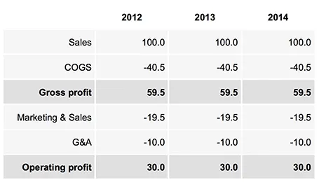
Sometimes, you do not need a data chart at all, and nicely formatted table with rounded numbers might just be the best option to visualize your data. This is especially true for financial statements with lots of information, or in situations where one chart contains a lot of numbers with completely different orders of magnitude. Some quick improvements you can make to make a table look good:

  • Space out rows and columns, the more of them are the same size, the calmer the table will look
  • Round up numbers to a reasonably precision, use a “,” to separate thousands Right-align numbers, make sure the decimal dot lines up
  • Right-align the first column with descriptive text, so it is as close as possible to the first column with numbers.
  • Use highly muted background colors, I usually pick the lightest grey that I can get, and draw the cell borders with a white line
  • If necessary reduce the font size, very big fonts with unnatural line breaks do not look very good in a table.
  • Enter data manually: yes typing in every single number by hand is often the only way to get the table to look exactly the way you want it to. Fifteen minutes that are well-spent

UPDATE: on request an example of a table layout I often use.

·Books

Most of your slides are a grid

In some presentation slides, the grid is obvious: a data table is an example. But also without the explicit lines of a table structure, you can recognize a grid in almost any composition you make. A diagram, the positioning of boxes on a slide, even a big picture with a few words of text. Recognize the grid structure, imagine the hidden lines and make sure everything lines up and is spaced out nicely. It will make for a much better slide composition.

If you are ready to dive in to hard core literature on the use of grids in graphics design, I can recommend the 1981 book Grid Systems (affiliate link) by Swiss graphics design master Josef Mueller-Brockmann(some of his poster design are in this Flickr set). The big issue for print designers is to juggle around text columns and images. Presentation slides are a bit different, but still the conceptual approach applies to them as well.