SlideMagic Blog

Frequent updates about all things presentations since 2008. Subscribe to never miss a post.

RSS
all posts

Category Layout

·Layout

Where to start?

Common presentation design wisdom is to start your design process by going analogue, sketching an outline on a piece of paper, on yellow stickers on a whiteboard, or in a mind mapping app. That is one of three components I start a presentation design with. Two others:

  1. A completely finished, random slide that is easy to make (a financial forecast for example) and just looks great to design the overall look and feel for the deck, yes going straight in to slide design software at hour 0
  2. A sketch of “killer chart”, a diagram that is the core of the whole story, the most important concept that needs to come across.

With these 3 pieces done, the biggest creative problems have been solved, and it boils down to executing your design.
·Layout

Tables as grids for logo pages

Organizing a messy page full of logos into an neat grid can be a pain. Most of the time, I use a simple PowerPoint table to do this. Figure out the required number of rows and columns, draw a table, reformat to a white background with very thin grey separator lines. Now you can plop in the logos in the right position, and best of all, if you have to insert/delete rows/columns, the grid gets adjusted in a second.

(An earlier post about designing good logo pages)

·Concepts

Trees!

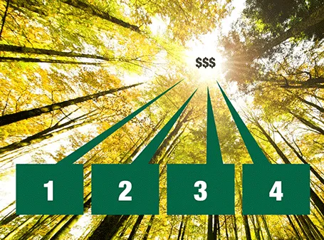
Photographs with a strong perspective are always the most interesting ones to use in a presentation. See the example below. Strong lines leading to a bright spot that almost makes you squint. When adding PowerPoint objects make sure to align them properly with the flow of the image.

·Animations

Uncover versus popup

I am not a big fan of animation, spectacular effects do not support a serious business message and documents with animations do not convert well to PDF for emailing.

Sometimes there is no escaping though, especially when you need to explain components of a complex system. The best way to do this is to add elements one-by-one through a series of clicks.

The usual way to do this is to use pop-up animations. However, these can be cumbersome to edit: you often forget one item in a group, and have to start all over again.

There is an alternative: cover the critical elements in your slide with boxes and remove the boxes one by one. Easier to edit. You can even make it more sophisticated by given the boxes a 10% transparency: the viewer sees sort of what is coming, but not completely. When you want to PDF and email a version of your document, you simply delete all the boxes which leaves the full diagram intact.

·Layout

16:9

The presentation canvas is no longer limited to the overhead projector. Laptops, TV screens are often used to display PowerPoint presentations with a wide screen or 16:9 aspect ratio.

For movies, 16:9 is great. The wider screen is more natural for our eyes. For slide design though, I find it less useful. We can read best when titles are short, or text is set in a narrow column. As a result, with 16:9 my slide design almost always changes to a horizontal story: element or title line on the left, and 1 or 2 other elements to the right. It always takes me a bit longer to comprehend the slide.

So, when I am designing a presentation specifically for a plasma screen (a trade show booth for example), I will stick with 16:9, but for other output devices I revert back to the good old 4:3.

It is always good to contradict yourself, see my earlier post from August 2008.

·Colors

Make the small print really small

On the first day of my career at McKinsey we were told to put the sources of our analysis really prominently at the bottom of each chart. Even if the source of the data was yourself, simply put “Team analysis”.

Still, many presentation slides have very conspicous sources and foot notes at the bottom. It is a typographical eye sore. When you are standing up to present your slides, people are not interested in reading the small print.

I am not advocating to take the foot notes of all together. Readers who go through the deck afterwards might be interested in them. It is also very hard to keep a good book keeping of data sources, better to have them handy all the time (I do not have the discipline to keep on updating that page with all the sources in the back of the document). And finally, taking of the reference to a photographer in an image with a creative commons license is not good practice.

So instead, do the obvious. Make the font really small (you can overwrite the “8” as smallest font size in the PowerPoint drop-down menu and make it a 6). And give the font a color with low contrast with the background. In that way, you get the best of both worlds.

This might also be the way to handle your lawyer who insists to put “confidential” and other disclaimers on every slide of the deck. Page numbers can be treated the same way. Sometimes they need to be there, but only for people who stand with their nose against the screen.

·Layout

If it is a text doc, treat it as text doc

Some PowerPoint documents are meant for reading, not for presenting. In many ways, PowerPoint is a more flexible tool to write text documents than a rigid word processor. It is easy to add graphs, shapes, text boxes.

If your document is a text document, treat it as such and do not try to turn it into an on-screen presentation. The resulting presentation will be something in between that is not good to present on screen, and not good to read on a monitor. It does definitely not look Zen, and the short bullet points in big fonts are too cryptic for someone to understand without explanation.

Instead have a look at what great document, brochure and newspaper designers do to make text readable. Smaller, lighter fonts for body text. Lots of white space around text blocks. Subtle use of colors. Subtle highlights of titles. Columns to avoid straining the eye across long lines.

Sometimes you can mix styles. A stunning image with a big headline that says that food shortage will be a major issue in 10 years from now. The next page is a restrained text page full of facts and information supporting your point.

There is nothing wrong with a text document in PowerPoint, as long as you admit that it is a text document.

·Layout

Text columns in PowerPoint

Sometimes, you need to fill a PowerPoint slide with text. These slides are obviously not meant to be presented on a big screen. Still, I make them now and then; a legal disclaimer on page 1 of an investor presentation, detailed bios of the management team in the back, or a page of text in a PowerPoint document that is meant for reading rather than supporting a live presentation.

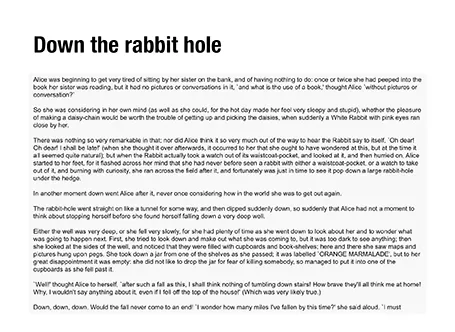
It is difficult for the eye to follow very long lines of text, because when the eye has reached the far right end of the sentence it has to move all the way back and find the start of the line below it. This gets hard with long lines. Also, long lines of text look ugly. Print designers discovered all this centuries ago, and invented the text column.

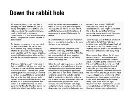
If you right click a text box in PowerPoint and select format text, you see that one of the options you can choose is columns (Mac). Play around with the number of columns and the white space in between them to get the desired effect. As an example, below are the opening paragraphs of Alice in Wonderland.

·Art

Learning from impressionists

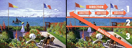
Every presentation slide should have a clear organization, and direct the eye. Paintings are a good example. Have a look at this painting by Monet: The garden at Sainte Adresse. It is clearly divided in 3 horizontal bands, has a strong diagonal cutting across, and the flags and steam clouds from the boats  provide energy that leads the eye from left to right.

·Layout

Two ways to emphasize text

Method 1 - emphasize subject: you can apply all bold, italics and underline effects, increase the font size, and pick a nice bright red character color (make sure you use all effects at the same time)

Method 2 - de-emphasize background: cut out all the visual clutter and distractions so that the point you want to make just appears by itself.

Guess which one I prefer?