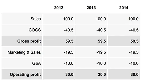
Sometimes, you do not need a data chart at all, and nicely formatted table with rounded numbers might just be the best option to visualize your data. This is especially true for financial statements with lots of information, or in situations where one chart contains a lot of numbers with completely different orders of magnitude. Some quick improvements you can make to make a table look good:
- Space out rows and columns, the more of them are the same size, the calmer the table will look
- Round up numbers to a reasonably precision, use a “,” to separate thousands Right-align numbers, make sure the decimal dot lines up
- Right-align the first column with descriptive text, so it is as close as possible to the first column with numbers.
- Use highly muted background colors, I usually pick the lightest grey that I can get, and draw the cell borders with a white line
- If necessary reduce the font size, very big fonts with unnatural line breaks do not look very good in a table.
- Enter data manually: yes typing in every single number by hand is often the only way to get the table to look exactly the way you want it to. Fifteen minutes that are well-spent
UPDATE: on request an example of a table layout I often use.