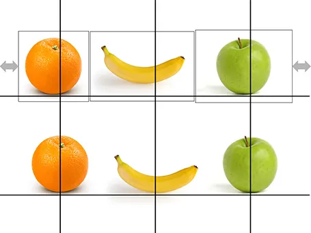
Centring objects
Images with objects isolated on an empty background are not always cropped perfectly. Centring the image will not center the object. Draw a some quick guide lines and you can align things properly.


Frequent updates about all things presentations since 2008. Subscribe to never miss a post.
Images with objects isolated on an empty background are not always cropped perfectly. Centring the image will not center the object. Draw a some quick guide lines and you can align things properly.
Mary Meeker has updated her deck about the state of the Internet:
The slides inside are typical examples of investment banking/consulting visuals with lots of information, they are best read offline rather than presented in front of a live audience. Record the eye movements you have to make in order to absorb all the information on the slide below:

When presenting, you can simplify the chart, but shortening/cutting titles and subtitles, making sure that a few really stand out, and that the rest is put on the chart in small print visible to the reader, but not really to the live audience.
A more general point about this presentation though. I have followed many editions of it over the past few years (going back to the time when she was still an equity analyst), and actually find that the current one disappoints a bit in terms of content. But maybe that is the state of the Internet today, little surprises?
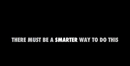
Some slides require a more dramatic introduction than just plopping it on the screen. I often use a blank slide wit a teaser sentence (not “the solution”) for this purpose. It breaks the flow and brings the audience attention back to the presenter.
A page full of logos in different colours can look cluttered. Apple re-did their partner logos in white on black in their recent product presentation. I am not sure whether all the graphic designers that were behind the logos would agree to this, but it sure looks better. I would have taken the slide design one step further though, and organise the logos in a rigid grid.
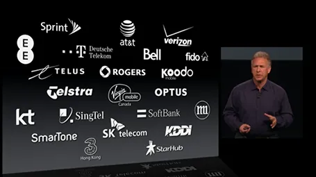
Many logos come with tag lines and/or ® or ™ attachments. When positioning a logo on a page, ignore these and focus only on the main text or graphic to align the image on a slide (even better: violate the logo style rules and crop them out). For horizontal alignment of a number of logos in a row, draw a temporary line and make sure the text of all the logos sits right on it.
The grid is the imaginary set of horizontal and vertical lines along which the objects on your slides are aligned. Breaking the grid is a key tool that designers use to add an interesting tension to a page layout. But in most cases, it is better just to stick to it. See the example below, your eye will immediately pick up that there is something wrong with the layout of these head shots.

When graphic designers start with the design of a PowerPoint template, they are faced with a white page. A common way to fill it is with a faded, washed out, water mark. It might look OK on an empty page, but it will clash with any other object than a text bullet point. To be avoided.
Unless other prescribed corporate template elements that are hard to change, a water mark can be easily taken out, simply delete the graphic on the page, or cover it with a white box.
Many consulting charts feature a tiny legend in the top-right corner that explains what the shading in the bar chart means (for example “Have no access to clean drinking water”). Often that is the whole point of the chart and that legend deserve to be made a bit more visible.
In the bottom of my office drawer I just found a small card with personalised suggestions for better presenting that I had to fill out after a communication training at McKinsey all the way back in 1996. All the usual things are there: stance, eye contact, etc.
But one things stands out and is so 1996/McKinsey: “Introduce the slide before putting it up” (remember we were still in the time of the overhead projector). McKinsey slides were incredibly busy and filled with data, so plopping that overhead sheet on the projector without warning would overwhelm the audience.
Instead, we had to introduce the message of the slide, show it, talk people through the various elements of the slide (what is on the axes, what the line means, etc. etc.), and maybe repeat the key point one more time.
Now 16 years later, my approach has completely changed. When you put up a slide, it should be completely self explanatory, cutting out unnecessary clutter and spreading out content of multiple slides if needed.
How do you showcase your application in a 20 minute pitch? Doing a full, live demo is hardly ever an option:
In a short VC pitch, doing a live demo is likely to take the energy and momentum out of our talk. The other solution is showing a bunch of screen shots. But how can we transform a series of uninspiring screen shots into an exciting use case of your product? Some steps to consider: