SlideMagic Blog

Frequent updates about all things presentations since 2008. Subscribe to never miss a post.

RSS
all posts

Category Images

·Advertising

Esthetics in everything you do

Another ad found on Ads of the World: Samsung wide-angle CCTV.

Very good Photoshop work. Still, the resulting image is not esthetically pleasing. My personal rule: never let an ugly chart or image enter my PowerPoint presentation, ever.

·Concepts

Chart concept - signs with a little humor

High-quality pictures of signs are great raw material for a presentation. They stand out by themselves, people are used to take a moment to read them and they could add some humor to your story:

  • Typos, or unusual text as an ice breaker for your audience
  • A correct message that is put out of context in a funny way in your presentation

The downside, they are very hard to find, but with a bit of creativity you can re-create them either by using a blank sign from a stock photography site, use a generator like AddLetters, or - even better - creating one of your own using PowerPoint shapes.

Here is a diffrent take on the credit crunch found on Noisy Decent Graphics:

·Data visualization

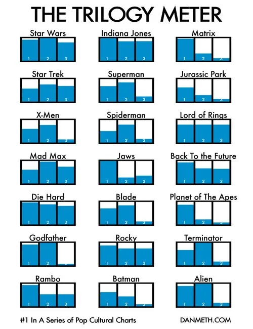
Visual power of many small repetitive data charts

A nice set of bar charts showing Dan Meth’s excitement about episodes of movie trilogies.

Many, many, similar small data charts on one slide can create a powerful visual effect. It is possible to create Zen charts that contain lots of detail.

Via Randy Krum

·Colors

Google image search narrowed down by image color

An interesting find by the Google Operating System blog: using Google image search to find pictures with a certain color. It is not an official search option (yet), you need to adjust the Google URL manually:

Finding red birds:

  • Enter “bird” in Google image search
  • Add “&imgcolor=red” to the Google URL so it looks like this: http://images.google.com/images?q=bird&imgcolor=red,
  • Replace “red” with “blue”, “green”, “teal”, “purple”, “yellow”, “orange”, “pink”, “white”, “gray”, “black” and “brown” to get other colors

Still, watch out for possible copy right violations or poor image quality when using pictures taken from Google in your PowerPoint presentations.

Thank you Ashish for pointing this out to me.

·Design

It's hard to find that perfect visual analogy

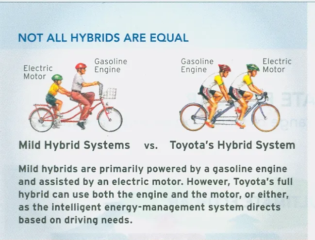
I came across this diagram in a print advertorial for Toyota hybrid cars (scanned it, could not find it online). Click on the image for a larger picture.

The diagram supports all the points in the text. Still:

  • The image looks a bit retro
  • You actually need to study it a bit to understand it
  • Race bikers can go fast, however they are by far not as powerful as a modern hybrid car…
  • The text below the image does not flow very well

In short, the image is probably good enough for an internal management presentation, but does not meet the bar for external advertising. It is hard to find that perfect image or illustration…

·Design

3D font city - 5 years from now in PowerPoint?

Graphics design has always been ahead of mainstream PowerPoint in terms of graphical abilities (colors, images, drop shadows, etc.). On the front page of Digg Design today an interesting collection of 3D typography put in one place by Naldz Graphics .

A taste of things to come! Wouldn’t it be interesting to navigate around in a 3D city of buildings made of words to support your presentation?

(Image by Serial Cut, advertising for the Zune marketplace)

·Design

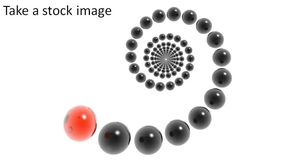
Create your own composite images in PowerPoint

It is easy to create your own composite images in PowerPoint:

  1. Select a stock image isolated on a white background
  2. Make the white background transparent
  3. Select image, go in format, picture effects, shadows, interior shadow to make the edges smoother
  4. Paste this image on another image with the background of your choice

·Design

Why not zoom those images

Stock image sites are trying to convince you to buy higher resolution (and higher price) versions of the same image, I usually don’t buy it.

  • In case you need to print it on a street sign (not required for me)
  • Because you want the very best looking PPT slide (no real difference + big file size)

There is a reason however that might make me change my mind. The same argument holds when buying digital cameras with ever increasing mega pixel capabilities: your ability to zoom.

Try to experiment with zooming into stock images (don’t be afraid to create a “bleed”). The result might not look good on your computer monitor, but from a distance it can look refreshing. (Do the slide sorter view test).


In the example above, both approaches work. A tiny image on a big white background, or an extreme zoom. The middle ground (as usual) is boring.


·Advertising

PowerPoint lessons from a toilet paper ad

I am learning a lot from print advertising. I am learning a lot from the adgoodness blog.

Especially in fund raising presentations I design for startups that are going to pitch to potential investors, I am spending a lot of time/effort in finding that one image or visual concept that really nails down the idea in one big bang. Almost to the extent that the following slides are not required anymore.

Consumer marketing is all about focus on one single and clear consumer benefit. Here is a(nother) great example. Food for thought when designing your next presentation.

·Design

Exception: some conceptual stock images can be useful

I am not a big fan of conceptual stock images. Compositions you can do yourself. There are exceptions. See the example below.