So how many different types of slides are there?
I think there are 4 different type of visuals, Have I forgotten any? (The images below are taken - out of their context - from previous posts on this blog)
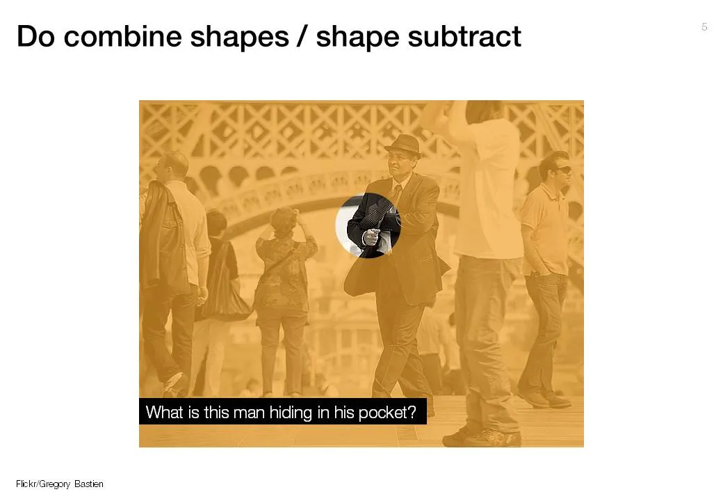
- Big picture, big emotion slide. A huge image of a squeezed orange “the competition is killing us!”, a big picture of an audience asleep “presentations are boring!”, swimmer dives in the pool “let’s go for it!” (lot’s of cliches here, but I have seen many good ones as well). These slides are an emotional shortcut, they unlock an idea/feeling that is already present in everyone’s brain quickly.

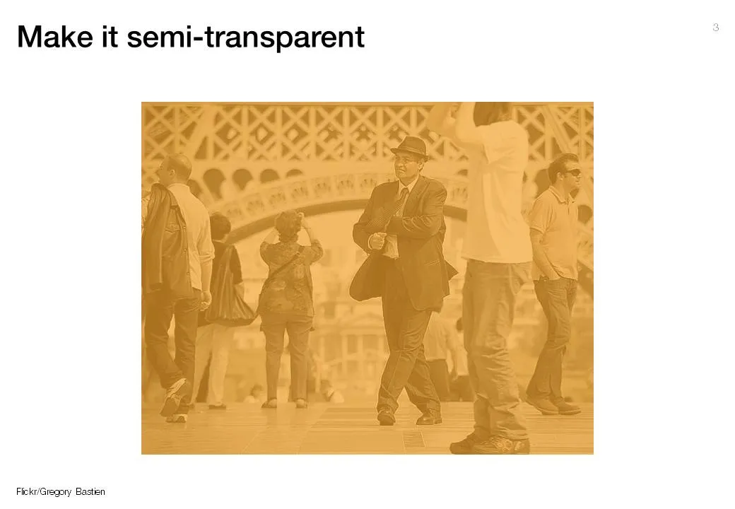
- Location port, a big image of a place, a street, a country, a customer. Pretty much like a movie director opening a film to bring us to a different time, a different place. An image of the interior of a messy store is much more powerful than a list of bullets: isles are not straight, labeling is unclear, lighting is poor.


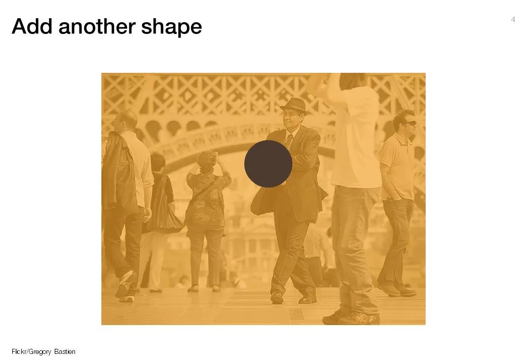
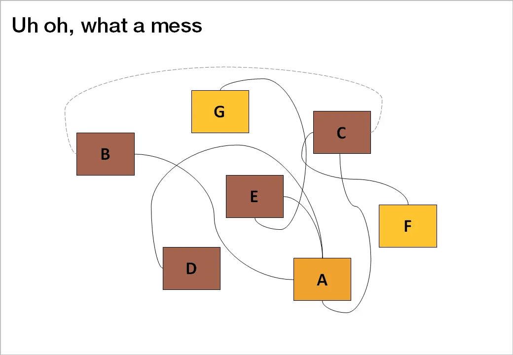
- Relationship slide. Shapes/boxes with text, arrows, to show how issues are related, impacting each other, are dependent on each other, sit in different places on the same map.

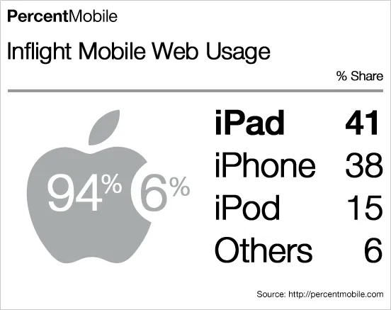
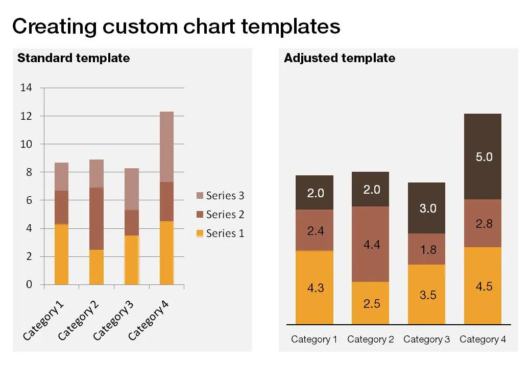
- Data chart showing us a trend, or comparing numbers.
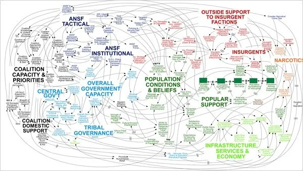
An incredibly dense relationship or data chart should actually be in the “location port” category, the U.S. army spaghetti chart is an example: it is not so much about understanding the chart in detail, rather the viewer understands immediately that “it’s complex” (earlier post).