SlideMagic Blog

Frequent updates about all things presentations since 2008. Subscribe to never miss a post.

RSS
all posts

Category Images

·Design

Hand-drawn figures in PowerPoint

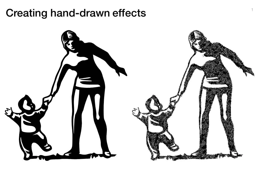
Another excellent clip art manipulation on Tom’s Rapid e-learning blog: how to create characters with a hand-drawn feel:

  1. Select a cartoon-style clipart
  2. Ungroup and strip out background elements
  3. Copy and paste as PNG
  4. Apply PowerPoint 2010’s new pencil sketch filter (or use Photoshop’s)
  5. Increase brightness, soften contrast a bit.

·Design

Clutter-free web site screen dumps

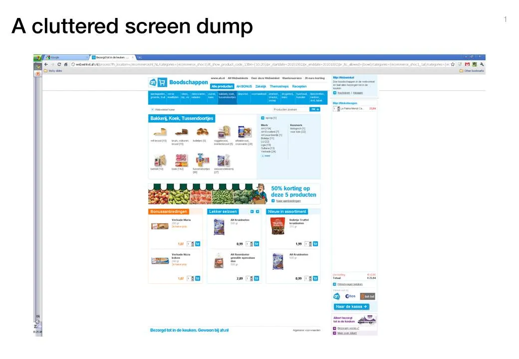
Screen dumps are often used in VC pitch presentations; either to showcase the company itself, or to give examples of competitors in the market. These screen shots are often filled with excess visual details:

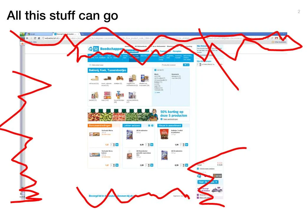
  • The Windows title and scroll bars (sometimes with personal information such as instant messaging windows or the names of other web sites that are open on the screen)
  • The menu navigation structure, login windows, banner ads that surround the core web site.

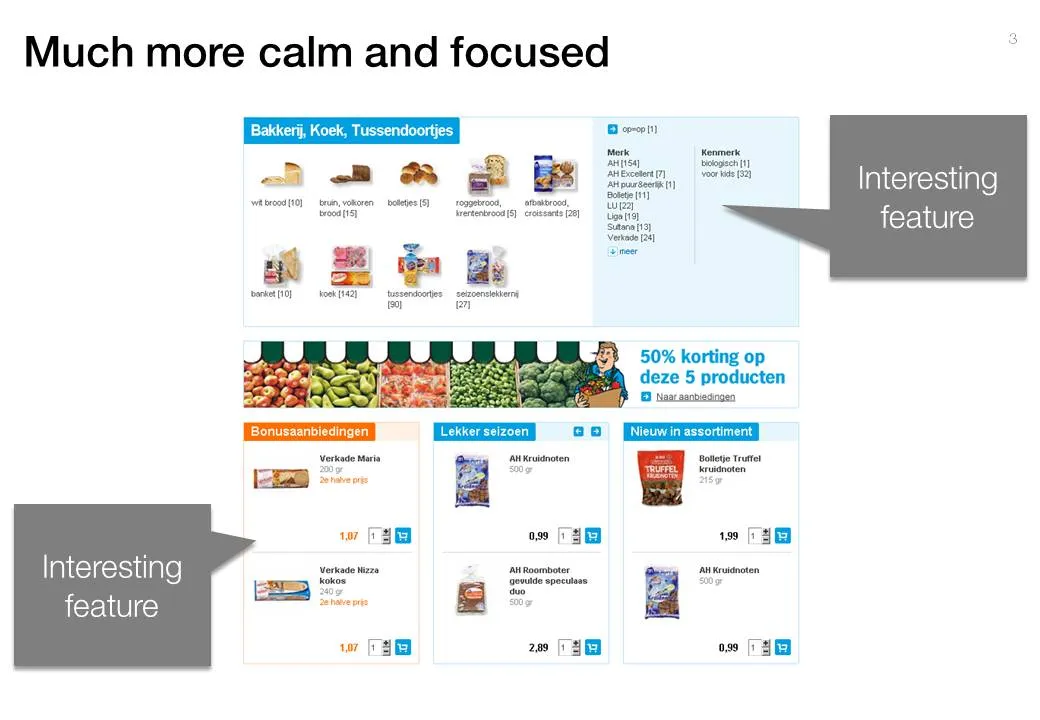
Cut this clutter to create a much calmer slide that allows you to focus on what feature/aspect you would like to highlight.

·Design

Animated GIFs

Usually, animated GIFs drive me crazy. The more subtle ones like this one could actually work in a presentation. If you copy and paste an animated GIF into your slide it will start to play if you switch to presentation mode. Via this isn’t happiness.

·Concepts

The PowerPoint blur filter

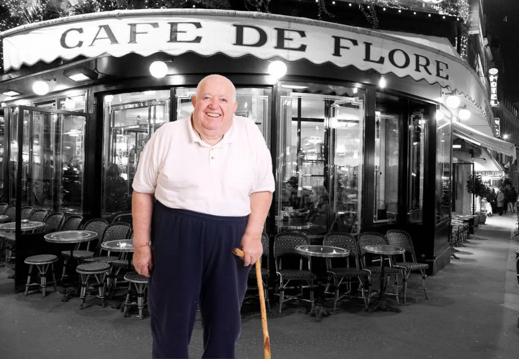
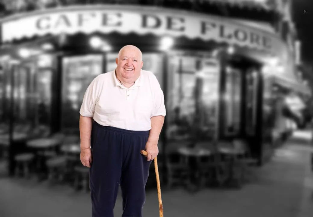
PowerPoint is slowly adding features that have been standard in Photoshop for years. One useful one is the image blur filter to increase depth of field of your photos (earlier post). It adds some extra realism to this composite image trick (discussed earlier here and here)

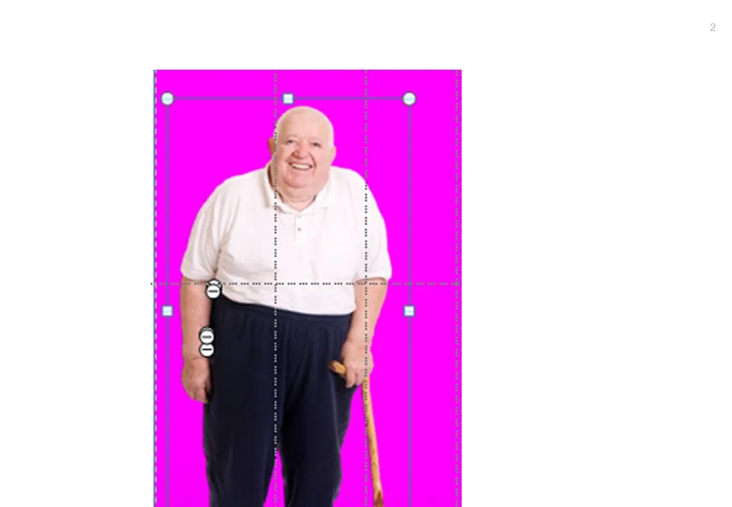
  1. Find an image for the foreground and use the PowerPoint format/remove-background function to get rid of the white background
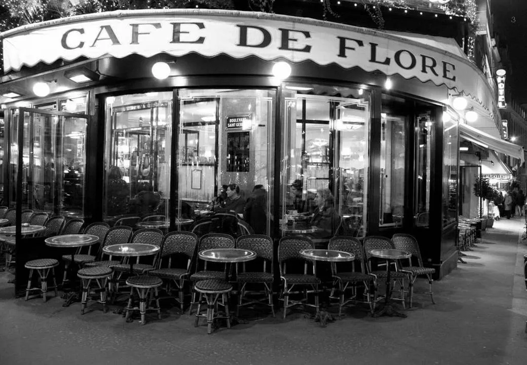
  2. Find a background (nice image of Cafe de Flore by DarkB4Dwan)
  3. Combine the 2 images
  4. Blur the background with (click the image, format, artistic effects, the right one in the 2nd row)

One other application is to repeat a blurred version of a busy chart for additional comments (see post here)

·Art

The real photographer and the stock photographer

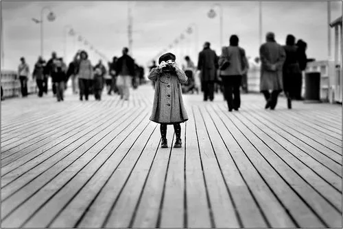
Clicking through some of the black and white images on this incredible page on Smashing Magazine shows you once more the difference between an average stock image and a photograph taken by an artist.

This image is by Andrzej Laskowski

·Concepts

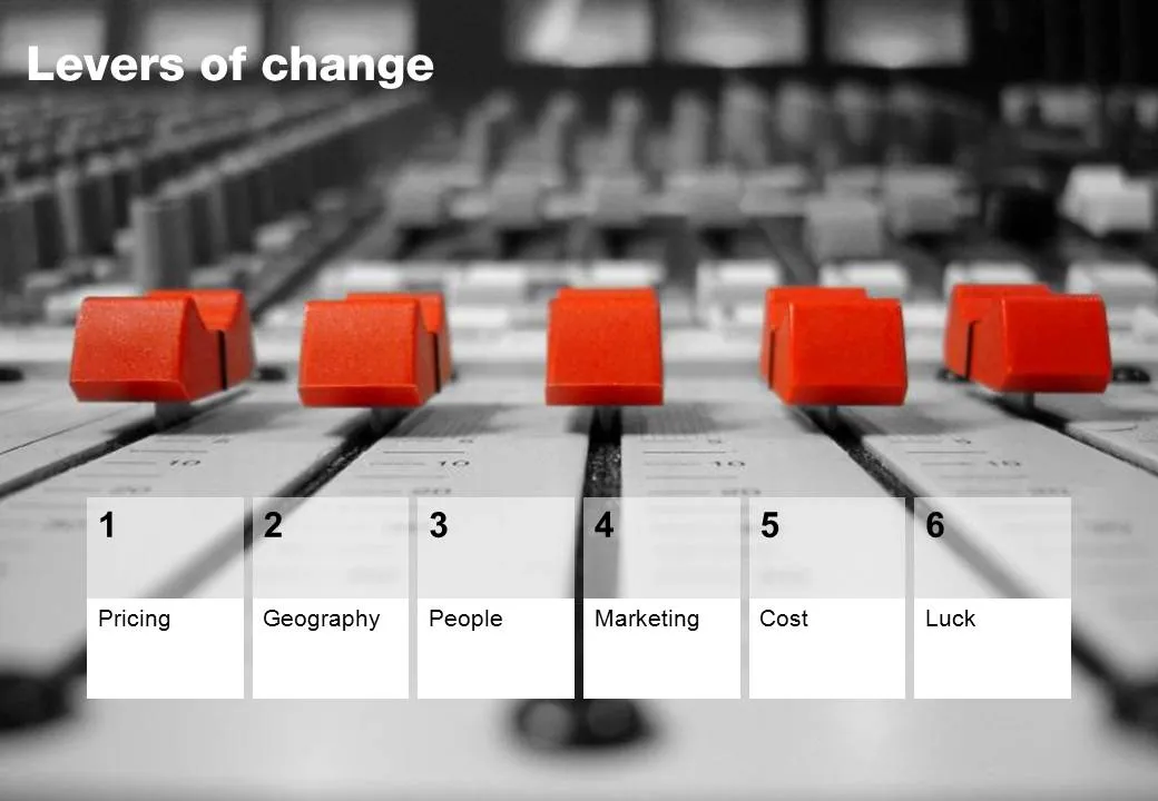
Chart concept - mixing console

Mixing consoles used in recording studios are a good visual metaphor for situations where you carefully need to balance, fine tune, juggle a set of drivers. Image via iStockPhoto.

·Design

Making the audience feel small

You probably have noticed as well that it is impossible to capture a wide panorama with a camera. “Look at this sunset over the sea! Where is my camera?!”. The resulting image is often boring and lacks depth, the exact reason why so many stock images of panoramas fail to excite.

The human brain is not restricted by a small 2D screen. It senses distance/3D by blending the slightly different images from both eyes in to one. Eyes never sit still, they constantly move. We are standing at the inside of a gigantic sphere. Eyes compare the size of objects, to assess dimensions.

Handing out 3D goggles to your audience is not an option (at least not today), so the presentation designer has to resort to tricks to create 3D effects.

  • Pay attention to camera position (earlier post)
  • Put a known object in the image so people can relate the size of the whole to the familiar dimensions of the object (earlier post).
  • Or use effects like the one used in the image below. Stitching together multiple photographs to create on large, distorted image that gives the illusion of standing inside a sphere. Your eyes are really running up and down the image, just as you would do when you would stand inside the cathedral for yourself. Huge image by balondrotor here. (Earlier post on a similar but less spectacular version taken in the Notre Dame)
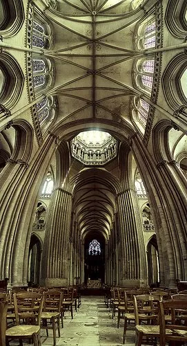
For those interested, the cathedral in question is the one in Coutances, Normandy, 20 km from this year’s holiday home. This majestic old building stands in the middle of the city center that was largely rebuild after the July 1944 battles. It was almost unscathed.


Continue reading →
·Advertising

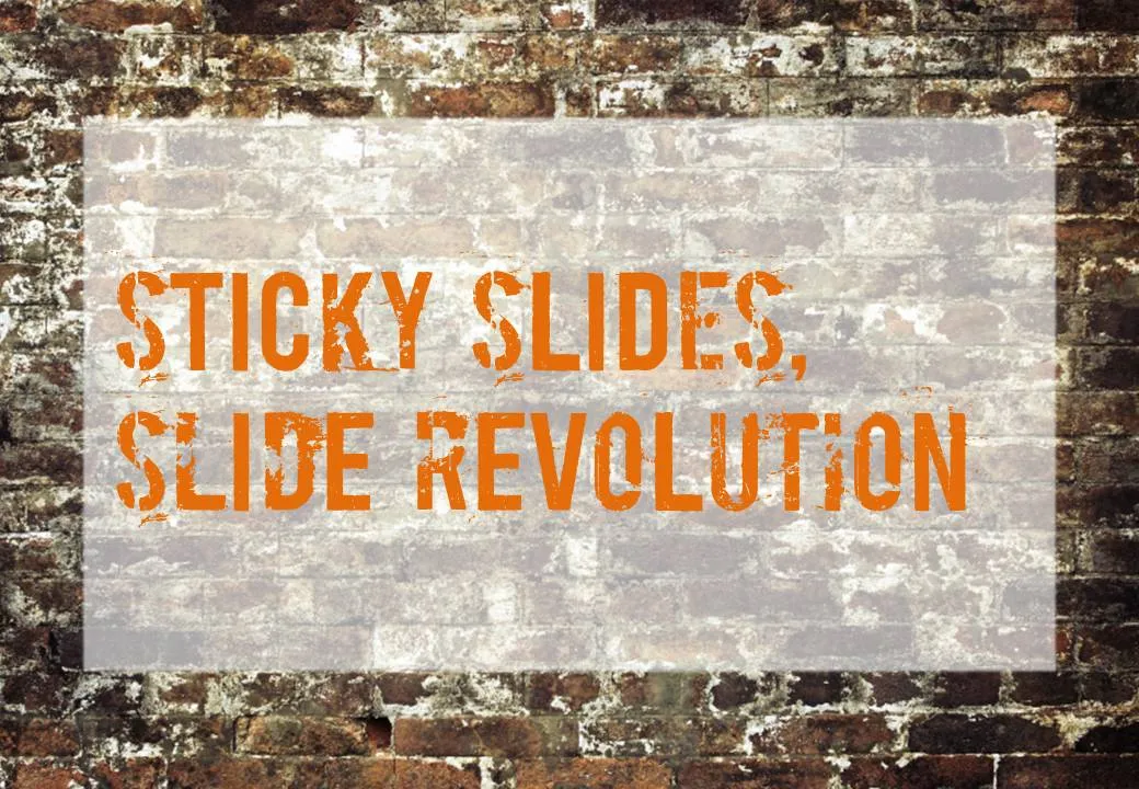
Chart concept - painted billboard

This vintage-style ad found on Ads of the World can easily be replicated in PowerPoint. A white box, semi-transparent with a bit of soft edges and a nice font against an image of a brick wall and you’re done.

·Design

File naming

The number of images on my hard drive is spinning out of control and I never got around to using dedicated software with image tags for my images (maybe I should). Lately, I am paying more attention when naming an image file. And the one thing that helped me most is to put the noun first. For example:

  • sky_sunny.jpg
  • sunny_sky.jpg.

The latter is how we are used to think, the first is best for sorting and finding things on a computer.

·Concepts

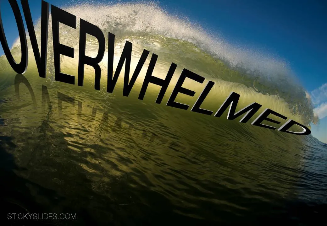
Chart concept - overwhelmed

It is important to pay attention to camera positions when selecting images for your presentation. This wave that is about to crash on top of the photographer is a great example. Add some dramatic typography and the audience can almost feel the need to swim to the shore before it’s too late.

Image via iStockPhoto.com.