SlideMagic Blog

Frequent updates about all things presentations since 2008. Subscribe to never miss a post.

RSS
all posts

Category Images

·Images

Clockwise or counter-clockwise

I do not understand software applications that do not use small arrows in their menus for rotating pages 90 degrees clockwise or counter-clockwise. It creates the exact same visual delay as bullet points:

  1. Read “clock wise”
  2. Imagine clock movement
  3. Project movement on image
  4. Think: “No I need the other one”
  5. Select menu option “counter-clockwise”

A visual shortcut is needed (i.e., a simple arrow)

·Images

Visuals are emotional shortcuts

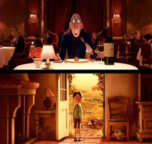
Visual slides are emotional shortcuts. A powerful image or visual concept unlocks something that was already (at least partially) stored in our memory. This scene from the movie Ratatouille (affiliate link)is perfect example: a taste sensation that unlocks a childhood flashback.

·Images

Small scenes showing big opportunities

Most startups pitching for VC money would pound the audience with billion dollar market forecasts produced by market research firms such as IDC or Gartner. They are important, but they do not touch the gut feel of an investor. Often, showing a small street scene without a single number in it, does the trick.

As an example, take online gambling, and let’s go to Spain. Anyone who spend some time there has seen the numerous lottery stands scattered across the cities. What if all these people could get the same thrill of purchasing a lottery ticket on their mobile device, rather than standing (visibly annoyed) in a long line? The opportunity is staring you in the face, right in front of you. The VC is reminded of it every time he drives to the office, every day of the week.
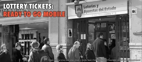
If you are interested, a recent blog post by Seth Godin about why these people are not buying the ticket to win the big prize. Image credit to Paul and Jill.


·Images

Images from the past

The majority of stock images are boring, why not look for real ones? The Internet offers now some interesting ways to get your hands on images from the past, great to transfer your audience to a point back in history. Here are a few of my favorite sources:

The images used here:

Creative commons images on Flickr, search by date
Vintage ads, watch out for copyright
Vintage magazine covers
Vintage websites (duarte.com ~2000)
·Images

What a great crowd image

Flickr is an unbelievable source of images. I came across this photo by Alex Kess. The texture and colors are amazing (the original on Flickr is much clearer than the image below).

·Images

Poster design goodness

Some interesting visual concepts in a Core77 poster design competition. I borrowed the image by the winner Miryam Melkumyan, you can see all entries here.

·Images

Sorry Degas...

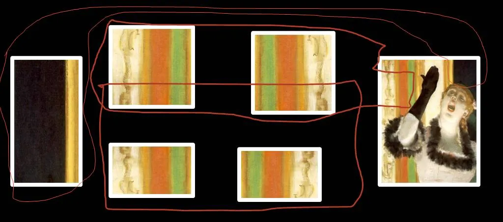
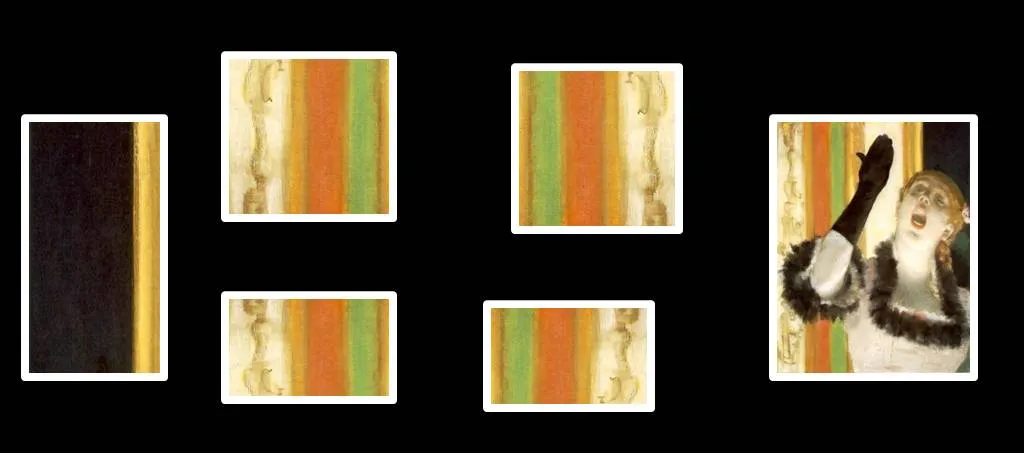
One of the images in the slider of my Idea Transplant web site needed some extension. Here is how I re-used some components of Degas’ original painting and make it fit in today’s widescreen format. I hope he will forgive me.

·Images

Designing good keynote slides

Some random thoughts on designing keynote slides (in no particular order):

  • A keynote is a specific presentation setting. A large audience, an audience that sits there because of its own free will (i.e., not the annual budget review). An audience that has alternatives (walk out for a coffee, check email on a mobile device). You have to capture their attention
  • Every keynote speech starts with the story you want to tell. Don’t  open your slide bank and see how you can stitch together something form existing slides. This might work in your weekly management meeting, it won’t for a big audience
  • It should be possible to tell your story without slides at all. Use graphics only for specific purposes. A picture that clarifies an example. A minimalist data chart that shows a trend. A few words that highlight what you are talking about, or to signal a transition. A map of competitor logos that shows how you are different. One big number to show how huge something is. Insert black slides into the presentation sequence for those passages that do not require visual support.
  • Dense bullet point slides won’t work. But a constant barrage of “stunning” stock images that change every 2 seconds will make the audience dizzy and distracts attention from the speaker.
  • If you have to use images, use real ones. Creative common images from Flickr with real people for example. Use images with a lot of white space. Scale images to the full size of the slide. Don’t use images with a negative emotion: something aggressive, something ugly, something revolting, something depressing, something “college humor”. Think aesthetics.
  • Dark slides with light fonts work better, slides with white backgrounds on a huge screen makes the speaker disappear in a sea of light.
  • Have the mindset of creating a video: think of someone filming your presentation and putting it online for everyone to see. What combination of you as the speaker and supporting visuals will create the best effect. Use a beautiful, calm, non-standard font. Strip out all corporate logos, repeating graphics. page numbers, source references, confidentiality stickers, everything.
  • Practice, practice, practice, and then: practice one more time
·Images

The Sartorialist

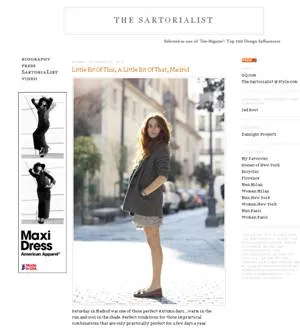
I am not sure to what extent people who read presentation design blogs also have a large number of fashion design feeds in their RSS reader. I follow one: The Sartorialist, the blog of Scott Schuman who wanders around city streets with a camera, taking pictures of regular people wearing interesting creations.

Browsing through his site will show you how poor staged stock images are, and how much more emotionally powerful images of real people can be in your presentation.

To the left is a small screen shot of the web site. Photography on The Sartorialist is under copyright, so you can use the site only for inspiration. Use Flickr to search for relevant images with a creative commons license.

Update: below a mini documentary that came out just today.

·Design

Looming and blurring

Somehow, this big bulldozer looks scarier after a treatment with PowerPoint 2010’s blur filter. If you do not have PowerPoint 2010 installed, you can find it in Photoshop as well. The second advantage is that a blurred image is more friendly to put text on.