SlideMagic Blog

Frequent updates about all things presentations since 2008. Subscribe to never miss a post.

RSS
all posts

Category Images

·Images

Overdoing the icons

It is tempting to use an icon for everything in your presentation: enterprise customer, picture of a guy in suit; small business, picture of a chef; consumer segment, picture of a smiling woman. Alternative: a factory icon, a house icon, a face icon. Other alternative: browse the clip art library

There are a few problems with this:

  • Unless you are pro designer, icons, pictures are hardly ever consistent in format/style
  • Icons/small pictures add clutter to already busy presentation slides
  • For the viewer in the back of the room, the small icons/pictures are actually hard to see
  • Clipart looks so 1990…

Sometimes keeping it simple is the best solution: 3 boxes in 3 different colours with the words ENTERPRISE, SMB, CONSUMER will do fine. Throughout the presentation, use the same 3 colour to talk about your user segments.


·Images

Print posters

Sometimes I get questions from clients who want to print a physical copy of a slide in a very large format to use in conference boots. That usually does not work. PowerPoint slides have a low resolution to manage file size. Even recreating the slide with a super high resolution version of the image will not work. The solution: recreate the slide in Adobe Illustrator or Photoshop…

·Images

Non-stock stock photo sites

A friend of mine posted a question on her facebook timeline: where to get stock images that do not look like stock images. I am shamelessly copying the list of URLs that were posted in response:

http://unsplash.com/ http://thestocks.im/ http://www.stocksy.com/ http://thenextweb.com/dd/2014/05/15/53-free-high-quality-image-resources/ http://www.caddis.co/blog/free-quality-non-stock-photo-resources-for-blogging

Post by Shira Abel.

·Images

It just does not look right

There is a component to visual design that cannot be learnt from studying books. On some presentations/slides I can spend a lot of time, because they simply do not look right, even if the content is pretty simple. And the worst thing, I cannot tell why.

After fiddling with a number of parameters, things can all of a sudden start to look acceptable:

  • Changing the balance in the colour scheme, often focusing on grey with just one strong accent colour, instead of using all the colours that are available in the corporate colour scheme.
  • Using lighter colour/shades in slide shapes
  • Making all images black and white
  • Endless repositioning of slide shapes to get the balance right
  • Reducing the font size (yes, you read it right), and/or rebalancing the number of words in one line

Why? I do not know, it somehow works…

·Images

Overwhelming images

Images are much better than words to amplify a message, but sometimes they can be too distracting. If people are staring in awe at this stunning photograph you found, they might just forget for a second about the message you are showing/talking about.

Image source

·Images

Twitter goes PPT

Twitter is keen to find ways to become more accessible to a broader audience, beyond the tech-savvy early adopters. The answer so far: images. Images grab the attention better than obscure hashtags and @ reply’s, and - sneakily - provides a way around the 140 character limit on a Tweet.

The results, lots of poor visuals. This large headshot is an attention grabber, but I am not sure whether Twitter users will take the time to read through the dense bullet points.

·Concepts

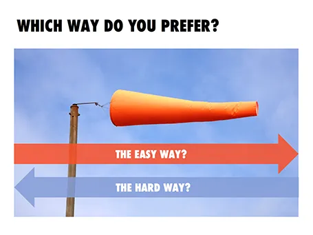
The easy or the hard way

Maybe not very original, but this concept worked nicely in a client presentation (something related to lowering customer acquisition cost).

UPDATE: A variant of this slide design can now be downloaded from the SlideMagic store.

·Images

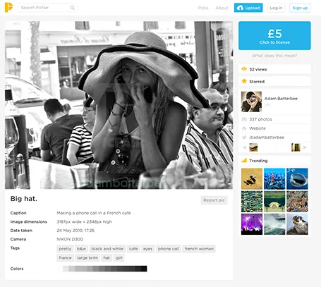
Picfair

A new stock image site Picfair joins the crowded market. It is a market place where photographers set their own price for their work. You can search by theme and keywords.

The good: The site has not been invaded (yet?) by the producers of plastic, cheesy, generic stock images. Photographs are interesting, spontaneous, and original.

The bad: Because of the lack of stock libraries, the range is (still) limited, and this is not the site to find banal but practical images (a bucket on a white background).

Hopefully one of the many small sites that try to provide an alternative to the stock photo giants will rise to become a player that is big enough to serve as a one-stop-shop for quality images.

(Image in this screen shot by Adam Batterbee)

·Animations

"We need to animate that!"

The audience does not see the difference between 4 consecutive slides with different images, or 1 slides with 4 consecutive image build up, so there is no point in trying to cut slides by consolidating 4 images into one. Four slides are easier to edit, and four separate slides are easier to email as PDF.

·Art

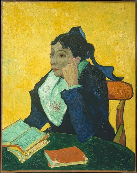
NY Met puts collection online

The New York Metropolitan Museum of Art has put 400,000 super high resolution images of their collection online, free to use. Great for use in presentations.