SlideMagic Blog

Frequent updates about all things presentations since 2008. Subscribe to never miss a post.

RSS
all posts

Category Images

·Images

Putting text on images

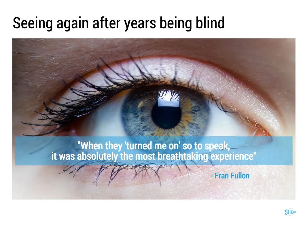
This image that I saw on Twitter has composition problems that you often see in presentation slides:

  • The text in the box does not have enough breathing space,
  • The quotation marks disturb the balance and alignment of the text box
  • The line breaks are not placed carefully enough, breaking apart words that belong together.

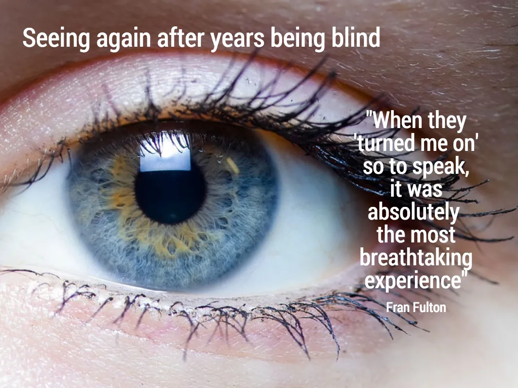
I tried to come up with an alternative design in SlideMagic (which does not support the giant quotation marks [yet]). You clone these two slides to your own SlideMagic account here and use them in your presentations if you want. Image taken from WikiPedia.
Art: detail of the Mona Lisa

·Layout

Slide icons

Repeating the whole story of your presentation on the last slide is boring. You want to end with a “boom” and quickly remind people of the most important message in the presentation. I usually do that with repeating a key visual (just one). Using (the cliche) that a picture says more than a 1,000 words, the repeated image brings back the full richness of the discussion you had in one millisecond. Much more efficient than writing a bullet point.

If you have to repeat multiple messages, here is another trick: use small screen shots of slides. At the end, the audience does not need to be able to read the entire slide anymore. The thumbnail is a quick visual reminder of the content. Below an example that I created in SlideMagic.

I have added this slide design to the template file of all slides I created for the blog. You can open it in the SlideMagic app here and use it for your own designs. Just change the images.

Art: The Flute Concert of Sanssouci by Adolph Menzel, 1852, depicts Frederick playing the flute in his music room at SanssouciC. P. E. Bach accompanies him on the harpsichord.

·Images

New image search habits

There are a number of problems with stock images:

  • Most of them are staged, cheesy, unrealistic images
  • Stock image search algorithms no push up results for photos that include some design elements (some words for example), stuff that is better being taken care of by the presentation designer
  • Many people are over doing the images, trying to use a photograph to visualise a concept that does not really need visualising. The result: an endless string of “stunning” images that distracts the audience rather than support your story
  • Stock images are so over-used that a presentation who uses them now almost look as bad as one that consist of list of bullets. It is an instant recognition: you see the first page of a bullet point presentation, you see the first page of a stock image presentation and you think “uh oh, the next 30 minutes it is going to be one like these”

Here are the steps I go through when trying to find an appropriate visual concept for a slide:

  1. Do I need an image at all? Or can a simple box composition with some text do the job?
  2. If I need images, is there some consistent set of photographs I can use throughout the presentation? Art? People using mobile phones? Retro? Paris?
  3. Do a quick Google Image search with search tools set to “labeled for re-use” to see whether there are any good free/real images out there (always check the actual image for re-use rights, Google might have it wrong)
  4. Try some other free image sources (see my list of free image sources here).
  5. Dive into stock image sites
Continue reading →
·Images

Not every presentation slide needs an image

Yes, visual slides with stunning images are more powerful than boring lists of long bullet points. But that does not mean that designing good presentations is the equivalent of finding a stunning image for every page (sorry).

  • A powerful quote can look beautiful on its own, in naked typography. The image of the person might distract the audience, especially if it is a relatively unknown author of an airport book best seller.
  • A simple information slide (here are the 3 priorities for next year), but just be best visualised with a simple list of 3 priorities.
  • Section breaks can be done in 2 ways: a dramatic visual to show the transition, or an almost blank page that brings the attention of the audience back to you
  • It is very hard to find dozens of images that are more or less similar in style or look and feel. As a result, presentations with lots of images look inconsistent.

It does require though that you find a way to make a typography-only slide look good. A nice full colour plain background, and some elegant stealing from the Swiss graphics design masters in the 1960s is a good way to start.

Art: Brice Marden, The Dylan Painting, 1966/1986

Click here to subscribe to this blog

·Images

Another free stock image site

I only now discovered startupstockphotos.com, a site with creative commons images of workplaces with a startup feel to it (aero chairs, lofts, Apple laptops, wooden tables). They look great! I added this source to my list of sources of free stock images.

Art: Degas, The Cotton Exchange, 1873

Click here to subscribe to this blog

·Images

The cover image that needs to say it all

The cover page of a presentation is an important page. It sits on the projector as the audience walks in the room. It is featured in the thumbnail of an email attachment. It sets the look and feel of your presentation.

Many clients want to have a cover page that says it all. A perfect image that reflects the entire story. In the absence of this image (99% of the cases), they want to do the next best thing: make a collage of smaller images that together tell the story.

I think it is better to pick just one, imperfect, image as a cover page. A collage of tiny images without explanation does not mean anything to the audience, and looks very cluttered. If people could get your message by just looking at a picture collage for 15 seconds, there would be no need for your presentation?

Art: David Teniers, The art collection of Leopold, 1651

Click here to subscribe to the blog

·Books

Useful presentation design tools and resources

As most of my clients outside Israel are enjoying the X-mas break, I have some time to clean up my web site further (no holiday here in Tel Aviv). I added a bunch of presentation design resources on the site.

  • Presentation design books. The flurry of new presentation design book releases seems to have faded a bit over the past years. Has all that needs to be said, been said, or did I miss anything?
  • Presentation design tools. A few neat software tools that can make the life of a presentation designer easier.
  • Sources of presentation images. There are more and more sites out there that offer free stock images under a creative commons license. These images are free, look real, BUT the library sizes are still small, and search is limited.
  • The blog search archive. Now that I moved away from Blogger, it is harder to add sidebars with search boxes, archive links, and tag clouds to the blog. Hence, the dedicated search page for access to 6.5 years of posts (more than 1700 in December 2014).

I hope you find it useful, and let me know suggestions to add more resources.

Art: Gustave Caillebotte, Les Raboteurs de Parquet, 1875

Click here to subscribe to the blog

·Images

Thomas Leuthard

Thomas Leuthard (web site, Flickr) is a street photographer who published his work under a Creative Commons license on Flickr (attribution is required). His work is of very high quality. His images make great backgrounds for presentations that need an urban setting.

Image by Thomas Leuthard
·Images

Sizing up the comet

A number out of contrast is hard to put in perspective. That is why our measurements originally were all somehow related to things we can compare to: feet, kilo (1 litre of water), inch (thumb). But when things get really big, or really small it is hard to absorb the scale of something.

In presentations, you would use bar or column charts to compare 2 numbers to each other. The best comparisons are those where the audience can relate to.

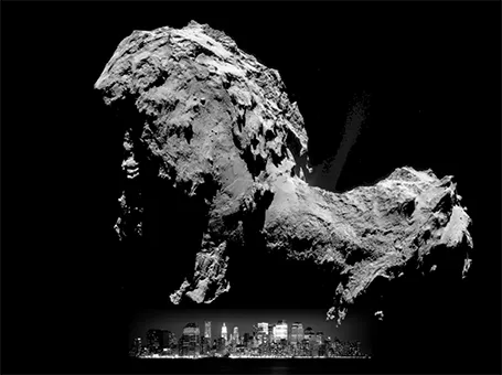
Many people tried to use images to put the size of Comet 67P in perspective (example, example). Below is my attempt, where I put the 4.1km height of the big blob in perspective to the 158m height of 26 Broadway in New York. I think the vertical compositions are much more dramatic than the juxtapositions on horizontal maps.

·Delivery

Going off script

When you get a question during your presentation, should you abandon your story flow and answer it? It depends.

  • For very large audiences, no. One person’s question does not merit throwing out your carefully crafted story line and potentially confuse the rest of the audience. Answer the question very briefly (“Good point, we use super glue for that, I will get back to it later in more detail”) and move on.
  • For smaller audiences that have seen the material you are presenting before, probably yes. For example a presentation to the partner group of a venture capital firm.
  • In one on one meetings: definitely yes. These meetings are not presentations, they are conversations and you should adjust the story flow based on questions, interruptions of the other person. If there are none, then follow the script, but that is likely going to be a boring meeting.