SlideMagic Blog

Frequent updates about all things presentations since 2008. Subscribe to never miss a post.

RSS
all posts

Category Images

·Cartoons

Cartoons need to be huge

Everyone loves reading cartoons, and they can make great content for presentation slides (watch the copy right). But for an audience to get the cartoon, they need to be able to read it. And given the scribbly nature of cartoon fonts, fonts sizes in the bubbles need to be bigger than what usually works on a regular slide (i.e, font 20 or up). If the bubble text has to be 20 points, that means that the overall image needs to be pretty large, often you do not have enough space for it.

When creating slides that are meant for emailing in advance and reading on a screen, font size is less of an issue.

To get the audience to focus on the cartoon, chop out all the usual slide clutter (titles, footers, logos), just a plain page with a cartoon graphic. Cartoons are usually busy graphics.
·Images

Movement in stills

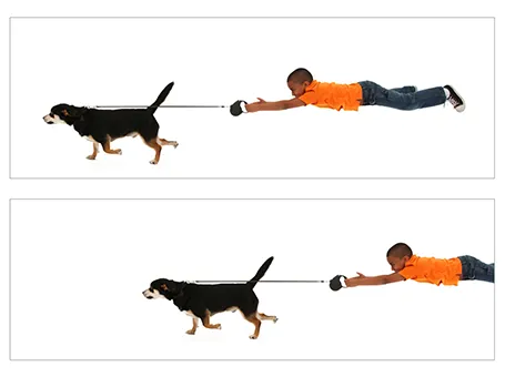
Putting an image smack in the middle of your composition often kills the sense of action in your slide. Experiment with cropping to make things more interesting and dynamic.

·Images

Getty Images - free embed

Getty Images (a huge database of both stock and news photos) is open sourcing non-commercial use of its collection if you publish an image via their embed widget. Web sites only for the moment, presentation design software will have to wait…

·Images

White <> plain

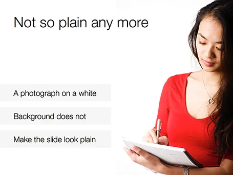
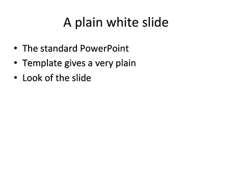
No one likes the plain, white, standard PowerPoint slide. And sometimes when I design a slide with an image on a white background and a lot of white space I get the comment that it looks very similar to a boring, plain PowerPoint slide. I beg to differ.

·Images

Historical images - CC

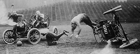
Another source of images that are in the public domain: the publicdomainreview.org You could pick one set of images and use them throughout a presentation to get a consistent look and feel of all your slides. Below a preview of a car polo game in the early 1900s.

Thank you Joann Sondy

·Images

Unsplash: CC image library

Unsplash is a frequently updated blog of creative commons images. Mostly background and nature shots. Via Orli. Image by Dyaa Eldin Moustafa.

·Images

Usage rights in Google images

In the search tools in Google Image Search is now an option to filter out images with a Creative Commons, or other usage rights. The details on the GOS blog. Very useful, but still: double check the image rights at the source and do not rely on Google solely. Via Gavin McMahon.

·Images

But it is the same image?

Sometimes I get this question when using the same image multiple times in a presentation. I re-use it on purpose (not to save stock image costs, or for lack of inspiration). Throughout the presentation, an image can become a brand, or a logo, for a complex idea. Putting up the image again (either in full size, or a smaller icon) communicates that complex idea in a nano second.

·Images

Cover images

The ideal cover image of your presentation (the slide that sits on the projector while the audience walks in) would be one that tells your whole story so perfectly that the presentation itself can be skipped. Many people try to reach this level of perfection by putting up a messy collage of different images, a very tricky visual concept or a highly tacky and cliche stock image that represents the values of the brand: young, healthy, lively, dynamic, and social.

I am less ambitious and usually pick an image that fits the corporate colour scheme of the client and is a preview of an image that I use on a very important slide somewhere inside the presentation. It looks nice and calm when the audience enters, and it will generate that instant recall of that important slide when I show it for the 3rd time on the closing slide.

·Images

Perspective

Have a look at this image (I did not buy it, so cannot embed it). The tilted but aligned rows of numbers in different font sizes give an instant depth effect. You can easily replicate this in PowerPoint or Keynote.