SlideMagic Blog

Frequent updates about all things presentations since 2008. Subscribe to never miss a post.

RSS
all posts

Category Design

·Design

Chart concept - standing out (from the crowd)

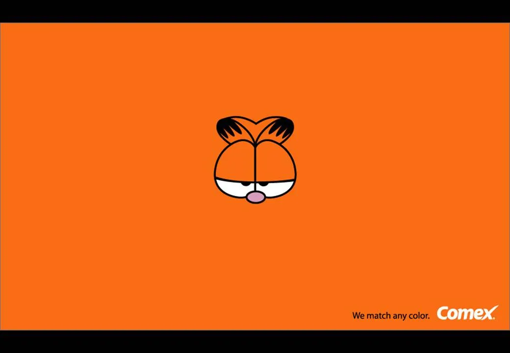
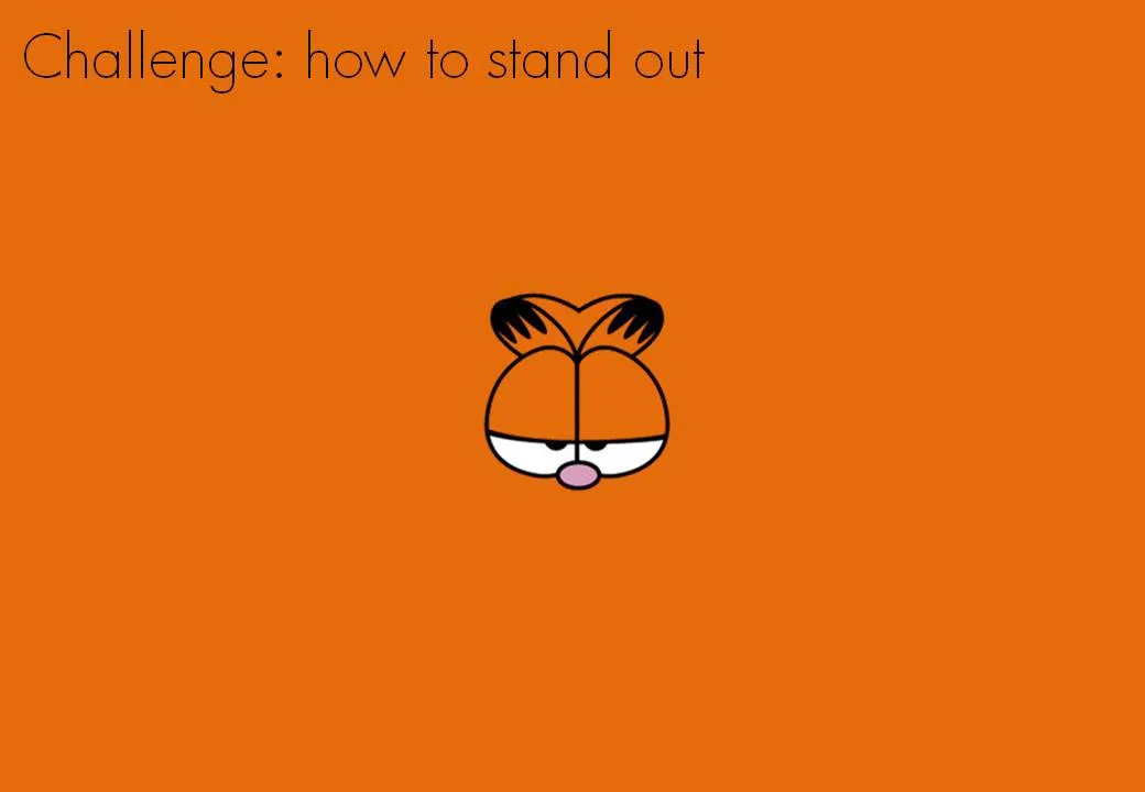
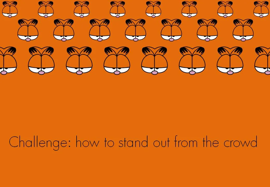
Every VC pitch presentation needs to talk about distinctiveness. There are many slick stand-out-from-the-crowd images for sale on stock image sites. This ad from Comex paints (via Frederick Samuel) triggered another idea. The comic character blending in the background is a nice setup page to introduce the problem. After this slide, you can talk about how you are making a difference in the market.

·Delivery

Does the multi-story-rock-star-presenter exist?

I was wondering this the other day. Many of the best presenters nurture one story year after year after year, and are getting better and better and better at it.

  • Best-selling authors previewing their book
  • CEOs pitching their company’s products
  • Gurus urging us to leave our cubicle to do what we are really passionate about
  • TV evangelists trying to save our soul
  • Presidential candidates preaching hope
  • Social media experts telling us that luckily we are one of the few who really “get it”

Is there such a thing as the multi-story rock star presenter?

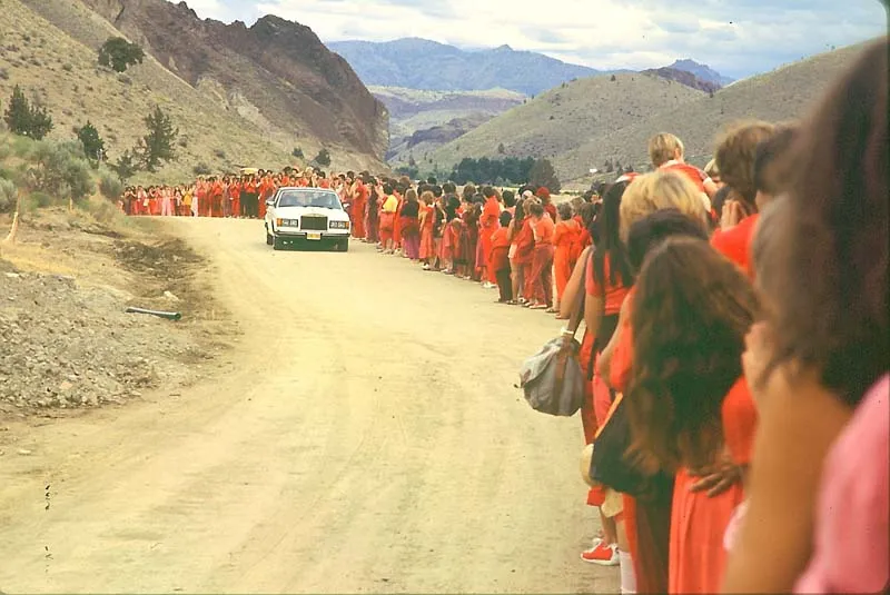
Osho greeted by sannyasins on one of his daily “drive-bys” in Rajneeshpuram, 1982. © 2003 Samvado Gunnar Kossatz

·Colors

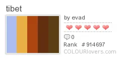
Neat source of color schemes: Color + Design blog

The Color + Design blog provides a constant stream of color schemes based on images, posters, fabrics, street art, to name a few. Add it to your RSS reader if you need color inspiration. One color scheme from today’s post:

·Design

SlideShare kicks off the 2009 World's Best Presentation contest - some thoughts

The World’s Best Presentation contests on SlideShare have become the closest thing we have to the annual world championship in presentation design: a lot of submissions, high-profile judges. This year’s edition just kicked off (deadline September 8).

SlideShare World’s Best Presentation Contest 2009

The bar is moving up. Everyone has learned where to find stunning images. Everyone has learned how to accomodate the fast-clicking online viewer by dragging charts out over multiple slides. Everyone has figured out how important the first page is in catching attention.

It is a shame that SlideShare did not set a subject for the contest, this would level the playing field. Part of the competition now is to find a compelling story, many presenation design gurus are probably in writer’s block as we speak.

The winner will be selected based on a professional jury, votes, and on the distribution of the presentation in social networks. So part of the effort is to design the content, part of the work of a contestant is to run an election campaign.

In the next edition SlideShare should run a finale similar to American Idol, in which the finalists have to present their slides in front of an audience/video camera.

I hope the winner of the contest will be a presentation that touches people, and makes them change their behavior in some way or another. This is not neccesarily the presentation with the most beautiful pictures, motion typography or amazing professionally crafted cartoon characters and sketches.


·Books

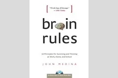
Book review - "Brain Rules" for presenters

I finally got around reading Brain Rules by John Medina and can confirm that it is indeed essential reading. Not only for people interested in visual communication (the likely reader of this blog). But it is also likely to change some of your fundamental perspectives on life if you are a knowledge worker, a manager, a student, a teacher, a parent, or any combination of these.

The book has been reviewed extensively elsewhere, and a good web site covers its basic ideas centered around 12 rules. I will not repeat this, but rather dive in to some of the details that I marked on the pages because I found them interesting. Most of them (but not all) are related to visual communication. Here we go.

  • Contrary to popular belief that (brain-related) things only go down after the age of 28 (millions of brain cells dying each day), the brain can renew. Just exercise and stay curious.
  • Everyone’s brain is wired differently, wiring gets decided early on in a person’s life. Surgeons about to operate on a patient need to keep the subject conscious with exposed brains, while touching part of it to figure out what’s inside. “Someone just touched my hand”. This allocation might impact performance. “Don’t let the superior temporal gyrus host your critical language area. Your verbal performance will statistically be quite poor”.
  • We don’t register boring things, after 10 minutes of a continuous flow of densely packed information, our attention is close to zero. A presentation should have a break, or something to wake us up every 10 minutes (or better still, presentations should last 10 minutes).
  • The first few moments of exposure to new information are the most important. Presenters should not waste it on boring generic overviews of their presentation, long-winded introductions of themselves. Leverage the fact that all brains in the audience are still switched on.
  • Recalling an emotion at the moment we are fed information the first time greatly improves our ability to remember it. Dare to use creative tools. “Apologies for the ugly drawing of this huge orange turtle, but it walks about as fast as the typical decision making processes in our company”. People will be talking orange turtles for the rest of the day.
  • Vision trumps all other senses is almost a cliche (the 1000 words etc.). We know that images in presentations are important. But here is interesting bit: reading text is difficult. Decode the funny shapes, construct the sentence, understand its meaning… Bullet points and text books create too many processing layers between information and memory. But this gives also food for thought to reconsider some of the “big font/powerful quote” slides. “20% of kids are obese” combined with a huge picture of a fat kid walking out of a fast food outlet. Sounds powerful, but I think visualizing the 20% will do an even better job of getting message across.
  • Vision is more than just registering an image. There are different parts of the brain that deal with color, motion, patterns. The brain is especially good at the latter. Use patterns, repetitions, in charts. Especially to visualize data.
  • The brain fills in missing gaps in a visual picture. When you imagine something should be there, you see it. Drawings don’t need to be perfect. Rely a bit on the audience’s imagination.
  • Meaning before details. We need to internalize what things mean before we can remember them. Out with the buzz words, out with the cliches. “Our new holistic security concept delivers scalable ROI that helps you stay competitive in an ever changing world”.
  • People need to sleep to function well. Poor sleep kills 20% of your brain power, that’s about 2 hours worth of work for an average working day. Brains are build to deal with short-term stress (“help a tiger!”) but cannot handle prolonged pressure. Manage your deadlines. A last minute, late night presentation iterations will for sure not deliver a brilliant end product. Our brain continues to chew on an idea in our sleep, give it time. These findings put into question the whole system on which corporate work environments are managed.
·Design

"Nothing on a slide should be placed arbitrarily"

Alignment*. Nothing should be placed on the page arbitrarily. Every element should have some visual connection with another element on the page.*

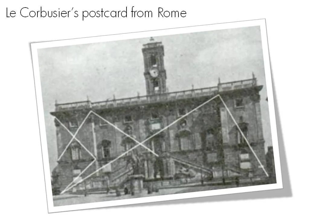
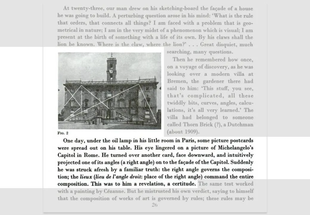
So very true, this quote from Robin William’s book The Non-Designer’s Design Book. Architects such as Le Corbusier are the masters in planning the proportion and alignment of objects on a facade.

The above image and quotes were taken from page 26 of Le Corbusiers’s The Modulor 1&2. (Click on the page 26 Google books link or the image to read the text)

Not that you have to be like them. But still remember from now, whenever you have the option to position a shape or a text box on a slide, why not think for a second where to put it, align it with something?

·Data visualization

Good data chart examples in this Kleiner Perkins presentation

This Kleiner Perkins presentation introducing their iFund makes good use of data charts to prove points.

Kleiner Perkins iFund Presentation at iPhoneDevCamp 3

·Advertising

Chart concept - giving it all a fresh new layer of paint

Sometimes you need a fresh start, begin from a clean sheet of paper, do some serious house cleaning. Covering a busy messy image with a paint roller and some stripes of fresh paint is a great way to visualize this message.

Here is an example of images on iStockPhoto that could be that basis of such a chart (the yellow paint rollers, make sure to strip out the white background color in Photoshop or with this PowerPoint trick). This post was triggered by this ad on Ads of the World:

·Creativity

6 suggestions for designers to increase their Return On Time

Yesterday I came across a very insightful blog post about what is probably the main source of unneccesary time wasting in enterprises: the clash between people on a maker’s schedule versus those on a manager’s schedule. (Paul Graham is a partner in Y Combinator, a funder of very early-stage startups.)

What is the big idea? There are 2 fundamentally different time schedules that people can work on. The clash between these two causes a lot of wasted time and frustration:

  • A maker is someone that needs to produce/design an endproduct. For a maker, meetings are a disasterous disruption of creativity. They fragment the day, making him/her postpone starting a major new piece of work because “the morning’s gone anyway”.
  • A manager’s day is divided into 60 minutes slots in which meetings can be scheduled. Meetings are a great way to get updates on the progress of things (put all designers in a room and let them present), or meetings are great to expand your network (“let’s grab a coffee”).

Although people in power are usually on a manager’s schedule, it is not neccessarily so that a maker is someone in a subordinate role. Anyone doing creative or problem solving work (designers, engineers, architects, yes even management consultants) is likely to be on a maker’s schedule.

Why does it interest me? Since breaking away from big corporate environments half a decade ago I have been given a great deal of freedom to design my own work practices. To my surprise I have noticed how it is possible to improve productivity dramatically without relying on the leverage of a large number of more junior people working for you. I often get feedback from clients that they outsource presentation/strategy work to me because “you can isolate a piece of quiet time to get things done”.

Continue reading →
·Data visualization

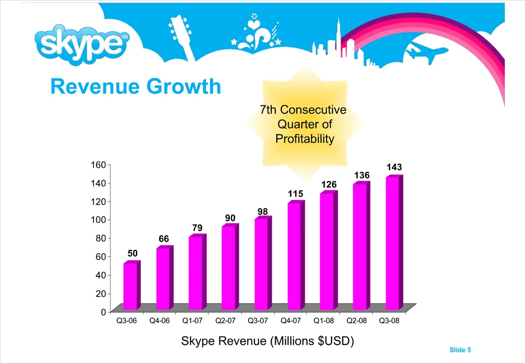
How can we make that growth look more impressive?

“Can we make that look a bit more impressive?”

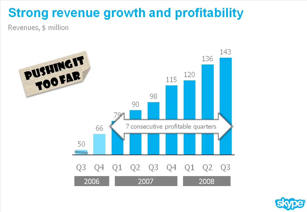
I get that question a lot. An obvious trick with column/line charts is to cut the axis. I think that is cheating the audience, putting at risk the trust in the content of all your other slides in the presentation.

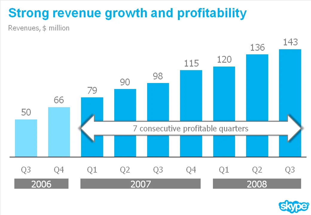
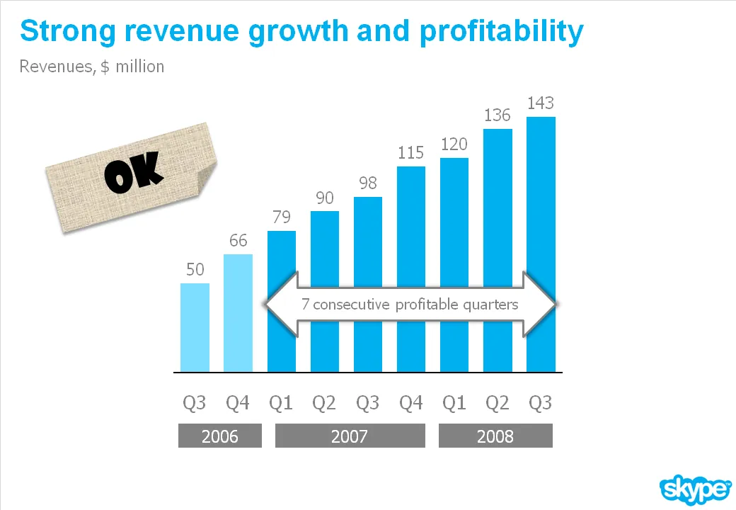
What you can do is play with the aspect ratio of your chart. As an example see the make-over of a Skype chart I used earlier. People in the comments were suggesting that the new version actually looks less impressive than the original. Maybe squeezing the chart horizontally while keeping the vertical size the same fixes that.