SlideMagic Blog

Frequent updates about all things presentations since 2008. Subscribe to never miss a post.

RSS
all posts

Category Design

·Design

Presentation lessons from cluttered French brasserie placemats

I just returned from a beautiful and relaxing family holiday in western France (apologies for limited posting and replies to comments). My 2 year old son’s fondness of cars required us to venture to the car museum in Chatellerault. (About the only thing to see in this town).

Lunch was in a local brasserie (not recommended). The placemat (click on the scan below for a larger image) reminded me of the slide sort sorter view of many poor PowerPoint presentations. Ads screaming for attention by using big, colorful and different fonts. With as much information crammed into it as possible.
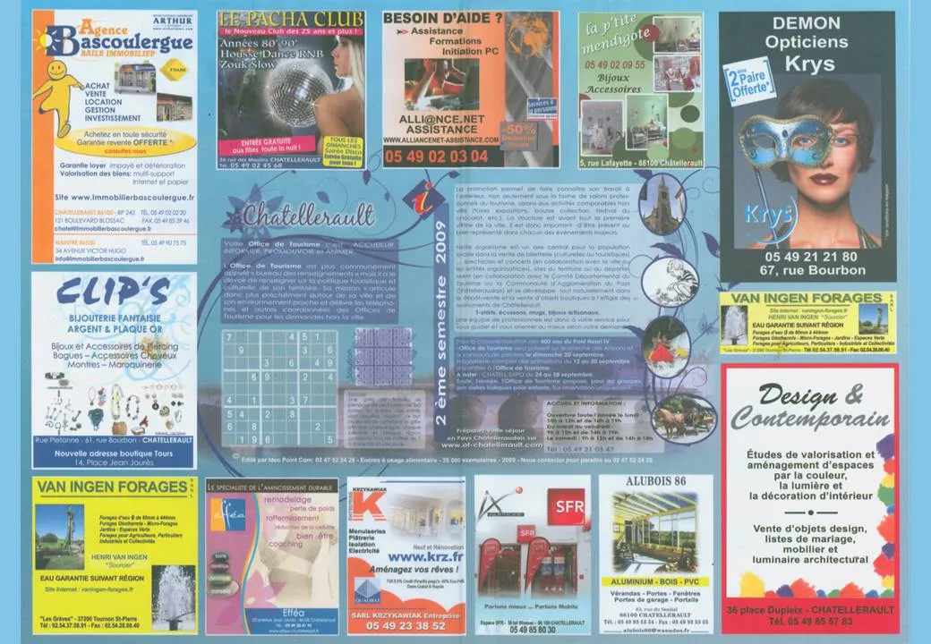
Few got it right with some exceptions. The power of pictures does work in France as well. Many men will be drawn to the Le Pacha Club, fashion-conscious women might check out the Krys optician. I was disappointed with the interior design study institutue though (bottom right).

·Design

Visit my Squidoo lens - useful and donates to charity

More light summer posting. My Squidoo lens is filled with useful resources for presenters (blogs, books, presentater tools, videos). Have a look. Add more content. Vote existing content up or down. You can even buy some useful things, affiliate link proceeds are donated to charity.

·Design

Maximizing screen real estate in PowerPoint

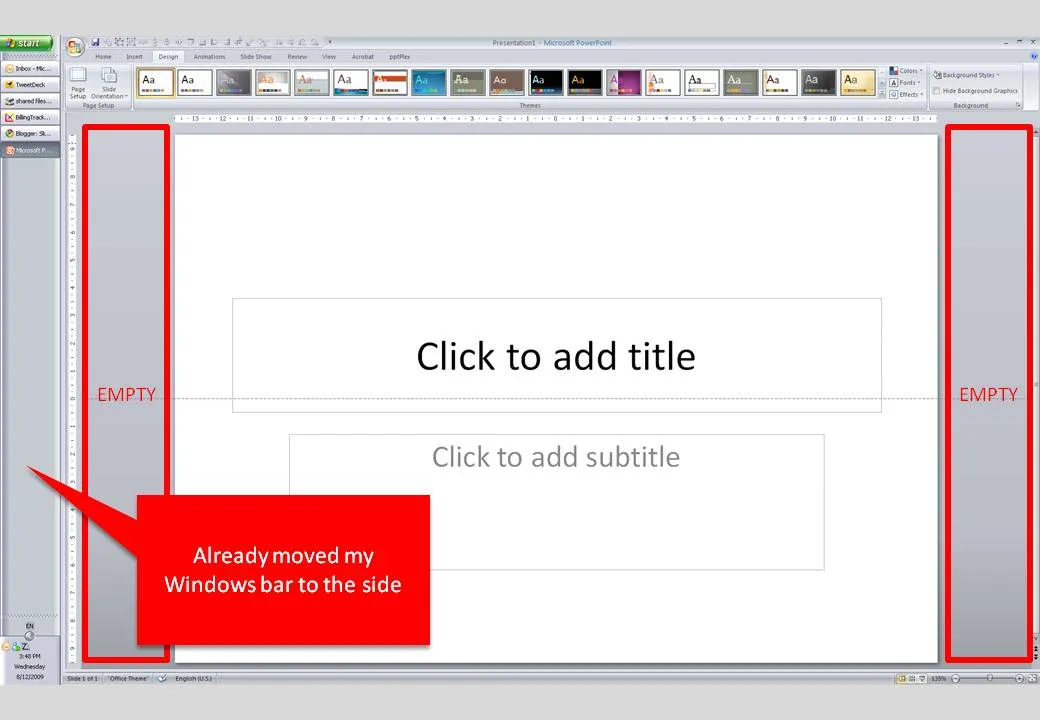
Many people have 16:9 computer monitors by now. Most of the time, we still design slides in 4:3 or A4/letter mode. As a result, a lot of space is available on the left and right of the PowerPoint slide in editing mode.

PowerPoint, like most software, is designed for the 4:3 screen by adding the ribbon and status bars at the top and the bottom of the screen. A lot of screen real estate is wasted. Adobe does a better job, tool bars are positioned to the left and to the right of the work area.

I already moved my Windows bar to the side. Is there a way to do the same thing with the PowerPoint ribbon? I don’t think so. A feature request for PowerPoint 2010.

·Concepts

Most of my "chart concepts" on Flickr

Apologies for the lighter post content during the summer break. I scraped images of the various examples slides I have been using on this blog over the past year and put them on Flickr as one set.

·Design

iStock photo free images expire

More light summer posting. I only recently discovered that the weekly iStockPhoto free images expire after a number of weeks. Do not forget to download them on a regular basis, and pick the very large size enabling you to zoom in dramatically if needed.

The fact that they are picked by iStock editors adds a nice bit of randomness to the stream of images. For example, here is last week’s:

·Design

A scan of your business card as prsentation slide 1

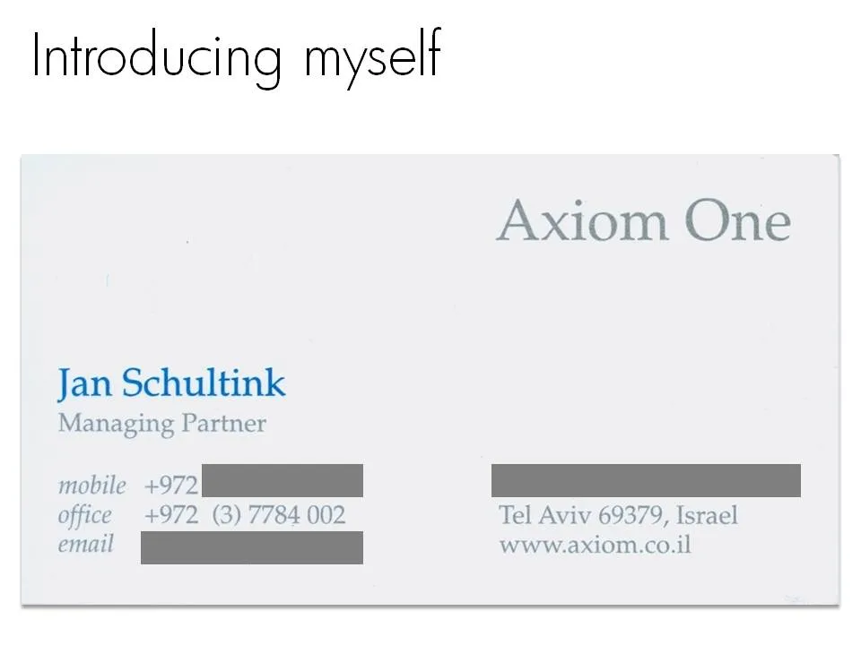
Right at the start of a presentation I always create an opportunity for the speaker to introduce herself. What visual to use for this? Definitely not a boring bullet point summary of your CV. Put a personal image that describes something unique about yourself. It can be frivolous in an informal setting, and in more formal presentations, a scan of your business card (“so last century”) can be a good background.

Apologies for blacking out spam-sensitive details.

·Design

Interior shadows to smoothen edges of images

If you are not a PhotoShop artist, and use PowerPoint to take out the background of an image instead, the edges of the remaining edges can look a bit ruffled. Sometimes applying an interior shadow to the image solves this problem. Sometimes, because it works brilliantly for some images, and not at all for others. You have to try.

To apply an interior shadow in PowerPoint 2007: click the image, go to format/shape effects/shadows/inner and pick the middle one of the options.

·Design

Reflections - if you really have to use them, use them right

I am not a big fan of the reflections that are used frequently in “web 2.0” logos and PowerPoint graphics. The fact that PowerPoint enables a feature does not mean that you have to use it. As an example see a logo that Visa uses to build a relationship with small business customers.

  • Both logos would look much nicer/cleaner without the reflection
  • In the left image the reflection is not correct, the 3D compartment of your brain tells you “something’s not right here”. I am sure it was not the intention of the designer to create a logo in the style of Escher.
·Animations

Motion graphics - blending presentations and animated video

You should design a presentation for an online audience in a different way than those for a live audience. Software such as Adobe After Effects are bringing the graphical tools traditionally used in professional video animations within reach of everyone. As an example, see this recent video produced by Paul Durban: a teaser to get people to download an ebook created by the members of Seth Godin’s triiibes community.

Two more examples of motion graphics:

A few observations:

  • The text-only animations are very useful for high energy, very short commercials. The bombardment of animations can carry one message across. “This tribes ebook contains a lot of questions, what was that tinyurl again, let’s back up”. “Got you, women are an underused resource in the 3rd world, we should help them help themselves rather than relying on food aid”. Software opens this genre up to the masses.
  • The real master pieces are the ones that include images and artwork (like video number 3). I think these remain highly specialized projects almost similar to TV commercials that can only be executed by animation professionals.
  • (Amateur) presentation designers can still learn from these techniques. See how they use fonts, spread messages over different slides and create subtle transitions between slides that are far different from the spectacularly animated PowerPoint effects.

It is interesting to see how the Girl Effect video tries to make up for the lack of images: it constantly encourages you to imagine/visualize things (“No go ahead, really, imagine her”) . See my review of the book Brain Rules, describing the difficulty the brain has with processing text.

·Design

Excel instead of PowerPoint as your presentation tool

Microsoft Office is a tightly integrated application suite. Inside Excel you can find pretty much the entire arsenal of PowerPoint drawing and charting tools.

For certain types of presentations, you should consider using Excel as the presentation tool instead of PowerPoint. Quarterly results presentations are an obvious candidate:

  • Massive amounts of dense data, and a need to switch back and forth between graphs showing trends, and the actual data tables itself
  • Time pressure; the numbers come in fresh from the accounting systems and need to go straight into the Board document, without sufficient time to analyze what actually is going on.
  • Presentations that need to be updated all the time but basically look the same: quarterly results (again), market share movements. Every time the data arrives in the exactly the same format, with a column added. Lots of time is lost with copying and pasting data across. The result is usually ugly Excel tables featuring in a PowerPoint slide.
  • Complex analysis that needs to be redone, i.e., a water fall chart explaining the difference between this quarter and last quarter’s results. Very few know how to do this. Even fewer know how to visualize this in a PowerPoint graph. A smart Excel template can help.

Here is what an Excel presentation could look like. Charts are laid out on the left side, data is put in on the right side. It takes some time setting things up and making all the links work, but once you do, you got yourself a very powerful tool (click image for a larger picture).

Continue reading →