SlideMagic Blog

Frequent updates about all things presentations since 2008. Subscribe to never miss a post.

RSS
all posts

Category Design

·Design

A daily dose of framework napkins

Yesterday’s post about Venn diagrams led me to a blog that I seem to be the last person on the planet to discover:Indexed. Jessica Hagy posts a napkin-style framework everyday. Sometimes funny, sometimes with a valuable insight about life or an unusual way of looking at things. Here is an example:
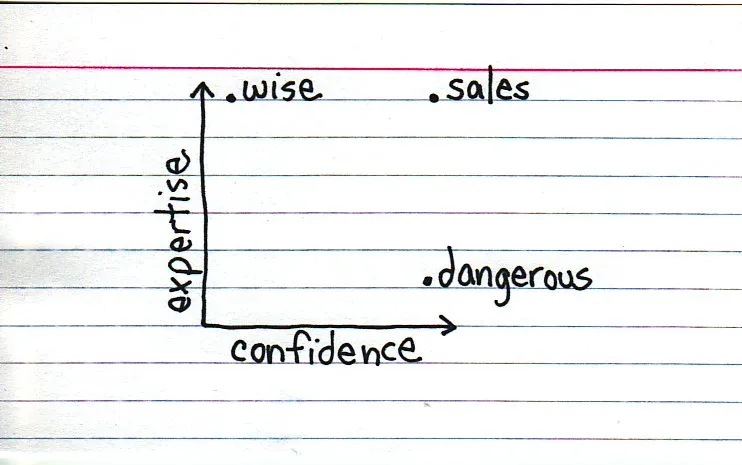
Venn diagrams, but especially 2x2’s, are very popular among McKinsey, BCG, Bain, and other management consultants. “We have put the world into 4 buckets, so now we understand it”.

For solving problems they are great, and I have used hundreds of them in my 17 year (oops) as a management consultant. All issues are on the map, how we can we move from one box to another?

But take a step back and think when you want to use these frameworks in a big keynote presentation. To illustrate my point: look at the drawings on the Indexed blog, and check which ones do you get in a second. Tricky isn’t it?

My advice: use these 2x2 frameworks only

  1. if you want to show movement of dots in the boxes. For example you can use the same framework in a few slides to show changes in strategy, or the positioning of a company
  2. if you want to highlight how your company/idea differentiates itself from the competition (by being in the top right box).

If you just need a structure to list 3 items, try to find a simpler way to visualize things.

Still, add Indexed to your RSS reader, it’s great fun.
·Design

Simple and complex at the same time

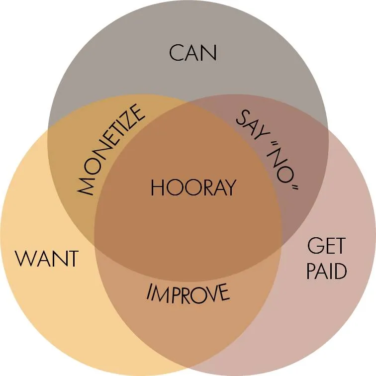
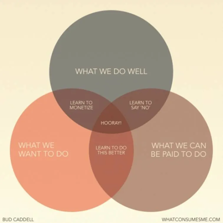
I came across this nice diagram with a useful lesson about what we should be doing in life (via Flowing Data).

A neat concept, and the Venn diagram is the right framework to visualize it.

The chart is simple, but it actually takes the reader a few seconds to internalize it. If you want to use something like this in a stand-up presentation, some modifacations to the slides are required:

  • Simpler words to express the ideas
  • Create more visual space for the overlapping areas
  • Animations (unfortunately, I cannot avoid it here) to introduce the circles, introduce the overlaps between 2 of them, introduce the overlap between all 3 of them.

Unfortunately, my slide does not look prettier than the original one, and standing on its own, it does a worse job in explaining the concept. On stage though, it will work better.

·Design

The PGDN PGDN PGDN pitch deck to let Mr. VC get it

Another excellent post by Mark Suster on the subject of pitching to VCs, specifically whether you should send your deck in advance. Read the post here, or get an overview of his entire series on VC pitching here.

The main conclusion: do send A deck in advance. As I suspected, VCs double-click the PPT attachment of an email, and go PGDN PGDN PGDN (this fast) until the end before reading the body of the email (if they read this at all).

OK, we all know that most presentations do not stand on their own, and that the presenter him/herself adds 80% to a presentation. To get through to a busy VC though, you have to leave all these ideals behind. Sorry.

Think of this PGDN PGDN PGDN presentation as a specific type of presentation that has a completely different objective from the standup ptich presentation. You try to get the VC to think longer than 60 seconds about your company:

  • Use the same graphical techniques you would use to try to grab the attention of volatile SideShare audiences. Big images, big fonts so that someone going click, click, click gets the messages
  • Focus the content of the presentation on letting VCs “get it”. And this is some of the stuff that entrepreneurs usually leave out. What do you do? “What, you want me to write down that we are making a firewall with a built-in spam filter?” “We do much more than that: we are offering a radically new holestic security concept!” The latter is hard to get…
  • We have no competition”. Not useful. VCs trying to “get it” like to put you in boxes, compare you to competitors/companies they know. Make life easy for them.
  • A VC who (thinks that he/she) gets it, can spend more time on your company, make some calls
Continue reading →
·Design

OK, OK, I get the point, thank you

Repetition helps the brain to remember things. But when looking at a slide, it is just fine to say things once. OK, OK, I get the point (for now).

Via Noisy Decent Graphics.

·Concepts

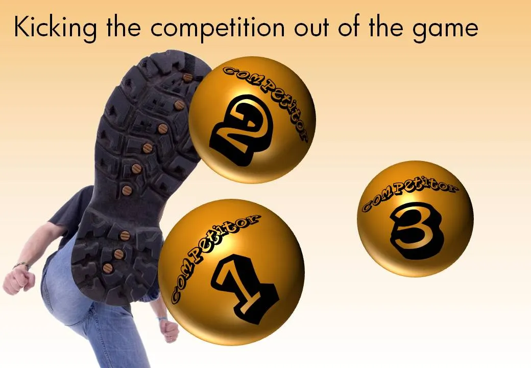
Chart concept - kicking the competition out of the game

Anat created another great chart this week to visualize how a company is going to kick the competition out of the game. See the example below with the client-specific details and colors left out.

The image is purchased from iStockPhoto, the balls are standard PowerPoint circles with some “extreme bevel” added to it, gradient shading in the back, the font is Planet Benson 2.

·Design

Look - my first zooming Prezi creation

After a first review of Prezi and pptPlex I started to get into a more detail with Prezi. One of the applications of these zooming tools is to create an effect of a perpetually zooming canvas. (There is a series of children books that uses this effect brilliantly.)

You can see my Prezi creation here (put together very quickly). Zoom out with your mouse to get the full picture. All images were taken from iStockphoto.

·Design

Zooming around with pptPlex and Prezi

I wrote about pptPlex and Prezi before, but for the first time I actually spend some real time to get into the details with 2 tools to let you design presentations on a big canvas, which you can mover around during a presentation, and you can zoom in and out of.

  • pptPlex is a PowerPoint plugin developed by Microsoft as part of their Office labs.
  • Prezi is a web-based tool with its own user interface, independent of PowerPoint or Keynote.

An introduction video about pptPlex:

An introduction video about Prezi:

Both of these tools have a learning curve, and I would be curious to see whether any of you have tried them out as well. Some of my observations below could simply be because I am ignorant of some of the features of the software.

My overall comment is that I really like the ability to freely move around, zoom in and out in presentation content. For example in fund raising presentations (small smart audience with little time), questions from the audience might take over the pre-set order in which slides are presented. But this also brings me to the main “negative” feedback of these tools: both are basically “frameworks” that link a series of slides or objects. I am missing the ability to design a presentation really as just one infinite canvas. The effect you get in Google Earth: zooming into ever more detail.

Continue reading →
·Advertising

Hyphenation and line wrapping - do it manually

When you use very little words on a slide, the position of the them becomes crucial. I always correct the automatic line wrapping manually.

  • Make sure that key noun-verb combinations are placed together in one line
  • Adjust the text (using different words) to make sure that there are no big empty white spaces in a line because of long words that did not fit in (I rarely use hyphens)
  • Re-order “sentences” according to their length

Either the designers of this ad wanted to make something that is hard to read on purpose, or this is a mistake.

Via Ads of the World.

·Data visualization

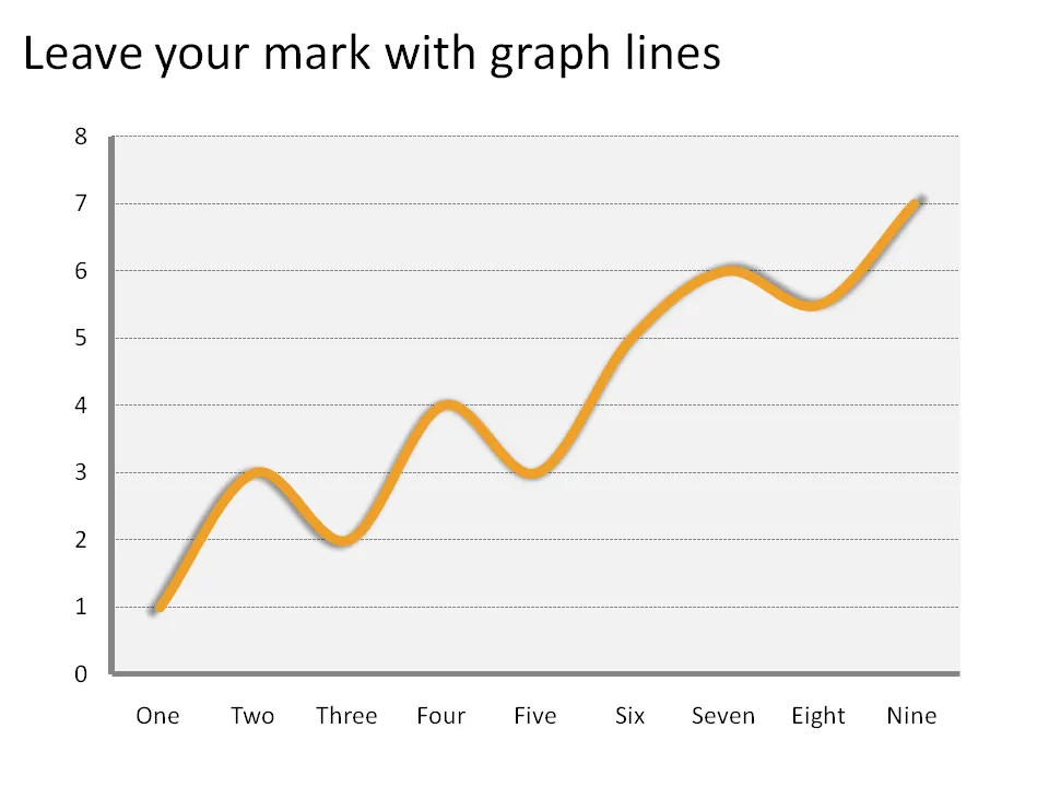
Confident graph lines

The standard chart templates in Excel and PowerPoint create fragile, thin graph lines. No one can see them. Right-click the line and make it bold and fat and it will stand out.

·Design

Cool - font designed by following car movements

iQ font - When driving becomes writing / Full making of.

An unusual approach to font design. You can download the font here. Via Swissmiss. If you are into design, you should follow her blog.