SlideMagic Blog

Frequent updates about all things presentations since 2008. Subscribe to never miss a post.

RSS
all posts

Category Design

·Data visualization

PPT hack - custom chart templates

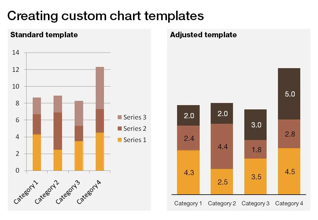
The standard PowerPoint templates do not look very good. The standard slide layout invites people to write presentations through endless lists of bullet points. But even more time-consuming to change are the standard templates for data charts.

This earlier post with a make-over of a column chart in a presentation by Skype shows some of the pain a presentation designer has to go through over and over again to create decent data charts. It took me around 17 years to discover the option to create your own templates. Let’s save you this time, right now.

If you click a chart in PowerPoint 2007, you can find the “save as template” button in the “design” ribbon of the chart. (Confusingly, two “design” ribbons pop up when you have a chart open, one for the chart, one for the slide). Give your template a name and PowerPoint 2007 will save it in the appropriate directory (with a “.CRTX” extension, but you do not need to worry about that).

The next time you select “insert chart”, a folder appears at the top of the standard PowerPoint options, open it to create a data chart using your own customer templates.

·Colors

The color orange - since 1512

While reading Chris Brogan’s latest book Trust Agents, I came across this interesting factoid: until only very recently there was no word for the color “orange” in Western European languages. Chris claims that it is the main reason why we talk about “red heads” or “goldfish”.

Research on Wikipedia provides more background:

The colour is named after the orange fruit, introduced to Europe via the Sanskrit word nāranja. Before this was introduced to the English-speaking world, the colour was referred to (in Old English) as geoluhread, which translates into Modern English as yellow-red. The first recorded use of orange as a colour name in English was in 1512, in the court of King Henry VIII.

·Concepts

Chart concept - the zipper

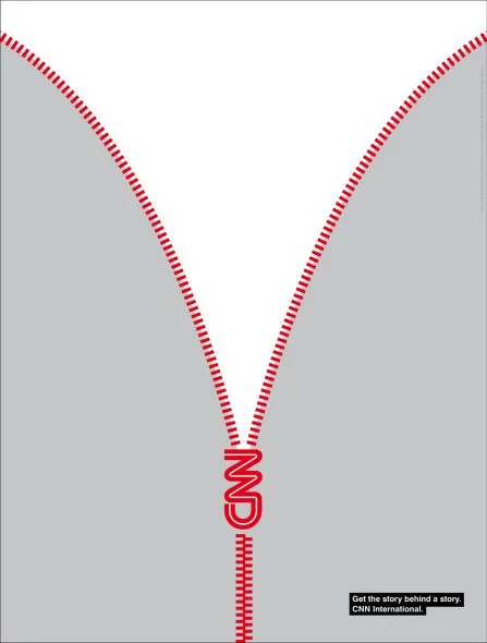
This ad by CNN reminds me of a chart concept that I use often to uncover things: the zipper. It can easily be replicated in PowerPoint using two approaches:

  • Select a stock image and remove the background color if necessary. An example here, or here, or this nice bag full of cash that you will return to your investors in 4 years.
  • If you are in an artistic mood you can actually recreate the zipper using basic PowerPoint rectangles, maybe using straight lines instead of curved ones.

Via Ads of the World

·Design

Logos on PPT slides / logos on corporate gifts

It’s the time of the year for corporate gifts. Many of these could be really nice, where it not for that huge corporate logo that makes you shelve a beautiful pencil instead of using it. A waste. If your gift is nice, you do not need to remind people that it was you who gave it to you, they will remember.

Most corporate PowerPoint templates waste a lot of screen real estate on elaborate graphics to make sure that the audience does not forget who the employer of the presenter is. This is not only a waste of space, but these graphics also disturb the overall balance of the slide. A far better way to reinforce your corporate identity is to use the corporate colors consistently through your presentation. No need for logos.

So far, a consistent message. But what if the presentation is poor, and people walk in and out of the conference room, check email, make a phone call or get a much-needed coffee? In that case, you might need a reminder of who is speaking when you re-enter the room. Maybe template designers just anticipate this situation…

·Design

Don't underline

Don’t underline, ever. It does not look good. There are other ways to emphasize a word. Make it bold, change the word’s color. Love these tiny blog posts.

·Books

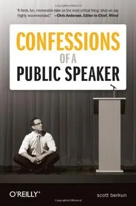
Book review - Confessions of a public speaker

There are many books on public speaking, which probably makes sense: people who are good at speaking on stage usually also enjoy spreading their ideas in print. Many of these follow the same pattern: the experienced speaker explains to us (inexperienced novices who “hum”, read out bullets from the screen, and avoid eye contact with the audience) how we can improve our stage performance.

Confessions of a Public Speaker is different. Scott Berkun is a public speaker, he does it for a living. What makes this book so interesting is that he discusses his own mistakes, failures, and stage fright. He puts into practice one of his techniques to gain credibility with your audience: tell the truth and be honest.

Here are some of the examples of the interesting experience and advice that are discussed in the book. Yes, taken out of their context and in random order:

  • Why it is not useful to imagine your audience naked
  • Even if (you think) you fail miserably on stage, the audience probably won’t notice
  • You have the mike, you are in control, do something nice for the audience (ask to change the freezing temperature of the A/C)
  • Don’t talk endlessly about yourself and your resume
  • I love the chapter about “eating the microphone”. When you start a presentation you have all the attention, the audience really wants you to do well, If things go bad, you will hit a point that you lose the audience, nobody is paying attention anymore. You ate the microphone.
  • It pays of to learn how to write better headlines/presentation titles
  • Anticipate the obvious question that any intelligent audience member would ask.
  • The concept of interference (taken from physics): the audience is still digesting one point when you bring on the next. As a result, both points are lost.
Continue reading →
·Data visualization

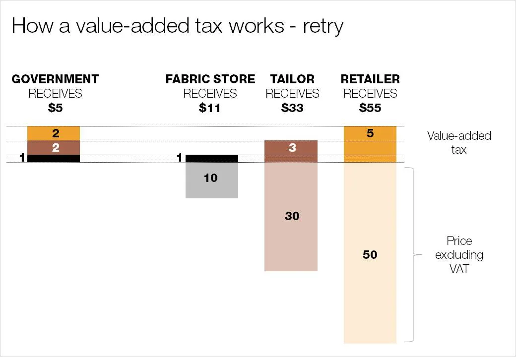
As promised my solution to the NYT infographic

Here is my suggested solution to yesterday’s puzzle: improving the NYT’s infographic that explains how a value-added tax works. Let me know what you think and/or whether you have alternative suggestions. You can click on the image for a larger picture.

·Design

What matters now

Seth Godin is the master of spreading ideas, he just published a new ebook:

  1. He convinced more than 70 authors to write a page
  2. Got the collective work to look decent in a PDF
  3. Orchestrated dozens of blogs to discuss it
  4. (Encouraged bloggers like me to push it further in a second wave)

You can download it here, or see it on Scribd below. As you click through it, try to think about why you stopped on certain pages, while skipping others. A good lesson for designing presentations for online audiences. What do you think of page 78 by Dan Roam?

What Matters Now

·Data visualization

Puzzle for tomorrow: improving an NYT infographic

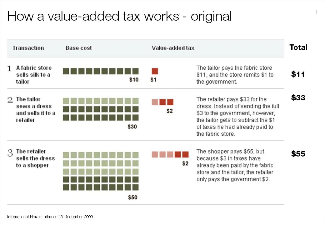
If you see it for the first time, value added tax is a bit tricky to explain. The NYT (equals the Herald Tribune) gave it a go in the infographic below. I am trying to do a better job and will post it in tomorrow’s blog post. I am actually not that happy with my result so far.

This is a heads up: give it a try yourself and we can compare notes tomorrow.

I had to modify the image on the NYT web site slightly and added the right column with totals that appeared in print, but was omitted in the online version of the graphic.

·Design

Creating depth of field on your slides

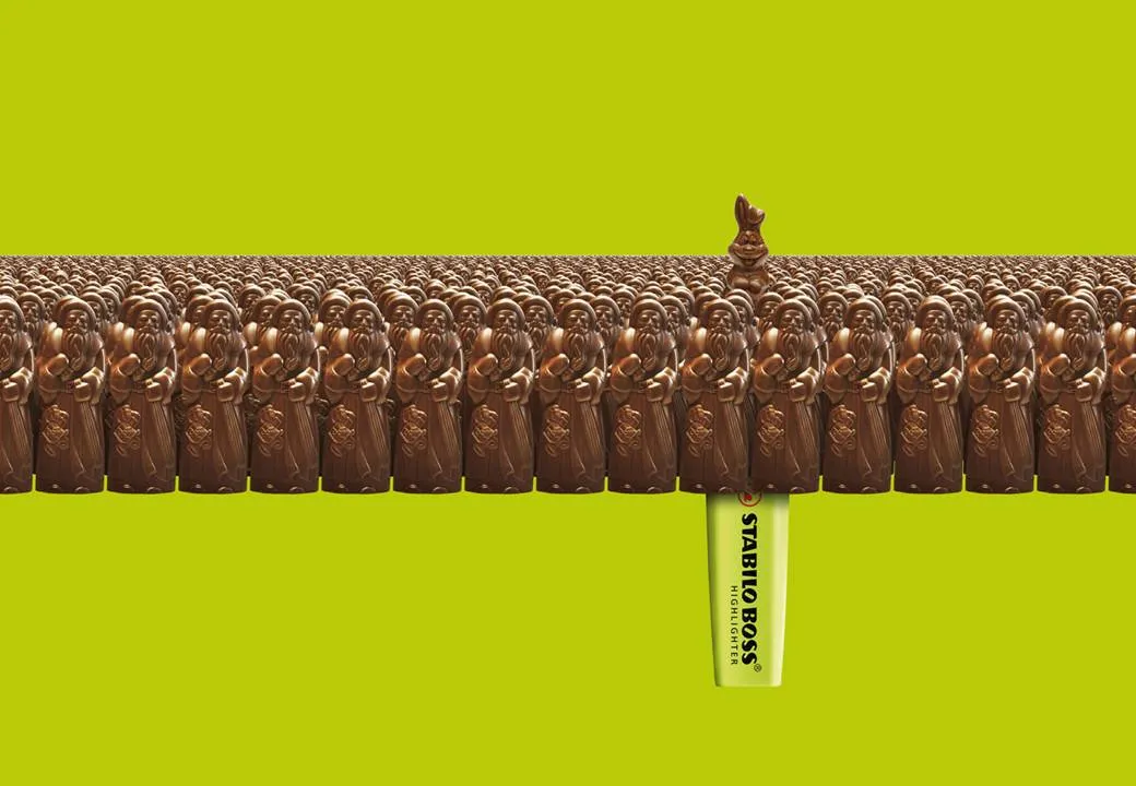
This ad on Ads of the World reminded me what a difference the angle at which an image is taken can make.The chocolate figures were repeated an almost infinite amount of time and stacked behind the front row. But to create the illusion of depth and infinity, the figures in the back stick just a tiny bit over the heads of the ones in the front row.

Think of this when picking your next image, especially roads or other concepts that need to show a long journey towards somewhere. The best images are those where the photographer was almost flat on the ground. Hopefully the photographer of this image (orangeacid on Flickr), managed to get up before the next train came by.

If you are interested: photographers refer to this effect as depth of field. If you look carefully at the image of the rail road, you see that the focus is narrow: the immediate front of the image is blurred, then follows a narrow strip of pin-sharp railroad beams, after which the rest of the image is blurred again.

Related: extreme use of depth of field to make images look like miniature toy scenes: tilt-shifting