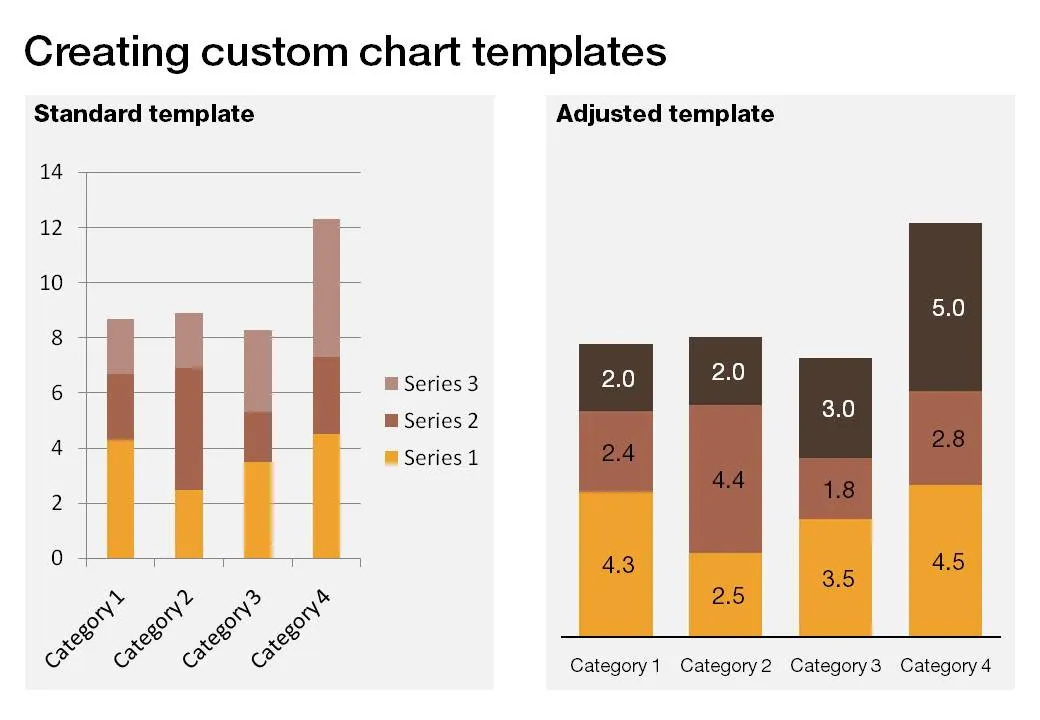
The standard PowerPoint templates do not look very good. The standard slide layout invites people to write presentations through endless lists of bullet points. But even more time-consuming to change are the standard templates for data charts.
This earlier post with a make-over of a column chart in a presentation by Skype shows some of the pain a presentation designer has to go through over and over again to create decent data charts. It took me around 17 years to discover the option to create your own templates. Let’s save you this time, right now.
If you click a chart in PowerPoint 2007, you can find the “save as template” button in the “design” ribbon of the chart. (Confusingly, two “design” ribbons pop up when you have a chart open, one for the chart, one for the slide). Give your template a name and PowerPoint 2007 will save it in the appropriate directory (with a “.CRTX” extension, but you do not need to worry about that).
The next time you select “insert chart”, a folder appears at the top of the standard PowerPoint options, open it to create a data chart using your own customer templates.