SlideMagic Blog

Frequent updates about all things presentations since 2008. Subscribe to never miss a post.

RSS
all posts

Category Design

·Design

Holiday posting schedule

Over the next few weeks I will be spending more time with my family, and less online (similar to what I guess many of my readers will do). Posting frequency will drop, and I will be re-posting some earlier post that I think could be useful for readers that have only joined this community recently.

·Design

The word "management"

These little annoyances in presentation design, the word “management” is one of them. You need it very often, it is relatively long, and it does not look good/readable when hyphenated. How many slides got a 2nd best design because of this word…

·Art

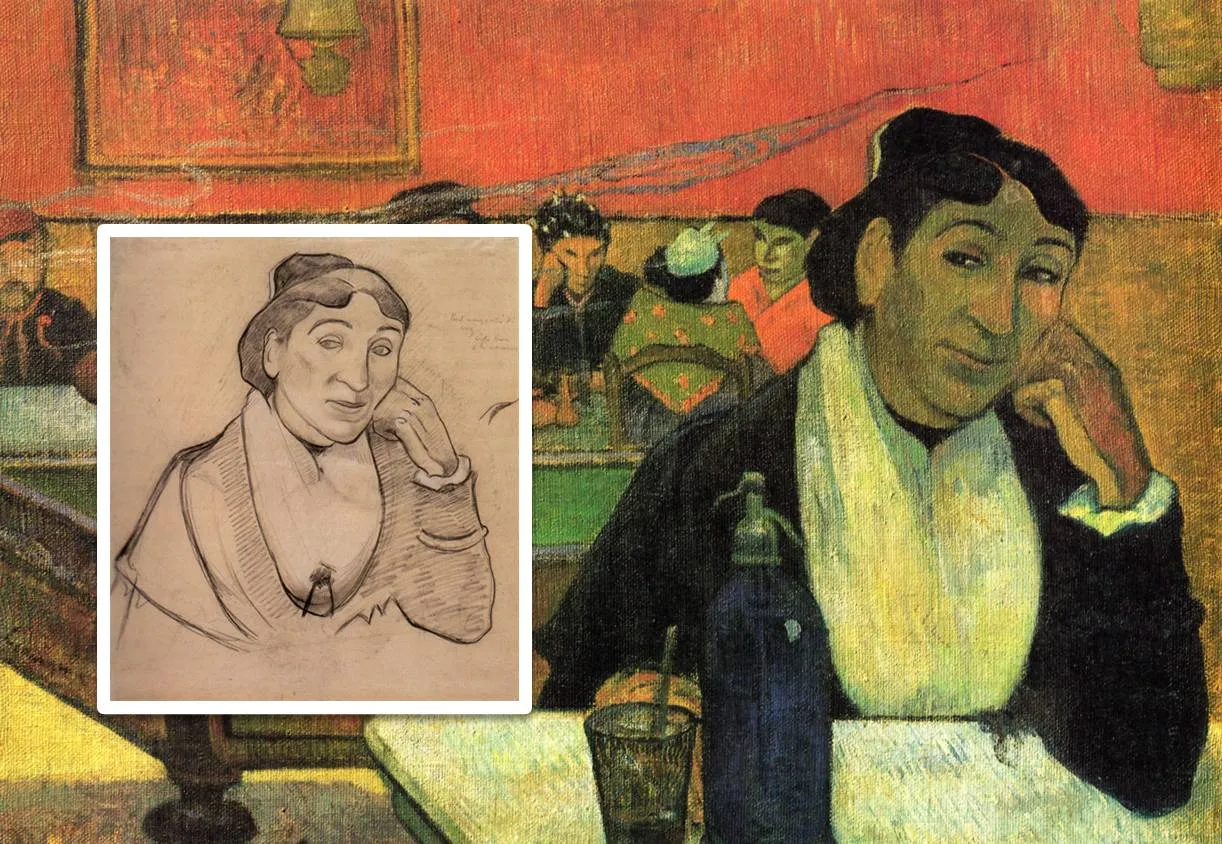
Every slide starts with a sketch

Painters first make a sketch before starting the final painting. Presentation designers should do the same. I have a big pile of old print outs that is my unlimited source of scrap paper. An important slide can take 5-10 page-filling rough sketches before turning to the PowerPoint editing screen.

I always carry one of these beautiful notebooks (affiliate link) with me to capture an idea that pops up in my head. Yes, a notebook and not an application such as Evernote on my iPhone because the idea is most of the time a sketch or a scribble. Hard to do in digital format.

The end of my most productive/creative days are always marked with a full paper trash can next to my desk.

The painting is Gauguin’s night cafe, info about him and Van Gogh painting at this location here and here.

·Data visualization

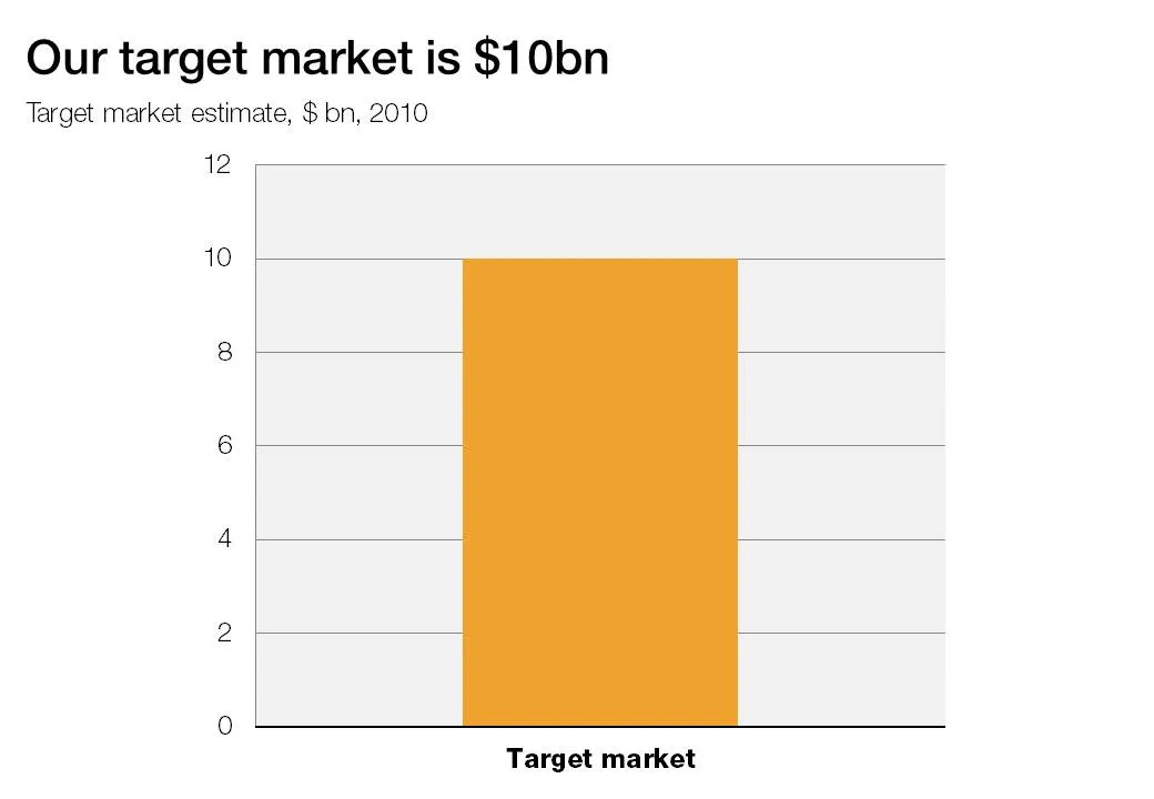
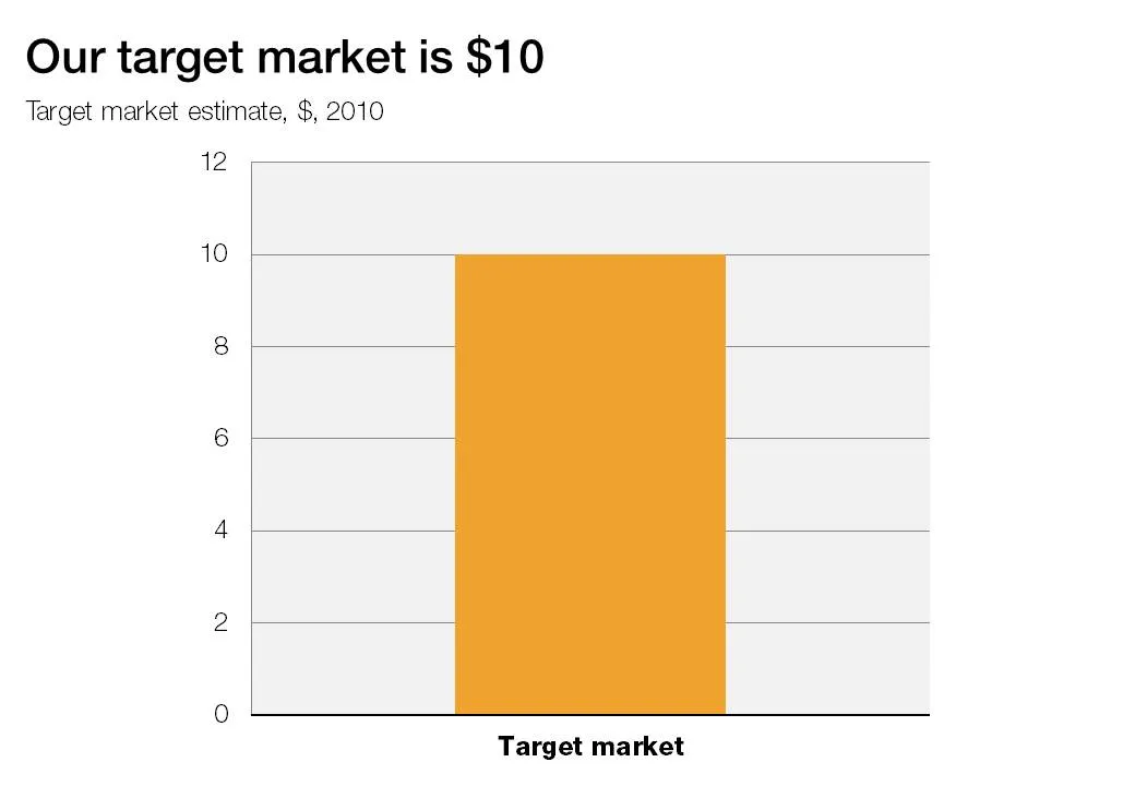
The lone column

A column chart with just one lone column is not a column chart. Column chart need to compare things, show a trend over time.

·Data visualization

Quotes to dramatize a number

The site number quotes is a tool with a healthy dose of humor: it helps you “dramatize” a number, simply enter it and the site returns a long list of quotes. Maybe the exact quote is not what you can use in a “serious” presentation, but it might just open up a part of your creative brain that you did not yet access. Thank you Steven Duncan.

·Advertising

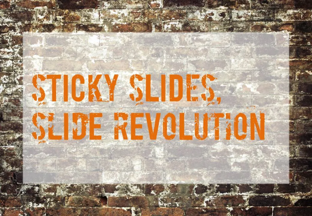
Chart concept - painted billboard

This vintage-style ad found on Ads of the World can easily be replicated in PowerPoint. A white box, semi-transparent with a bit of soft edges and a nice font against an image of a brick wall and you’re done.

·Design

Oops, I thought I deleted that?

PowerPoint files can still contain information that you thought was long gone. Watch out with this, especially when sharing files with outsiders via email, or on content sharing platforms such as SlideShare.

The easy solution is to convert PowerPoint files to PDF. If you want to stick to the PowerPoint format, here are some things to watch out for:

  • Data charts (bars, pies, columns) in PowerPoint are generated via an embedded Excel spreadsheet. Even if you did not include data in the graph, the source still sits in the Exel file. Open the spread sheet behind each chart and check whether it contains redundant data you do not want to disclose. (For example breakdowns by category, or in case of public investor presentations, forecast of financials beyond the current reporting period).
  • Cropped pictures that were not compressed still remain in PowerPoint in their full size, if you reset the image it comes back in its original form. If you do not want that, select the image, then compress, then ask PowerPoint to remove the cropped areas of the image.
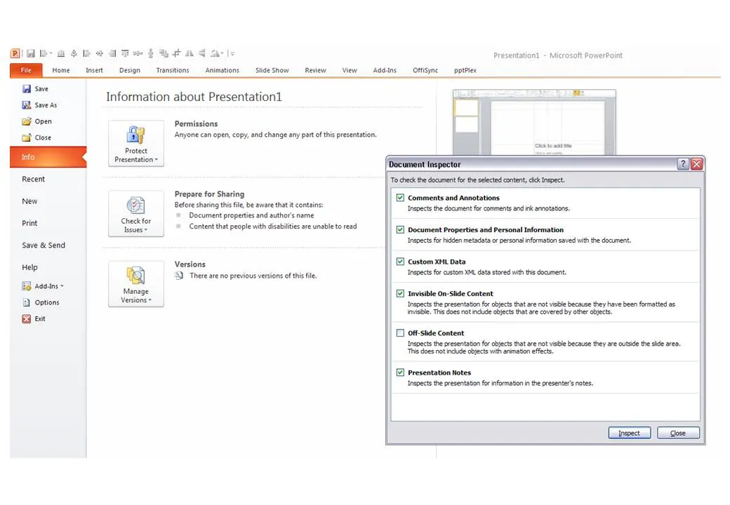
  • Hidden content such as author information, speaker notes with informal side comments such as (“not sure whether this is true, I made it up for the moment”), or objects that are outside the canvas of the slide. In PowerPoint 2010 you can inspect your presentation for things like this in file, info, prepare for sharing.

P.S. Image tags can be an unwanted piece of information in PDFs, here is how to get rid of them.

·Design

Almost the same size is not good enough

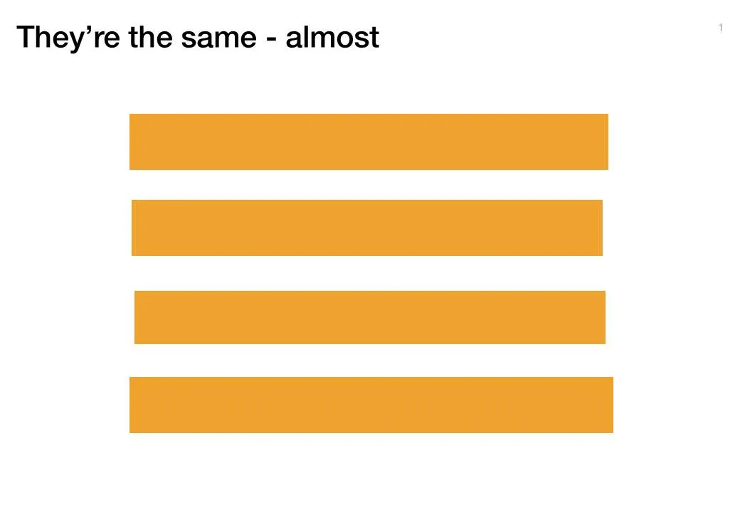
Making similar boxes the exact same size, and exactly aligned matters a  lot in slide design. The brain gets distracted when object alignments is just a bit off.

Usually the slide starts out OK, ctrl-C/ctrl-V a bunch of objects and they are all exactly identical. Over time, things start to degrade. Accidentally resizing things a bit, moving a box a bit, etc.

You need to train your eye to spot the imperfections. The quickest fix is usually to select a group of objects, select “format” and then give them all the same size in centimeters (hight, width, both). In the Arrange / Align menu you will tools to spread objects out evenly.

Little effort, big result.

·Design

"Let's start with our history" Uh oh...

You’re the owner/founder of the company and you are pitching to a potential investor. When introducing the company, you always start with its history:

How you started straight out of university, renamed the company after a waterfall you visited in Africa a year later, developed a 2nd product line, but then dropped that again in year 4, re-branded again, moved to a different city, and hey, that’s how we ended up where we are today.

To you it makes perfect sense. The story is how the company became what it is, how you became what you are. To the outsider, it is not that relevant, and even potentially confusing as the audience tries to figure out what you are about.

Skip the history and start with today. Except - if needed - a short reference to a useful link to the past: “the fact that we started out as a piece of 3D home design software in 1998 comes in handy today as we move forward to build the world’s best 3D gaming engine”.

A chronological story line is not always the best story line.

·Data visualization

Undoing PowerPoint 2003 data chart font squeeze

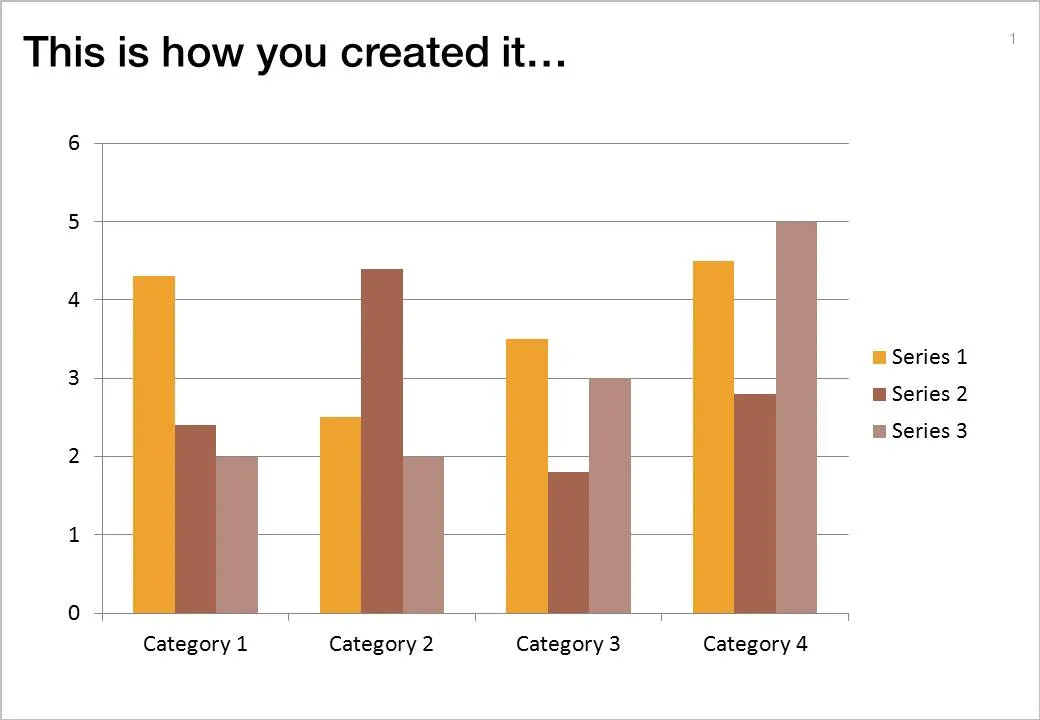
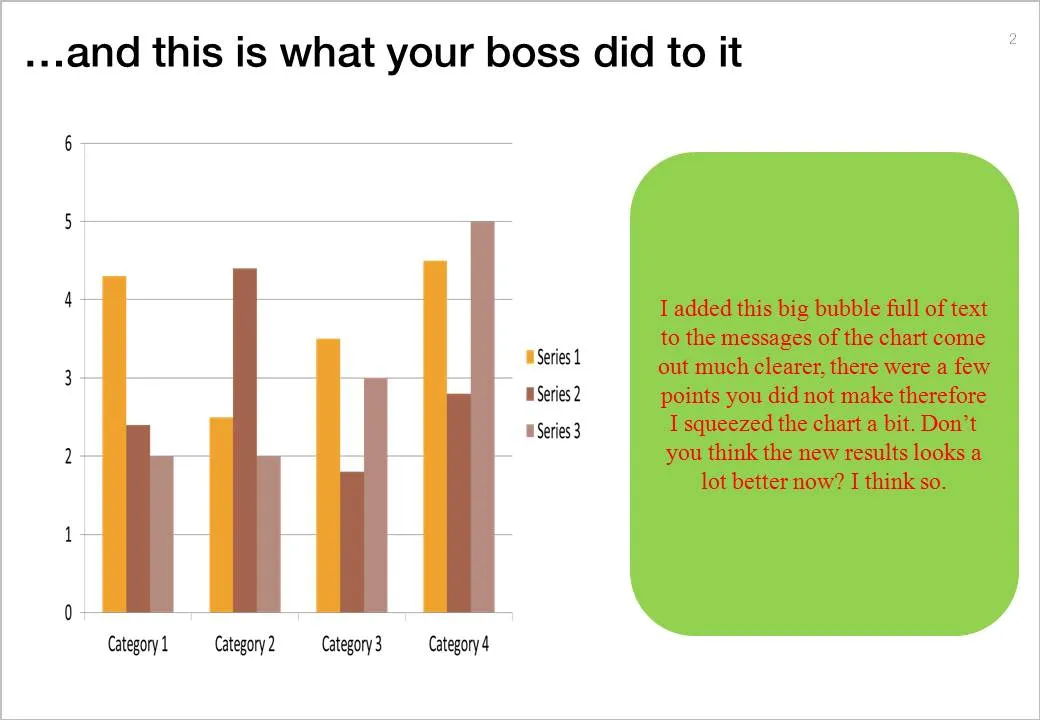
One the biggest hassle of PowerPoint 2003 was that when you resized a data chart, all the fonts got completely squeezed. Only PowerPoint pros new that you had to open the chart, and once it’s open in Microsoft Graph, you can resize the object without doing damage. Any other person (99.99% of the population) went for the squeeze.

If there is one reason to upgrade to PowerPoint 2010 (2007 also solves this), this is it.

But here you are, the corporate IT department insists on keeping the company on Office 2003, and you just got your 45-page back from your boss who “edited things for clarity” and you’re on to present tomorrow morning 9:00.

This will save you:

  1. Right click the chart
  2. Go to the bottom: “format object”
  3. Now resize the chart back to 100% by 100%
  4. Close the object
  5. Open it as you would do normally (you are 0.01% of the population) and resize properly.