SlideMagic Blog

Frequent updates about all things presentations since 2008. Subscribe to never miss a post.

RSS
all posts

Category Design

·Design

File naming

The number of images on my hard drive is spinning out of control and I never got around to using dedicated software with image tags for my images (maybe I should). Lately, I am paying more attention when naming an image file. And the one thing that helped me most is to put the noun first. For example:

  • sky_sunny.jpg
  • sunny_sky.jpg.

The latter is how we are used to think, the first is best for sorting and finding things on a computer.

·Design

In Paris this summer

I will be around Paris some time this August. I am not sure whether it will work out in the end, but maybe we can organize a meetup in one of my favorite places there. If you are interested mail me at contact [at] axiom [dot] co [dot] il. (Image credit bfraz)

·Concepts

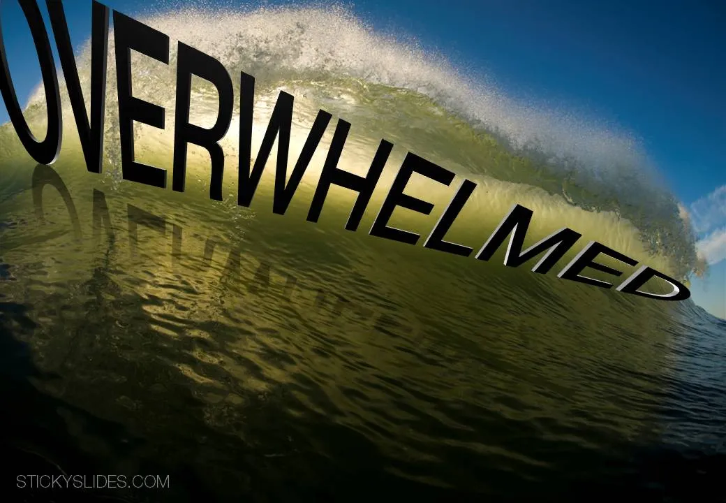
Chart concept - overwhelmed

It is important to pay attention to camera positions when selecting images for your presentation. This wave that is about to crash on top of the photographer is a great example. Add some dramatic typography and the audience can almost feel the need to swim to the shore before it’s too late.

Image via iStockPhoto.com.

·Design

De-cluttering this blog

The reading experience on the iPad has influenced the design of this blog. I cut the share buttons, retweet counters, time stamps, etc. What’s left is a clean sheet of paper with some ideas to make you a better presentation designer. Now it’s purely up to the quality of the content whether ideas here will spread or not. What do you think?

·Concepts

Chart concept - sky writing

You take a picture of a cloudy sky, and hand write a text with a healthy dose of “glow” and you can create your own skywriting images.

Here is how people used to do this before the age of PowerPoint:

·Design

PowerPoint 2010 mini review - the little differences

I have been working with PowerPoint 2010 for a few days now, here are some of my first impressions. I am discussing the upgrade from PowerPoint 2007 to 2010. (2003 users: see my earlier post on upgrading to 2007.)

For heavy PowerPoint users, I recommend upgrading to PowerPoint 2010 not so much about the advertised “big” new features, but amount a number of minor changes that make a big difference. Here are a few that I have discovered so far:

  • Finally the “hanging bullet” issue does not require complicated ruler manipulations: you click a bullet style, and the 2nd line of your paragraph gets aligned properly without a need for manual intervention.
  • Like in PowerPoint 2008 for the Mac, when you drag around objects lines appear that make it easier to snap objects together or align them
  • PowerPoint 2007 used to crash a lot when editing complex data charts (in Excel): no longer (fingers crossed)
  • You can now customize the ribbon without having to rely solely on this hack.
  • Apparently, PowerPoint 2010 saves a backup file somewhere even if you say “don’t save”, which can be a life saver.
  • The user interface is a bit calmer and more “Zen”
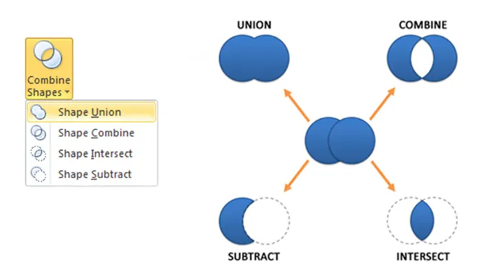
  • Finally, PowerPoint can now join and subtract shapes.
  • The tool to take the background color out of an image got a lot more sophisticated

Should 2003 users upgrade: definitely, 2007 users, probably only the heavy users. An (affiliate) link to everything Microsoft Office 2010 on Amazon.

·Design

Visual Bee: attempt at PowerPoint automation

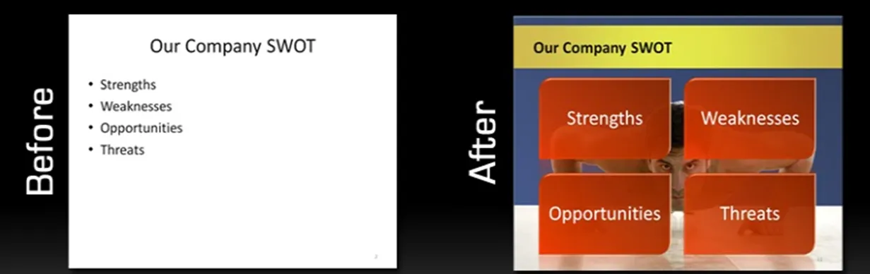
Visual Bee is an Israeli startup that offers a plugin for PowerPoint that can improve slides automatically. At the click of a button it does 2 things:

  1. Transform list of bullets into shapes that are distributed evenly over the slide
  2. Analyzes the words in your bullet points and picks an appropriate background image

The user can choose from a number of styles, that will be applied consistently through your document.

The style of the transformed slides is not exactly my personal favorite (“standard” stock images, lots of effects), but having said that, they do look a lot better than the original bullets. The best results are achieved if the original slide is actually already in pretty good shape. For example in the bullet slide above, the words have been cut to an absolute minimum. The tool will work less good when applied to dense slides.

As a professional designer, I would value a tool that automatically creates harmonious structures of 4, 5, 6, 7 objects. Fitting shapes around a pentagon is tricky.

For the non-professional designer, maybe the best thing that this tool does is to encourage you to improve the quality of the input slides: cutting text without worrying about the layout of the slide.

·Advertising

Chart concept - mystery door

This ad reminds us how easy it is to create a visual concept with elementary shapes and nothing more than basic drawing skills.

Via Ads of the World.

·Advertising

Buzz word abuse

Wonderful, a top 100 of the most over-used buzz words in press releases compiled by Adam Sherk:

Leader, leading, leading, best, top, unique, great, solution, largest, innovative, innovator, award winning, exclusive, premier, extensive, leading provider, innovation, real-time, fastest, easy to use, dynamic, state of the art, smart, flexible, cutting edge, biggest, world class, amazing, next generation, revolutionary, sustainable, best practices, leverage, thrilled, robust, delighted, cloud, user friendly, extraordinary, breakthrough, savvy, ROI, transform, seamless, groundbreaking, empower, scalable, one of a kind, proactive, best in class, return on investment, market leading, turnkey, mission critical, strategic partnership, ground breaking, dashboard, iconic, industry standard, never before, re-purpose, ecosytem, win-win, best of breed, enterprise class, empowerment, magical, synergy, out of the box, feature-rich, stack, cross-platform, value proposition, well positioned, disruptive, hit the ground running, disruption, mindshare, space-age, bleeding edge, exit strategy, customer-centric, sea change, sticky, silo, synergistic, client-centric, outside the box, paradigm shift, peak performance, perfect storm, organic growth, top-down, next-gen, never been done, bottom-up, solution-driven, secret sauce, low hanging fruit.

People hear/see/read them so often that nobody pays attention anymore. Think about that in your next presentation or white paper. (Hmm, not sure what to think about “sticky” featuring prominently in there.)


Via Advertising is Good for You.

·Design

2 years of Sticky Slides

Today is the second anniversary of my blog, thank you for reading, commenting, and contributing!