Chart concept - standing in the shadow
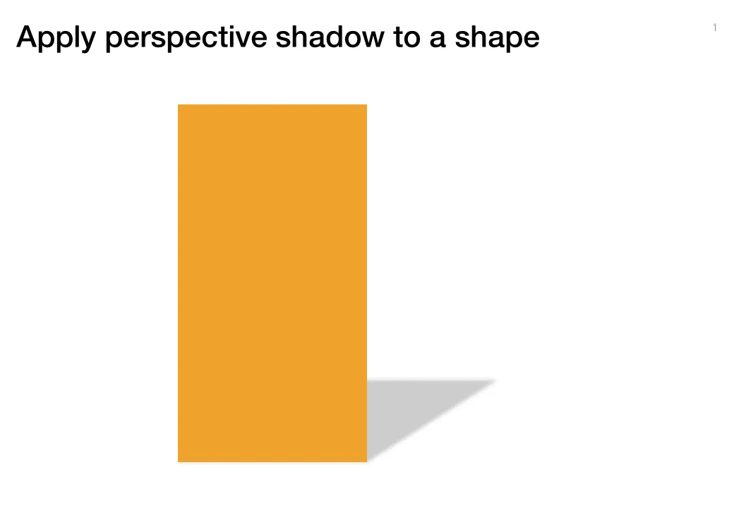
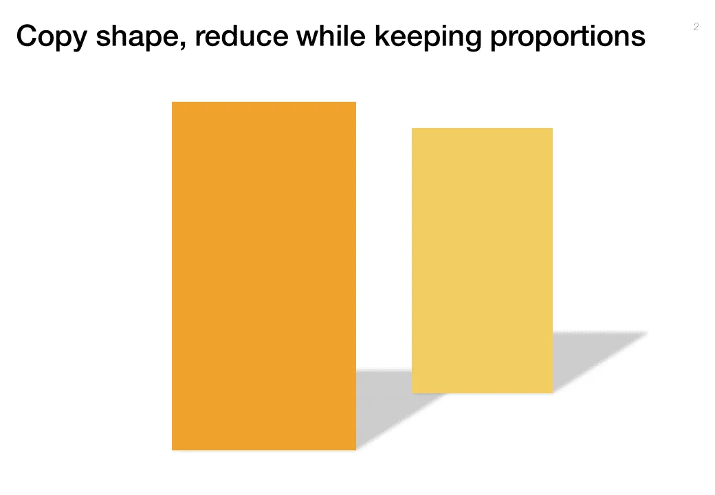
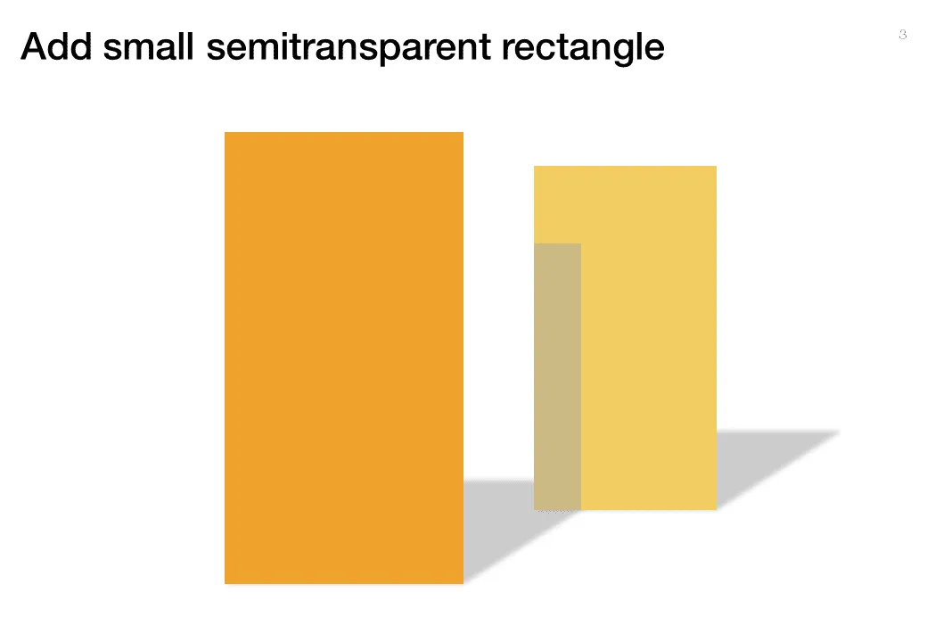
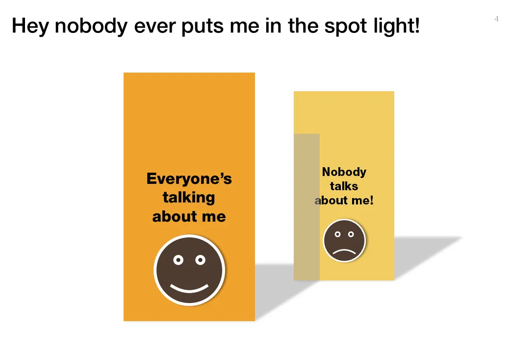
Some issues/people get all the attention, while others never get discussed. The chart below looks a bit like a child’s drawing, but the point is to show how you can play with shadows to create the effect.


Frequent updates about all things presentations since 2008. Subscribe to never miss a post.
Some issues/people get all the attention, while others never get discussed. The chart below looks a bit like a child’s drawing, but the point is to show how you can play with shadows to create the effect.
Highly amusing video of a fund raising discussion. In many pitch discussions, people talk at each other, but are not really listening, talking to each other. Created by ITHAYER.
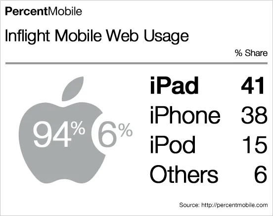
What a nice chart by Mobile Analytics. Perfect blend of data, logos/icons, and typography.
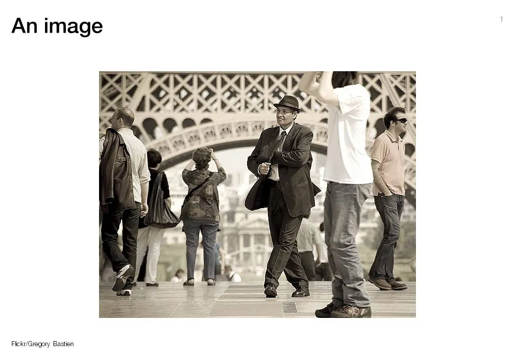
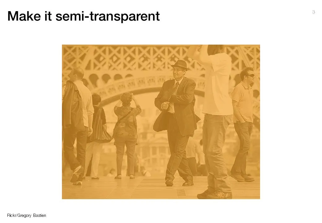
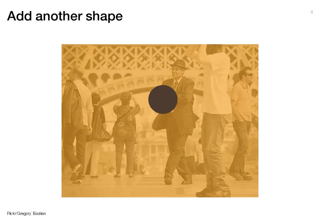
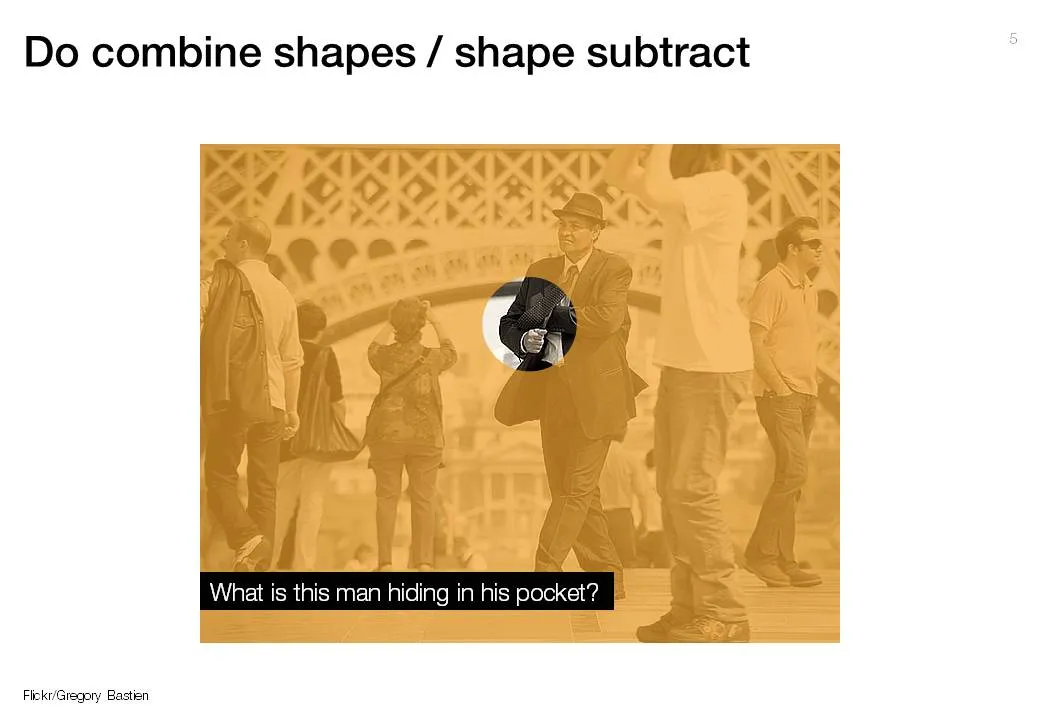
The new shape subtract feature in PowerPoint 2010 (review) enables you to make shape cutouts in a more elegant way than before (see the old approach here). A step-by-step guide using a great image by Gregory Bastien.

The bar has been put higher and higher over the past years:
What is left that is hard to do is the “art part”. It can never be automated. Sequencing the right story, knowing what to cut, what to keep in, picking the right analogies, selecting the right images, picking the exact right data visualization option…
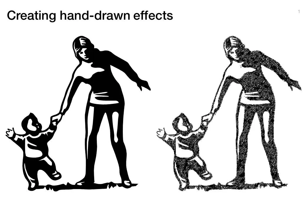
Another excellent clip art manipulation on Tom’s Rapid e-learning blog: how to create characters with a hand-drawn feel:
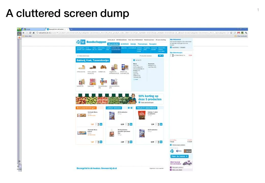
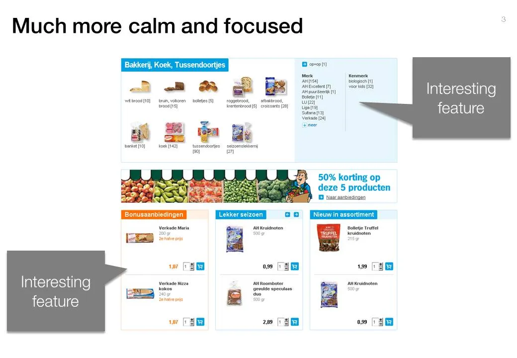
Screen dumps are often used in VC pitch presentations; either to showcase the company itself, or to give examples of competitors in the market. These screen shots are often filled with excess visual details:
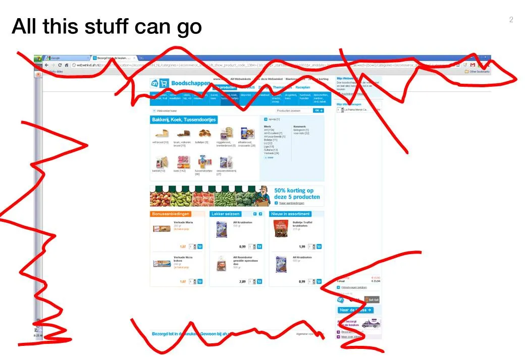
Cut this clutter to create a much calmer slide that allows you to focus on what feature/aspect you would like to highlight.
Usually, animated GIFs drive me crazy. The more subtle ones like this one could actually work in a presentation. If you copy and paste an animated GIF into your slide it will start to play if you switch to presentation mode. Via this isn’t happiness.

PowerPoint is slowly adding features that have been standard in Photoshop for years. One useful one is the image blur filter to increase depth of field of your photos (earlier post). It adds some extra realism to this composite image trick (discussed earlier here and here)
One other application is to repeat a blurred version of a busy chart for additional comments (see post here)

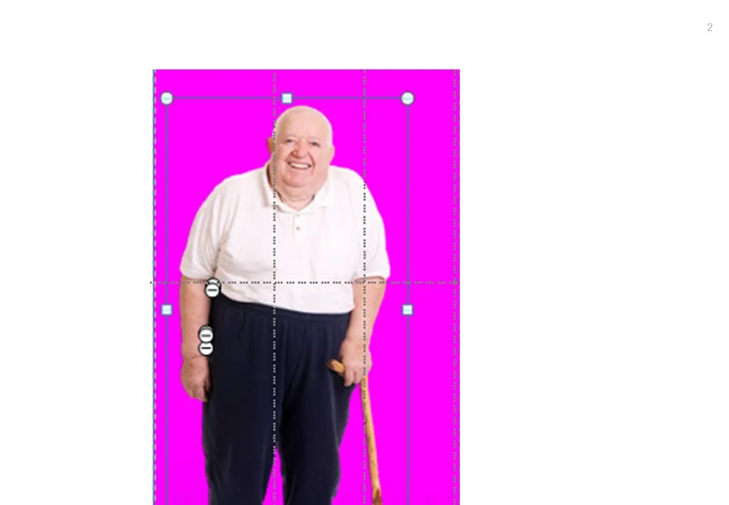

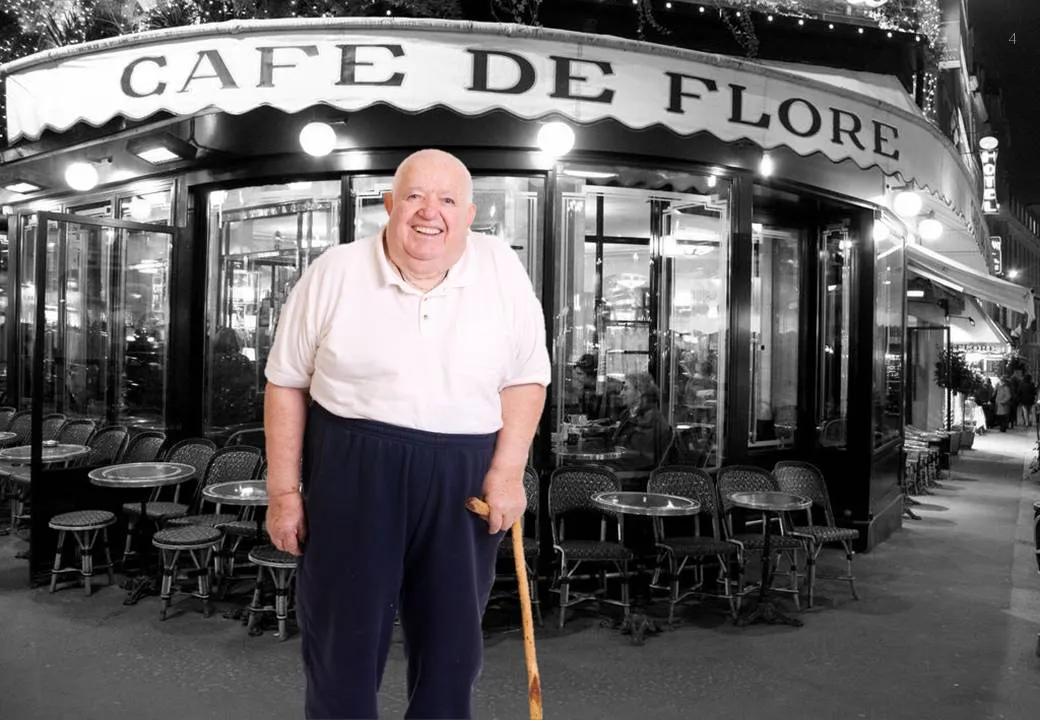

PowerPoint 2010 has now incorporated some of the shape manipulation techniques that until now were the domain of Adobe Illustrator: union, combine, subtract, and intersect (read my earlier PowerPoint 2010 review here).
Until now, I never got into understanding Illustrator. Until now, because I (ironically) start to experiment with integrating more hand-drawn shapes into my presentations (I am even thinking of picking up my old highschool habit of drawing cartoons of people). Fonts are no issue (earlier post). The line/curve manipulations capabilities of Illustrator however are still far better than PowerPoint.
Here is how to move an Illustrator shape into PowerPoint, not just as an image, but as an editable vector object.
Converting is this simple. Unfortunately, understanding Illustrator is not…