SlideMagic Blog

Frequent updates about all things presentations since 2008. Subscribe to never miss a post.

RSS
all posts

Category Design

·Creativity

Negative thoughts are creativity killers

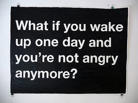
I stumbled on this image this morning: such a true quote. Whenever I allow myself to get upset in a Tel Aviv traffic jam, or on the phone to the useless support desk of my ISP, I simply cannot get myself to design a good presentation. The rest of the day is best spent doing the monthly accounting.

Via Diego Zambrano.

·Design

PowerPoint fails as an internal management reporting tool

A situation probably familiar to many of you:

  • Corporate conglomerate needs update from country business units
  • Analyst creates PPT template with just headings: “key successes”, “key issues”, etc.
  • Template gets sent out, “fill in by next Tuesday (please), our review meeting is Friday”
  • Towards Thursday evening: pages and pages of dense slideuments start popping up in the inbox, (of course) not following the template, but Frankensteined (earlier post) from other presentations
  • Analysts cuts and pastes an overview document together (Friday 3AM) and sends it up the hierarchy as a status update.

If your goals is to provide a 20 minute update on the status in the business units the analyst might as well write the slideument herself. The writing of the slides will not take the time, it’s getting the information, and internalizing it. An alternative scenario:

  • Analysts schedules 15 minute interviews with counter parts in the business units
  • In a phone call, the real story comes out.
  • Analysts write the summary slideument and sends it out for comments to the BUs
  • Analyst incorporates the changes and is now ready to answer any question senior management might have on the situation in the business units

This approach works for high level qualitative updates. For detailed financial information, a proper management reporting system needs to be put in place. It is easy to analyse and compare financial data mechanically across business units, hardly any phone calls are needed. To take the finger on what else is going on in the business, the good old human interaction cannot be eliminated.

·Design

DON'T: Tell 'em what you will tell, tell 'em, tell 'em what you just told 'em

I often hear this advice to make sure something gets stuck in the audience brain: tell it 3 times. I disagree. This is the approach of the (poor) teacher asking a class to recite the alphabet over and over again. Here are some better approaches:

  • Tell a story that stitches the elements of your message together
  • Create a memorable visual to highlight the concept
  • Give them something they will never forget (see Duarte’s post)

Everything is better than boring your audience with saying the same thing three times.

·Art

The real photographer and the stock photographer

Clicking through some of the black and white images on this incredible page on Smashing Magazine shows you once more the difference between an average stock image and a photograph taken by an artist.

This image is by Andrzej Laskowski

·Design

The presentation designer's responsibility

Today’s post on Seth Godin’s blog made me think (probably his objective). Bluntly speaking, he argues that the marketer of cigarettes or the lawyer defending a criminal should take responsibility for her actions, or refuse to take on the challenge.

My profession is to help other people tell their stories in a more convincing way:

  • to sell a product,
  • get funding for a company,
  • close the IPO on the stock market,
  • increase the company’s share price,
  • seal an important strategic partnership,
  • secure a distribution franche,
  • etc.

In most cases, I am 100% behind the story that I am writing. In very few cases, I stumble on something that is a “hard sell”. Fortunately, I have never encountered an occasion that would trigger the debate Seth is talking about. He just convinced me that it should stay that way.

·Design

Clearing your head, once a year

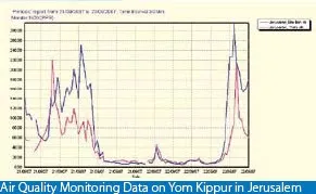
Falling in love with an Israeli woman 15 years ago has put me in this slightly unusual situation today: experiencing Yom Kippur as a non-Jew in Tel Aviv. (Read more about Yom Kippur here.) While I do not have the religious tradition of this “holiday” and even think it can be dangerous for people not to drink for 25 hours in a 30C+ climate, there is something special about this day. Everything comes to a complete stand still. No cars, no shopping, no noise, no polluting smells (see graph below, air pollution drops by a factor 100), no nothing. I live right on the sea shore just north of Tel Aviv, very close to the busiest highway crossing of Israel. It is magical to see human society grind to a halt, and you can almost feel the energy of a few million people near by reflecting on what contributions they have made over the past year.  The sun setting and the only sounds remaining are those of the sea, the wind, and the birds. This is not your average car-free day, it is really about letting nature taking back over.
As designers, we need more of these moments that enable us to get rid of the clutter in our minds.


·Data visualization

Combining stacked and clustered columns

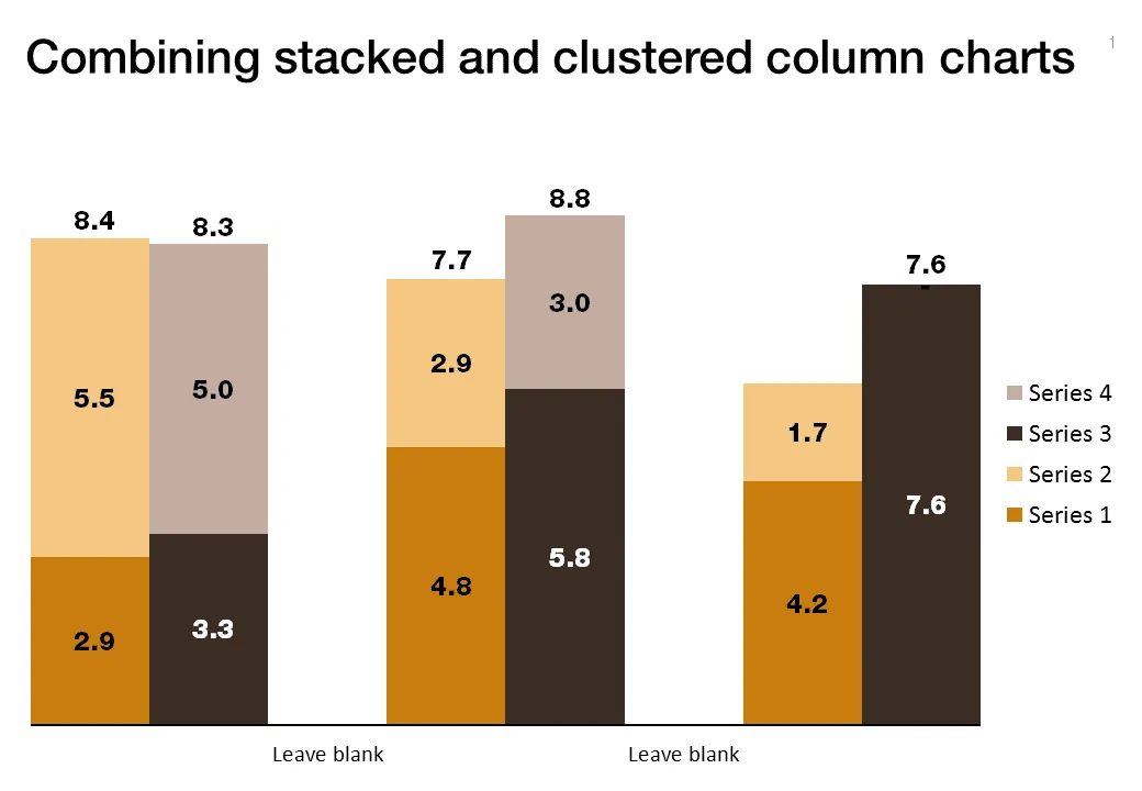
In PowerPoint, there is no standard option to create a combined stacked and clustered column chart. Here is a work around, taking the stacked column chart as the basis.

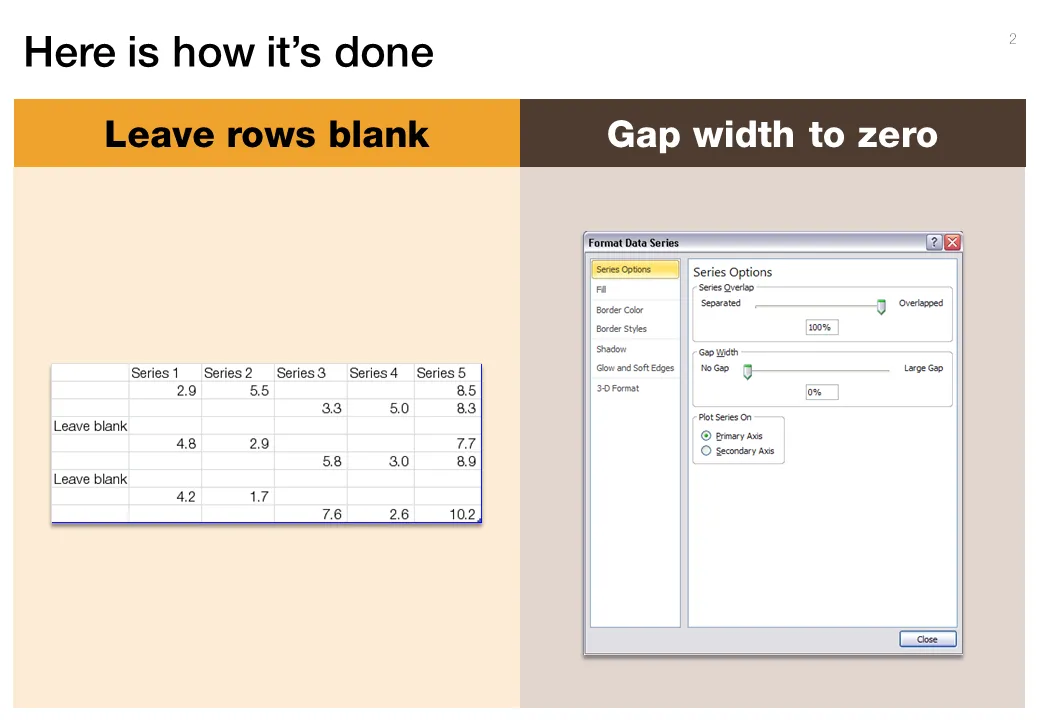
  1. Set the gap width to zero (in the format data series menu) to create the white breaks in between the columns
  2. Adjust the data points manually. The first stacked column goes in regularly. The second stacked column (that should have a different color scheme) gets added on top of the first one. But for data points of the second column, you zero out the values of the first one. Sounds a bit complicated, but the visual example below should make it clear.

Art: Canaletto, The Piazza San Marco in Venice, 1723

**Click here to subscribe to this blog**or follow me on Twitter

·Concepts

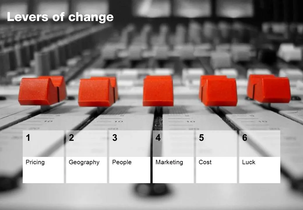
Chart concept - mixing console

Mixing consoles used in recording studios are a good visual metaphor for situations where you carefully need to balance, fine tune, juggle a set of drivers. Image via iStockPhoto.

·Design

The art of writing a good slideument

The term “slideument” was coined by Garr Reynolds (his post from 2006 here): a PowerPoint file that looks more like a densely written text document than a minimalist, visually powerful sequence of slides for a presentation.

Documents and slides serve a different purpose and should be designed differently. But here is what I have been observing: the document is on its way out, and the slideument will have a bright future. Not as a presentation tool, but meant for on-screen reading, mostly for an internal audience that is very close to a subject matter. Background materials for a strategy discussion for an important board meeting would be an example. Nobody has time to plough through a dense text document anymore.

Some suggestions for creating good slideuments:

  • Create good data charts, using the exact same rules as you would for an on-screen presentation. Focus on the trend you want to show, ignore everything else. Round numbers up.
  • Use overview maps, strategic landscapes, with trends/competitors plotted against 2 axes, or lists of options with qualitative evaluation bubbles or traffic lights. One page that has the entire logic in it. Far too dense to present to a big audience, but really useful to discuss options. See the map to get a vague idea about the logic, digest the subsequent information in the deck, come back to the map to understand the full nuances.
  • Bullet points are an essential part of a slideument, but make them useful. Make sure they are short, and say something tangible/specific. Don’t just rattle down a list of 15 points on a page, but group the bullet points into meaningful categories. Put bullet points inside boxes, and use arrows to highlight the relationships between groups of bullet points.
  • Write a clear page upfront with what you want from the group you are submitting the document to.
Continue reading →
·Design

Leave some room for imagination

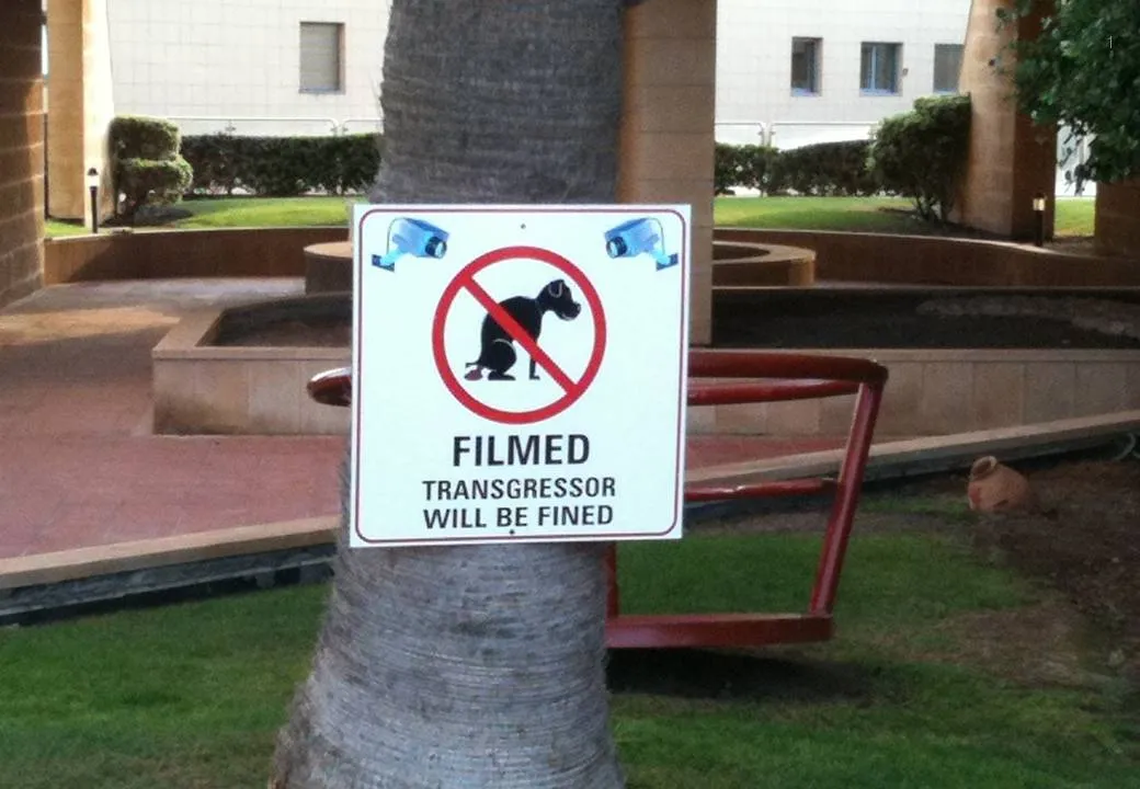
Great novels, movies, and painting leave room for the audience to fill in the blank spots. This photo found outside my own is the exact opposite. Ugly graphics worked out in the greatest detail, even providing the dog with a pair of mean red eyes that would fit the hound of the baskervilles. It is possible to say/show less and still convey the message…

Earlier post with a similar observation.