Sort your bars
Sometimes bar charts have a clear order, a ranking of items. In other cases it is less obvious. Still, you slide looks visually more appealing when you sort them in descending order even if the ranking is not the core of your message.


Frequent updates about all things presentations since 2008. Subscribe to never miss a post.
Sometimes bar charts have a clear order, a ranking of items. In other cases it is less obvious. Still, you slide looks visually more appealing when you sort them in descending order even if the ranking is not the core of your message.
My post about
how to create a McKinsey-style waterfall chart
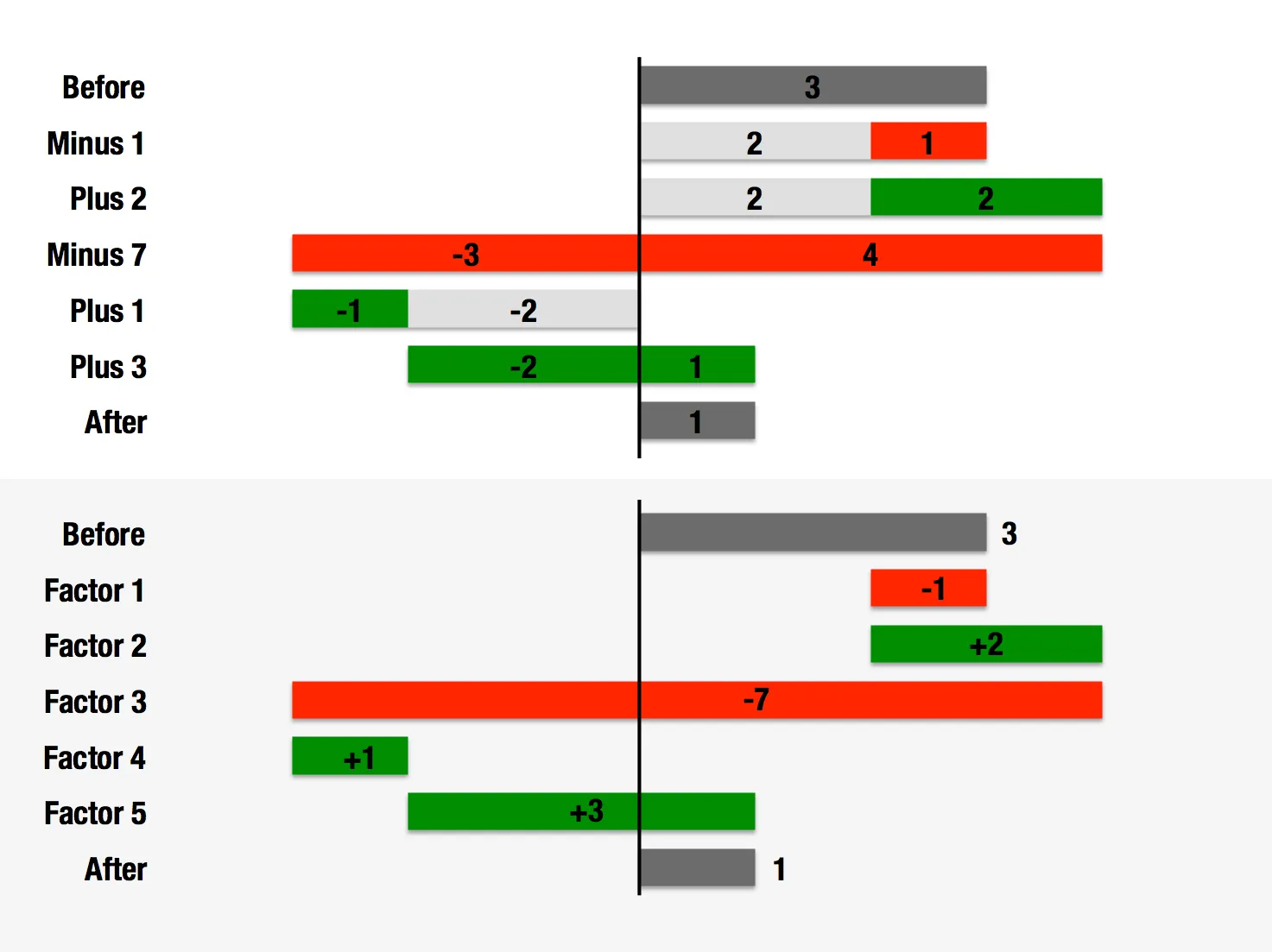
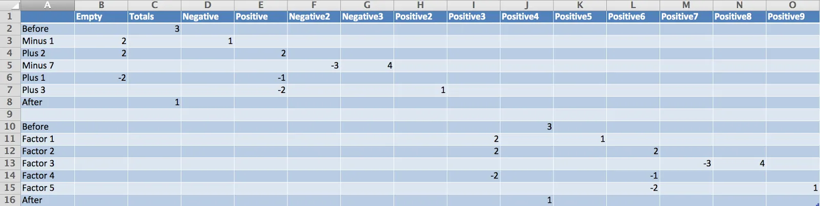
is one of the most read on this blog. The method I showed breaks down when there are many negative numbers involved. The solution is a manual one, sketch your waterfall on a piece of paper, fill in all the numbers, and fiddle with colours until you get it right. Remove the automated data labels and put text boxes with the values instead. See the example below.
This infographic by Synthesio about the positive side effects of the Burger King Twitter hack is a good example of what - in my opinion - is often wrong with infographics: too much noise (facts, breakdowns, inconsistent graphics), not enough signal.
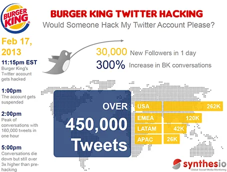
A better visualisation would be a simple time line at the top, below that a horizontal bar with the Burger King logo, followed by a horizontal bar with the McDonald’s logo, below that one stat (maybe number of mentions). This shows that as soon as the logo flips, traffic goes through the roof.
Over on the Daniel Pink blog, a brief discussion about robosourcing; software that automatically generates prose based on statistical information (sports, finance, etc.).
I do not consider that a bad thing. In fact, I believe that many human journalists just do that: take data that can be neatly summarised in a visual and dilute it into text that takes far longer to digest and often provides an incomplete picture.
I am looking for technology that goes the other way: take human prose and turn it into razor sharp visuals and tables.
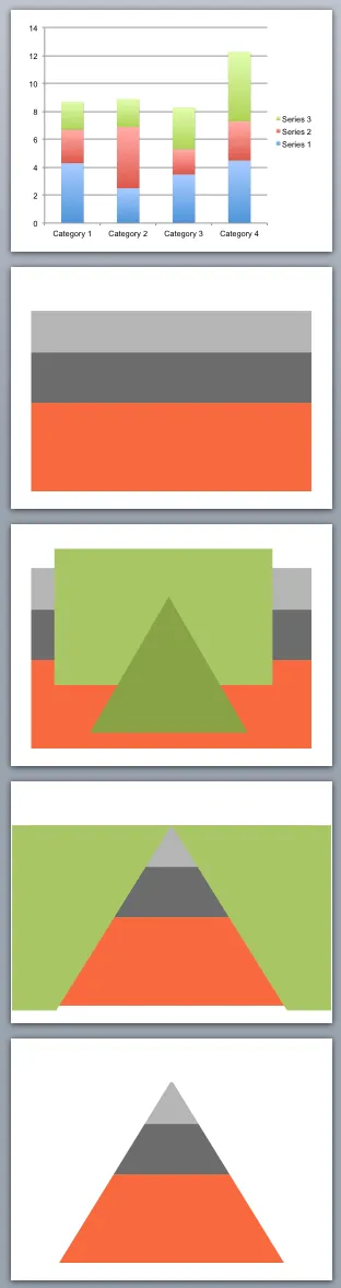
You can use shape cut outs as masks to create unconventional data charts. Here is how I created the pyramid-shaped stacked column chart:
A reader sent me a question the other day: what font to use in Excel instead of the boring and over-used Calibri/Arial?
I think there is not much to gain from using custom fonts in Excel. Readability is requirement number one, and the standard ones deliver. Moreover, Excel sheets are often emailed around to multiple people, and changing fonts creates compatibility issues.
The biggest opportunity to make Excel sheets look better is in the layout of your worksheets and typography. Subtle use of bold, carefully selecting the language you use, grouping similar items together, subtle grey box fills, etc. With a few little adjustments you can make your Excel sheet look like a nicely formated page out of an annual report.
Three different ways to show off your client list, depending on what you want to emphasize:
Mixing them up might not give the best picture: logos of completely unknown companies, a world map with lots of dots in New York City.
A few days ago there was Kickstarter, and now Mailchimp has put its annual overview online. I like these blends of web design and presentation design.
From a form perspective, the presentation is clever. Widen and narrow the screen and see what happens, as you make the window narrower, first the infographics move closer to each other, then the design switches from a 2 column to a 1 column layout.

From a content perspective, there is some work to be done. Data is not rounded up and makes it hard to read, and some of the information presentation is not terribly relevant to the viewer (pizzas served). Then, the objective of the site is to show that a lot of stuff is going on at Mailchimp, and with that in mind, they succeeded conveying the message.
P.S.: another cool annual report: Warby Parker(h/t Duarte)
Usually, I find infographics too forced, trying to be cute at the expense of being understood. This visualisation of a big organisation over time is an exception. It must have taken some time to construct though…
Via Fast Company Design.
In some professions people have gotten used to a certain way of communicating. Lawyers use complicated language, medical diagrams look incomprehensible (people want them to look realistic).
Recently, I changed a medical diagram to make it look less realistic, but a lot clearer to explain. I am still convincing the client that it is the right thing to do.