

This infographic by Synthesio about the positive side effects of the Burger King Twitter hack is a good example of what - in my opinion - is often wrong with infographics: too much noise (facts, breakdowns, inconsistent graphics), not enough signal.
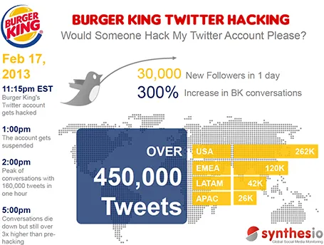
A better visualisation would be a simple time line at the top, below that a horizontal bar with the Burger King logo, followed by a horizontal bar with the McDonald’s logo, below that one stat (maybe number of mentions). This shows that as soon as the logo flips, traffic goes through the roof.