SlideMagic Blog

Frequent updates about all things presentations since 2008. Subscribe to never miss a post.

RSS
all posts

Category Data visualization

·Data visualization

6.1m and 6.1m

If important numbers in your presentation are exactly the same (sales are $6.1m, cash flow is $6.1m and we will have 6.1m users in year 3), it is almost worth tweaking the assumptions in your Excel model a bit so that they are just slightly different. Usually, there is no material difference in the accuracy of your forecast, but it will be a lot easier to understand.

·Data visualization

The Meeker deck 2012

Mary Meeker has updated her deck about the state of the Internet:

The slides inside are typical examples of investment banking/consulting visuals with lots of information, they are best read offline rather than presented in front of a live audience. Record the eye movements you have to make in order to absorb all the information on the slide below:

When presenting, you can simplify the chart, but shortening/cutting titles and subtitles, making sure that a few really stand out, and that the rest is put on the chart in small print visible to the reader, but not really to the live audience.

A more general point about this presentation though. I have followed many editions of it over the past few years (going back to the time when she was still an equity analyst), and actually find that the current one disappoints a bit in terms of content. But maybe that is the state of the Internet today, little surprises?

·Data visualization

Infographic hieroglyphs

Sometimes I come across slides that simply try too hard. A stunning image with a hard to understand analogy, or an infographic-style rebus that looks like ancient Egyptian hieroglyphs. OK, it is a visualisation, but a puzzle does not make it easier for your audience to understand what you try to say. Even worse, an overly simplistic symbol might play down the seriousness of the business you are trying to pitch. Instead of creating a puzzle, why not simply write down what you want to say. Image via WikiPedia

·Data visualization

Data chart make over

Here is diagram published on TechCrunch about the financial returns of angel investors. There are 2 ways to improve the diagram:

  1. Make it a simple stacked column diagram that adds up to 100%, 1 column for the US, 1 column for the UK next to it.
  2. Use more contrasting colours than the dark blue and red

Then there are a few more things you can do to make it look less like Excel: tick marks out, big title at the top left, replace the Times Roman font from something sans serif, value axis title below the main title (i.e., no vertical text).

·Data visualization

Making up some numbers

In many cases it is hard to give a real example of the cost savings someone can achieve with your product or service. Data is not public, or in case of a startup, you might not have that many customers yet. “Making up some numbers” does not sound like an ethical alternative, but it is a good strategy if you stick to some simple guidelines.

  • Explicitly say that it is a hypothetical example
  • Create a highly realistic artificial customer (1 owner, 3 trucks, 1 warehouse, $x million in annual revenues, etc.)
  • And most importantly: explain how you get to your cost savings. If possible break them down into a few simple categories, and use a highly simple and transparent way to quantify them (10 instead of 35 phone calls of 30 minutes each per week equals $x)
  • Make the spreadsheet as complicated as you want, but start with a blank PowerPoint/Keynote page to explain your calculation.
  • Add everything up and see whether the cost reductions make sense as a % of the total

The main purpose of the case example is to explain how you got to the savings, not the absolute point estimate.

·Data visualization

Excel on the front page

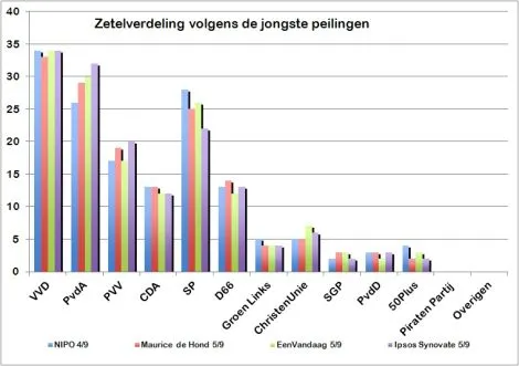
It is shocking to see that pre-election poll results on the cover of a large Dutch newspaper are presented in a plain standard Excel template and colours with one adjustment: add some 3D effects, which makes it even worse.

·Data visualization

How to position a data chart

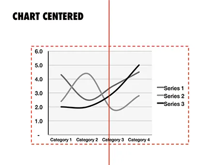
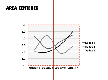
There are two ways to center a data chart on a slide: center the entire chart image including labels and legends, or center just the chart area, ignoring the labels. I prefer the latter.

·Data visualization

Pretty, but hard to understand

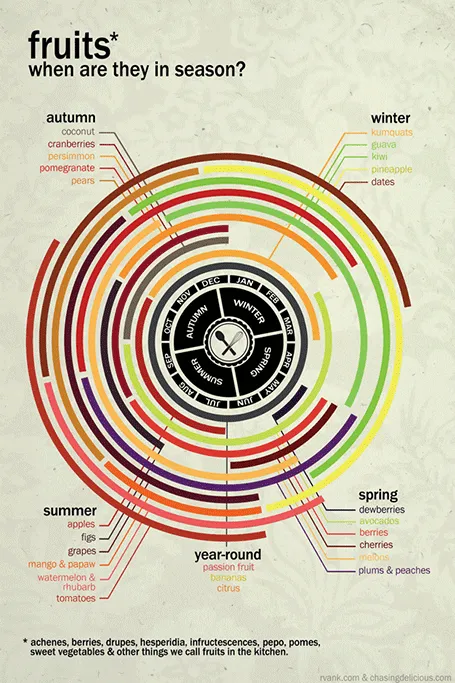
Infographics can be beautiful, but many times this comes at the expensive of clarity. This chart explaining the seasonality of fruit on Life Hacker is an example. The designer went for a circle concept because nature does not break up years between December and January. Still, this one would have been clearer with (fatter) horizontal bars.

Original design by Chasing Delicious.

·Data visualization

Tables can look good

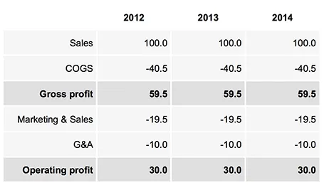
Sometimes, you do not need a data chart at all, and nicely formatted table with rounded numbers might just be the best option to visualize your data. This is especially true for financial statements with lots of information, or in situations where one chart contains a lot of numbers with completely different orders of magnitude. Some quick improvements you can make to make a table look good:

  • Space out rows and columns, the more of them are the same size, the calmer the table will look
  • Round up numbers to a reasonably precision, use a “,” to separate thousands Right-align numbers, make sure the decimal dot lines up
  • Right-align the first column with descriptive text, so it is as close as possible to the first column with numbers.
  • Use highly muted background colors, I usually pick the lightest grey that I can get, and draw the cell borders with a white line
  • If necessary reduce the font size, very big fonts with unnatural line breaks do not look very good in a table.
  • Enter data manually: yes typing in every single number by hand is often the only way to get the table to look exactly the way you want it to. Fifteen minutes that are well-spent

UPDATE: on request an example of a table layout I often use.

·Data visualization

Explaining your business model

Most investor pitches I see claim year 5 revenues of $50m to $100m, so putting in just that piece of information is not going to convince investors, you just sound like everyone else. What you need to make believable is why you are going to hit that target. Showing an incredibly complicated Excel model (”look, we did our homework”) is not going to get you there either. So the top line number is not convincing, nor is the detailed model, what works? The napkin.

When a modeling economics, I usually go brought a cycle. Start with a very simple calculation that gets to a ballpark answer, and is easy to follow and verify. Then, go I to incredible detail in an Excel model, understanding why I do, or do not get close to my initial ballpark. After the rock solid model is finished and bug free, it is time to simplify down to the level, of that very first ballpark number.

Simplification is not simple. You need to pick which drivers of your business are the most important, you need to decide which factors to show, which ones to hide. Your challenge is to stay close to values that are linked to everyday reality, not accounting. Messages per user per month, price per message instead of $m depreciation.

With all this preparation, you are now able to let your potential investor write her own ballpark or napkin calculation of the company’s potential. You provide her with the basic framework, what are the 6 numbers you need to multiply in order to get to your $75m in year 5. She might not agree with all the numbers, but you gave her a framework to which to apply her own estimates. Getting the point estimate right is not important, agreeing on the order of magnitude, and the way how to get there, is.


Continue reading →