SlideMagic Blog

Frequent updates about all things presentations since 2008. Subscribe to never miss a post.

RSS
all posts

Category Data visualization

·Data visualization

** Footnote

In tables, I prefer to right-align numbers with the same amount of decimals after the dot. A footnote reference can break that line. Two ways to solve it: One: add the ** as a separate text box on top of the table. Two: if you have to use many footnotes use numbers [i.e. 7) instead of ******] to keep your footnote references short.

·Data visualization

Data chart consistency

There are many options to format a data chart: write million or m, put percentages in columns or not, a thin baseline or a fat baseline or no baseline at all, tick marks or not, grid lines or not grid lines, drop shadows or flat, you can go on and on.

Whatever you choose, choose the same preferences on every page so your presentation will look consistent.

·Data visualization

Infographics that try too hard

Many (maybe even most) infographics focus primarily on a cute visual concept and forget about the data they need to communicate. The result: pretty pictures that are impossible to understand.
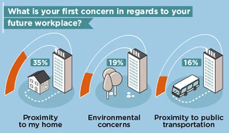
First, focus on the data and think what you want to show: a trend, a comparison, a ranking, a contrast. That should be the basis for the design of your graphic.

Then, remember that cute icons can be as hard to understand as a bullet point: sometimes it can be more effective to write down the words “home” and “work” than trying to come up with illustrations of a house and an office.

Clients often request a cool infographic to get their message across. My response is to stuck to a more traditional presentation format, but if they insist on an infographic look, to go more creative on colors, shapes, and especially fonts at the expense of technical compatibility and the ability of everyone in your organisation to edit the slides for their own needs.

The WTF Visualizations blog is full of bad infographics, enjoy! (Via Daria)

·Data visualization

2-step scientific charts

Especially for my pharmaceutical clients I often need to produce scientific presentation slides. I tend to take a different approach to the industry standard when I need to present to a non-scientific audience: split the chart in 2.

  1. Chart 1 focusses just on the message and is highly simplified (“Survival rates went up 35%”)
  2. Chart 2 provides all the details about the study (number of patients, patient profile, confidence interval)

Springing the full combined chart with all the detail will just overwhelm the laymen audience. Medical professionals have trained decades to extract chart 1 from the combined chart in a nano second. The average investor lacks this experience.

·Data visualization

Just make me a set up

“Oh, just make a set up, and I will fill stuff in later.” This approach does rarely work for presentation design. A framework is good to guide data collection, but when it comes to creating a slide to communicate your data and conclusions, you need the actual data.

·Data visualization

Micro economic charts

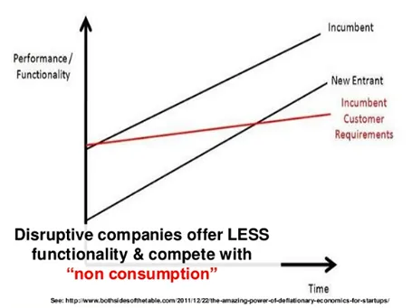
Line graphs with supply and demand shifts, pricing, are great for a round the table discussion of micro economics, but they are less suitable for presentations for large audiences. Take the example below. It takes time before you get the picture (what is on the axis, what do the crossing lines mean). Once you understand the framework you can have a great discussion about it. But in a big audience setting, not many people will get there, unless you build it up slowly, slowly one step at a time.

This image was taken from a presentation by Mark Suster, which in general was an excellent presentation. Not consistent in formatting, but I think the audience will forgive a busy VC harvesting charts from multiple sources, it is the content that matters.

·Data visualization

Put things in perspective

I just returned from a camping and hiking trip in Israel’s southern desert (the Negev) and came home with some beautiful pictures.

It is very hard to capture the sheer size of a landscape in a photo, and one trick to do this is the make sure to have an object in your frame that the viewer knows the size of. In the example below you see that the perspective greatly diminishes when I Photoshop my friends out.

The same is true with data in presentations. Putting the stunning image with the word “53 million” on it does not put the size of the number in perspective. Relate it to something instead.

·Data visualization

Lots of them

If that is your message, you can write the sentence “There are 45 applications” with a cutely formated 45 on a background of a stunning image. The other solution is to write out the applications in 45 boxes that are nicely spaced out over the page. The latter solution is more cluttered, but actually makes the point in a more convincing way.

·Data visualization

Data chart surgery

Related to Monday‘s post, there is another way to use a poor quality data chart image in your slide. Crop out all text elements (axis labels, footers, titles, etc.) until you are just left with the lines/bars/columns themselves. Set the background color of your slide to the same color as the image and manually recreate the text labels (if necessary, many graph images contain huge footers and duplicate titles that you do not need).

·Data visualization

Extracting data from a poor graph

Sometimes the image quality of a graph is low, and/or the color scheme does not match yours, that you may want to recreate the data chart in PowerPoint. If there are proper labels, it is no problem. If not, here is a fix:

  1. To measure the values of a column or bar chart accurately, you need an image that is as big as possible. I usually make a physical printout of a stretched chart image on an A4 paper.
  2. Measure the bars/columns in millimeters
  3. Decide the real value for your biggest bar/column, and using its millimeter value determine the value for all the other bars/columns
  4. Now you can recreate the data chart. Since your values are not 100% accurate, do not use data labels, but simply put a value axis on the side of the graph (like it was the case in the source image).