Shorter or quicker?
If the time window if your presentation gets cut you have 2 choices: fewer words, or more words per second. Pick fewer words.


Frequent updates about all things presentations since 2008. Subscribe to never miss a post.
If the time window if your presentation gets cut you have 2 choices: fewer words, or more words per second. Pick fewer words.
AI is turning the semi conductor industry upside down, and I saw this interesting graphic comparing the market caps of Nvidia and Intel, which look very different from a few years ago.
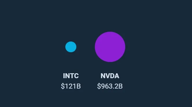
The circles are cute, but are softening the contrast between the 2 numbers. Two dimensional surfaces look closer together than straight bars, see below.
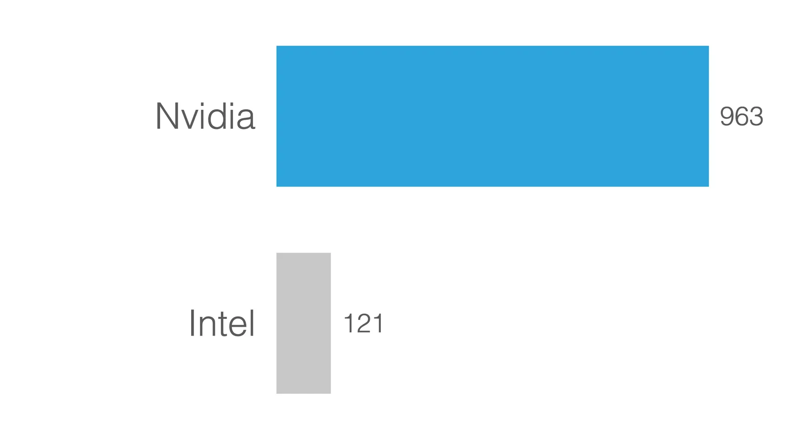
This is also the reason that I prefer to use stacked columns over pie charts.
I was talking about prioritizing your time a few days ago and remembered a time prioritization tool that was suggested to me while at McKinsey. It turns out it is called the “Eisenhower Matrix”. I added it as a template to SlideMatic.
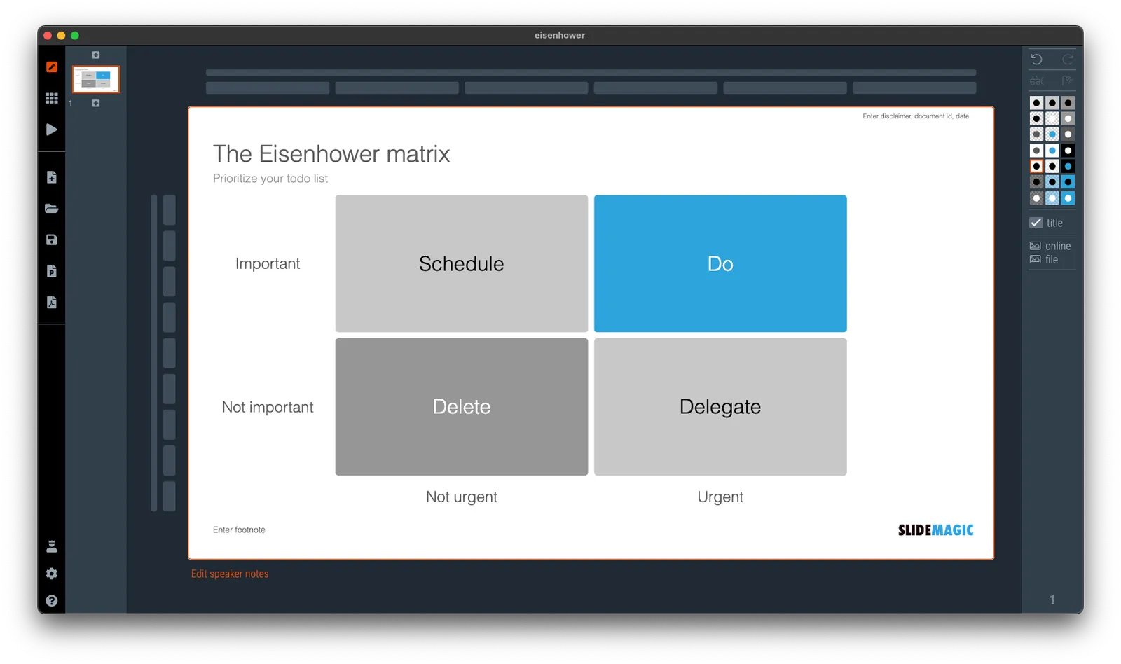
They key insight here was to be really rigorous and actually don’t do unimportant, not urgent tasks. The problem though was that all requests added to my desk were important and urgent….
During our very short (see yesterday’s post) speaking slot to launch a new partnership for 9xchange, we used the slide below. Deal making in healthcare is inefficient because everyone needs to kiss too many frogs in order to uncover their prince.
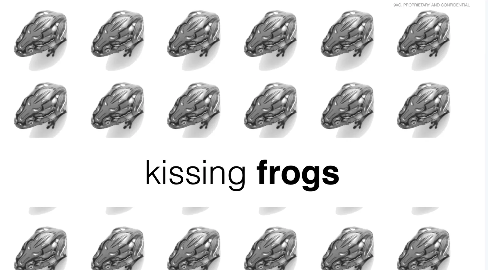
It got stuck in people’s head, and during the following presentations, presenters kept on referring back to frogs in their own talks. Free publicity.
When speaking at a conference and you get offered two possible speaking slots: early in the day and very short, and later in the day and a lot longer. Which one to take? Easy, the early/short one.
My other venture 9xchange had a a busy week. We announced a partnership with AI-enabled drug discovery company BenevolentAI at the Biomed conference here in Tel Aviv.
On 9xchange, we match buyers and sellers of pharmaceutical drugs that are still in development. Sometimes, a drug no longer fits the strategy of a pharma company, sometimes, a drug fails clinical trials for a specific disease, but might still work for another one.
BenevolentAI has technology to find potential new indications for drugs. Drugs posted on the platform are exposed to its AI engine and results are fed back into 9xchange to broaden the number of matches between buyers and sellers, now taken into account newly discovered indications for which this drug might work.
It is often quick and easy to use PowerPoint to draw a diagram. No need to install and learn new specialized software. A few boxes, lines, a screenshot, and you are done. But why the result totally obvious a PowerPoint slide, even if you are not using the program to present your visual?
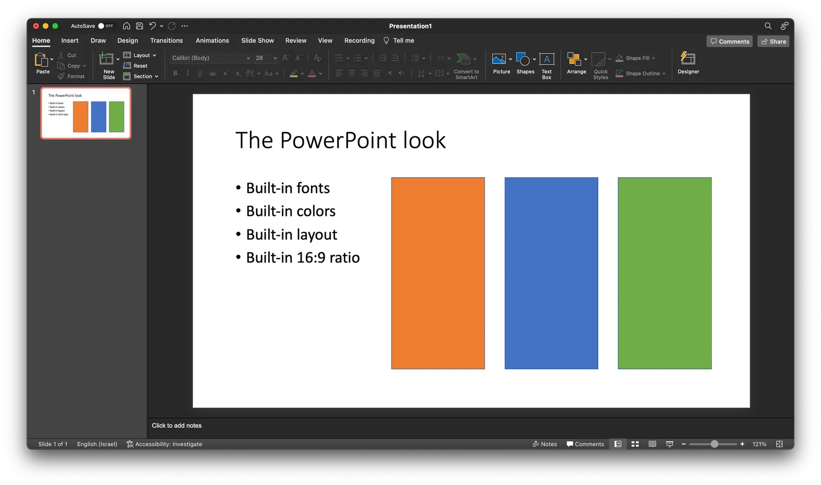
Over the past years (decades for some) we have become so used to seeing PowerPoint slides with the built-in fonts, standard color palettes, that most people will recognize it instantly. But when your end product is a screenshot, you don’t have to worry about things like font compatibility and presentation templates.
I am usually not a big fan of illustrations that visualize data. Below is an example (with data from February 2022). The soldiers might as well have been represented by straight bar charts.

This article in the NYT though, was pretty effective. Representing unused office space with repetitions of well-known landmarks. People can instantly relate to, understand, and internalize the amount of space we are talking about.
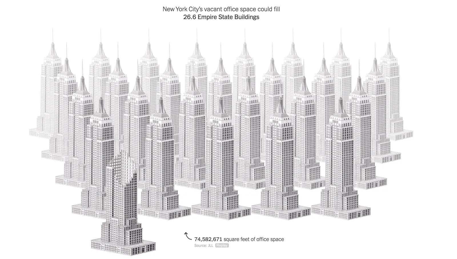
(BTW, these illustrations are made by Kaylie Fairclough)
I like to play some music in my free time, here is a new synthesizer that was released this week. It sounds great, but I would have loved that they spent a bit more time on solving the grid puzzle of the knobs and buttons….
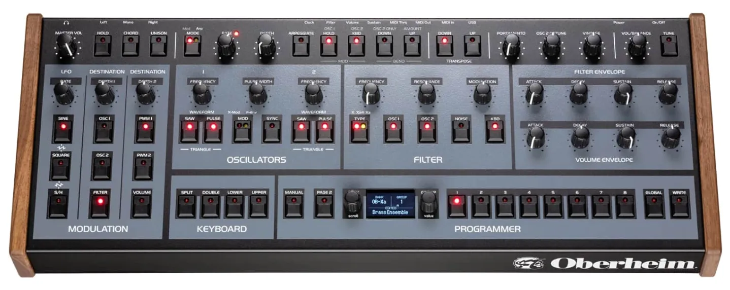
But hey, I am probably the only one worrying about this…
A good presentation has images that are consistent in style throughout the deck. Same color palate, same mood, same type of characters. This was very hard to achieve unless you make drastic design decisions: vintage black and white only, pop art cartoons only, impressionist paintings only (remember Ideatransplant ?), or cheesy stock images only.
AI can bring a solution here. Invest time in developing a standard prompt that generates the desired setting for your photo, then apply that same prompt consistently with small variations to get your snaps.
Databases of image prompts are starting to pop up (see a list here, writing this in May 2023) and this trend might well be the beginning of the end of stock image sites and even model agencies.