

I am usually not a big fan of illustrations that visualize data. Below is an example (with data from February 2022). The soldiers might as well have been represented by straight bar charts.

This article in the NYT though, was pretty effective. Representing unused office space with repetitions of well-known landmarks. People can instantly relate to, understand, and internalize the amount of space we are talking about.
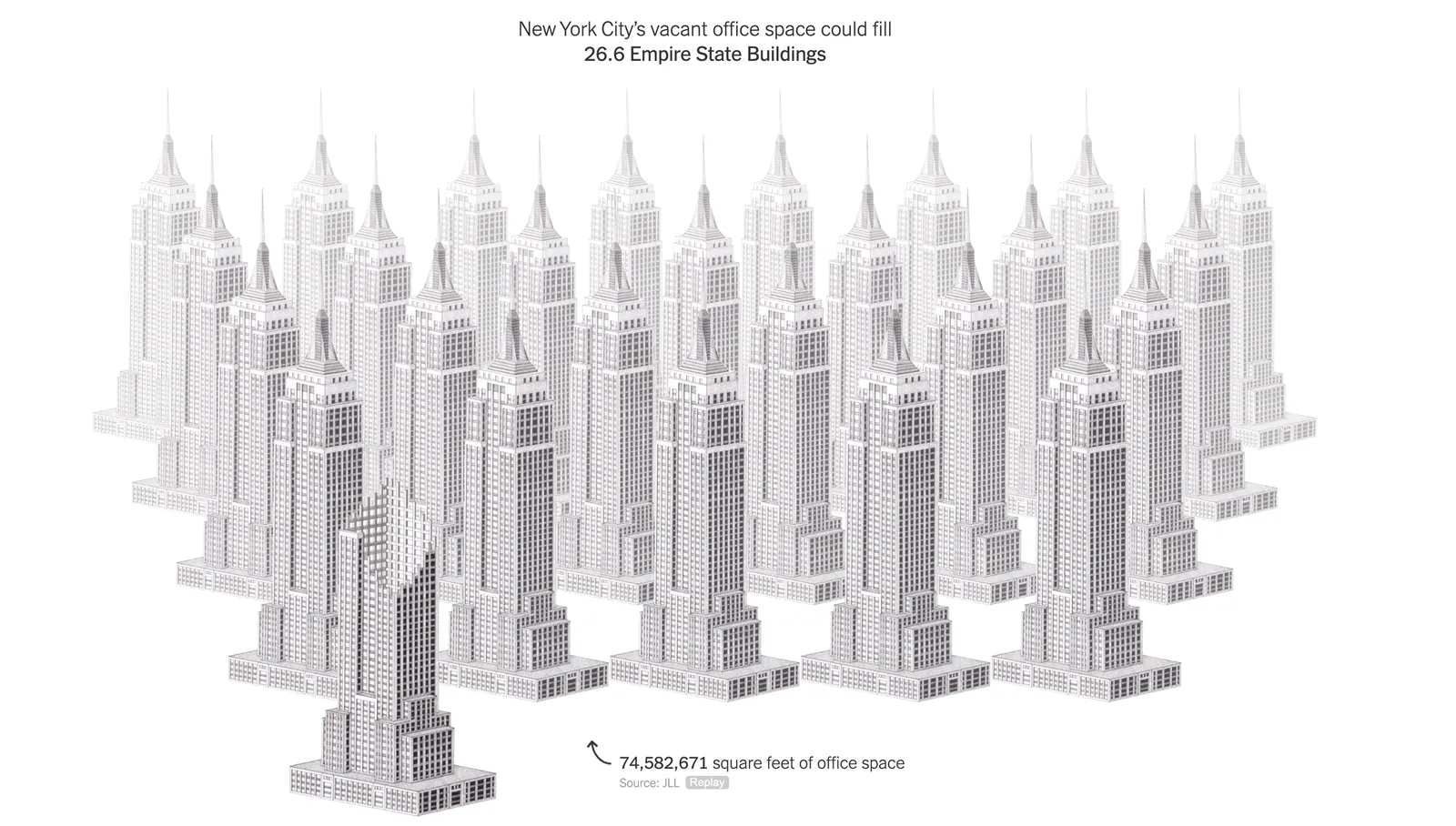
(BTW, these illustrations are made by Kaylie Fairclough)