SlideMagic Blog

Frequent updates about all things presentations since 2008. Subscribe to never miss a post.

RSS
·Delivery

No slides does not mean no presentation

In smaller, informal settings, pulling out your laptop to run through your slide deck can zap the energy of a meeting. For these meetings without slides, it does not mean that this is a meeting with a presentation. In the absence of slides, it can be hard to stay focussed on the story line. You might get lost in tangents, you might miss the important punch line as the waiter asks if you need sugar or milk.

The way you “present” in a slide-less meeting is different from when you are in front of a big audience. But still, you need to rehearse that story, maybe even more.

·Story

Things ChatGPT is good at (and not)

ChatGPT can be a useful productivity tool for presentations:

  • Get a basic story line / section outline for. a presentation
  • Improve the language of a text
  • Etc.

When using it, it is important to understand what underlying technology it uses, so you can see understand where it is strong, and where it is not.

  • ChatGPT predicts words based on your prompt and the previous words it has already generated. Therefore, it is really good at “completing” texts that are very common on the Internet. High school essays, business plans, corporate annual reports, product documentations, product reviews, computer code. If your presentation fits one of these, it will work great, if it does not, results are not very reliable.
  • ChatGPT cannot yet do live web searches to enrich its answers. Everything it “knows” is based on its training data set that was cut off in September 2021. Any information that became available after that, is not incorporated in the results.
  • The majority of text available online is in English, so results in other languages will not be as strong.

Back in the early 2000s, Yahoo! was trying to categorize the Internet. Google beat it with a simple approach of tracking to which site other sites point for a certain subject. ChatGPT is a sort of super template: instead of looking for / categorizing text in templates, it simply reads all the templates and predicts what sentence is most likely to come next given the previous ones.

Continue reading →
·Data visualization

Diversity

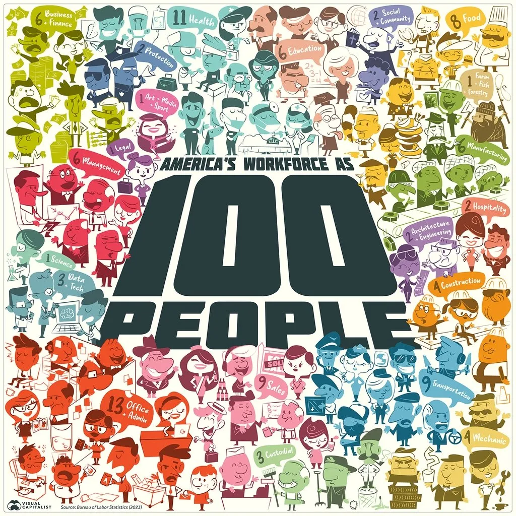
This is an interesting graphical representation of the US workforce:

Source: https://www.visualcapitalist.com/american-workforce-100-people/ on Visual Capitalist.

It is very cute, but does not do a good job at communicating the actual data (percentage breakdown by sector). Also, since this graph tries to make the point of diversity, the characters in the illustration do not represent the gender and race balance of the work force.

One idea to tackle this. Add multiple dimensions of data: sector, gender, etc. to the characters, and then render multiple iterations of the 100 people, each time grouped differently to focus on a specific statistic. The opening slide is a random permutation of the entire group.

·Delivery

Shorter or quicker?

If the time window if your presentation gets cut you have 2 choices: fewer words, or more words per second. Pick fewer words.

Good old bars...

AI is turning the semi conductor industry upside down, and I saw this interesting graphic comparing the market caps of Nvidia and Intel, which look very different from a few years ago.

The circles are cute, but are softening the contrast between the 2 numbers. Two dimensional surfaces look closer together than straight bars, see below.

This is also the reason that I prefer to use stacked columns over pie charts.

·Concepts

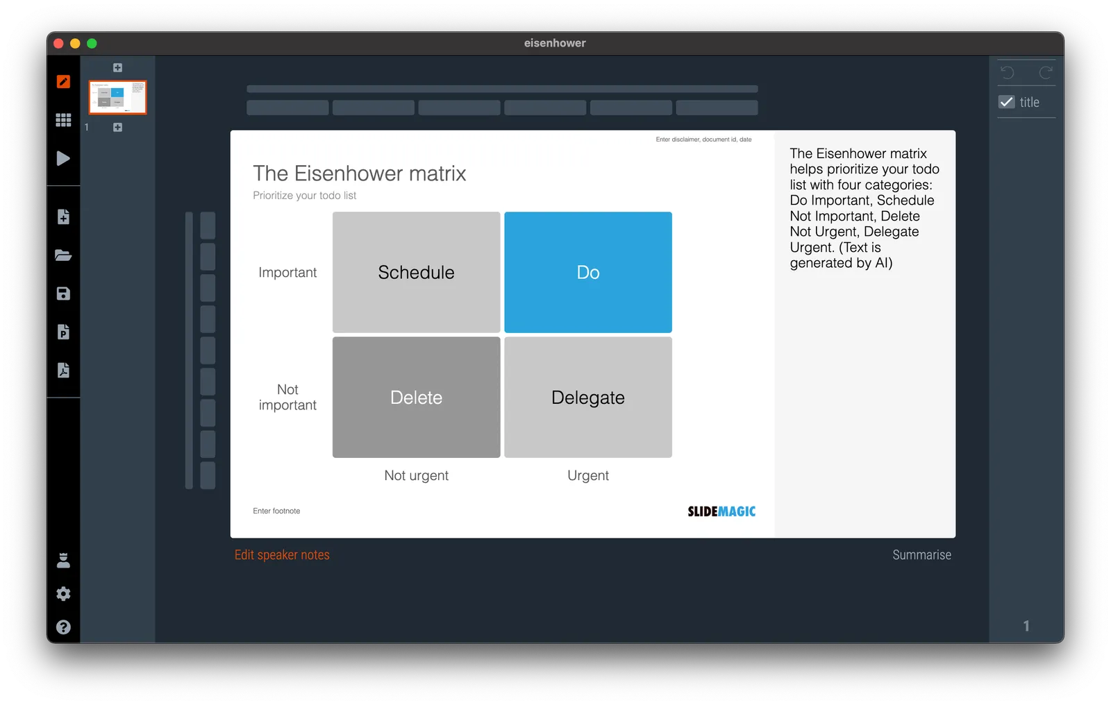
Prioritize your todo list, the Eisenhower matrix

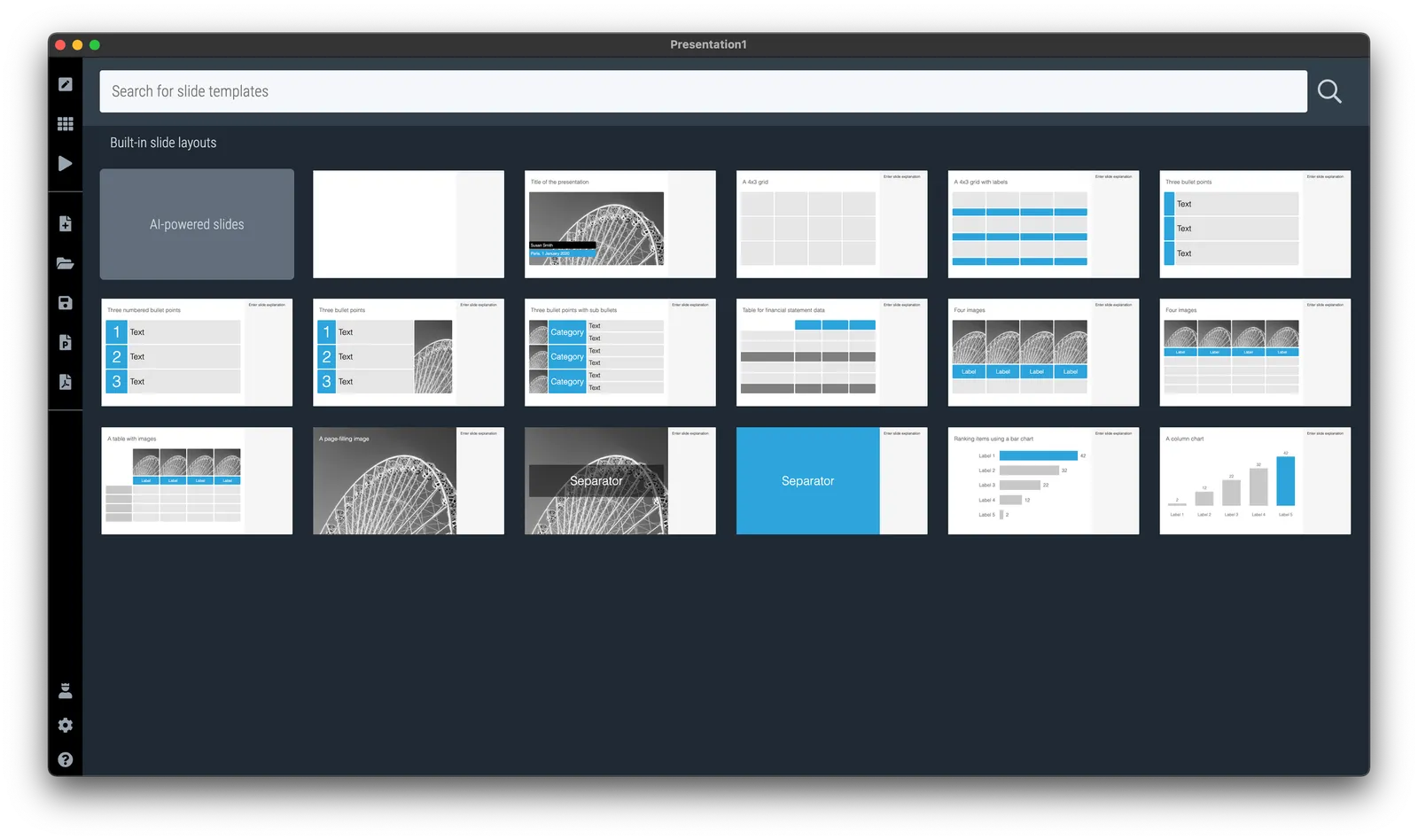
I was talking about prioritizing your time a few days ago and remembered a time prioritization tool that was suggested to me while at McKinsey. It turns out it is called the “Eisenhower Matrix”. I added it as a template to SlideMatic.

They key insight here was to be really rigorous and actually don’t do unimportant, not urgent tasks. The problem though was that all requests added to my desk were important and urgent….

·Story

Let others do the selling for you

During our very short (see yesterday’s post) speaking slot to launch a new partnership for 9xchange, we used the slide below. Deal making in healthcare is inefficient because everyone needs to kiss too many frogs in order to uncover their prince.

It got stuck in people’s head, and during the following presentations, presenters kept on referring back to frogs in their own talks. Free publicity.

·Delivery

First/short or later/longer?

When speaking at a conference and you get offered two possible speaking slots: early in the day and very short, and later in the day and a lot longer. Which one to take? Easy, the early/short one.

  • Attendance at conferences drops during the day, your audience is a lot bigger in the morning
  • When people see you speak (early) they are more likely to approach you later, (feedback about) your presentation is an ice breaker
  • In conferences, a really short speech is likely better than a long one. You are not here to close the deal, just to start more conversations. Your short speaker slot is a blessing.

Back from a busy week

My other venture 9xchange had a a busy week. We announced a partnership with AI-enabled drug discovery company BenevolentAI at the Biomed conference here in Tel Aviv.

On 9xchange, we match buyers and sellers of pharmaceutical drugs that are still in development. Sometimes, a drug no longer fits the strategy of a pharma company, sometimes, a drug fails clinical trials for a specific disease, but might still work for another one.

BenevolentAI has technology to find potential new indications for drugs. Drugs posted on the platform are exposed to its AI engine and results are fed back into 9xchange to broaden the number of matches between buyers and sellers, now taken into account newly discovered indications for which this drug might work.

·Software

Why does it look like PowerPoint?

It is often quick and easy to use PowerPoint to draw a diagram. No need to install and learn new specialized software. A few boxes, lines, a screenshot, and you are done. But why the result totally obvious a PowerPoint slide, even if you are not using the program to present your visual?

Over the past years (decades for some) we have become so used to seeing PowerPoint slides with the built-in fonts, standard color palettes, that most people will recognize it instantly. But when your end product is a screenshot, you don’t have to worry about things like font compatibility and presentation templates.

  • Change colors and fonts to match the document you are working in
  • Let go of the restrictions of the aspect ratios for a slide (4:3, 16:9) and pick something that is appropriate for your diagram.