SlideMagic Blog

Frequent updates about all things presentations since 2008. Subscribe to never miss a post.

RSS

Vacation picture evening!

You remember those evenings in the 1980s, where a family would invite you to come and see their vacation snaps that they put on the 35mm slide carrousel in a dark living room. Sixty minutes of “then we did this, then this happened, then that projected on the wall with the art replica temporarily removed.

The host family had great fun and finally could use the equipment they had bought 6 months ago. The guests, less so. For them, the images were not linked to actual experiences and memories, a picture of a car with a flat tire, is well, a picture of a flat tire.

It is always good to take a step back and asking yourself whether you are inviting your colleagues to this type of event when you update them about the status of your project.

Photo by Nathan Anderson on Unsplash

2 years in 2 minutes

In case you have not seen the 2-minute speech of the New Zealand prime minister:

Obviously, the objective of this speech is not to get you to remember all the stats, it is 2 minutes of one message: “I did a lot’. It is very effective though, and she must have gone through several practice runs to get the take right.

Now; if you take the same information load, allocate 45 minutes of time, improvise the delivery, and replace the flashing words by full-length bullet points, you get a more common update presentation. Which one do you prefer?

·Software

Printing presentations in 2019

I don’t think many people are still printing presentations in 2019. The one exception: bankers pitching to institutional investors. The latter still like to flip along (or ahead) with the presentation and make notes in the margin.

Still, I want SlideMagic 2.0 to be fully rounded app, so I start the work on its print function. Printing is often ignored by many application development frameworks. The feature is not that important, it is tricky to develop and get right, but it has to be done.

A positive side effect is that I am coming up with a better way to convert presentations to PDF without the need to rely on open source libraries, and I can soon support conversions as a parallel process that no longer will block the main application process (something that can be annoying especially if you used large images).

(Beta testers can get around the current lack of the print feature by converting to PowerPoint or PDF and then print in those apps).

Photo by James Pond on Unsplash

·Data visualization

Bar versus column charts

Sparked by this tweet:

My guideline:

  • Columns to show trends over time. The shape mimics that of a line chart, you don’t need much space for the column labels (usually years, or months)
  • Columns for breakdowns. More horizontal space for complicated labels, and a stacked column is a more natural format than stacked bars.
  • Bars to rank things. The shape mimics a “top 10” top to bottom list, and you can make more space for labels that usually describe things

In this case: bars are better than columns.

Photo by Sophie on Unsplash

Back to Helvetica

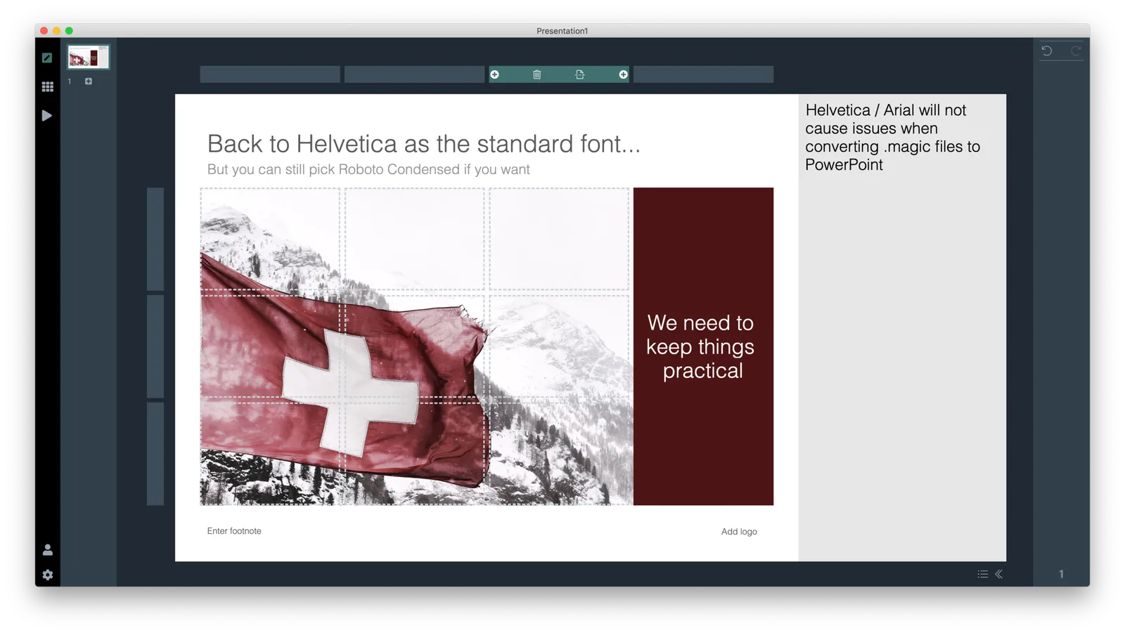
SlideMagic slides always looked a bit different because of the Roboto Condensed font. A recognisable style, plus a narrow font that can hold a lot of text on one line. In the latest update for beta testers, I am putting Helvetica/Arial back as the default, making Roboto a second choice.

I see many users using SlideMagic as a starting point for a conversion to PowerPoint, as most of their colleagues have (yet) no idea with SlideMagic is. SlideMagic files with Roboto in them will gave unpredictable results for users who do not know how to install custom fonts on their machine.

Usability is #1. Hence, the switch, but with an option to fall back on Roboto that can get saved as your default font in the settings tab of the app.

Photo by eberhard grossgasteiger on Unsplash

·SlideMagic

Starting a brand overhaul (once again)

Slowly, slowly, I am starting up overhaul my website and branding once more. The custom presentation design business site has been taken down, marketing for SlideMagic 1.0 has been hidden in a menu, and I started to display alanding page for SlideMagic 2.0.

Sunsetting 2 businesses on which you have worked for years (even more than a decade) feels a bit strange, I remember worrying about SEO and other things, while I am now switching off the whole thing in one click.

All to make space for 2.0.

Auto-update is working again

The update server is back up, now with improved security. Beta testers will have version 2.1.17 installed automatically, with bug fixes and improved stability.

Auto-update temporarily closed

I am beefing up the security and code protection of SlideMagic 2.0, and have temporarily taken down the automatic update server. Beta testers who want to get their hands on the latest version should log in with their account at cloud.slidemagic.com/beta and download the latest version manually. I am working hard to get everything back up soon.

·Software

...And more app updates

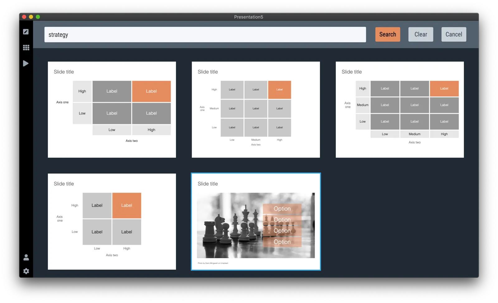
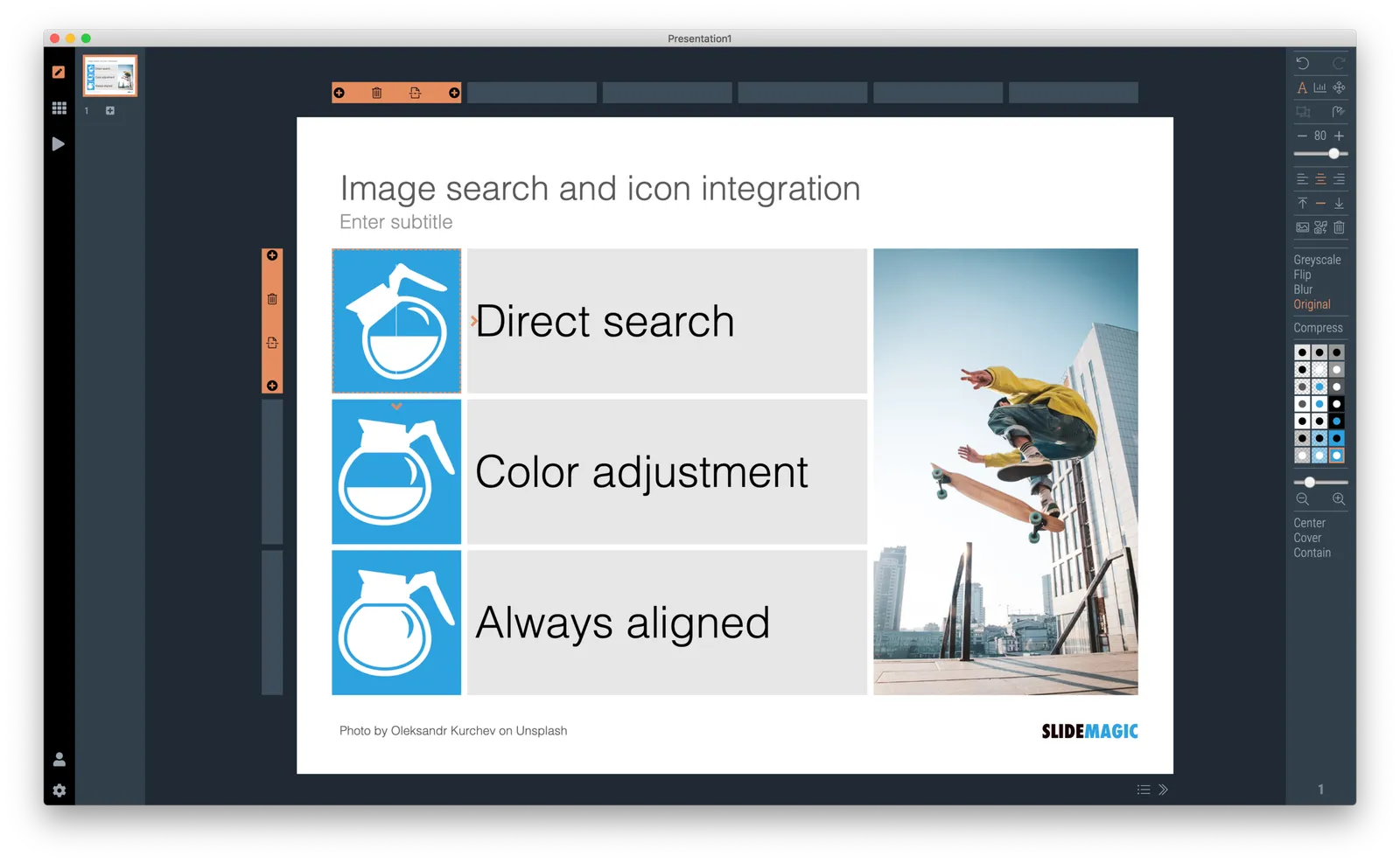
I am focusing on increasing the template database and in the process encounter more ways to make working with SlideMagic faster, and slides prettier. After the past days:

  • Various bug fixes, and code cleanups. I can now laugh at some of the code I wrote at the very beginning of this project, what was I thinking…
  • A proper way to deal with text overflow in boxes, things look professional now when font sizes are getting to big
  • The grid bars now light up when you select shapes
  • A allowed bolding of text with CTRL-CMD B, unlike bullet points, I think this actually does add something to the slide (not yet reflected in PowerPoint and PDF conversions, I might have to write a text block parser to make this happen).
  • Building on bold text, I made the overall font thinner
  • And I added slide subtitles as a fixed feature to each slide template.

To be continued

·SlideMagic

App update

SlideMagic 2.0 beta users will have their app updated over the coming days with a few tweaks and improvements, mostly the result of me now using the app in earnest for the expansion of the template database.

  • I gave up on insisting that you cannot change the layout of the title page of the presentation. Page 1 still looks like it did before out of the box, but you can now change it, delete it, move it, like any other slide in the presentation. Whatever you do to it, the design will be 100% consistent with the other slides in the deck though. Page one is important to brand your presentation, and I was imposing too many restrictions on my users. The side effect of this is that removing the need to distinguish between page 1 and regular pages I could simplify the app code massively (= deleting many, many lines of code). Legacy SlideMagic 1.0 presentations will be converted automatically.
  • I removed the ability to edit slide titles in story mode. Initially I thought it would be a useful way to edit headlines of your slides all together. Now in use, I found that it actually confuses the story user interface.
  • I perfected drag and drop of slides, now also across multiple presentation windows (something that is hard to do in browser-based applications such as Google Slides). As result the clipboard in story view was no longer needed. You can now also drag, copy, delete, move slides in the small thumbnail strip at the side of the main edit screen. There is still work to do here (dragging multiple slides for example)
  • I implemented right-click context menus throughout the presentation, enabling me to declutter the user interface by removing icons that are no longer needed.
  • Popup menus enable you to work with very fine grids now, as I no longer need to render lots of icons.
  • Popups also solve user interface conflicts between drawing connector arrows and combining/splitting shapes
Continue reading →