SlideMagic Blog

Frequent updates about all things presentations since 2008. Subscribe to never miss a post.

RSS
·Layout

I got the vanishing point wrong all the time...

They key concept in drawing in perspective is the vanishing point: every line in your slide should disappear in it (see an earlier blog post). It turns out I got the concept slightly wrong all the time. Because of the curve in the Earth’s surface, the real vanishing point for someone standing at sea level is actually below the horizon. A vanishing point that sits on the horizon, would require the radius of the Earth to be 64x as large. (For comparison, the Sun as a radius about 109x that of Earth.

 Vanishing point at a planet with a radius 64x that of Earth

Vanishing point at a planet with a radius 64x that of Earth

 The accurate vanishing point

The accurate vanishing point

With this new knowledge, will I change my approach to slide design? Not sure.

Based on an article in NRC Handelsblad. Simulation images by Siebren van der Werf.

·SlideMagic

Where are the bullet points?

A question I got from a SlideMagic 2.0 beta tester.

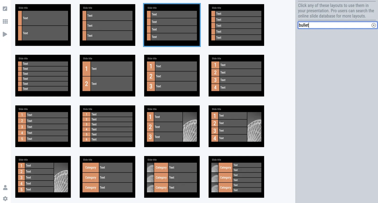
The answer: there aren’t any. I am trying to create a presentation design tool that changes people’s design habits. SlideMagic does not have built-in bullet point formatting options. It is meant to be that buzzer that reminds you to find an alternative design solution the moment you are about to fall back to your old habits.

It is possible to create lists in SlideMagic though. Below a screen shot from a template search in the (still very small) slide library. If you need to make a list as a conscious design decision, you can, if you want to fill a box quickly with a number of bullet points, you can’t.

Maybe I am pushing things too far here, but I am not yet ready to give in.

Photo by Jon Tyson on Unsplash

·Templates

Board deck templates

Tel Aviv VC TLV Partners has updated their funding playbook with a set of PowerPoint and Excel templates to prepare a Board presentation. Board meetings should be productive, and preparing for them should be as efficient as possible (there are other things that a startup needs to do). You can save time by investing less in graphical polishing, and set up smart links between Excel and PowerPoint to copy data across. Maybe you will find these templates useful.

I was not involved in the preparation of these documents.

Photo by Startaê Team on Unsplash

Presenting a property with images

I just returned from a wonderful trip to show my kids California (apologies for the silence here on the blog). To find places to stay I had to browse AirBnB and hotel web sites, basically online sales presentations for real estate. I was struck by the images most places used. They could have been better:

  • Real estate people like to show features: close up pictures of washing machines, wide angle shots of living rooms, bed rooms. But I think most short term tenants look more at the atmosphere of a place… Few features, more ambience.
  • Related to this: lighting. Super bright flood lighting, flash, makes all the objects in the property visible, but kill the ambience of the photo. Everything looks like a high school canteen. Add images that actually highlight the outisde view through the windows, not the inside. Take pictures in the early morning or around sunset for softer light.
  • Think of the sequence of the slide show: your best shots upfront, but don’t forget the last ones as well. Spread out the washing machines and ironing boards in between more atmospheric shots of the property.

Sales presentations are everywhere.

·SlideMagic

SlideMagic slides, not by SlideMagic

Some designers have a distinct look & feel that you can recognise instantly. Recently, I started to see “SlideMagic-type” visuals on the Internet (boxy grid-based slides with one strong colour). Not by people I recognise immediately (Twitter followers, blog readers, SlideMagic users, etc.), and these were not direct copies of my designs: new charts in the spirit of SlideMagic

I consider this a great compliment. SlideMagic is a culture change in business presentation design. The style, the approach, everything is open source. As a side effect I hope to create a financially viable business by offering a tool that makes it even easier to spread the culture to everyone who needs it.

Photo by Moss on Unsplash

"...and then I wrote the deck in 2 hours..."

This happens often, you work on a presentation for weeks, and then 1 day before the deadline, you throw everything away and start from scratch finishing the thing in just a few hours.

No, you did not do anything wrong those first weeks. In fact, it is because of the work you put in, that you can finally write your story down exactly as it should be. If you started the day before the presentation, you would never get there.

Photo by Tim Gouw on Unsplash

"Sloppy" IPO documents

A piece in the WSJ states that WeWork investors were turned off by ‘sloppy’ IPO filings.

Consistency and accuracy are the #1 requirement for any investment document. As soon as a potential investor needs to stop looking at the content of the business and start worrying about whether the numbers are correct and add up, you probably lost the deal. Trust is paramount. Investment is a leap of faith, and it is impossible to check 100% of all the data before writing the check. If you find some things that look incorrect, there might be more.

The WSJ article does not mention that there were actual errors in the report, just things missing. Details of private jets are not the most important I think, it is the data that allows you to construct how the business actually works: new location, mature location, and that multiplied by the roll out. Every investor presentation boils down to a story that ultimately gets translated into a spreadsheet by someone. You need to spoon feed the right information, without explicitly providing a finished financial model. The latter would enable investors to start “salami slicing”, turning all assumptions down and explaining you why the valuation of your business is too high using your own Excel model.

In the case of WeWork, there was clearly an “elephant in the room” question, and investors needed an answer to it, which they did not get.

App update - drag/drop, clipboard sunset

Dragging and dropping across multiple application windows looks easy, but from a development point of view it is tricky to get right. I think I managed to get it to work for SlideMagic 2.0. In the same effort, I removed the clipboard in story view, that was a hack that I had to use in the web-based SlideMagic 1.0. A hack, because it was weird and confusing to use. No more need for it now.

Beta users should receive the update to their software automatically.

Photo by Joyce McCown on Unsplash

App update - multiple windows

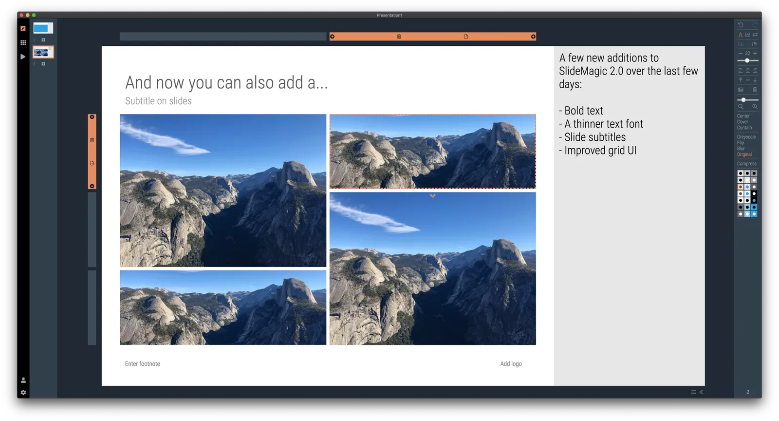
Over the past week I have been stress testing SlideMagic 2.0, and added 2 important features:

  • Support for multiple windows. Open presentations side-by-side and copy elements back and forth. This is a strong advance of desktop app over browser-based software. Copy-pasting is still fragile here and there, work in progress.
  • The ability to split a grid row or column in 2, which allows you to change the layout of a slide quickly without rebalancing the grid. Grid manipulations now work super-fast and intuitive.
  • I have installed in-app analytics to see where beta users get stuck. As a beta user, you automatically opt-in to usage data gathering, the commercial version will have the opt-out option.

Beta users can simply go the cloud.slidemagic.com, log in, and download a new version of the app.

Project documents vs. presentations

People use the same software to create them, but they are very different.

Project documents:

  • Full of detail, assumptions, footnotes (“Harry wants to make sure that everyone knows that the data does not include South America”), disclaimers
  • Many authors (captains, holders of the pen)
  • Team members have seen page 25 over and over again (“ Why does it still say $23m profit there?)
  • No problem editing them live on Google Docs with 5 people in 4 different locations
  • Aesthetics can be compromised in order to squeeze that extra row in
  • The has agreed on a way forward through discussion, now let’s write it down on the pages

Presentations:

  • Introduce an audience for the first time to a story
  • The audience still needs to be convinced of the way forward
  • Usually one person delivering a carefully crafted pitch
  • Poor aesthetics can definitely harm the effectiveness of the pitch

SlideMagic 2.0 will address document type number 2.

Photo by Kaleidico on Unsplash