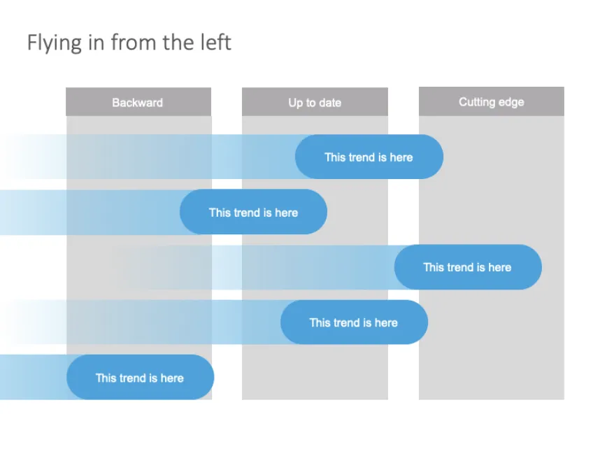
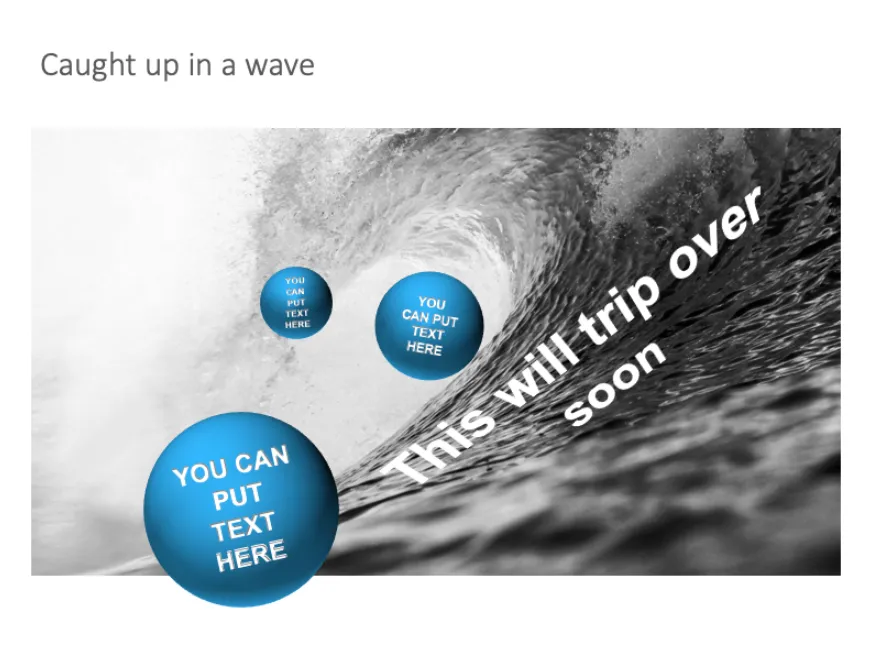
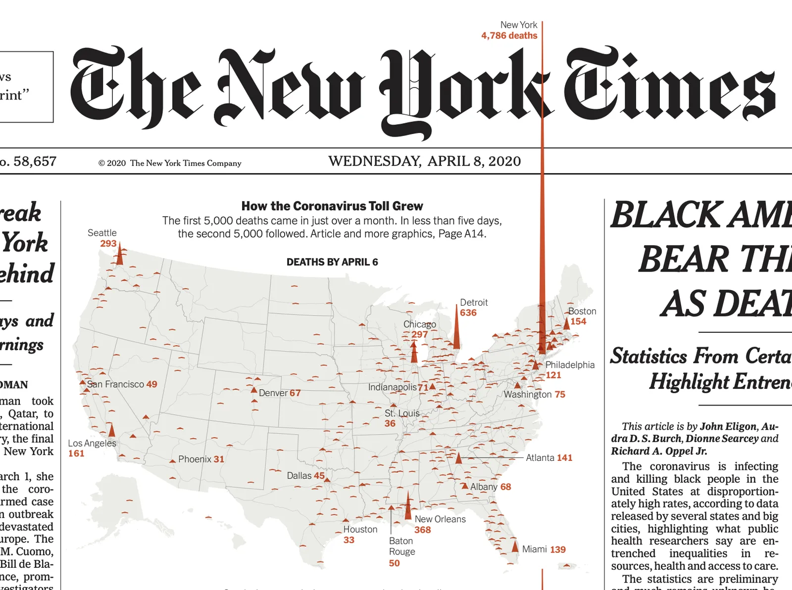
The NYT used this pop out technique as a data visualisation tool on the front page. The NY virus casualties literally spike outside the graph, even over the newspaper’s logo.
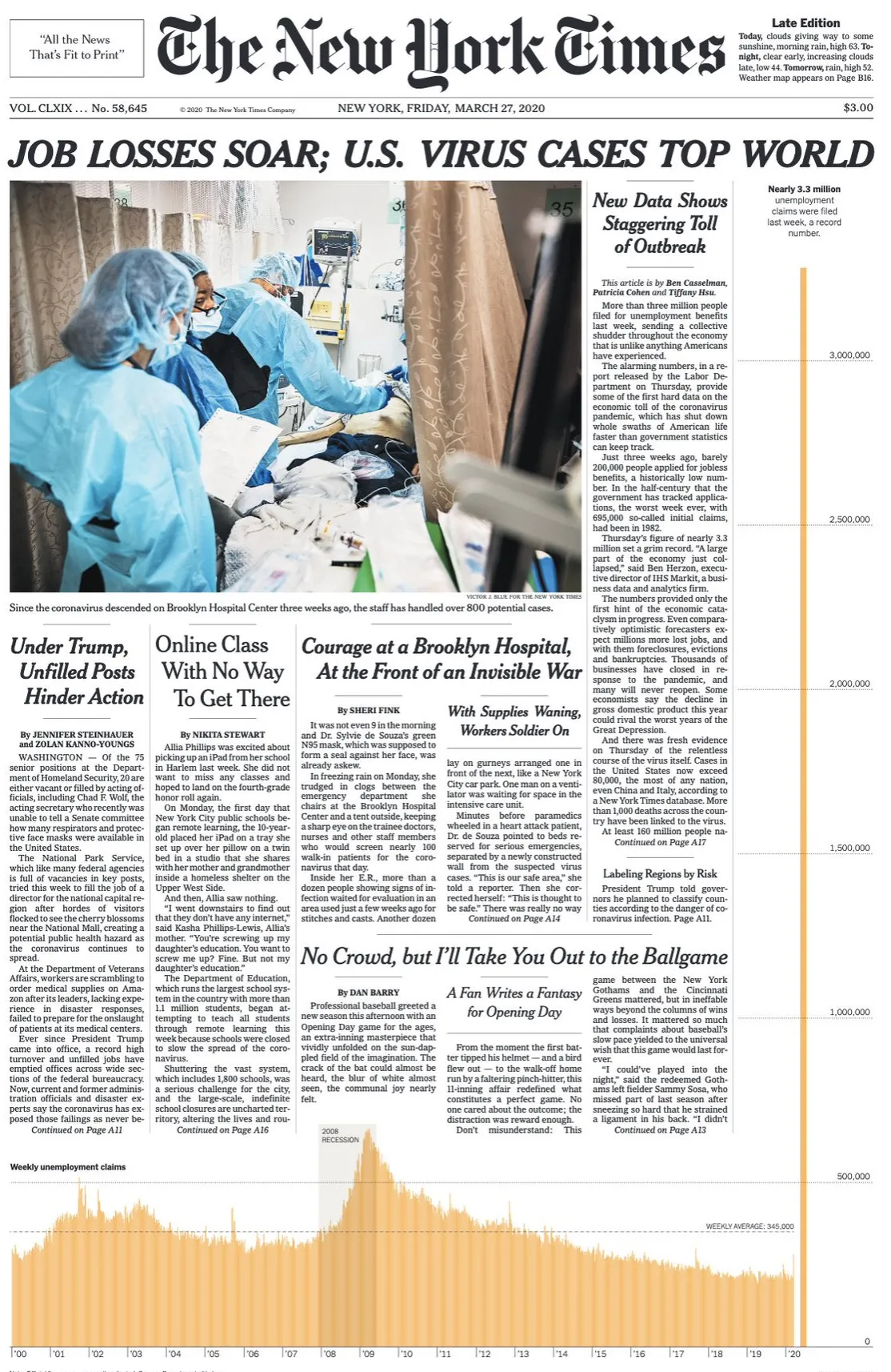
Similar to a graph about unemployment benefits from last week. You could use something like this in your presentations as well.
I have a few slides on SlideMagic (example here) that use this pop out effect. They are PowerPoint-only though, since the style police of the SlideMagic app protects you against yourself breaking the rules of good graphics design. In 99% of the cases, that is a good thing, this is an example of the other 1%.