

I needed a chart to visualize 3 quality levels I think a presentation can go through:
- Your audience bothers to listen
- Your audience understands what you are trying to say
- Your audience follows up after leaving the room
Brainstorming some concepts, I ended up with that of a graphic equalizer beating away at higher intensity levels. Stock images failed, so here is the DIY approach in PowerPoint:
- Create distributed rows of narrow rectangles
- Add green, orange and red colors
- Add a “flicker” animation on the last 2 bars of each row (going back and forth between grey and the accent color),
- Set animation repeat to “until slide ends”
- Set animation speed to “very fast”
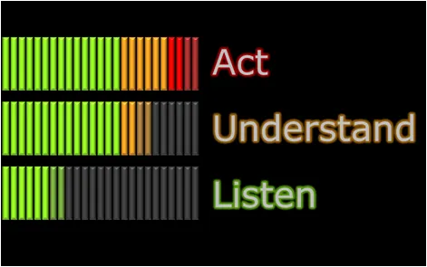
The still image does bring out the happily dancing bars very well though…
Rules (animations do not add anything) are there to be broken sometime. Still, this type of chart fits in a more frivolous presentation setting, and not in one where you let’s say have to pitch your company to venture capitalists.
1 comment