SlideMagic Blog

Frequent updates about all things presentations since 2008. Subscribe to never miss a post.

RSS
·PowerPoint

Speaking at one of the Outstanding Presentations webinars

For the second year in a row, Ellen Finkelstein is organizing her Outstanding Presentations workshop, a series of 7 weekly webinars by guest speakers. I will be one of them. Here is the line up of presenters:

  • September 7: Carmen Taran, co-founder of Rexi Media and author of Better Beginnings
  • September 14: Cliff Atkinson: author of the Beyond Bullet Points
  • September 28: Bruce Gabrielle: Author of Speaking PowerPoint: The New Language of Business
  • October 5: Me
  • October 12: Simon Morton: Founder of Eyeful Presentations
  • October 19: Andrew Dlugan: blogger at the Six Minutes blog
  • October 23: Ellen Finkelstein will be wrapping up

For your calendars: October 5, 14:00 EST

The sessions are free and will be recorded for later viewing. More information about the Outstanding Presentations webinars here. Please note that you still need to register if you want to view the recorded sessions.
·PowerPoint

Product presentations and product catalogues are not the same thing

“Let me talk you through our exciting products!” And up comes the agenda page: product 1, product 2, product 3, product 4. Uh oh. Your audience starts checking whether there is guest WiFi to check some emails on the phone…

Product catalogues are an exhaustive description of what you have on offer. They are about you, not about the customer.

How can you keep a product or sales presentation interesting and relevant? Start explaining the overall architecture of your product range (we have big ones, and small ones, we work in this segment and that segment). Then, think about the needs of the customer in front of you and narrow down the options dramatically. Spend a lot of time / slides on solutions that are relevant for your audience, and surpress the urge to be complete and cover everything.

·Data visualization

Data without context is meaningless (and boring)

The quarter is done, and here comes the day-long sales results presentation. Excel is pasted into PowerPoint, creating huge decks through which senior management has to sit through. Sales organizes by channel: small restaurants sales, growth; large restaurants sales, growth, supermarkets sales, growth. Marketing presents by brands: brand 1 sales, growth, brand 2 sales, growth.

If you are a marketing manager, looking at the Q3 sales and growth figures of a particular brand is really interesting. All the numbers of the previous quarters are more or less in your head. For the production manager though, going through these pages is mental torture, as she does not have the historical context readily available. (Read more about the Curse of Knowledge here)

The solution is the opposite of what I preach for bullet point charts: instead of breaking up slides into multiple pages, condense lots of data in 1 chart, but make it comparable. Put the quarter growth rates of all brands on a page and compare them. List the historical brand growth rates of the past 8 quarters on one page and see what is going on. There is no problem showing a massive amount of data on 1 slide, as long as it is about the same variable that is compared across different dimensions.

·Gadgets

Wacom Inkling

I still have not found the perfect device to transfer sketches to a computer. Drawing with the mouse does not work. I do not like using drawing pads that do not allow you to see what you just drew on the same surface, and the very large touch screens are very expense and so heavy that they are impossible to carry around. And carrying around is crucial for creative sketching. Ideas always come up when you are not at your desk.

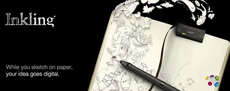
So, that is why I am excited about the Wacom Inkling that was announced today. A sensor tracks the movements of a regular pen on normal paper and stores them. Once you connect the sensor to a computer, sketches are transferred.

I see 2 benefits for presentation design:

  1. Enabling me to include cartoon-type drawings in my presentations. The key here is the option to use layers. Sketch a character roughly on a piece of paper. Press a button to open a new layer, and trace a more precise drawing over the rough one. Repeat the process of necessary. The top layer can now be of decent quality, and transfered as a vector to your computer. Great.
  2. An archive for sketches that can be filed and searched on a computer.

The big question: does it actually work? I took the risk and ordered one and will report back.

·Data visualization

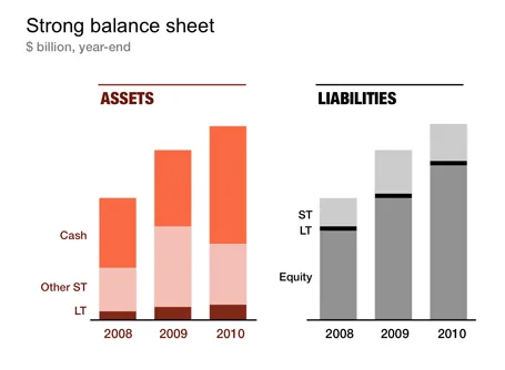
Unconventional balance sheet visualization

Financial statements are completely unsuitable to put on a PowerPoint slide: too dense, too much information. I like to use column charts to represent this information and dramatically cut the number of categories in the process. After a while, even accountants get used to it. The chart below gives an example of a balance sheet, in a real presentation I would add data labels rounded to 1 digit behind the dot.

·Images

Being too explicit?

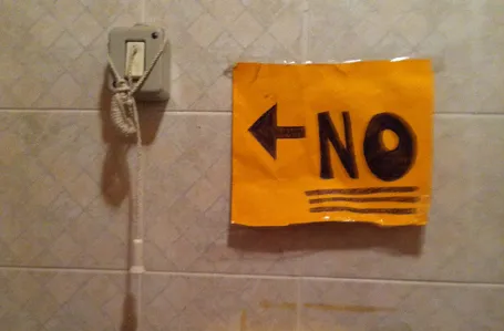
I just returned from holiday and this interior shot of a Tuscany bathroom (taken HERE near the marble excavation sites of Carrara) is an interesting visual. The explicit instruction makes it so tempting to do the opposite. I complied, but am wondering how many times the sign is ignored.

·PowerPoint

Steve Jobs quotes

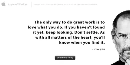
The site Apple of Wisdom is packed with quotes by Steve Jobs. Useful to spice up your presentation. Also, the site design is an example of a minimalist style blurring the boundaries between presentation slide and web site design.

·PowerPoint

Gobbledygook

Robin Wauters of TechCrunch linked back to an old TechCrunch post summing up words that are over-used in press releases (and presentations):

  1. Leading / leader
  2. Best / most / fastest / largest / biggest
  3. Innovative / innovation
  4. Revolutionary
  5. Award-winning
  6. Disruptive / disruption
  7. Cutting / bleeding edge
  8. Next-generation
  9. Strategic partnership
  10. Synergy

The post then goes on to link to The Gobbledygook Manifesto by David Meerman Scott. All useful reminders for presentation designers.

If you are about to use one of these terms, think again and see whether you really need them. If so, please use them, if not, change them for something more original.

·PowerPoint

Presentation design eBook can be downloaded

With the help of SalesCrunch, I have compiled an eBook of the 2 NYU presentations and the SalesCrunch webinar. Go here to download the eBook about presentation design. Some readers pointed out a few glitches to me, keep the feedback coming so I can improve it.

·PowerPoint

On becoming an independent designer

From feedback I understand that many of of the readers of this blog are in fact independent (presentation) designers as well. Some have already made the jump and started their own business, some are still pondering whether to do it. Here are some reflections on the process that I went through, and some of the things I learned.

Becoming an independent business is not easy. It takes time until you have figured out what the setup is that works best for you. What type of projects, what type of clients. Through a process of trial and error you get to where you want to be, slowly. Allow time for this process to happen, and realize that you will be constantly moving direction (I still am).

Small businesses tend to under-invest. Old software (or maybe even pirated software!), slow computers, small screens. All this is a tax deductible business expense/investment, leverage it to do better work and compete with larger firms.

Optimize your workflow. Use gmail with clever filters to make stay on top of email. Use dropbox to access your files anywhere from any device. Use freshbooks to track time and do your billing. Enjoy your freedom from the IT purchasing department and pick the right productivity tools.

Minimise businessn meetings. Social meetings with friends are fun and energizing. Business meetings are most of the time a big time sink. Drive to meeting, park, small talk, discuss business, small talk, drive. That was an entire morning wasted, and now that the day is partly gone, you probably won’t start that big creative piece of work that you still have to do.

Continue reading →