

Blog post

Unconventional balance sheet visualization

August 30, 2011 ยท by Jan Schultink
โ† all posts

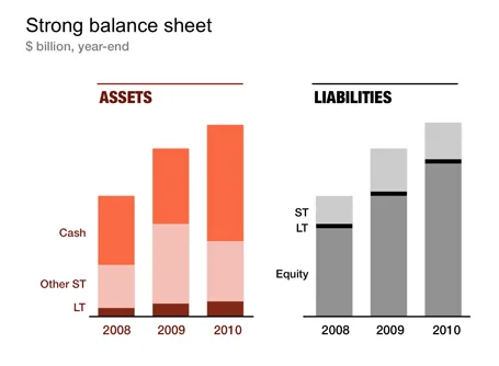
Financial statements are completely unsuitable to put on a PowerPoint slide: too dense, too much information. I like to use column charts to represent this information and dramatically cut the number of categories in the process. After a while, even accountants get used to it. The chart below gives an example of a balance sheet, in a real presentation I would add data labels rounded to 1 digit behind the dot.
Data visualizationPowerPointPresentation design

About this blog

Notes on all things presentations โ€” design, storytelling, and AI workflows.

Subscribe now to never miss a post.

RSS

About SlideMagic

A platform for business presentations.

A free student plan is available.

3 comments

taotechuck2011-08-30 13:47:07
I like the approach, but I'm curious about your color choices. Why would you put assets in any family that is even remotely similar to red?
Geoff Higgins2011-08-31 04:00:57
I love the ability to see trends across multiple years on balance sheets. Nice touch.

...Geoff
Jan Schultink2011-08-30 15:05:23
Fair point