SlideMagic Blog

Frequent updates about all things presentations since 2008. Subscribe to never miss a post.

RSS

A better slide 1 of your presentation

The cover page of your presentation is important: it will be sitting on the projector for a long time as the audience comes into the room, and even more important: it determines how many people will open your deck on online presentation sharing platforms such as SlideShare.

Presentation designers (including me) still have lots to learn from book cover designers. I enjoyed browsing through this book: The Best of Cover Design: Books, Magazines, Catalogs, and More (affiliate link). It reminded me of all this design options I have in PowerPoint that I actually do not use at all for cover slide design.
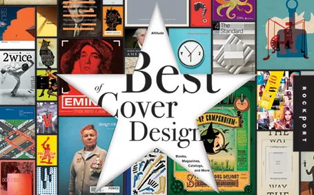
There is some irony though. The introduction of the book states that the cover designs presented in the book are proof that print media is here to stay forever. I disagree, we digital designers are learning to bring the quality of digital design up to the same standard as print.


Cliché stock compositions

On stock photo sites, many photographers and illustrators try to do the slide design work for you and create ready-made compositions. Often, they are not very good.

The one below for example. It requires a lot of technical skill to make it, but somehow the colors and the look and feel do not seem right. Also, the concept is a bit forced. You could equally show the 2 logos of the joint venture partners on the last slide and you convey the same message.

And worst of all: because these type of images have been over-used so much in bad presentations, putting one up will immediately make your audience assume that this presentation will fit into that category.

Image housekeeping

In the heat of the presentation design process, you can easily forget some basic image house keeping. You search Flickr for a Creative Commons image, find it, CMD-C/CMD-V into PowerPoint, go back to find the name of photographer and put it in small letters on the PowerPoint slide. Done. What next? PowerPoint reduces the resolution of the image to 72 DPI, and crops off the bits you do not use (if you compress files). Also, inside a PowerPoint file, it is much harder to find that image when you want to use it later. So instead: save your file to disk with a good description, including the name of the photographer. If you want, you can add meta data in workflow applications such as Aperture. In this way, you are building on a useful photo library for the future.

Milton Glaser: To inform and delight

The wonderful thing about movie streaming services like Netflix is that it opens up a long tail of movies that you normally would not buy on DVD. I am digging through the art and design section and stumble of some really interesting documentaries.

Last week, I watched “Milton Glaser: To Inform & Delight ” (affiliate link), a documentary about U.S. graphic designer Milton Glaser (probably best known for the design of the I heart NY logo). The film provides excellent food for thought for any designer. Here are some random insights from the movie.

An album cover for Bob Dylan (fragment) that became a symbol of the 60s
  • A designer should not everything on a silver plate to the audience, but leave something to solve. His I heart NY is an example of that.
  • Art and design create symbols for people to connect. Through art they have something to share rather than killing each other. Milton thinks this is the gift of art
  • Upon graduation from high school and after his decision to gor art rather than science, his art teacher handed him a pencil box as a gift and said: “Do good work.”. Makes sense.
  • The movie title was inspired by a quote from the Roman poet Horace: “The purpose of art is to inform and delight”
  • Another good one: “drawing is thinking” to describe the intuitive process of free sketching on a white sheet of paper.
  • And his insight that every object is defined by its opposite. It reminds us how important it is to use contrast in design.
Continue reading →
·Investor presentation

What a potential investor really means when she requests a business plan

The traditional business plan used to be a 200 page Microsoft Word document. A large part of it was filled with fluffy market background information and more fluffy industry buzzwords, frameworks and mission statements. It was always out of date. Its primary purpose was to rest your hand on it and say: “We have a business plan”. Nobody would really read it.

In most startups, the business plan is replaced with a large PowerPoint slide deck that evolves rapidly over time. A selection of the slides in this document are upgraded to be used in standup presentations. The vast majority of them are dense appendix material.

Daniel Tenner wrote a good blog post about what it means when an investors asks whether you can email her a business plan. In short, after the initial pitch, the investor wants a document that can be emailed (forwarded to partners) that answers some fundamental questions about your venture. The content should be good, the content can be short, and you can afford to invest less in the design of the slides.

·Images

The usage context is enough

Many of today’s VC pitches are about some sort of mobile technology. It is very hard to find good images of people using modern phones at shop check outs (stock photographers: this is a business opportunity). I actually am not to concerned about showing the device. Giving a good feel for the usage occasion is much more important.

·PowerPoint

Asking the stupid question

In the middle of a design project, I decided to ask the client the fundamental question again: “So what is this about again?”. It was followed by a short silence in which I could imagine the eyes rolling at the other end of the phone line. The short and candid answer to the stupid question was actually very useful in the design process. It is OK to ask stupid questions. It is useful to have an outsider do it.

JPEGmini compresses file size not quality

JPEGmini has a new technology to compress the sizes of JPG files dramatically without quality loss. I took it for a test drive in snow-covered Amsterdam. My file was reduced from 2.4MB to 0.4MB and only by zooming into the image (click on the second image) you can see a slight, but only slight loss of brightness (can you tell which one is the original?). A pretty impressive result. The question is whether the JPEGmini offering will stay free, and whether will get used to adding another step to an already complex image processing workflow (find image, save it with key words, crop/extend for presentation, adjust dimensions, save Photoshop file, save for web, drag into presentation).

·Delivery

Your monitor device

Rock bands use massive monitor speakers to hear themselves play in a concert. When you run a virtual presentation, you need something similar. Slide transitions can be delayed especially when you use high res images. You are on the next page, but your audience is not.

To prevent this, log into your own webinar with a second computer, or even an iPad or internet-enabled smart phone to see what your audience is seeing. The really skillful presenter switches slides on his own computer but continues to talk about the slide that is still in front of the audience.

Image by Anirudh Koul

·Data visualization

Infographic overload

The blog Bitrebels posted a number of infographics that compare the salaries of self-employed people in the U.S. versus those the U.K. Without picking on this particular design, this graphic shows common mistakes that often apear in infographic illustrations.

  1. Round up the numbers to the nearest $ 000. The digits behind the comma do not add anything.
  2. Group data together, a standard bar chart showing the 2 numbers with their delta is much clearer.
  3. Pick a meaningful comparison unit. More than 3,000 hamburgers is not.