SlideMagic Blog

Frequent updates about all things presentations since 2008. Subscribe to never miss a post.

RSS
·Images

Crappy paste-as-image

If you use a custom font just on one page of your presentation, it is better to use the text as an image, so viewers of your presentation do not have to install that font on their computers in order to see it. Microsoft PowerPoint gives the option of paste special, past as image but - at least on a Mac - the resulting graphic looks horrible. I simple make a screen shot of the text and paste that in.

·Keynote

Got into a fight

I usually do not get draw into a fight, the exception was recently when a client asked me to design a presentation that was a response to a presentation by a competitor that was a direct attack on the company.

The competitor document consisted of 5 pages of dense text with long sentences written in a style of two children complaining in front of the head teacher: “She says, but that is not true, then I say, you see that I am right?”. Lots of quotes, lots of complicated arguments, no numbers, no visuals.

My design was different. One simple headline per slide, one simple fact or illustration to support it. I did not discuss any features of my client, did not repeat the sales story of my client. Just corrected fact after fact after fact. I think it works pretty well, it is just a bit a waste of all that negative energy that goes into aggressive presentations.


·Images

Replicators

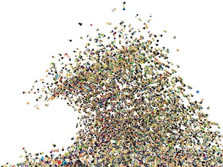
I have never been a fan of stock image photographers making pre-fab slide compositions, but in one area they can add value: digitally replicating items to infinity. See the attached image by higyou on Shutterstock. It is worthwhile visiting multiple stock image sites for these type of renderings, since they often can only be found exclusively on one site. Have a look at Filter Forge if you want to try to create these types of effects.

·Concepts

Nothing ever changes...

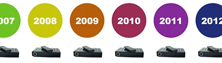
Here is a simple concept to visualize a problem that the cable television industry has: replacement cycles of hardware sitting in the people’s homes is really loooooong, especially compared to how often we upgrade our mobile devices. In this slide I used repetition plus cropped the years on both sides of the page to create that sense of continuity.

·PowerPoint

Changing PowerPoint shapes

Another hard to find feature in PowerPoint. It is possible to change a shape, for example turn a rectangle into an oval. Select the rectangle, go into the SmartArt menu, select the shapes button, and the select the shape you want instead.

·PowerPoint

Office 365: not there yet

I signed up for a trial of Microsoft Office 365, the cloud-based version of Microsoft Office to see whether it could be a work-around to get the Windows version of PowerPoint to run on my Mac. (There are a few bits missing in the Mac-version of PowerPoint).

Not every Office user is the same. For the corporate user that needs access to files on any device, plus the ability to make some small edits to Office documents that are created on desktop applications, the Office 365 offering makes perfect sense.

But Office 365 is not ready yet to become a core design platform. I tested only PowerPoint, and ran the web app in Google Chrome on Mac OSX, please correct me if some of the limitations were due to hardware/software issues:

  • The availability shapes and functions in PowerPoint are extremely limited when compared to the desktop version. Now, I am all in favor of cutting PowerPoint features but here basic elements were left out (creating data charts  or cropping pictures for example)
  • Fonts are a big issue, if purchased custom fonts that are installed on my computer, but they are not present on Microsoft’s Office 365 server, so your presentations become garbled
  • The preview of slides are low-res and slightly blurry (I am using a 2500 pixel monitor), only when you click to edit an object does the full resolution kick in.

In a few years from now, Microsoft Office applications will run smoothly across devices and platforms, we need a little bit more patience.

·Advertising

Everyone can design

Advertising agency RPA made a bunch of Apple-style ads for common products, probably intending to show that the world would be boring of all ads looked like this. I actually disagree, and would welcome to see the clutter in advertising go.

You see how easy it is to create professional looking slides by just applying a bit of white space and picking the right crop for your images. You do not need to be an advertising professional to do this, you do not need sophisticated software to do this.

Via AdFreak.

·Images

Keynote discoveries

I am a PowerPoint veteran who only recently started to design presentations in Keynote. Here are some of the little things that were hard to find:

  • Connecting shapes with a line: select both shapes go to the insert menu and select connecting lines
  • Remove an image background: go to the format menu and select instant alpha
  • Edit an image (make it B&W for example): select the image and click the tiny button with the levers (next to the stroke buttons).
·Investor presentation

The pitch bottleneck

Sometimes a startup idea is already stuck in the mind of a potential investor. I think pretty much any VC is convinced that ultimately mobile payments or social friend-to-friend shopping recommendations could be huge businesses. The bottle neck is: how to make it work. When you pitch your startup idea in one of these fields, you will be welcomed by a healthy dose of cynicism.  Do not waste your time on preaching to the converted, but have your pitch target the bottle neck in the mind of the investor.

·PowerPoint

Re-discovering Smart Art

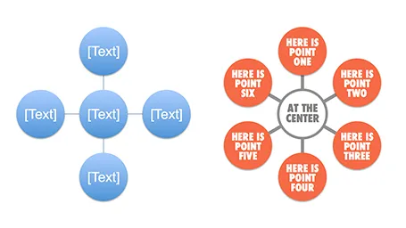
Smart art inside PowerPoint is a semi-automated template engine for diagrams. It easy to add and remove boxes/bubbles, edit text. The idea is good, but I have not used them a lot:

  • The standard out-of-the-box formatting is ugly
  • Although there are many frameworks to chose from, none of them usually really work for my particular presentation problem
  • I have seen them too many times in presentations where designers simply dump in a smart art graphic to replace a bullet point chart (the result is still a bullet point chart that looks a bit different)

Recently, I have started to use smart art in my presentations, but in a different way. I use them to position objects on a slide by picking only the very basic configurations and reformat the slide items heavily so you can hardly recognize it is a smart art object anymore. An example below:  

Well, I said before: your PowerPoint is really good PowerPoint if your audience cannot tell it is PowerPoint…

More about smart art on the Microsoft site, or over at the PowerPoint Ninja blog.