SlideMagic Blog

Frequent updates about all things presentations since 2008. Subscribe to never miss a post.

RSS
·Images

Putting things in perspective

It has hard to grasp the magnitude of something with cold statistics. For example, this waterfall that I recently visited in Iceland drops 60m, but it is hard to imagine, unless you pay attention to the tiny people standing next to it.

Another example is this TED video by Ramesh Raskar, about photographing light traveling through an empty Coke bottle at a few trillion frames per second. At 3:50 the key statistic comes out: it would take a bullet fired from a gun 1 year to travel through the bottle if it was slowed down as the same rate as the light beam.

Do the same in your presentations. Tell stories with analogies to make it easier for people to understand big (or small) numbers.

Off topic: when photographing landscapes I usually resist the temptation of making that completely clean shot without any evidence of human presence in it. That small house, car, or person adds that critical sense of size to an object. When making a shot of a long-distance view, keep something close to the camera in the composition (a tree branch or something) to maintain the sense of distance.


How to use Instagram filters

I love Instagram to make interesting visualizations on the go. You can follow me, my user name is ideatransplant (surprise), examples of some recent snaps from Iceland are here. Filters are a key feature of Instagram that provoke diverging opinions: some people love them, some people wonder however why you would distort any image you take to make it look like 1977.

There is a middle way though. Filters can be used as shortcuts to legitimate photo corrections when you do not have time to open a photo editing program and fiddle with all the possible adjustment levers. Instagram filters are basically shortcuts or presets of a number of settings. Below are some examples:

  • Color balance: Hudson, Walden, Nashville make things more blue, more cold, Hefe, Kelvin, Rise make things more yellow/green, warmer
  • Contrast: X-pro II, Lo-Fi add more, Rise, Walden add less
  • Brightness: Sutro, Brannan make things darker, Amaro, Rise make things lighter.
  • Saturation: black and white obviously has none, Lo-Fi has lots

In most cases you need to try all of them to find a filter that offsets the imperfections of your hastily taken picture best. Used in this way filters are no longer distortions, but actually improve the look of your photo.

·Layout

Food photography

Probably one of the few areas where visuals do not contribute to more effective communication is on restaurant menus. When I stand outside a place and see a menu with an image of a greasy hamburger on a laminated piece of paper I decide to move on, because I have eaten in too many bad restaurants that use food photography on their menu. My brain has hardwired the relationship: food image on menu -> bad food.

The greasy hamburger image effect also applies to slides. The second you put your first one on the screen, people compare that visual to the 1,000s of other presentation slides they have seen. If it is a list of bullet points, you have lost your audience before you uttered your first sentence.

(P.S. I think typography is a big opportunity for bad restaurants: cut down on the images, replace the laminated menus with pictures for nice heavy paper with freshly printed menus (new every day) using lots of white space and a chique font, and business will boom in your tourist trap. But hey, if you are willing to put in this amount of effort into your business, why not start improving the food…)

Join me at Startup Reykjavik

I have been enjoying the most amazing holiday in Iceland this summer and will make a stop over at the Startup Reykjavik accelerator for a presentation about designing investor and sales presentations for startups.

Hopefully I can help the companies in the Startup Reykjavik program that are working hard on finalizing their investor pitches for follow-on funding. But Startup Reykjavik agreed to make the event open to the public, so if you are around you are invited to drop by.

This event is sponsored by Arion Bank, a major retail and commercial bank in Iceland that is working hard to support the startup economy here (more info about the bank).

The details of the event: Monday August 13, starting around 11:00-11:30 and will probably last 1-2 hours, Startup Reykjavik is based at 13 Ármúli.

Olympic infographics

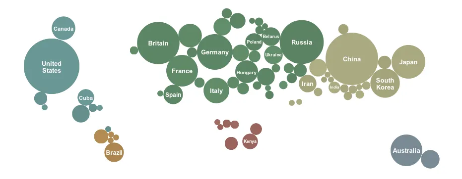
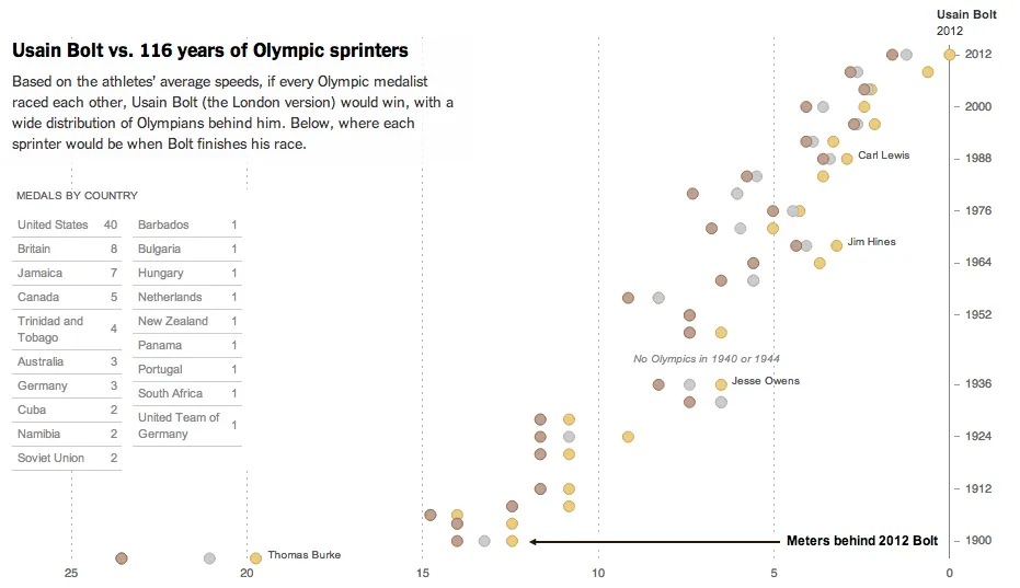
The results from the Olympic Games are a great data source for infographic designers, here are 2 examples from the New York Times: one that I like, and one that I do not like.

The country medal count bubbles is cute but not very useful. It tests the reader’s geography knowledge to figure out what the countries are that have no data label inside them. A simple bar chart will do a much better job, and will leave space for a second bar chart: inhabitants per medal. You would always expect a country with a larger population to produce more medals.

This overview of 100m running medals over the past century is great though. It transforms the basic finish time data into something much more interesting, where on the 100m track would each runner be the moment the 2012 crosses the line. The NYT also created a nice video to analyze the results.

·Delivery

Sugar levels

It takes some skill to time the right amount of energy for your presentation. Presenting after a very heavy lunch will be difficult. Presenting on an empty stomach is the other extreme. I usually eat a granola bar around 30 minutes before I have to go on stage, to make sure that I am all fired up to go with a fresh shot of energy. Granola bars have a good sugar kick, but also provide some substance that is missing in many processed food snacks and candy.

·Keynote

Behind her back?

If you are pitching to a big corporate, it is important to understand how their decision making process works. For example: going behind someone‘back and talk to her superior could back fire.

Big corporates can be big bureaucracies, but not all departments work like this. It could be that the junior team member you just skipped sits next to her boss who is forwarding the email she just received from you straight back at her. They do exist inside big corporates, proper functioning teams with an open work culture.

Some people who are very high up in the corporate hierarchy might actually not have that much decision power. It depends on the type of business. For example, someone can be global marketing manager of a big soft drinks brand, and have a lot of responsibilities. However, it could be that most tactical decisions are actually taken at the country level, in the local subsidiaries in wich the parent holds a minority stake. In short, understand how your big corporate target works before planning your pitch strategy.

·Concepts

Torn

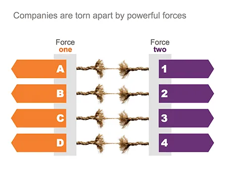
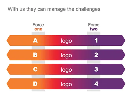
One of my clients is saving companies that are caught between two opposing forces. Here is the visual concept I used that explained the 4 contradictions.

·Keynote

Summer posting schedule

Over the next few weeks posting frequency will drop on the blog as I will be spending more time with my family and less time at the computer. I hope you all have a great summer as well.

Image credit: fridgeirsson

·PowerPoint

PowerPoint 2013 mini review

Everyone can install a preview of the new and upcoming Microsoft Office 2013 free of charge. Follow the process outlined here, and take into account some of the health warnings by Geetesh Bajaj (be especially careful with Outlook). I installed my version on a Parallels virtual PC on my Mac and limited my mini review to PowerPoint.

Probably on purpose, Microsoft made very little changes to the menu structure of PowerPoint. Anyone using PowerPoint 2010 will feel at home immediately. Everything stayed in the same place. The look and feel of Office 2013 has improved a lot: clean lines, fewer gradients, fewer shadows, light fonts. The UI radiates calm and good taste. Almost a bit too calm, as it can be hard sometimes to see the contrast of white slide backgrounds against the background of the design canvas. But overall, very good.

Microsoft has made the 16:9 aspect standard in PowerPoint 2013. This will work well with modern computer monitors, but I am actually not a big fan of designing slides in 16:9. It works great for movies, but for visuals I find a wide screen somewhat limiting. Also, old VGA conference room projection screens have a 4:3 ratio, and more importantly, I do not expect tablet devices to go to a 16:9 screen ratio.

If there is one criticism for Microsoft, it would be the bullet point template: it is still there. You insert a new slide, and the bullets are waiting for you to be filled in. The entire slide master is still the messy collection of bullet point-based slide layouts with big page numbers and dates on every page. Maybe with PowerPoint 2016, this will be eliminated…

Continue reading →