SlideMagic Blog

Frequent updates about all things presentations since 2008. Subscribe to never miss a post.

RSS
·Images

10 points that say it all

One of my clients is one of the finalists in a long RFP process full of long presentations, documents, meetings. After all this information, the client thought it was appropriate to send one last piece of PowerPoint: a simple recap of why they are the best choice in 10 slides.

It was probably one of the most convincing presentations of the entire process. It took very little time to write. It contained much more emotional arguments (we are fun to work with etc.) than all the previous material that was used.

The visual concept I used was designed for on screen reading. I doubled the width of the page to an aspect ratio much wider than 16:9. Reserved the entire left side of the chart for a sentence in huge fonts, and supported that sentence with a very simple picture on the right side. Just 10 pages.

PDF it, email it, and hope for the best.

·Data visualization

Mailchimp online annual report

A few days ago there was Kickstarter, and now Mailchimp has put its annual overview online. I like these blends of web design and presentation design.

From a form perspective, the presentation is clever. Widen and narrow the screen and see what happens, as you make the window narrower, first the infographics move closer to each other, then the design switches from a 2 column to a 1 column layout.

From a content perspective, there is some work to be done. Data is not rounded up and makes it hard to read, and some of the information presentation is not terribly relevant to the viewer (pizzas served). Then, the objective of the site is to show that a lot of stuff is going on at Mailchimp, and with that in mind, they succeeded conveying the message.

P.S.: another cool annual report: Warby Parker(h/t Duarte)

·Images

Aspect ratios and image fills

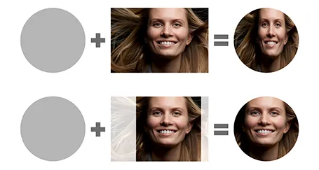
PowerPoint distorts the aspect ratio of images when you use them to fill a shape. To work around the issue, you need to crop the picture in the aspect ratio of your target shape. In the example of the circle below, that is a square.

I use PhotoShop to crop my pictures. You can also use the PowerPoint crop function itself and right-click, save as image.

·Delivery

Crappy VGA projectors

Screens on computers and mobile devices are getting better in 12 month cycles. I design presentations on 2 giant 27" displays that show a lot of detail and reveal the most subtle color shade differences.

Then you put your presentation on a conference room overhead projector that has been sitting there since 2002… The screen resolution is so small that it takes you 5 minutes to find your application windows, and when you finally get to show the slides in presentation mode you will notice that white and light grey is the same color, and that almost black grey is actually bright grey, and that orange means pink.

Test run your designs for the crappy conference room projector.

Flat design

I never liked gradient fills, reflections, and bevels. But recently I am increasingly letting go of drop shadows as well, only using them for objects that really need to pop out. I guess I am influenced by the current trend of flat design in web/UI design.

·Images

Kickstarter presentation

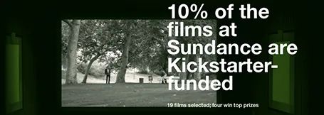
This Kickstarter presentation is a beautiful example of simple visualisations that go beyond PowerPoint slides. It is a series of web pages, with simple typography, well-chosen images that are made uniform in style through a color overlay.

Slide design and web design are converging.

·Images

Open clip art

I am not a fan of 1990s-looking presentations full of childish Microsoft clipart, but this site Open Clip Art can still be useful resource for presentation designers. Firstly, clip art designers are moving into full illustration designs. Secondly, the site is a good place to find icons for your presentation. All material is free to use. As with all user generated content sites, there is no professional reviews before designs get posted, you need to select the poor from the great yourself.

·Data visualization

An infographic that works

Usually, I find infographics too forced, trying to be cute at the expense of being understood. This visualisation of a big organisation over time is an exception. It must have taken some time to construct though…

Via Fast Company Design.

·Data visualization

It does not look scientific!

In some professions people have gotten used to a certain way of communicating. Lawyers use complicated language, medical diagrams look incomprehensible (people want them to look realistic).

Recently, I changed a medical diagram to make it look less realistic, but a lot clearer to explain. I am still convincing the client that it is the right thing to do.

·Investor presentation

Origin of the elevator pitch?

Tom Tunguz claims that this is the origin of the elevator pitch:

The term elevator pitch originates from the very first demonstration of an elevator with a safety brake. At the time, elevators were hazardous, routinely plummeting down shafts when their hoisting ropes fell, destroying their payloads. In 1852, Elisha Otis invented a locking system that would catch and secure plunging elevator. Unable to drive much interest in his innovation, Otis organized a demonstration in New York City. He stood in the elevator as an assistant severed the hoisting ropes and the safety brake engaged. Otis’ innovation paved the way for humans to ride in elevators. Today, the Otis company’s products transport 7B people every three days.

If true, this is a more interesting tale than the story that I thought was the source: finding yourself next to your client CEO going up in the elevator and having 1 minute to sell your idea.