

SlideMagic Blog

Frequent updates about all things presentations since 2008. Subscribe to never miss a post.

RSS
·Colors

Lighten up

It can be tempting to splash on the colours in a slide design, especially if you have a colour palette with 3 or more colours. The result: highly colourful slides that still look very “PowerPoint”.  Why does the work of a professional designer not look like PowerPoint?

The secret: only use colour or highly contrasting greys (dark on a white background, light on a dark background) when you want an object to pop out. Use one base colour frequently, and reserve all the others for accents. Use light shades of grey, rather than filling a big slide object with a very dark grey. Consider using dark grey for your font colour instead of pitch black.

·Delivery

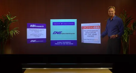
Minority report screen

See this presentation screen by DVE Telepresence (auto-play alert), it allows you to move PowerPoint slide objects in the style of the film Minority Report. What do you think? I am afraid that more sophisticated screen technology will not turn humans into better story tellers.

What would be useful though is to have a technology that allows you to write on a transparent whiteboard in front of an audience where technology takes care of mirroring your writing, so it becomes readable by both you and the audience.

Secondly, having a camera hidden inside a screen is great for creating natural eye contact.

·Investor presentation

Conference vs. investor audience

If a conference audience loves your presentation, it probably means that you are trying to achieve something that resonates with consumers. An investor presentations though, needs more: OK, you checked the consumer box, but is this a profitable business opportunity? Different question, different audience, different presentation slides.

·Investor presentation

Big architecture slides

Almost every presentation by a tech company has a big architecture slide in it, lots of boxes that are connected to the cloud. This slide does not explain what your products are, let alone how these products help solve your customer’s problems. It does show that though that your product is a master piece of engineering. If you want to say the latter, use the big architecture slide, but probably not on page 2.

·Investor presentation

Financial anchors

In financial presentations aimed at financial analysts you need to establish a financial framework, anchor before throwing in North American sales growth, leverage ratios, and the cash flow of last year. While a boring table with a top level profit and loss account and a balance sheet might not be the most exciting charts in the world, it prepares the accountants and bankers among us to digest the information in the slides that are coming.

·Data visualization

Software needs design as well

I see many enterprise software application dashboards that look worse than the worst PowerPoint slides. My clients begin to ask me to give my input on them as well.

  • People have not thought about what information is important, and what is not
  • People have not thought about how to present the information: numbers are not rounded, column, bar, and pie charts are thrown in at random, colours are picked randomly

Consumer applications have gone through a big design revolution over the last couple of years, now is the turn for enterprise software.

·Investor presentation

The year in Kickstarter

Kickstarter has posted its 2013 overview here. What I like about it: done in HTML, adjusts for different screen widths, beautiful typography, and very nice use of video.

However, the opening slides with the stats are actually not that powerful. Rounding up numbers, using a simple data chart here and there, and maybe use maps would have driven the points home much stronger.

Still, it would be good if more people try to find a different format to publish their annual report.

·Design

TL;DR or TB;DR?

Seth Godin notices how - because of information overload - we have stopped reading/absorbing things with the full nuances, referring to “TL;DR”: too long, did not read.

You as a presentation designer need fight against this behaviour as well. Dense boring slides do not get attention, instead people apply their mental models and think they already understand what you are gong to say.

The obvious approach to this is to design visually attractive slides to grab people’s attention. But visually striking images is only half the work. Your story itself need to have interesting and unexpected turning points as well. An unexpected fact, an unexpected contradiction.

People do not really think something is too long: they think something is too boring to read: TB;DR.

·Investor presentation

Explain when different

Your audience has mental models of businesses in their head. For example, if you are raising money for your own new venture capital fund, people expect to see that you only invest in companies with a clear competitive advantage, great management teams with track record, that you as an investor are hands on, that your investment team is great and that the carry is 20%. All venture capital pitch decks sound like that.

If your approach to the business is different than the mental model, you need to explain it carefully upfront, explain the pure mechanics of the situation, before launching into the more emotional part of the presentation (showing how great your team is, and how great the investment opportunity is).

Your different model might be completely obvious to you, it is unlikely to be the case with an audience who hears it for the first time. I you wait for it in the back of the presentation, your audience all of a sudden will be confused (“Wait a minute?”) and the questions/discussions you are going to get in the end are practical ones, not about the great investment opportunity, but how exactly your fund works.

·Keynote

Some people do not mind

I had been discussing three versions of a presentation that uses custom fonts with a client, and every time I started the conversation with the question whether they installed the font. Three times, the answer was: “Not yet”.

I already feel uncomfortable when I see a small line break issue due to font compatibility on a slide. Other people can focus on the content of a slide, and consider fixing the fonts as a small todo at the end of a presentation.