Raising seed money
This is a pretty informative deck about pitching investors for seed money by **Steve Schlafman**a VC at RRE.
Raising Seed Capital from Steve Schlafman
Thank you Paola Bonomo.


Frequent updates about all things presentations since 2008. Subscribe to never miss a post.
This is a pretty informative deck about pitching investors for seed money by **Steve Schlafman**a VC at RRE.
Raising Seed Capital from Steve Schlafman
Thank you Paola Bonomo.
The colour rendering bug in Microsoft PowerPoint 2011 for Mac is highly annoying. Here is fiddly a trick to get around it. You basically need to goal-seek the text colour into something you like.
Save your colour template with 1 accent colour for text, and one accent colour for shapes. In your drop down menu they will look different, on screen they will look the same.
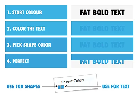
Note 1: I tested the PowerPoint RGB colours as well in Photoshop and Illustrator, and it turns out that PowerPoint renders the shape colours incorrectly, the text is correct.
Note 2: There is a more analytical way to get your desired colour than simply trial and error. You can analyse the RGB codes of the background colour and the text colour. So, set the shape colour to something that you would like. Write down the RGB codes. Colour the text with that colour, and pick its colour with the colour picker. Write down the text RGB codes. Analyse the difference between the two colours and create a third colour by adding/subtracting the R, G, and B differences between the colours. This will be your text colour that renders the same as the desired shape colour. It all sounds more complicated than it is.
When you write a presentation, it can be helpful to have a real person in mind that you need to convince. With real I do not mean the actual sales prospect you are going to pitch to next week, but someone who you know better, personally.
The hard-nosed venture capitalist, the hipster designer, the over-loaded IT manager, the stylish marcom lady, the social media expert, the alpha-male sales director, the super-bright hedge fund manager, the Israeli wheeler-dealer, the geeky startup founder, etc. I have a cast of characters who always travel with me and are always willing to receive a mental pitch.
In a startup pitch try not to define yourself early on through an explicit competitive positioning. Early in the presentation, you can mention how current solutions fall short, and you do something clever to fix that. But only later should you introduce the actual names of the competitors.
Here is an article from the Guardian, discussing how the UK government is thinking of getting rid of Microsoft Office in favour of open source software. The arguments 1) cost saving, 2) making it easier to share documents.
The article highlights an inevitable trend: the reduced importance of Microsoft Office as the standard for enterprise document creation. But I do not think that some open piece of software will replace Microsoft Office. Unfortunately, we will see increased fragmentation of document creation apps that - I think - will convert their output to PDF files for reading on any computing platform (including mobile phones).
I think that the majority of senior managers at the moment use PowerPoint to view presentations that subordinates send to them, but very few actually edit them themselves.
Many hightech investor pitches contain parallels to big success stories (Facebook, Google, Twitter, etc.). Many of these analogies are forced. They do not make the right comparison, and worse, might actually confuse the audience.
There are two ways to use an analogy correctly:
Update: Fred Wilson posted his thoughts on “This for that” investor pitches.
The beauty of a verbal story is that it forces you to stick to one sequential story line. In a direct dialogue you need to weave your big thoughts together on the spot, right there with the instant feedback of the eyes of your audience signalling “Uh oh, I am losing the plot here”.
When writing prose, this clean story line can go missing. You write a sentence, go back, edit it, add a buzzword, put in a tangent/exception, copy and paste the section somewhere else. Soon, the clear, instant, on the spot, story line is gone and replaced by a page out of a business school text book.
In visual slide design something similar happens. You start with an idea for some visual concept, but then things get added (ROI, customers, social engagement) and before you know it you have a diagram that is really useful for you, the designer, as an aide memoir of what your business is all about, but the audience is losing the plot.
When designing a presentation, try to stay as close as possible to that fresh, on the spot, story line with which you started out with. Stick to very basic visual compositions (a trade off, best of both worlds, elimination of a layer) and visualise your story around that. Add distractions and complications later, after the big idea has settled in.
In the search tools in Google Image Search is now an option to filter out images with a Creative Commons, or other usage rights. The details on the GOS blog. Very useful, but still: double check the image rights at the source and do not rely on Google solely. Via Gavin McMahon.
One of my clients has a technology that can save cost for a retail business. They did a pilot implementation at one retailer and have a lot of cost saving data as a result.
You can present this data to other potential clients (sanitised of course) in 2 ways. Approach one is the absolute number: we helped save $x,000 in costs. But this is hard to relate to for other retailers with different types of businesses. Better is to do it relatively: “we shaved 10% of the cost of item x.”, but it is still a bit generic, any startup with a cost saving technology has a sales pitch deck with these types of numbers. A credibility issue here.
Even better is to go into the nitty detail and highlight simple case examples of things that go wrong every day in a retail store, and how the solution helps to prevent it. It shows that you know what you are talking about, and lends instant credibility to your story.
At McKinsey we used to say: retail is detail.
Microsoft PowerPoint 2011 for Mac has an annoying bug: when you apply a colour to a font, it comes out slightly differently than when you apply the exact same colour to a shape. One: it looks bad on slides, two: it gives surprises when you open a PowerPoint file created on a Mac on a Windows machine (which does not have the same issue).
When I posted about this somewhere on a Microsoft forum I got the response that this was done on purpose; to make text readable against a coloured background. This does not make sense, if I want to make the text readable, I will put in a different colour myself, and definitely not the one that Microsoft is using. See below, the letter colour is a completely different type of blue than the background.
(Geek alert). There is a complicated way to get around it. Type some text, change it to the desired colour. Now select the desired text (not the entire sentence) and bold it: the right colour appears… But, as soon as you do anything else to your text box, the wrong colour gets put in. Annoying…