

SlideMagic Blog

Frequent updates about all things presentations since 2008. Subscribe to never miss a post.

RSS
·PowerPoint

Hidden megabytes

PowerPoint files can be very large, especially if you use high resolution images, or even videos. In the near future, all of us will have moved to a cloud-based storage solution, where we no longer email actual documents to each other, just a link. In the mean time, we need to try to keep our PowerPoint files below 10MB, the email architecture limit that was invented in the 1990s.

In the format pictures menu of PowerPoint is an option to compress images to save space, I usually go down to 150DPI. After compressing, always check what happened to the images in your presentation, the compression tool can do funny things (ruffle transparency borders, undo re-colouring, etc.)

If your files are still big after compression, or even when you do not use any images at all, have a look in the slide master (view, slide master view). There might be templates for title pages and/or separators there with full-size images. These get saved with the entire presentation. You can delete the template slides if you do not need them.
·Investor presentation

The investment banker

Investment bankers use presentations that are documents for reading, they are even denser than the slides a management consultant typically produces. And whereas a management consultant usually can be convinced easily to change a presentation approach, investment bankers stick to their traditional approach. I have been thinking why this is the case, because I believe that a more visual presentation approach also works in the world of finance. Possible reasons:

  • Finance is a conservative industry, and a different looking presentation might give the impression that you are not serious.
  • Bankers are actually good sales people and do most of their sales pitches verbally, they put up the confusing and dense slide with all the facts, but when you listen to the audio track, the story is quite clear. The slides are for reading after the meeting, the presentation is for listening only
  • Bankers work under very strict time pressure, so there is simply no other practical way than to produce a deck by writing bullet after bullet.
  • Bankers usually do not get very deep in to the strategy of a company (like a management consultant does), a company is a company with sales, growth, margins, PE multiples, and leverage. As a result, the presentation will look more generic.
  • Bankers are used to reading/interpreting financial ratios: a EV/adjusted EBITDA ratio of 6.8 instantly rings a bell. A less financially savvy audience might need more than a bullet point to be impressed by this.

In most of my projects with a conservative investment banker, I try to negotiate a highly visual summary deck that goes in front of the dense appendix. Over time, we iterate the summary deck more and more, and the appendix gets used less.

Continue reading →
·Keynote

"My story is more complicated"

A client told me the other day that she had seen many of my presentations, and thought they were really good, but all very simple. Her story would for sure be more complicated… It made me smile.

·Keynote

The joy of tables

Tables in PowerPoint are a great basis to set up a slide in PowerPoint. Everything is instantly lined up in a grid, it is easy to add and remove boxes (lines). I often use tables with a very light grey fill and fat white lines.

·Keynote

OS X - Windows compatibility

Now that the installed base of Macs is growing, especially outside the large enterprises, you need to take into account that your PowerPoint presentation is likely to be opened on both machines.

There are obvious differences to be aware of. The key one is fonts: there is a large set of fonts that are available on both operating systems, but very obvious ones are not always part of the overlap (Helvetica for example is not available on a standard Windwos machine, and Calibri gets only installed on a Mac once the user buys Microsoft Office).

But here are the less obvious ones. Even if you stick to standard fonts, there are still tiny differences in how both operating systems insert line breaks. Watch out especially for tight text in boxes.

Also, there is an annoying difference in the way PowerPoint for Mac colors text and shapes. You pick the same colour for both, but they look different. A design can look perfect on a Windows machine, but off on a Mac.

There is no quick solution to all of this. Installing a second virtual machine on your computer might be a bit overkill. I guess there is no alternative but to ask a friend or the recipient of the presentation to send back a quick PDF file to double check, especially for important presentations that will be presented on screen (as opposed to a document meant for reading).

2013 graphs of the year

With the food for thought in the 2013 graphs of the year on Wonkblog I take the opportunity to wish you all the very best for 2014!

·Creativity

From memory

I realised that I hardly look back at my notes from a briefing meeting when designing a presentation. The big story is designed from memory, only for facts I need to revert to my scribbles.

I guess that your brain gets used to recording stories when you design presentations for a living. When I listen to someone (more important than seeing an existing presentation) I record the information by creating a story flow in my head that is more memorable than scribbles on paper.

·Gadgets

Designing on a MacBook Pro

After a second hard disk crash (long live Dropbox) I decided to write off my 17" MacBook Pro, and upgrade to the new 15" one with a retina display.

Buying a new computer used to generate the same level of excitement people experience when upgrading their mobile phones today. Used to, because buying a new computer now mainly is buying a new utility. Re-install your apps, sync Dropbox, and things are pretty much business as usual (albeit a bit faster).

This 15" retina display though slowly lured me into something I have not done in years: sit in a sofa and do serious design work. The amount of screen my laptop covers is tiny compared to my Thunderbolt screen (you see this when dragging a laptop window across), but the incredible pixel density makes the whole experience wonderful.

·Images

But it is the same image?

Sometimes I get this question when using the same image multiple times in a presentation. I re-use it on purpose (not to save stock image costs, or for lack of inspiration). Throughout the presentation, an image can become a brand, or a logo, for a complex idea. Putting up the image again (either in full size, or a smaller icon) communicates that complex idea in a nano second.

·Concepts

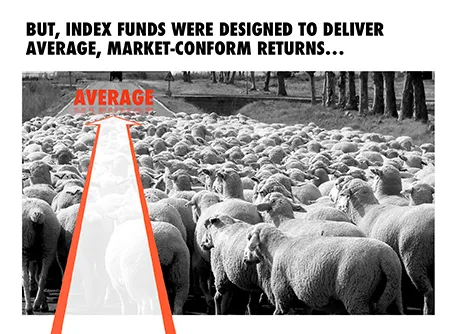
On the way to average

I designed the chart below for a sales presentation for an asset manager who is about to go on a roadshow to pitch a new investment fund to potential distribution partners. Yes, you saw that right, I did use a reflection effect.