

SlideMagic Blog

Frequent updates about all things presentations since 2008. Subscribe to never miss a post.

RSS
·Layout

Squarespace versus wix

There are two popular web site template providers: squarespace and wix. I like to think of presentation design software SlideMagic as “squarespace for presentations”. Many other PowerPoint alternatives (such as prezi) are “wix for presentations”. What is the difference?

  • Wix offers a lot of features, colours, fonts, pre-programmed templates for specific sectors (vets and pets for example)
  • Squarespace is muted, has far fewer choices, fewer colours, bells & whistles.

The great thing is that the design restrictions of squarespace actually result in better web designs. People have to think how (whether) to put that content on the page. A professional designer will pick a style and restrict herself to stay in that framework. That is why it looks so good. The layman designer cannot resist to add more stuff. Squarespace and SlideMagic protect the non-designer from herself.

P.S. Squarespace powers the SlideMagic landing pages and blog.

Art: The Stadhuis under construction, by Johannes Lingelbach, 1656 Subscribe to this blog, follow me on Twitter
·Story

You cannot force creativity

I tend to work on presentation design projects in bursts: dive in, get stuck, put it away, work on another project, get back to it, put it away again.

Even when you stop working on something consciously, your subconscious mind continues to chew on things. This article discusses recent research that proves that the subconscious brain can solve real problems.

There is another benefit of this delayed approach. When you get back into things some details of the story have faded to the background a bit. It is this “numb” state of mind that is useful to piece together the story that really matters, you have to explain it to yourself again and it might come out clearer without the distraction of these details. In addition, other details might come to the forefront which you thoughts were not important.

All of this explains why presentations that are created at 3AM at night before the 9AM meeting are not very creative (most management consulting projects). It also explains why an outsider or senior executive/partner can walk into a room and articulate a story much better in 3 minutes than an entire team who has been working on it 24/7 for the past 3 months. It not all experience, it is also being able to take some distance from the subject.

What to do? Start thinking early about the presentation of your results. The problem of how to communicate your project, is a different one from the problem that your project solved (read that sentence again). While you still might end up finishing your presentation at 3AM, if you started early enough to think about it, your presentation will be much more effective.

Continue reading →
·Investor presentation

Should you work for free?

I design a lot of investor presentations (hey, Google views me as the #1 investor presentation designer!), including pitches for startups. And companies that need to talk to investors are by definition short of budget. Many startups ask me whether I consider working for a delayed fee. Usually, I say “no” and that sounds harsh to a boot strapping startup. Here is a ruthless profit seeker trying to extract money from a small, fragile, company that could do amazing things for the world.

Here are some points to remember, and I invite all freelancers to use them where appropriate:

  • Deferred payment is real money. Yes, you are not selling a physical product (nobody would walk into a car showroom and have the guts to ask for free vehicles with payment after the next fund raising round, if it happens), you sell time. But there is a real opportunity cost to working on one project: you cannot work at the same time for a client who does pay cash.
  • Deferred payment is your own money. Most startups have some sort of funding, which means that they benefit from OPM (other people’s money). Freelancers cannot. It is their own cash. (In my case where I am funding SlideMagic from own personal savings this argument is especially true).
  • Startups do not equal charity. Startups want to become a commercial success. Doing pro bono work fore a cause you belief in does not equal providing free work to a company that is raising money.
  • Success fees have to be so large that no startup will pay them. Venture capitalists require that their investments need to return 3, 5, 10 times their money. And VCs invest in a stage of a company where at least one risk has been eliminated: funding risk. The designer working on an investor presentation comes in before that, which would merit an even higher return. No startup has agreed to pay 10x the price of a regular project.
  • The carrot, we will generate lots of work for you in the future does work for a big company that needs to feed a big fixed cost infrastructure. A successful freelancer will have no problem filling her work pipeline with other clients.
  • This startup is not the only one. I get these type of requests every week. If I would say yes, I could spend 120% of my time working on a deferred payment basis. Why should I say “yes” to this startup and turn down the other 10?
Continue reading →

One story

There are two ways that a presentation that originally had one story can get diluted with a second one.

  • Old slides are not replaced. As soon as you say, “this is an old slide, I still like to use it, but now things are a bit different, let me explain”. It is time to chuck it and design a slide that does represent what you want to say
  • Not deciding on a clear story/audience. Most startups do not have a clear market positioning yet. It can be this, it can be that. This doubt gets reflected in the slides. The result a confusing story with 2 messages that are diluted. Best solution: pick one. Second best option: explain the basic idea and/or underlying platform, and tell 2 stories one after the other and be honest about the fact that you have not decided yet.

Art: Painting of Dazzle-ships in Drydock at Liverpool, by Edward Wadsworth, 1919 Subcribe to this blog, follow me on Twitter

·Sales presentation

Benefits versus features: the cart before the horse?

Benefits of enterprise high tech products are usually pretty similar: you save cost, time, increase productivity, security, scalability, flexibility. Starting your presentation with these benefits will not really make them stick. Everyone is saying exactly the same thing on their page 1 of the their presentation.

You have to reveal a bit of what it is you do before plunging into the benefits. “We automate all manual processes in order picking”. Right, now I can see where all these benefits come from and tell me how big they are.

In business and marketing seminars we are always told to talk benefits, not features. Talking product gets you boxed in as too detailed, too middle management, too engineering, too much missing the big picture.

I disagree, people who have a story with real substance have an edge here. There is too much hollow marketing speak out there.

Art: Edgar Degas, Aux courses en province (At the Races in the Country) c. 1872; Museum of Fine Arts, Boston  Subscribe to this blog, follow me on Twitter

·Story

Convincing the center

Here in Israel the election campaign is in full swing with mud slinging and charged advertising campaigns everywhere. The surprising thing is that very little effort is targeted at convincing the voter at the political centrum, because she will decide the election.

Targeting your existing supporters with messages they already have bought in to will get you lots of likes and support, but will make little impact on new potential voters. Think about those voters that sit on the edge, how can you tip the balance in your favour?

The same is true for almost any presentation. Your followers are already on your side. The haters will never agree. You need to target the ones that have not decided yet.

Art:  Annibale Carracci, The Choice Of Hercules, 1596 Subscribe to this blog, follow me on Twitter

·Software

Rediscovering Evernote

I was an early user of Evernote on a PC (a couple of years ago) and used it to organise bookmarks for reading later. Then I stopped using it for some reason until recently. Not as a bookmarking service, but to organise life across multiple devices. It has specific advantages over bookmarking sites, Dropbox/Box/iCloud/Google Drive, online presentation apps

  • My demo presentations. It is easy to maintain and access a folder with all my demo decks ready and up to date on all my devices. This is the folder that I set to sync/download to my devices so it is available without internet connectivity. I have run pitches on my iPhone to potential clients.
  • On the go note taking. Away from the office it is hard to capture stuff and not lose it. I use the Penultimate hand writing app for iPad that gets synced into Evernote. Evernote itself has notes screen where you can jot down quick thoughts (an idea for a blog post for example). The Evernote scan app (Scannable) is perfect for capturing receipts, doodles, and white boards. It is actually faster to search through hand written notes than typed ones.
  • Screenshots have become a big part of my design workflow. I just can’t be bothered to convert between different image file formats. Skitch, the Evernote screen shot app has a very used cross hair few that the standard Mac function is missing.

I did not get paid a single $ for writing this (unfortunately).

Continue reading →
·SlideMagic

The catch up slide

Here is a concept that you can use in many investor and/or sales pitches for technology:

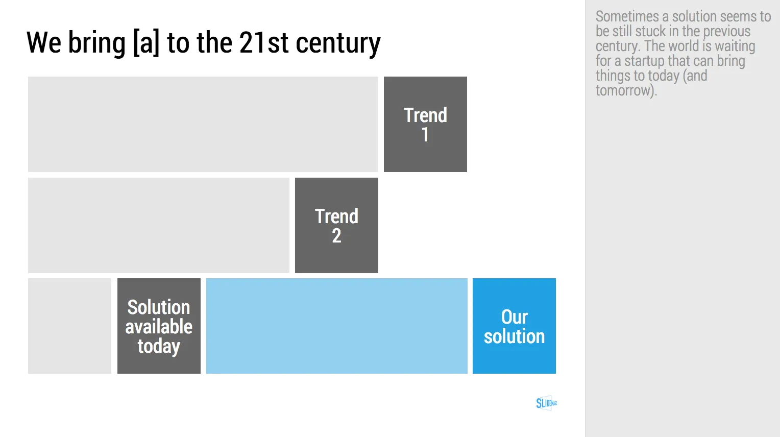
While [a] and [b] have moved on, [c] is still pretty much stuck in the 1950s despite a lot of technological development. Our company is going to fix that.

I have added a slide to the SlideMagic startup pitch template library that reflects this idea, Two “arrows” moving to the right, and a third one which is catching up. Look at the simplicity of the graphics which exactly fits the philosophy of SlideMagic. It looks pretty, it gets the message across, is easy to design. A new business language that does not need arrows, drop shadows, and gradients. It is almost a Lego-like abstractification (is that a word?) of a complex visual.

Art: Le derby d’Epsom, painting by Théodore Géricault, 1821 Subscribe to this blog, follow me on Twitter

·Delivery

Smaller screen, better presentations

There is a nice side effect of people ditching their laptop and carrying a small tablet device instead: presentations get better. But it has nothing to do with technology, it is the setting of the presentation that has changed.

In the absence of a big projector screen or LCD monitor, that small conference room just changed from a mini cinema theater to a discussion table. The attentions is shifting back from the screen to the presenter. The presenter vaguely points at the device and continues “what this chart wants to say is [and out comes the story]”. Only when you have to, the iPad gets passed around the table to show that important piece of data on page 37.

Good stuff until Airplay-enabled projects are hooking up our mobile devices to projectors again.

Art: Roy Lichtenstein, The whole room, 1961 Subscribe to this blog, follow me on Twitter

·SlideMagic

Your requests for SlideMagic templates

I am keen to make the templates in presentation software SlideMagic as useful as possible. Let me know if you have specific requests for templates and/or story flows that I should include. Two conditions for this free presentation design help:

  • You do not get angry with me when I could not find the time to work on your request and prioritised another template
  • The result of your request will be publicly available for everyone to use, so strip it of any specific/confidential information

Send your requests to jan at slidemagic dot com, start with TEMPLATE PLEASE in the subject line.

Art: Henri Matisse, The Open Window, 1905 Subscribe to this blog, follow me on Twitter