SlideMagic Blog

Frequent updates about all things presentations since 2008. Subscribe to never miss a post.

RSS
·Layout

Learning from Swiss graphic designers

Most presentation design software today is the result of someone in the 1980s thinking: “hey, this mouse is cool, you can use it to draw things!”. We can move, drag, stretch, place things freely across our drawing canvas.

Presentation software SlideMagic aims to close this tangent and go back 20 years earlier to the 1960s when graphics designers in Switzerland developed a clean and crisp style of communication and design that does in many cases the exact opposite of the freedom the mouse offers: tight grids, limited font choices, limited colours. simple shapes.

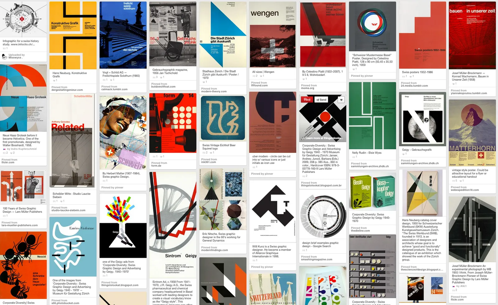
Eyeball the posters on this Pinterest board by Misswyss and see what you can learn form them for your own designs. Which one do you like? Which one does a better job at communicating than others? Why is it that some of these very simple designs look very pretty?

 Examples of posters designed in the Swiss style

Examples of posters designed in the Swiss style

Some of the features they have in common:

  • Limited number of colours
  • Sans serif font (only one)
  • A strict grid alignment throughout the page
  • Relatively small headlines
  • De-emphasising (making things grey) rather than emphasising (making things bold) text
  • Flat shapes, no gradients, drop shadows, textures
  • Big silhouettes, simple shapes

Why not steal some of these ideas in your slide designs?

Art: Albert Anker, The walk to school, 1872, 90 x 150 cm Subscribe to this blog, follow me on Twitter
Working with data charts in SlideMagic

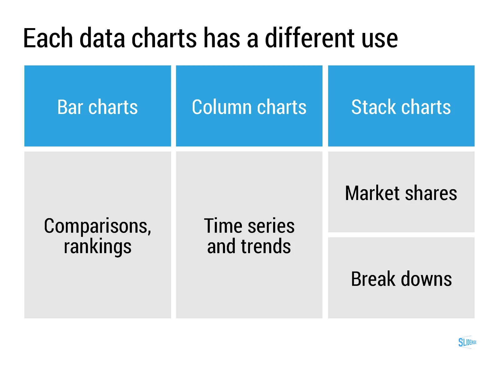
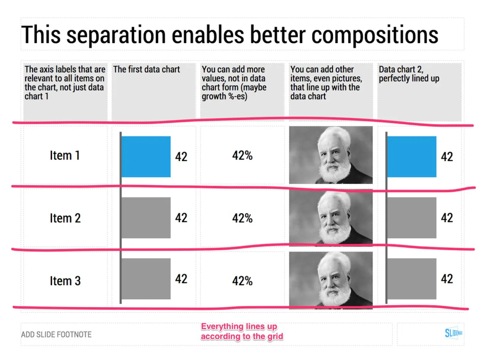
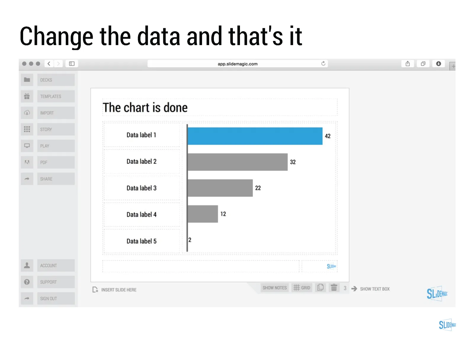
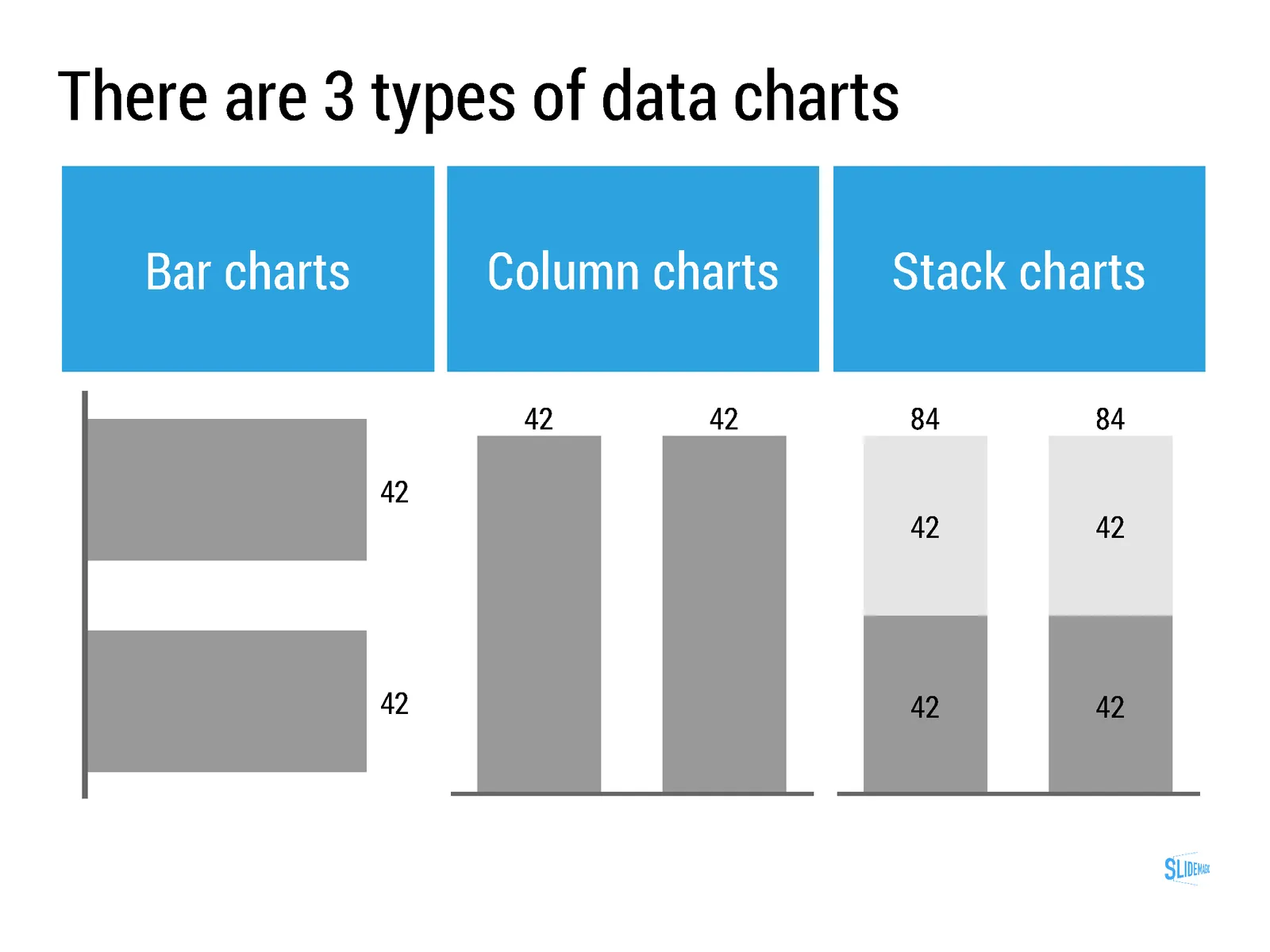
Data charts in SlideMagic work a bit different than in other presentation software:

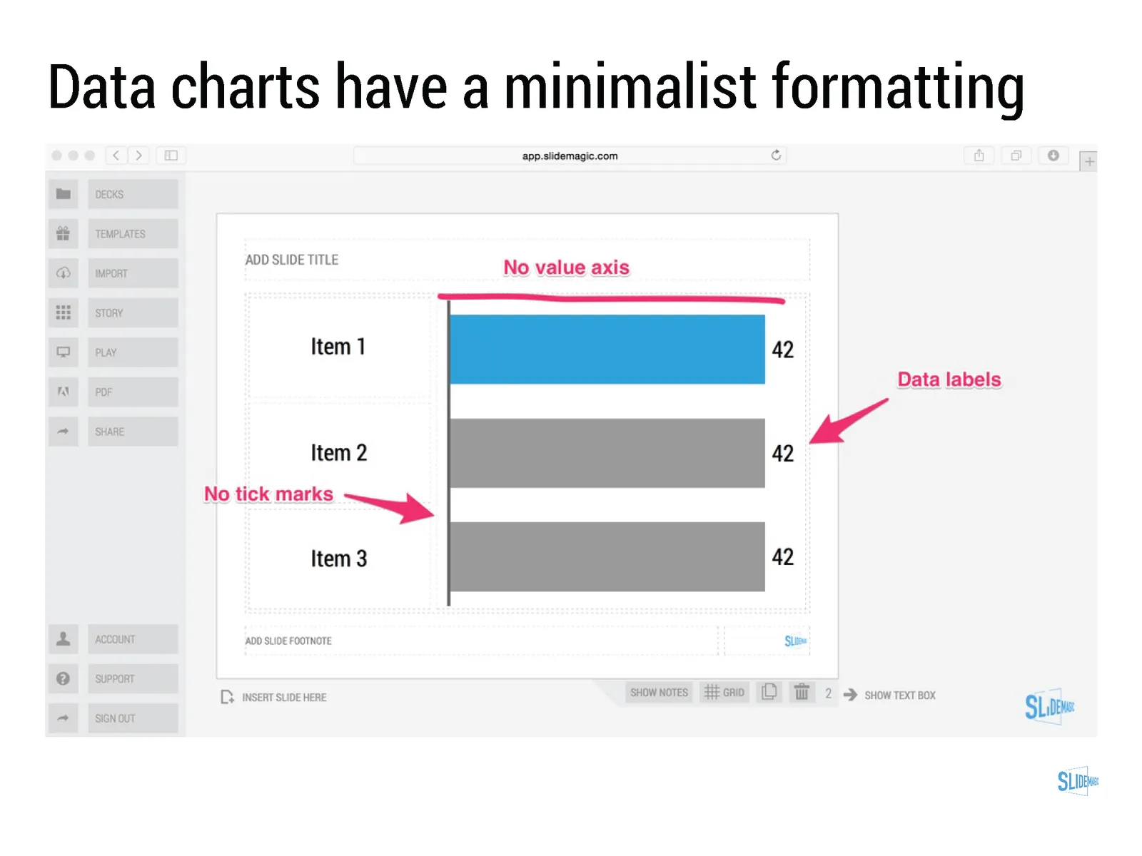
  • Charts come in a beautiful, simple, formatting without the clutter of value (y) axes, tick marks. Charts are automatically adjusted to your own branding (the right colours, the right font).
  • SlideMagic only supports those data charts that I regularly use in my own presentation design project. No pie charts for example (sorry)
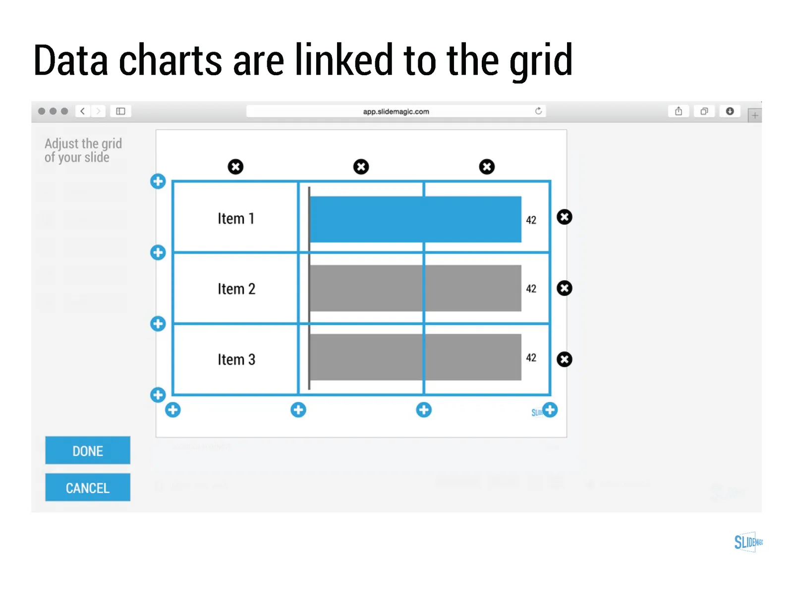
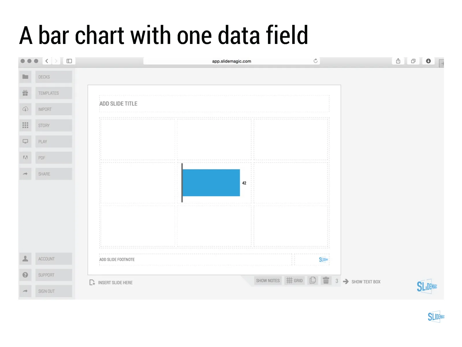
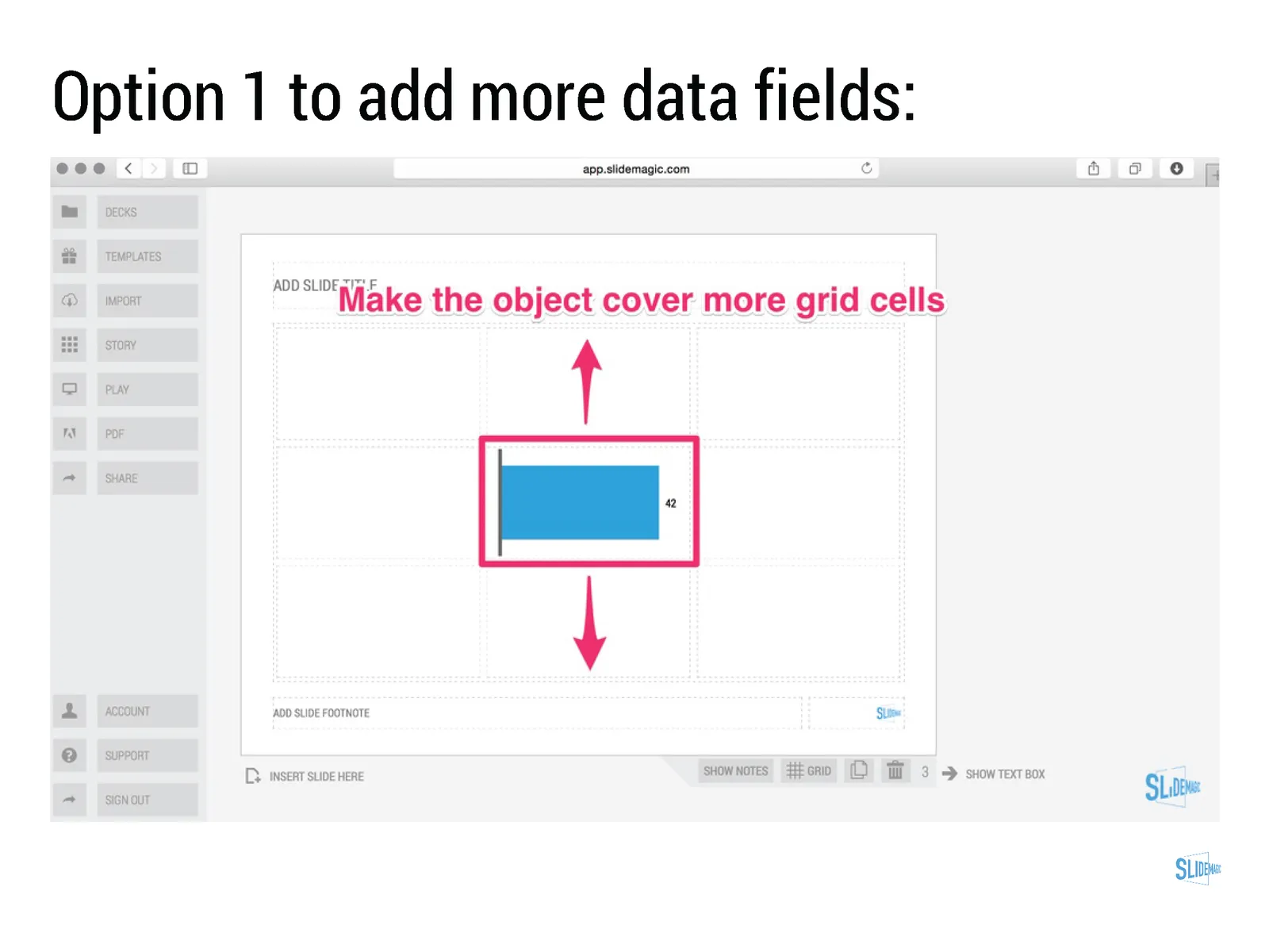
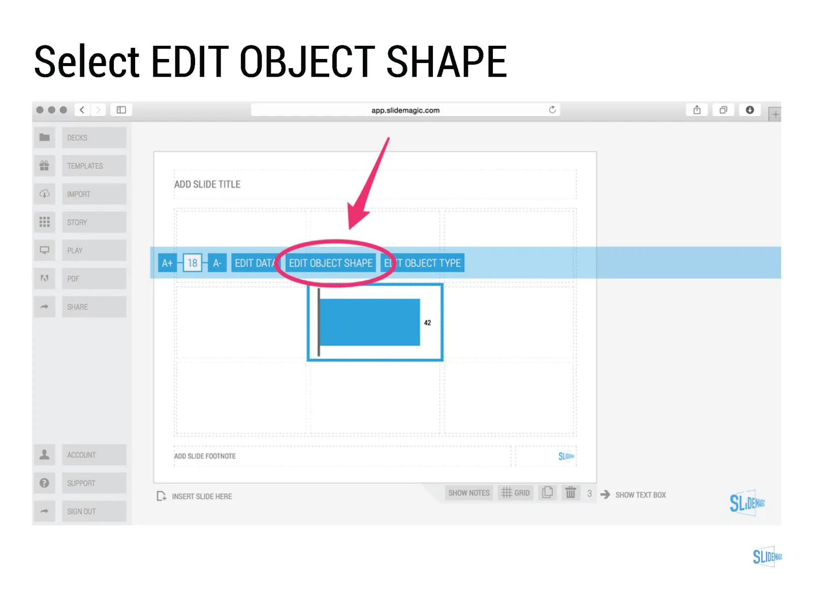
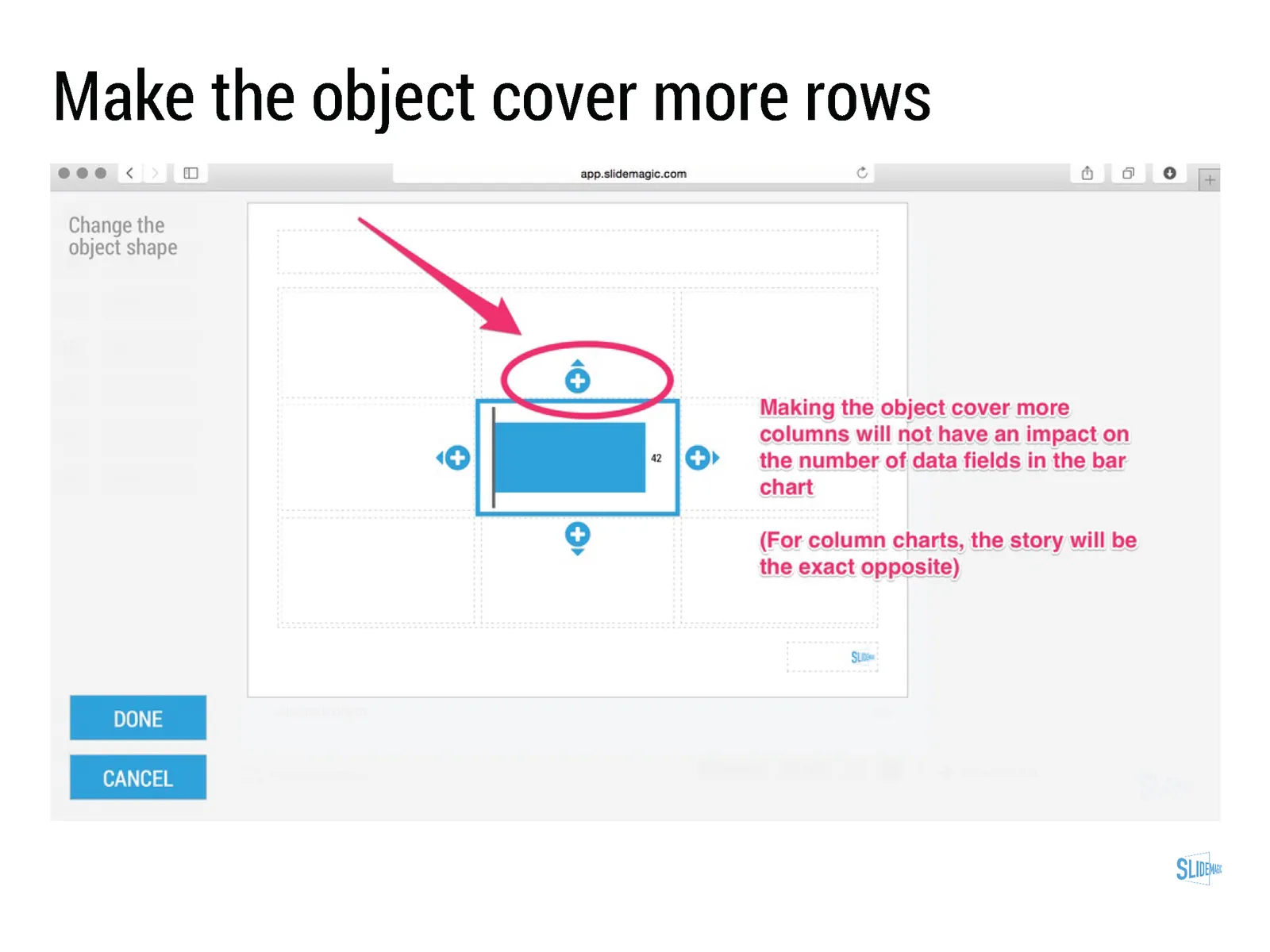
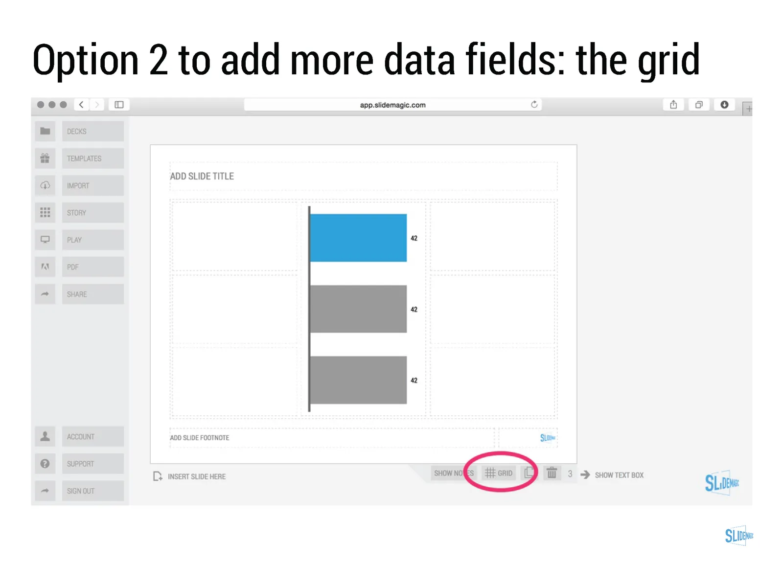
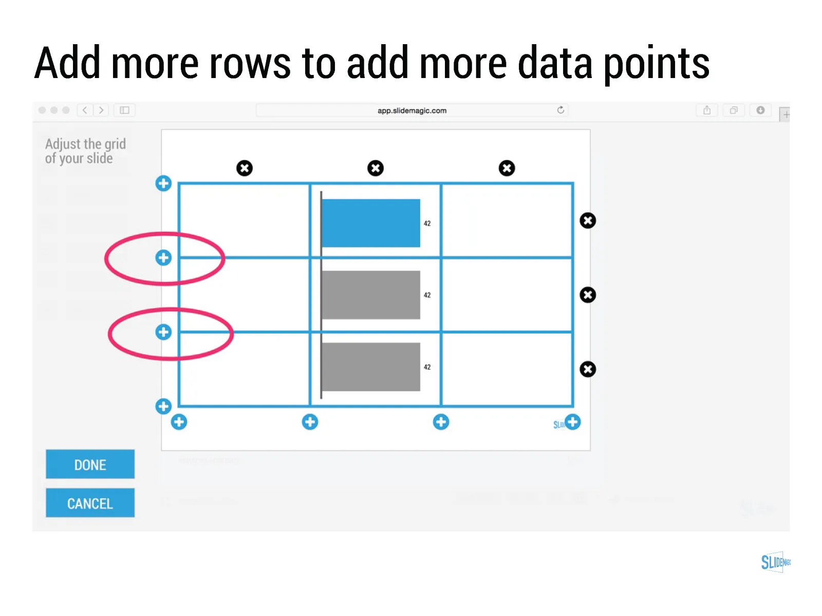
  • Best of all: SlideMagic data charts line up with the grid of the slide. In most business presentations, data charts are part of a broader slide design. There is an extra column on growth percentage bubbles next to the bar chart. There is more than 1 bar chart on a page. In PowerPoint it is very tricky to get these things to line up properly. In SlideMagic, it is not possible, not to line them up

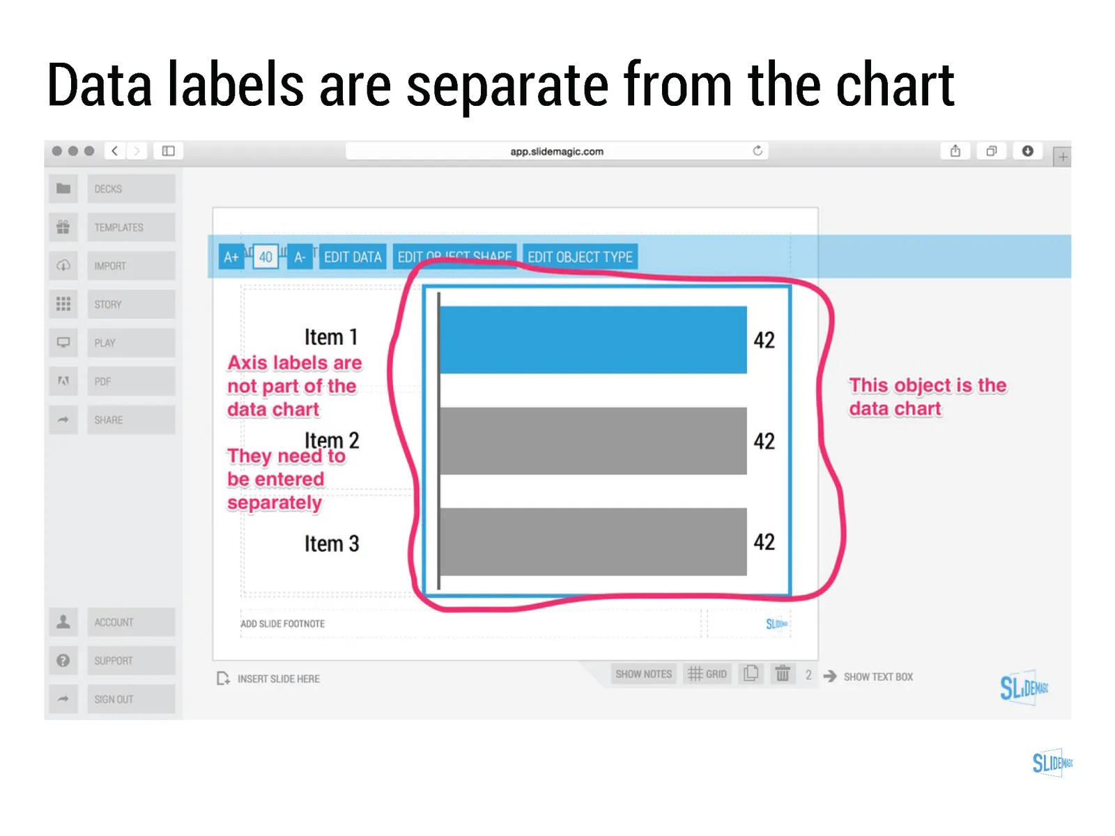
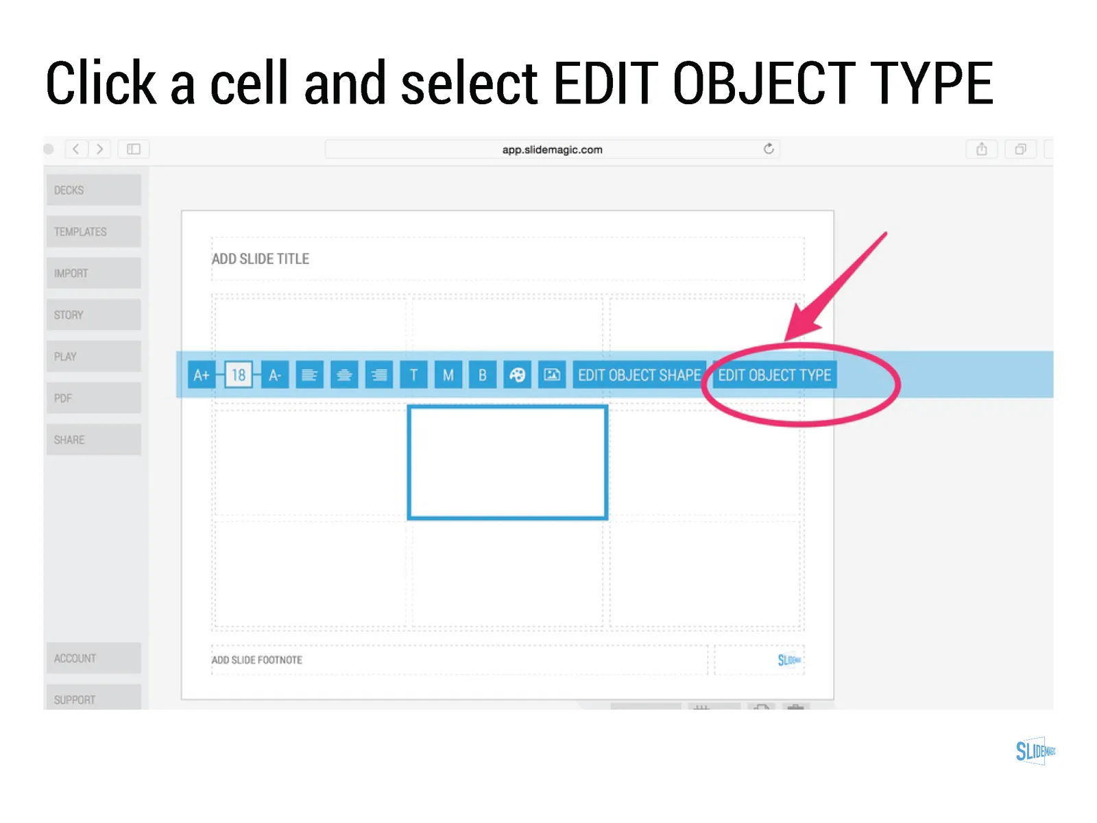
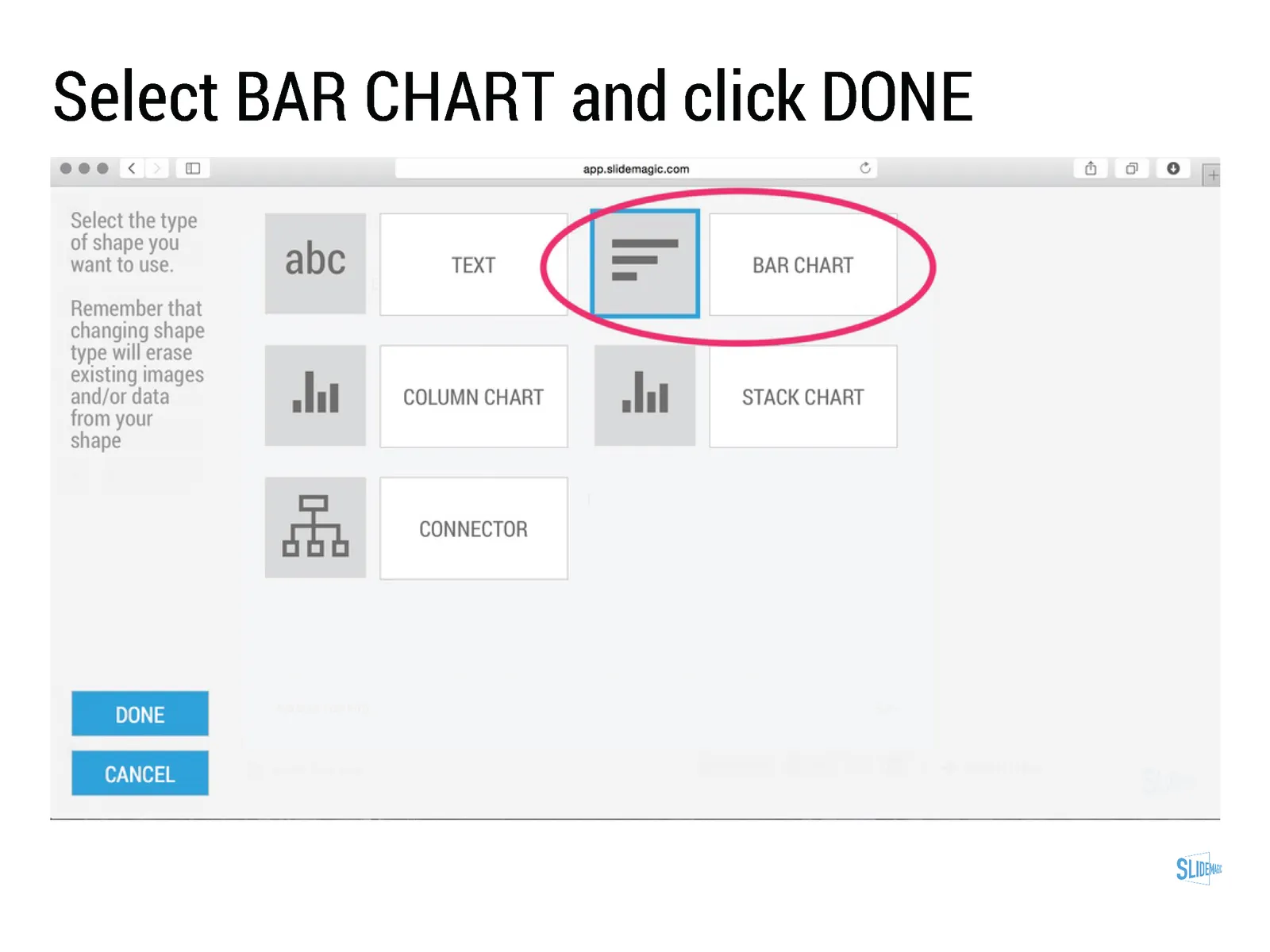
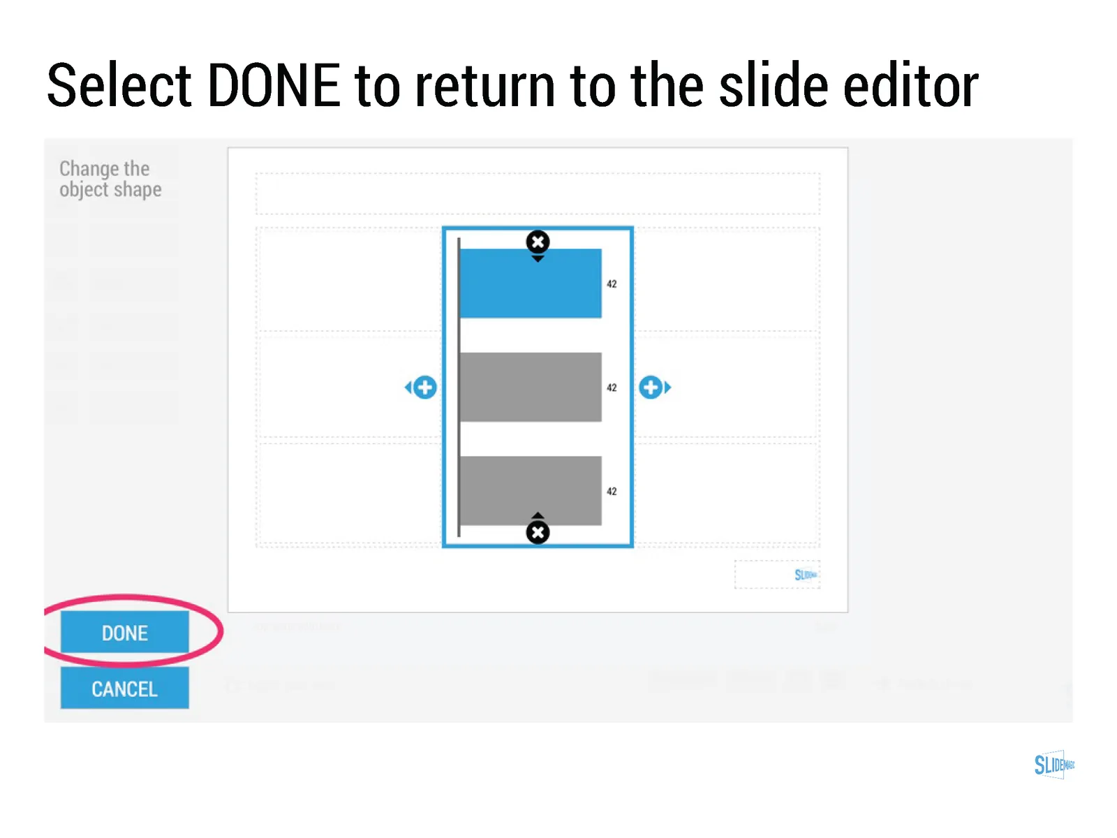
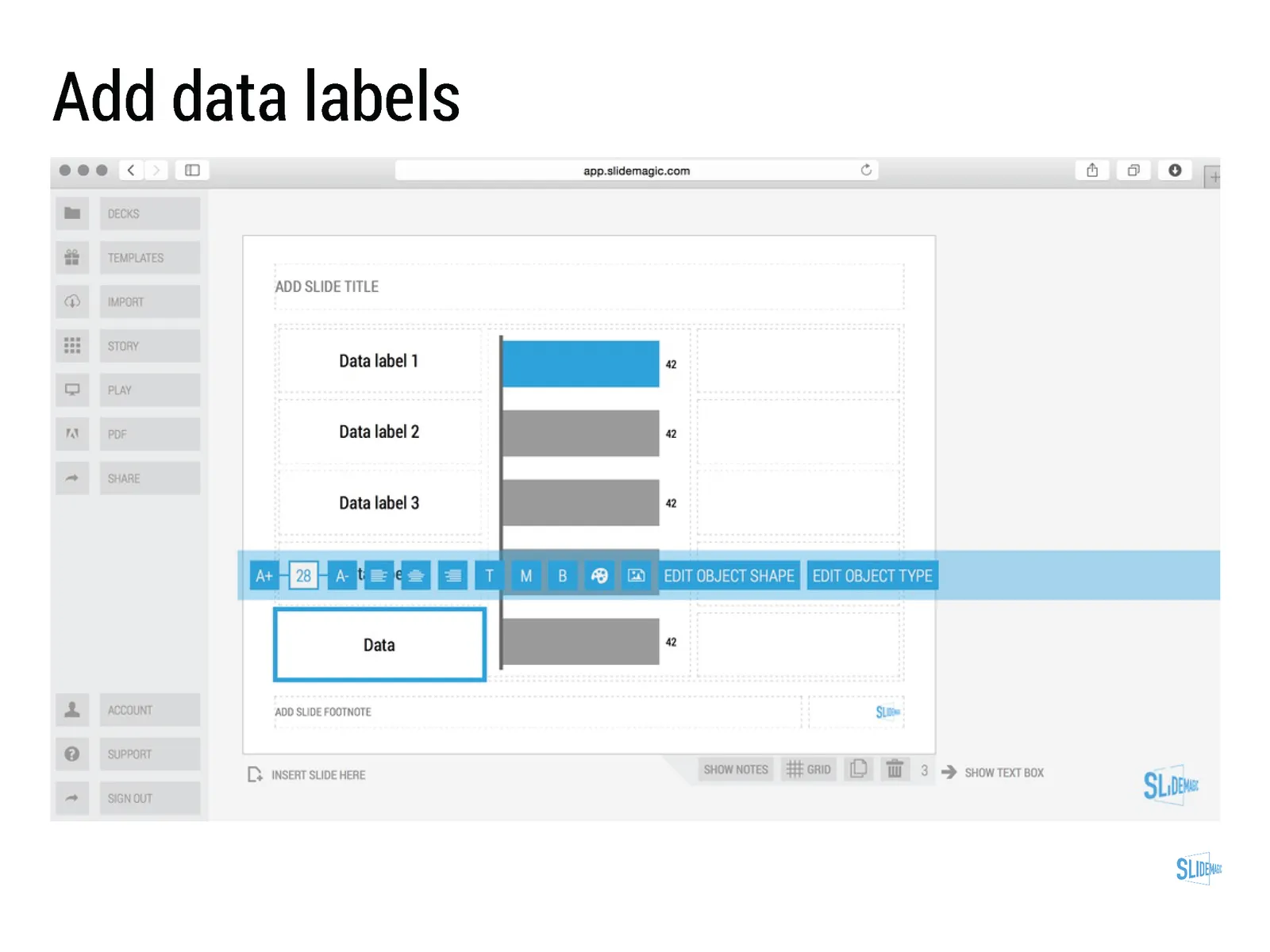
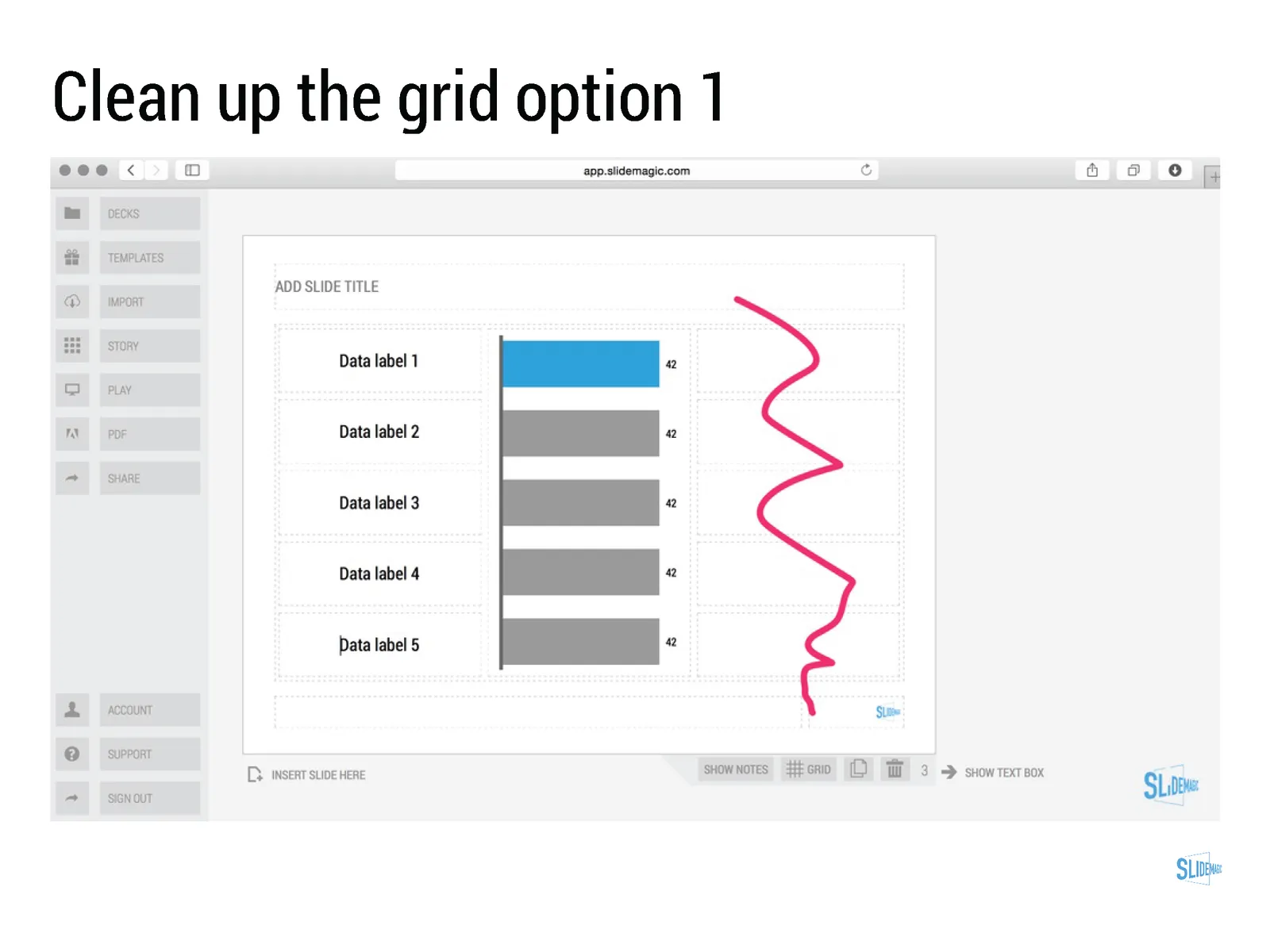
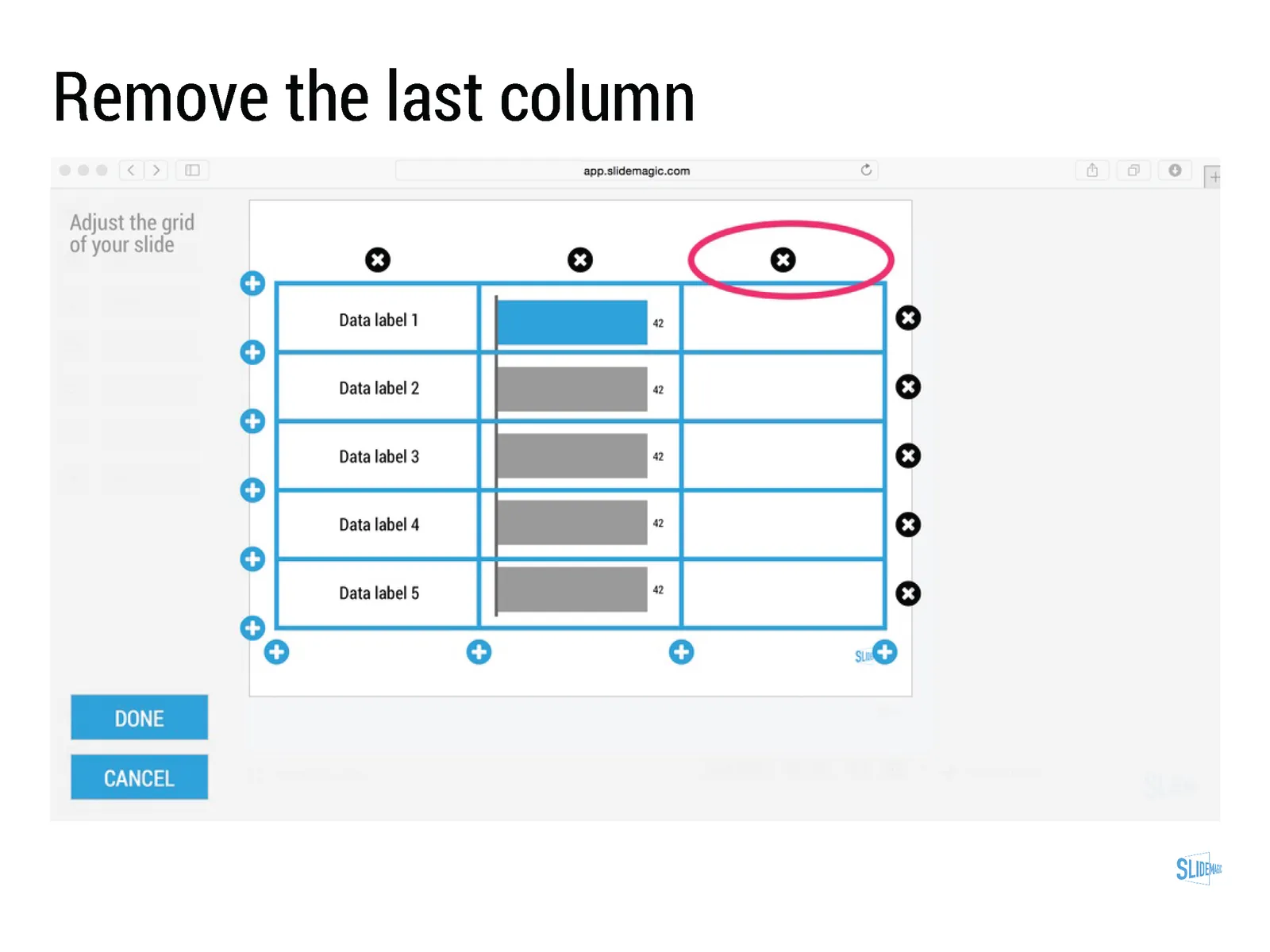
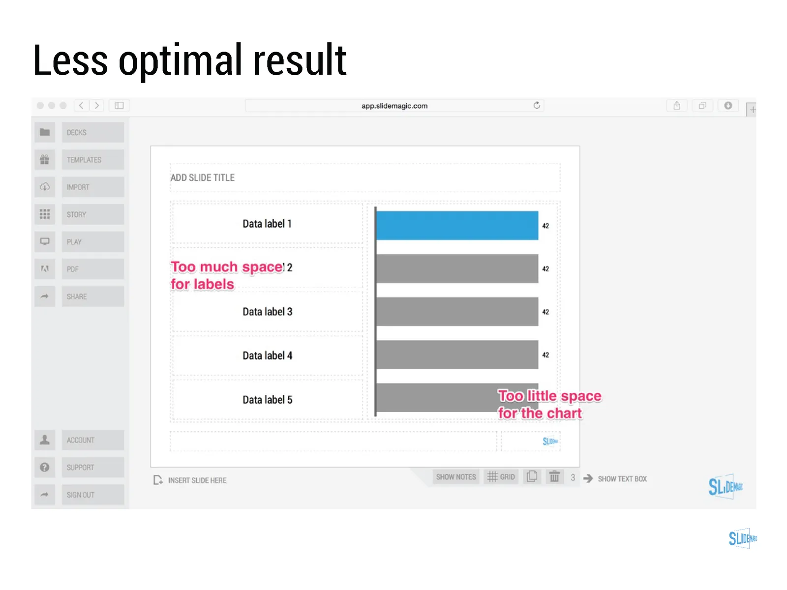
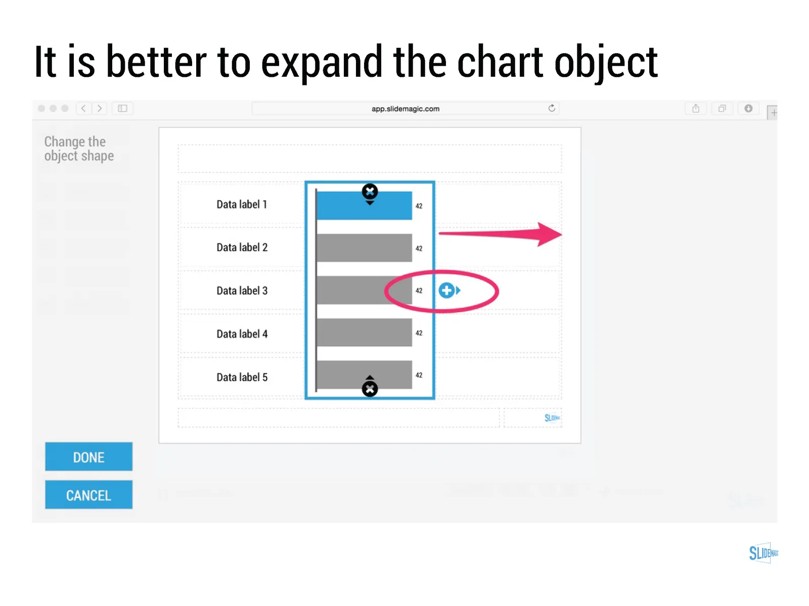
Click through the slide sequence below to get an idea of how you can work with data charts in SlideMagic. Feedback and comments are welcome (comment below, or email me at support @ slidemagic dot com).

Art: Melencolia I. Print by Albrecht Dürer, 1514 Subscribe to this blog, follow me on Twitter
·Delivery

Alcohol against stage fright?

The supply of liquor in this tweet below probably was more symbolic than functional, but I have heard other stories about people getting offered a drink back stage before appearing in a major TV broadcast.

A bit of alcohol relaxes nervousness, but it is actually not the sort of relaxing you want on stage. You need to be sharp and switched on to remember your story and react to audience feedback. Some other things you can do to deal with nervousness:

  • Know your story inside out, rehearse, rehearse, rehearse. Seth Godin suggests that you can even start with dogs as your risk free audience. Work especially hard on the opening of your presentation, since these are the most difficult moments. Once you are on a roll, the rest will follow much easier.
  • Remember that everyone (including the pros) is a little nervous before going on stage, remember that a bit of nervousness gives you the right alertness to deliver a good performance (alcohol does the opposite), remember that the audience wants you to succeed there, remember that for most people stage fright is like that first chill when jumping into a pool, it is over in 2 seconds once you get going.

Art: Edgar Degas, L’Absynthe, 1876 Subscribe to this blog, follow me on Twitter
·Investor presentation

Investors, it is your track record

Many of my clients are venture capitalists themselves who need to go out and raise money from big pension funds or wealthy individuals.

There are usually two big components in their own investor presentations:

  1. The concept of the fund (where/what/how much it invests)
  2. The investor track record of the team.

Investors tend to spend a lot of time on number 1, but the thing that really matters is number 2. Unfortunately, most investors cannot say that they were seed investors in Facebook, Google, Twitter, and Uber. So the challenge of the presentation is to convince institutional investors that you can be trusted with their money.

Art: Theodor Rombouts, The Cardplayers

Click here to subscribe to this blog

·SlideMagic

Working with templates in SlideMagic

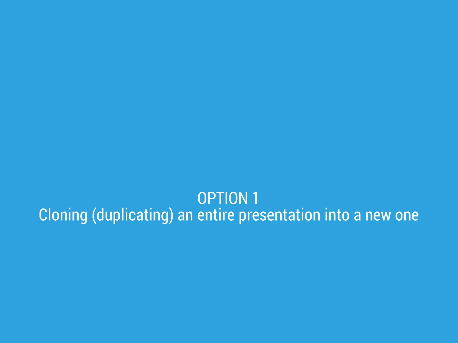
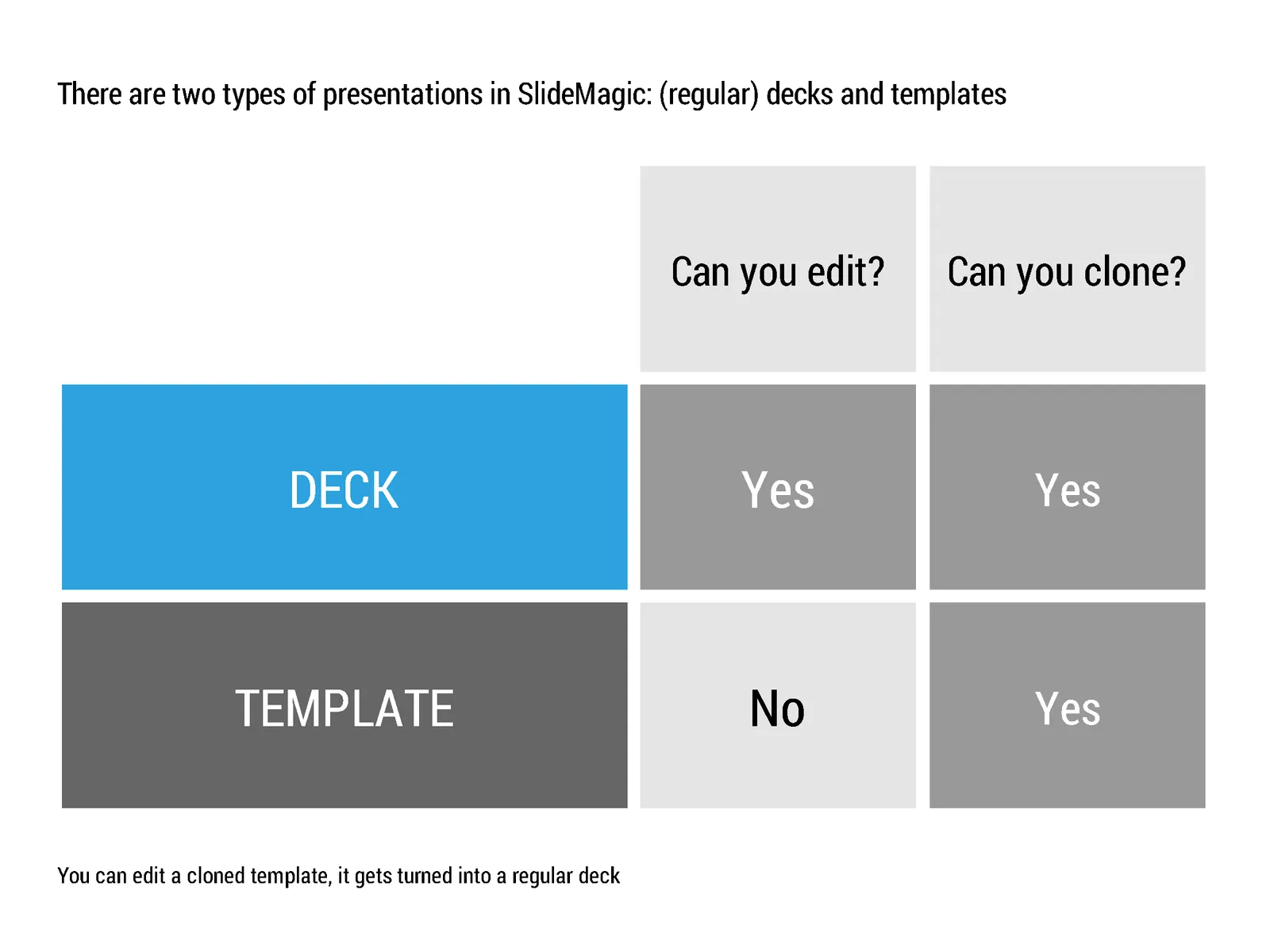
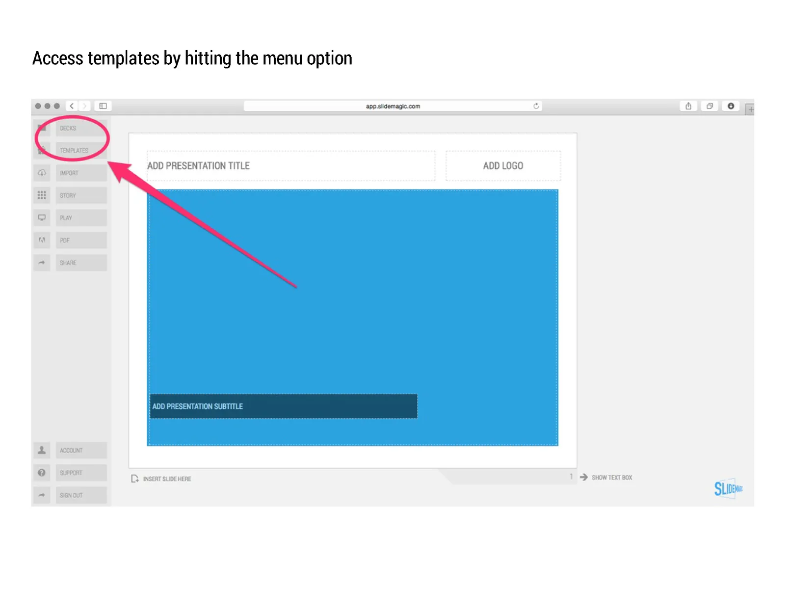
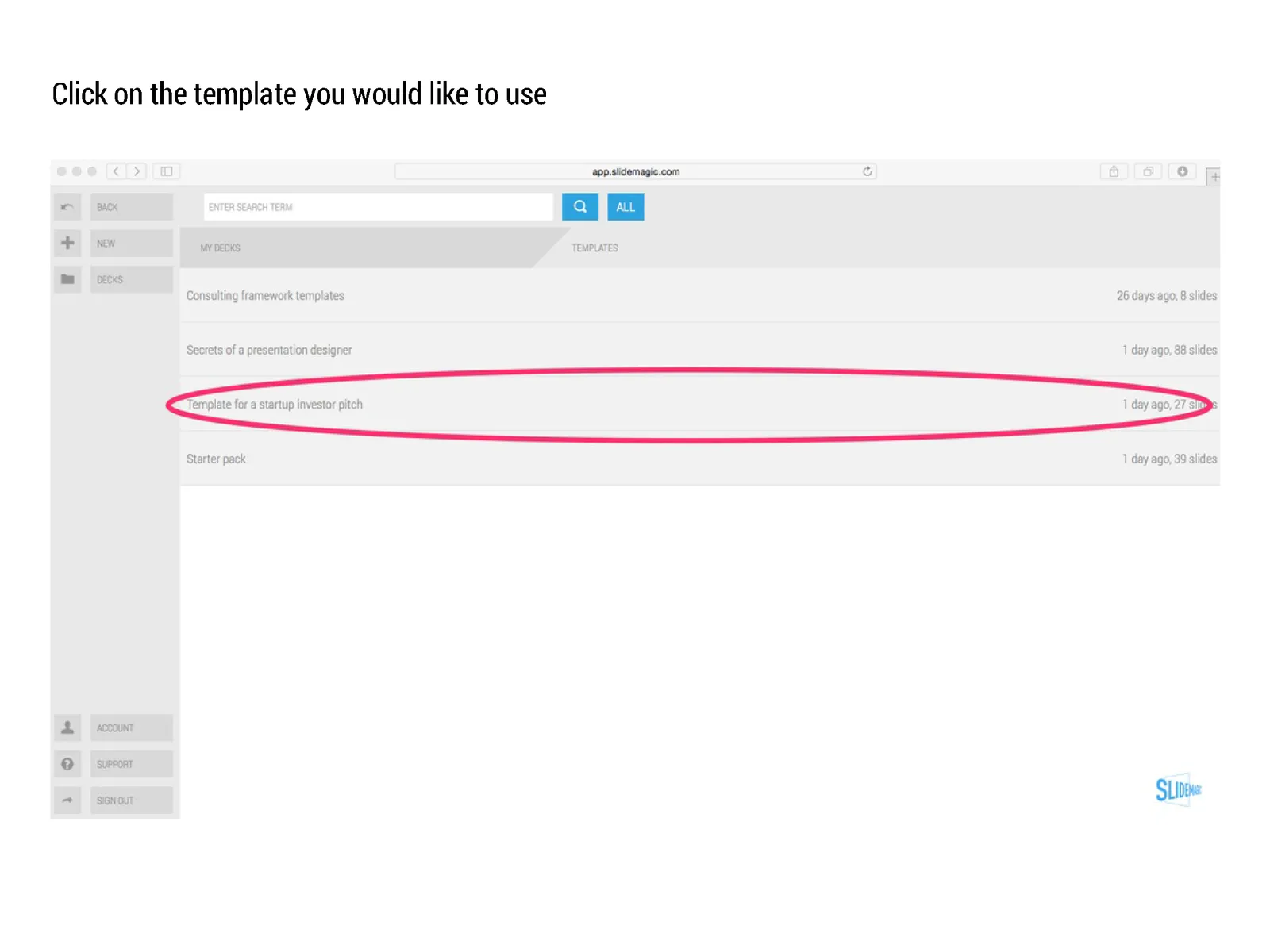
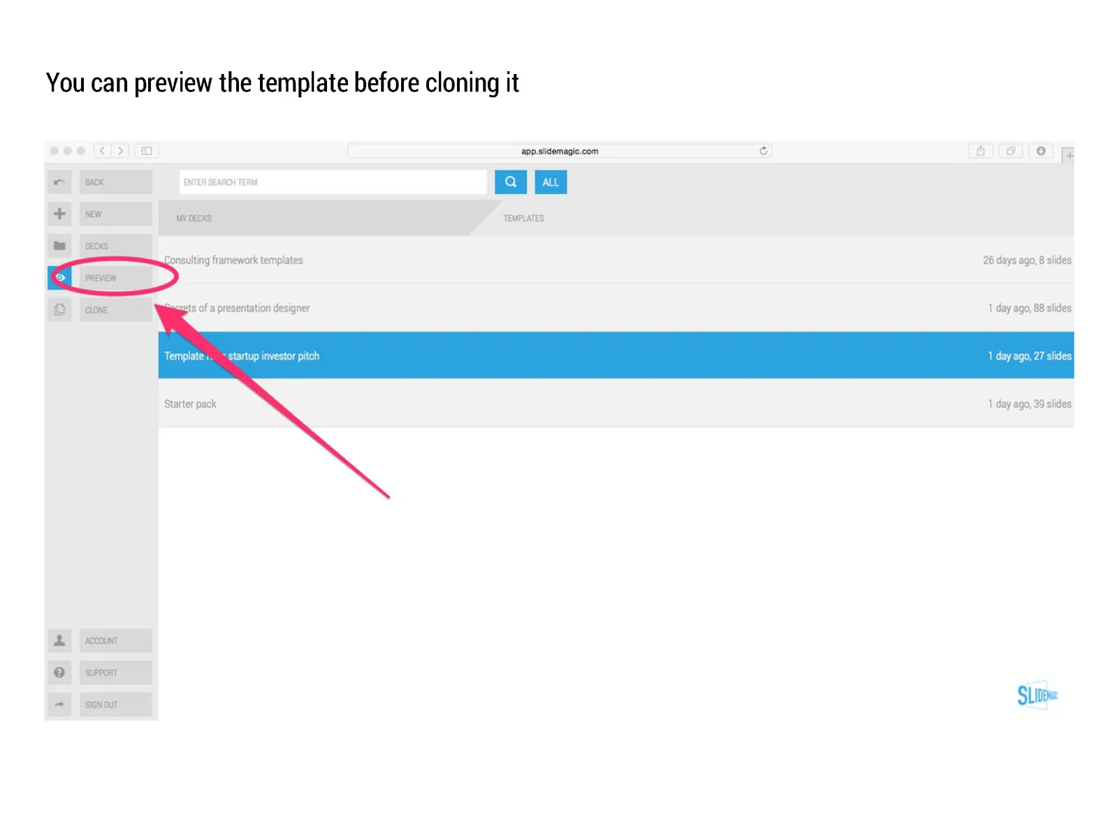
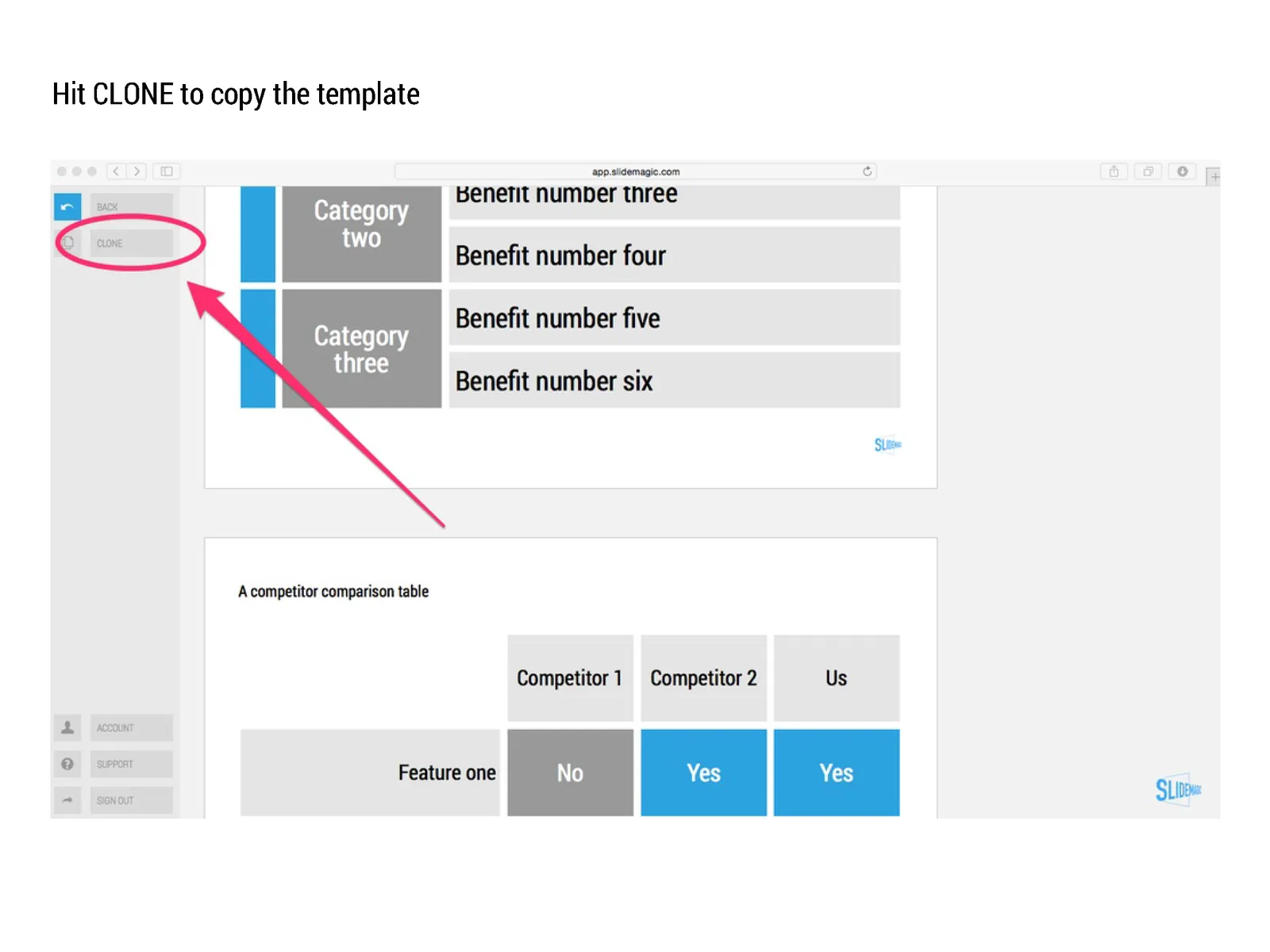
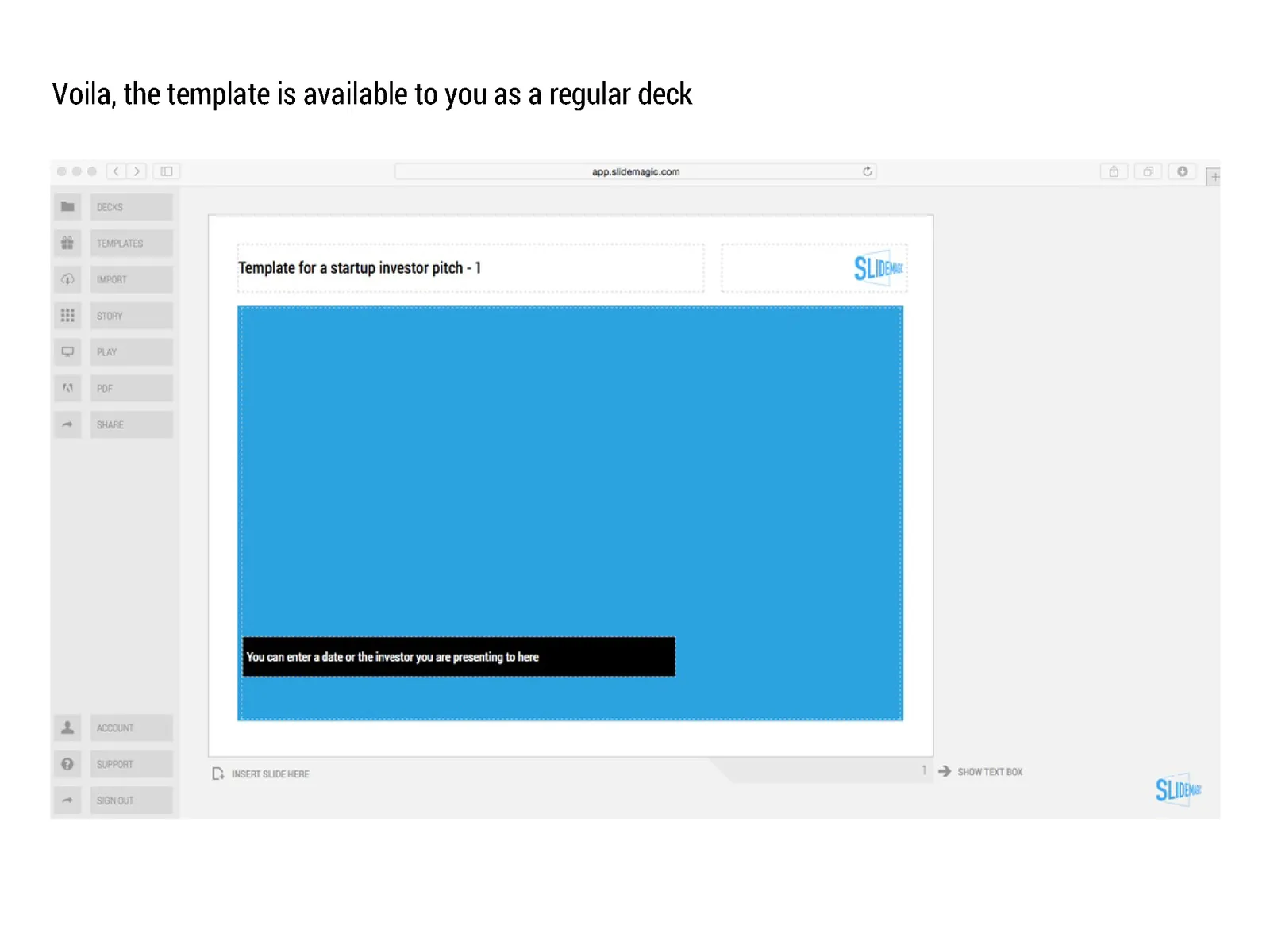
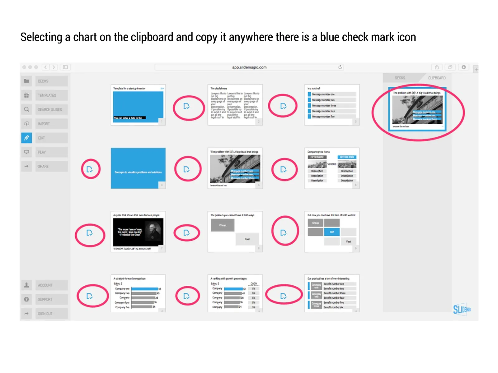
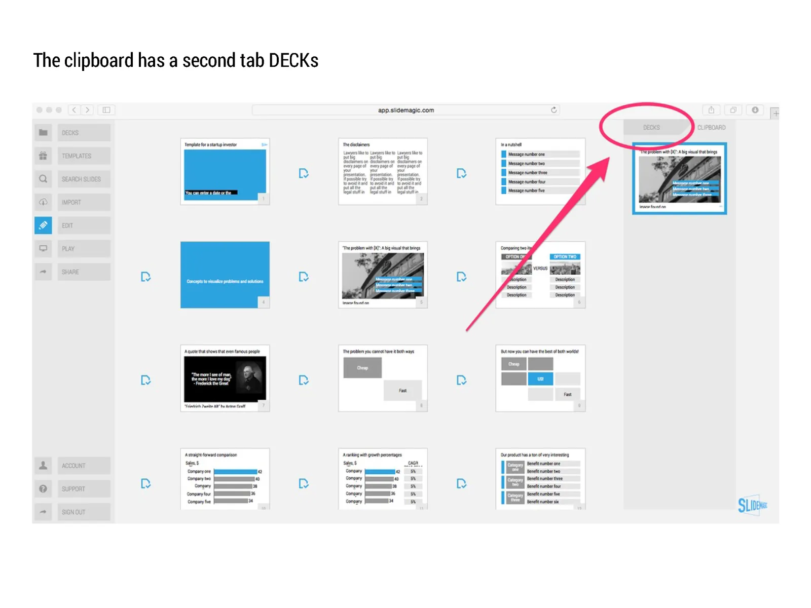
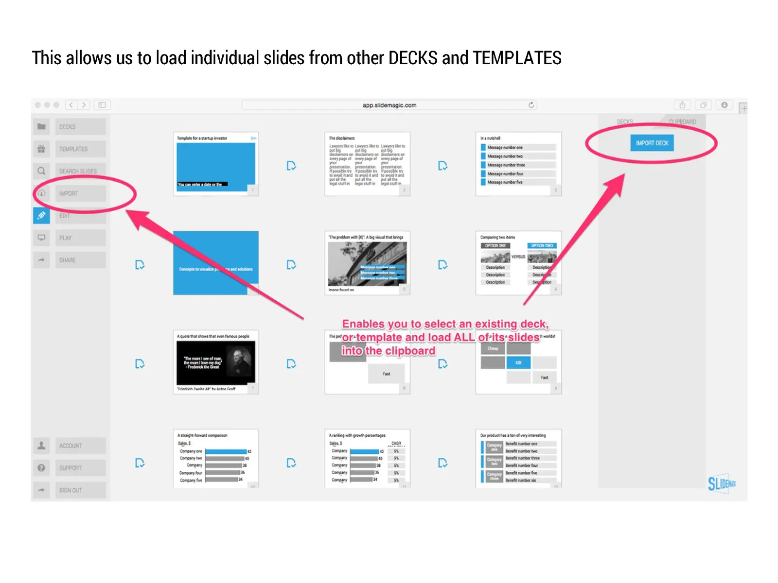
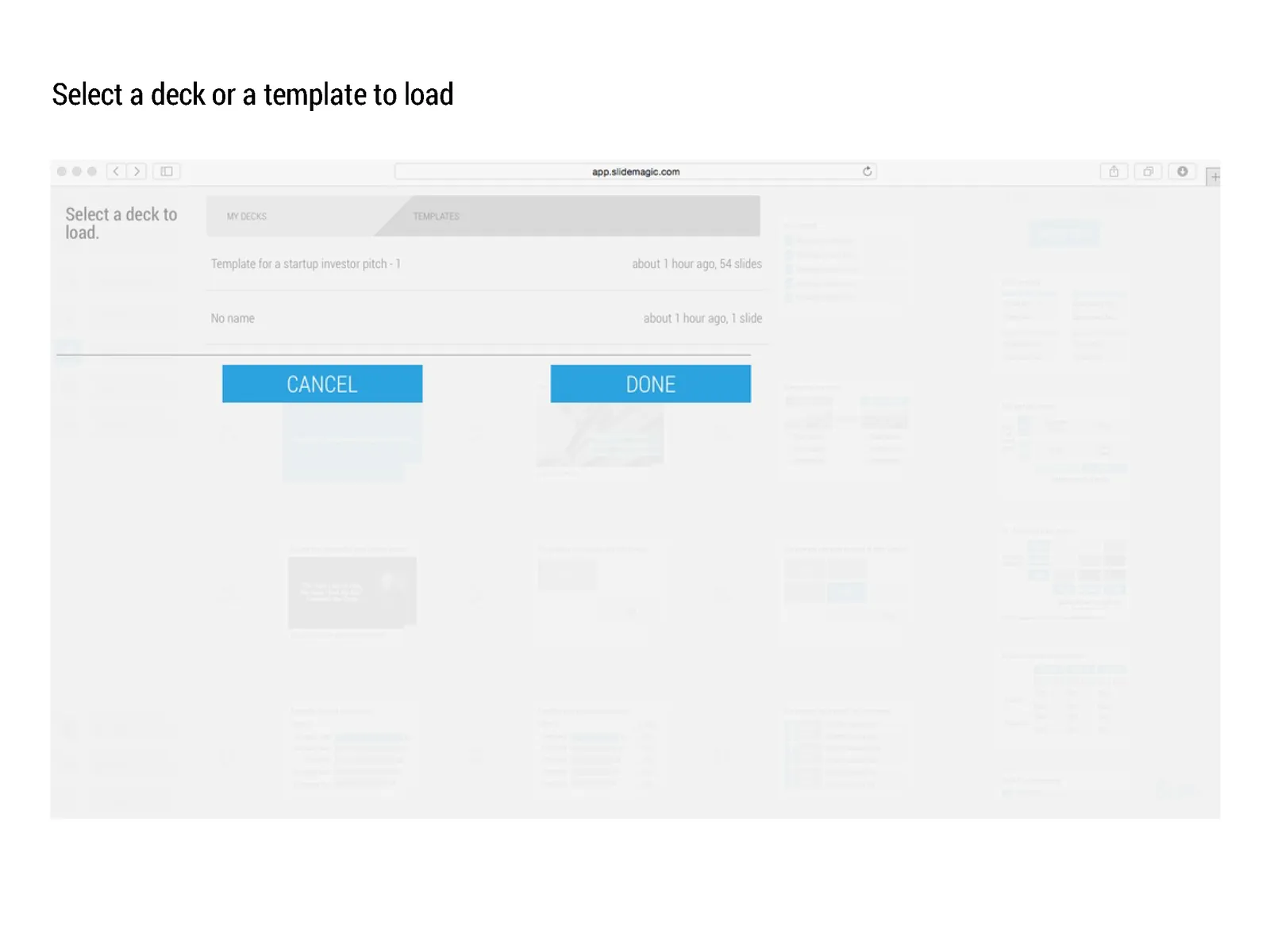
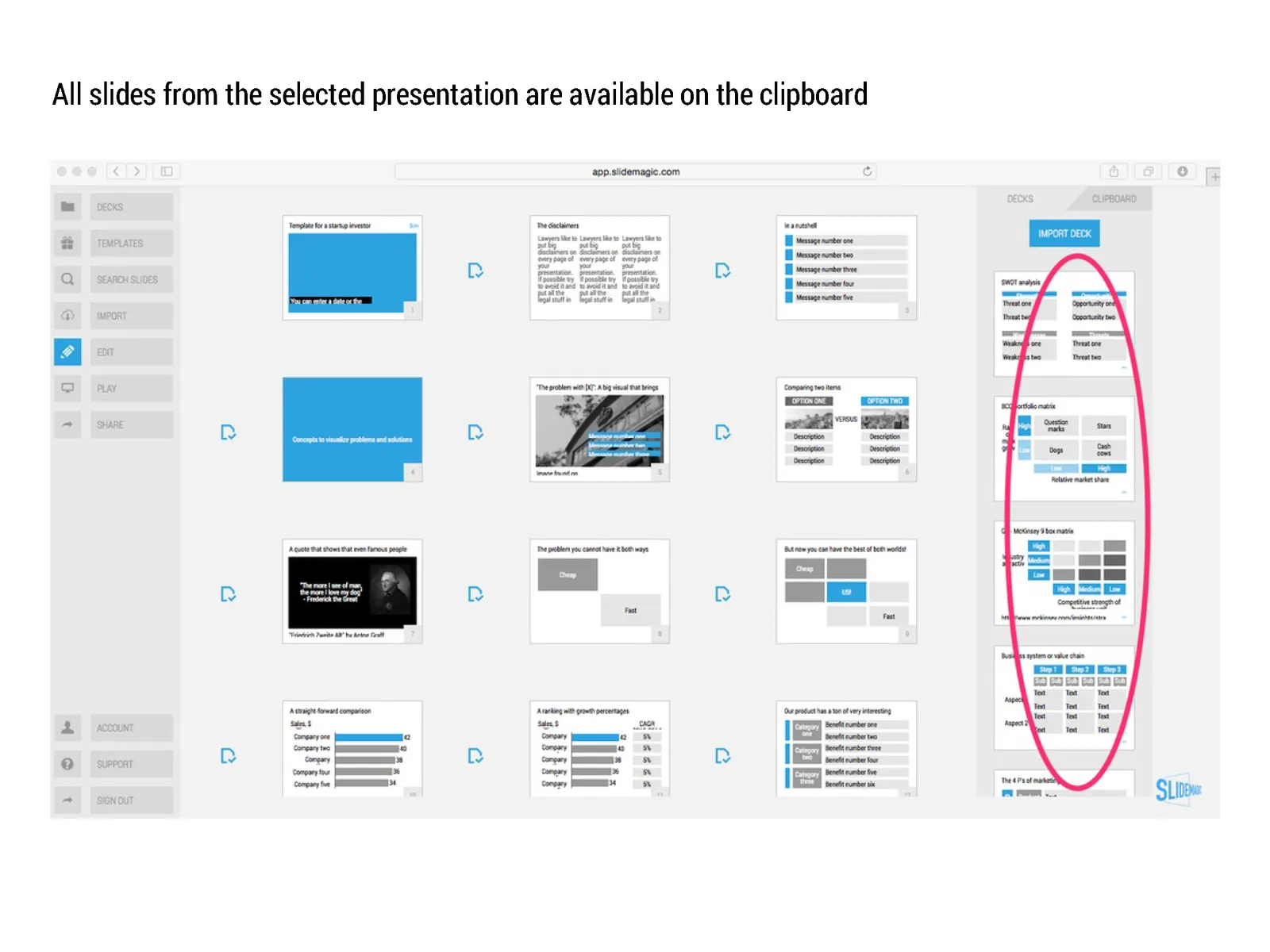
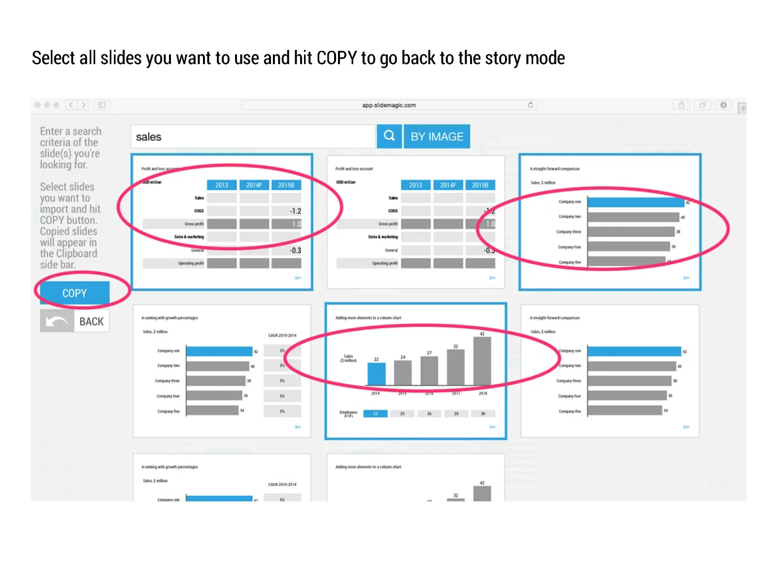
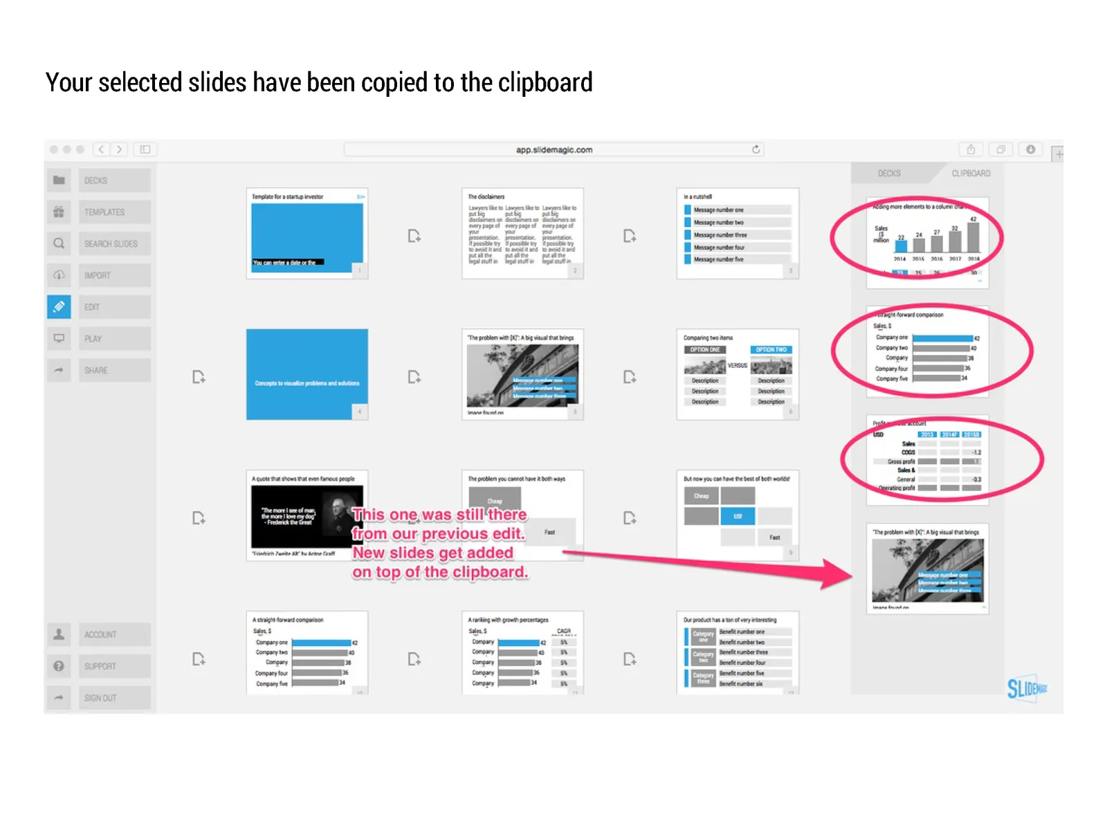
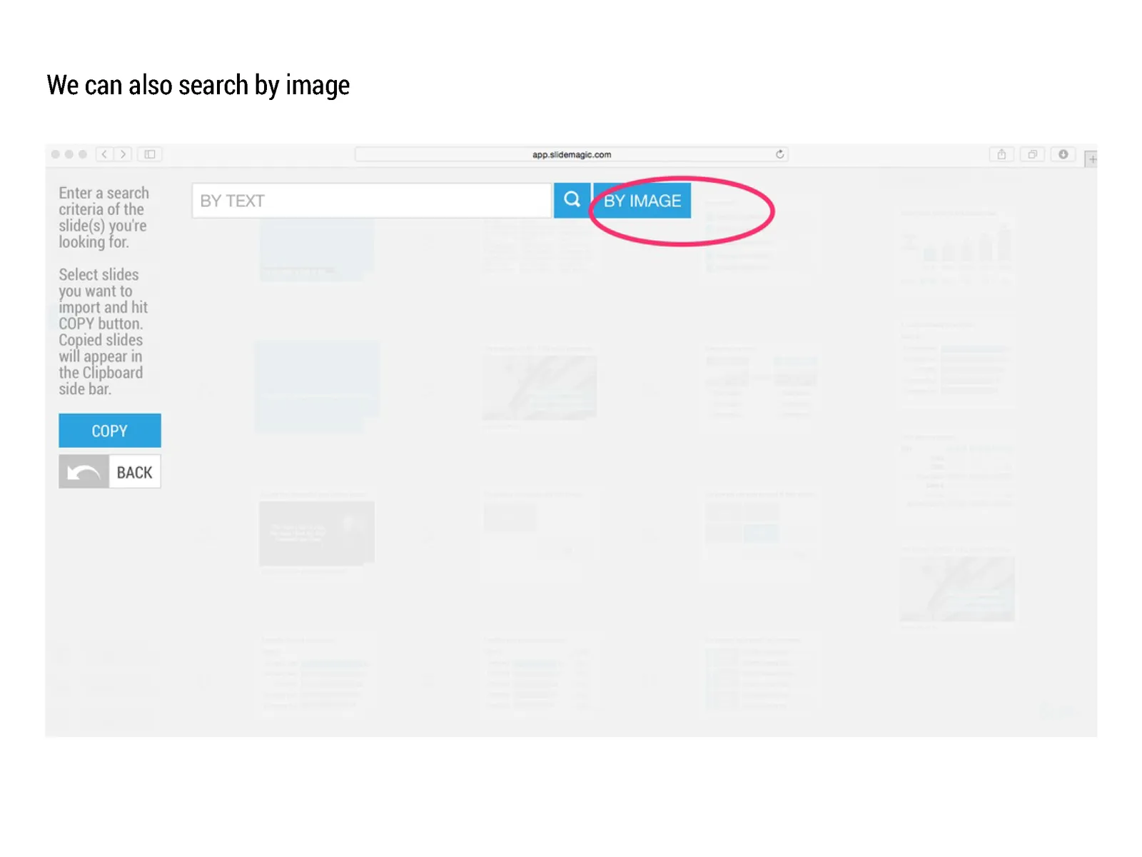
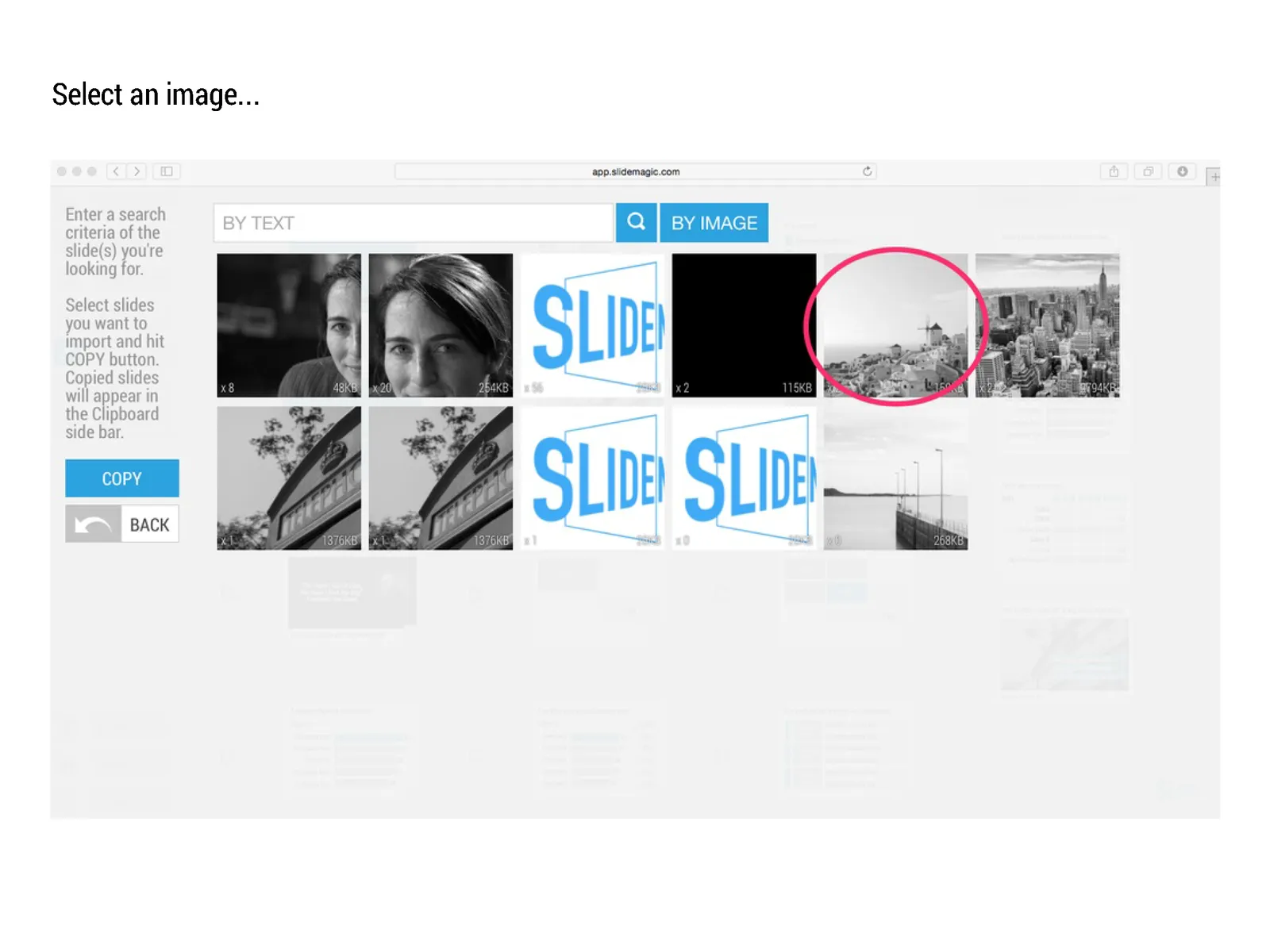
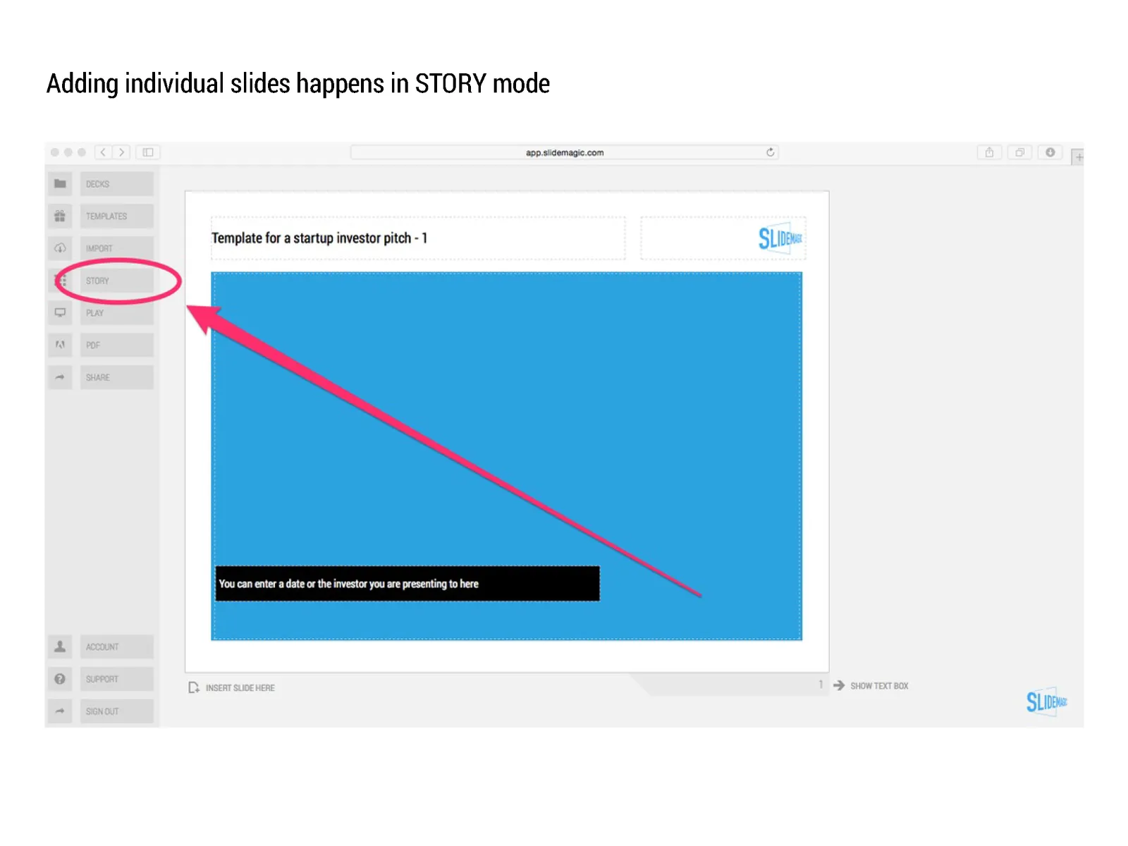
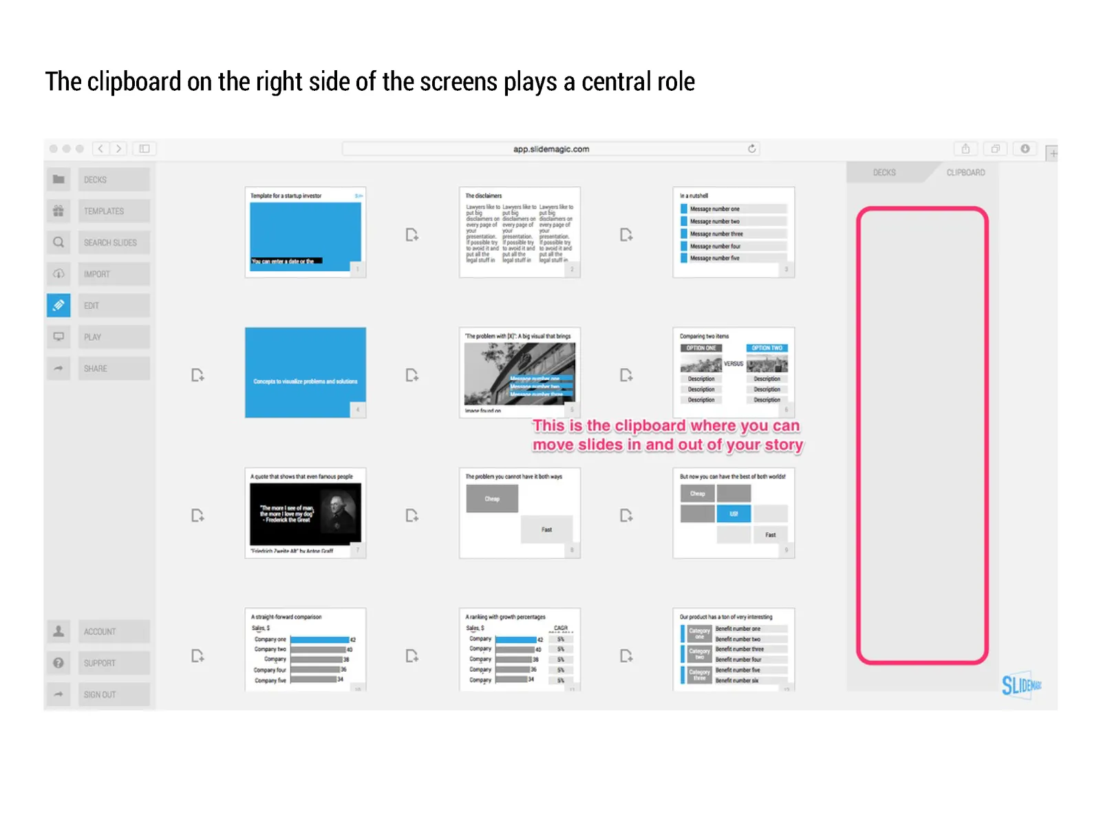
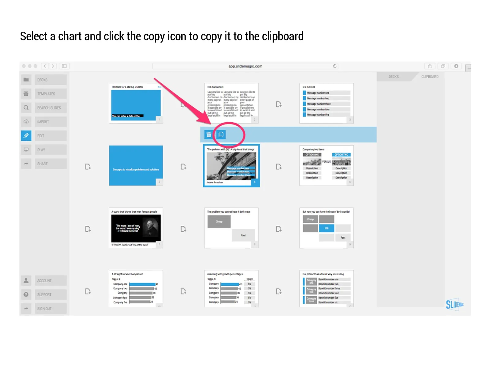
Many beta testers ask me how to use templates in presentation software SlideMagic. The series of screen shots below explain how you can access and use them. You can:

  • Clone an entire template presentation into a new presentation
  • Import selected template slides into your presentation

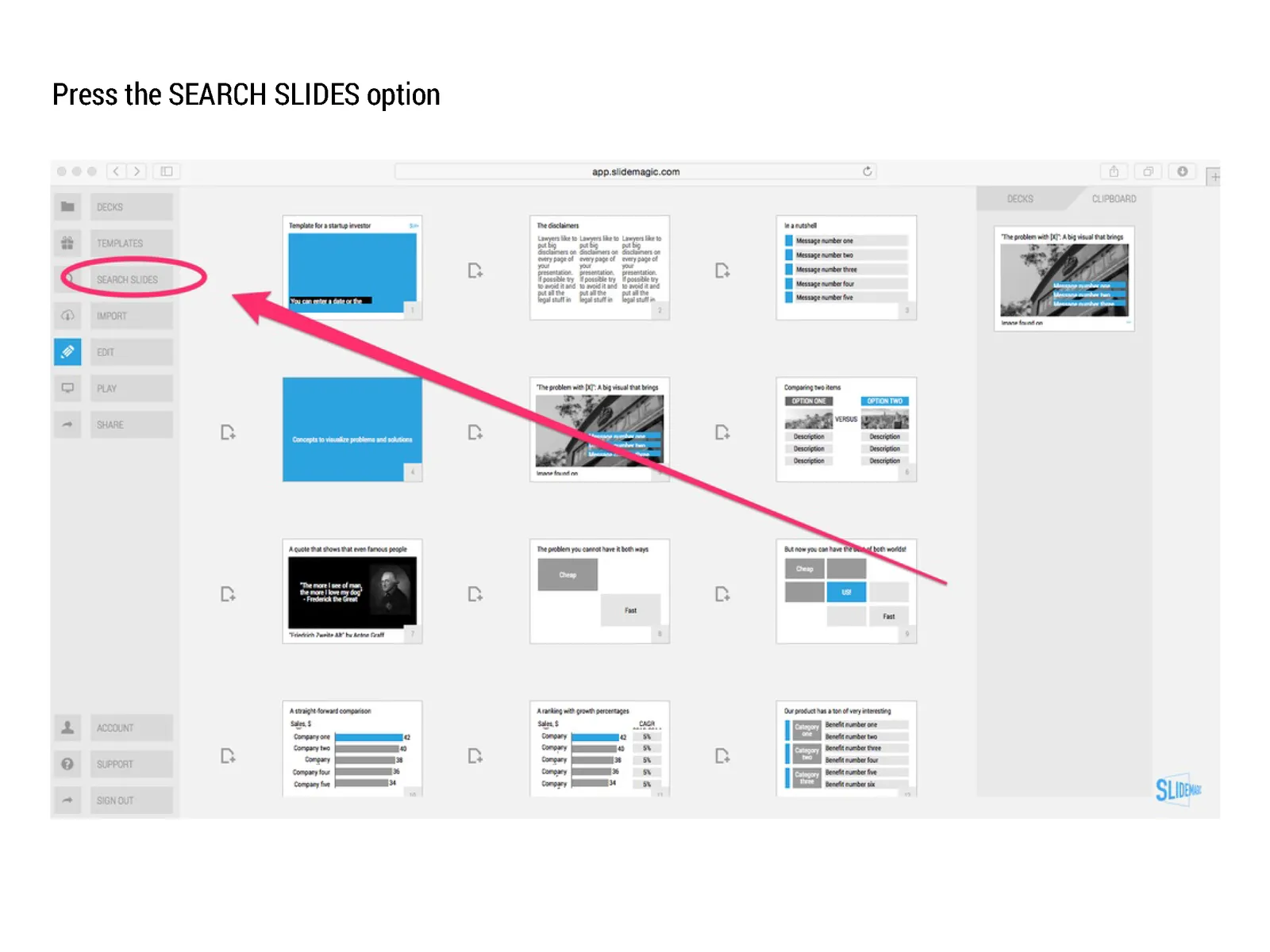
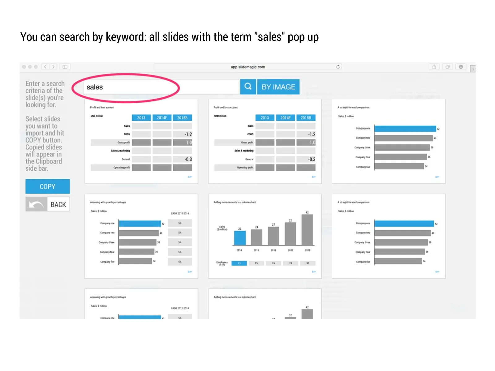
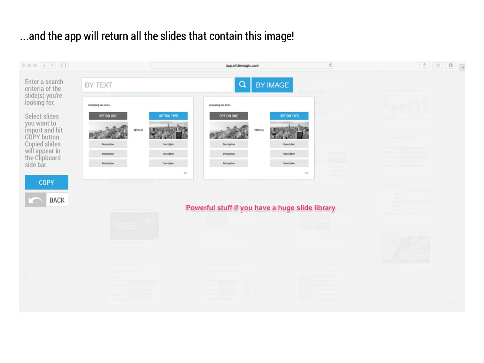
SlideMagic stores all presentations in one big database which created the opportunity for a really cool feature: the ability to search through ALL your slides like a Google web search. And not only with keywords, you can also ask SlideMagic to return all slides that use a specific image.

Art: William Powell Frith, The Sleeping Model, 1893

Click here to subscribe to this blog

·Investor presentation

Overpolishing

Some stories are best served raw. The other day, a client pitches a wonderful startup idea to me. The company solves two broken issues (sorry for the cryptical language), and has a solution that changes something that has not been changed since the 1950s.

During the design process I felt somehow that we made it too polished, adding too many “and also, and also, and also” points. It is the full story, the full picture, but the additions kill the energy of the pitch. I think we should go back to the raw version and accept that in a 20 minute pitch we do not have time to cover everything.

Art: Vertumnus, a portrait depicting Rudolf II, Holy Roman Emperor painted as Vertumnus, the Roman God of the seasons, c. 1590

Click here to subscribe to this blog

·Delivery

To answer or not to answer?

What do you do when your presentation gets interrupted by a question from the audience and you were planning to answer the point a few slides down? Answering it will disrupt your carefully designed story flow. Not answering it might upset the audience. My suggested approach differs by presentation setting.

  • For huge audiences (a big TED talk for example), you are unlikely to be interrupted.
  • For slightly smaller audiences, you can say that people should hold of questions until the end of the presentation. After that, only hacklers can still decide to interrupt you.
  • If you get a question in a presentation for a big group of people, I would answer it really briefly (yes, good point, we do have a blue colour option) and say that you will get to it in more detail later on, look a way from the asker to stop the dialogue.
  • In smaller meetings, you can sometimes completely go off script and let the audience guide your presentation. A good example would be a pitch to partners in a VC firm, where they read the material beforehand and have a number of very specific questions they want to see answered. Being stubborn here and sticking to your script will upset the meeting.
  • In one on one meetings you need to read the body language of the person sitting in front of you. When someone keeps on asking what it is that your product actually does, it is better to kill off the issue rather than have the person sitting and guessing with a frown on her face until you get to the right point in your presentation. A person who is guessing, is not listening to what you say.
Continue reading →

A summary presentation should not just summarise

You have finished this huge strategic or business plan and you need to present it to the top management team of your company. You sent the deck before the meeting and they probably page-downed the slides. How to create a good summary presentation for the meeting?

Just summarising the big document (and then we did this and then we did that and then we went on to do this), is not going to get you a decision. The opposite, a super high-level presentation with generic buzzwords is also not going to cut it.

Your presentation should be a deck specifically for the meeting, not one for reading later (you sent that one already). It can be based on your big document, but it will be different.
  • Make it very clear what you actually want (more budget, more people, permission to explore M&A opportunities, etc.)
  • If your project involves some decision (maybe even with a controversial recommendation), make the trade off very clear. Some sort of pro and con overview.
  • Your manager is not a complete outsider who comes in cold to the subject. So you can cut the emotional, stunning visuals, and focus on those elements of the trade off that she might not know about yet. Show the new and original analysis you did that support conclusions that are new. Leave out the obvious analysis that confirm things everyone already knows.
  • Feel free to deviate from the structure of your big document. The big document is reference material, the presentation is your tool to get an important decision approved.
Continue reading →

Your audience is not ignorant

In education, teachers start most of the times with a completely ignorant audience. In mathematics we start with the basics and slowly, slowly, build our story from the ground up towards higher algebra and advanced geometry.

Many presenters use this mindset when pitching a business idea and/or investment. Their presentations resemble a 101 text book on the market.

But in most cases, your audience will know quite a lot. Venture capitalists see dozens of pitches of internet-related businesses every day. Surgeons get pitched everyday with new drugs and medical devices.

Think about that when designing your pitch. What thought process would an intelligent, knowledgeable person go through when confronted with my idea? First she needs to understand what it actually is. In her mind she probably tries to compare it to a concept she already knows. Then she probably starts asking herself the big obvious questions. Does the world need this? Why is this so special / has no one else done this before? Can these guys pull it of?

Do not try to educate your audience, instead try to answer the obvious questions she cannot answer herself.

Art: Joseph Ducreux, Self Portrait, 1791

Click here to subscribe to this blog

Common laymen mistakes in SlideMagic

By now I have seen a number of real presentations that beta testers of my presentation software SlideMagic have produced. The results are very encouraging! Without exception, all presentations look “pretty decent” to “very good”. All of these decks were designed by complete laymen designers.

Even more interestingly, it is possible for someone like me (a pro), to upgrade these “pretty decent” to “very good” presentations to something really good in just 15 minutes of polishing. (The user base of SlideMagic is still small, so beta testers can benefit from the luxury of my input here and there).

Here are the common mistakes I usually fix:

  • Cutting / re-editing text. Taking out unnecessary tangents, side comments, indirect sentences saves space and allows you to make text bigger
  • Making text in similar boxes the same font size. I considered freezing font sizes in the app but that would take too much design freedom away from you guys. A simple rule, if text boxes are part of a group (a list, a diagram) try to give them the same font size
  • Fixing left alignment and centred alignment. It is hard to give a rule, but in some cases one looks better, and other cases the other (yes, that is vague).
  • Fixing inconsistent header formatting across slides (font size, colours). I gave you guys the freedom to play with this and make them different across slides, but I am considering freezing it (sorry).
  • The biggest one, fixing poor grid compositions. In many cases users select axis definitions that leave a large number cells empty. (One row, criterion, product, has a lot of attributes that are irrelevant for the others). White space in a slide is good, but if that means that all the other cells in your chart are tiny/unreadable we have to be pragmatic.
Continue reading →