How to make frosted glass in PowerPoint
Follow these simple steps:
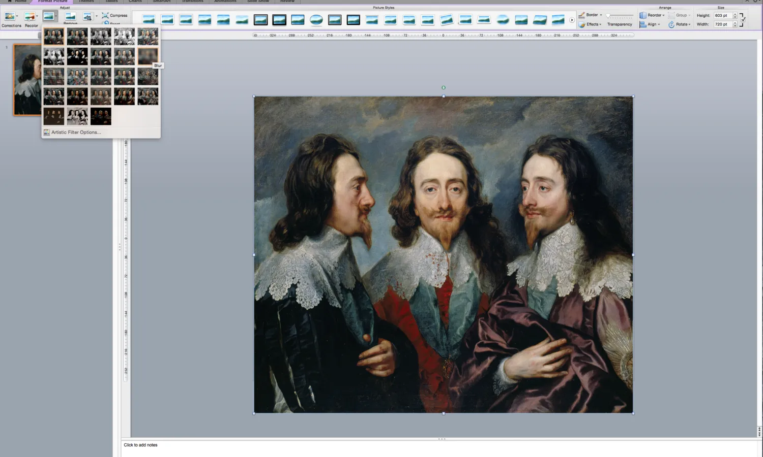
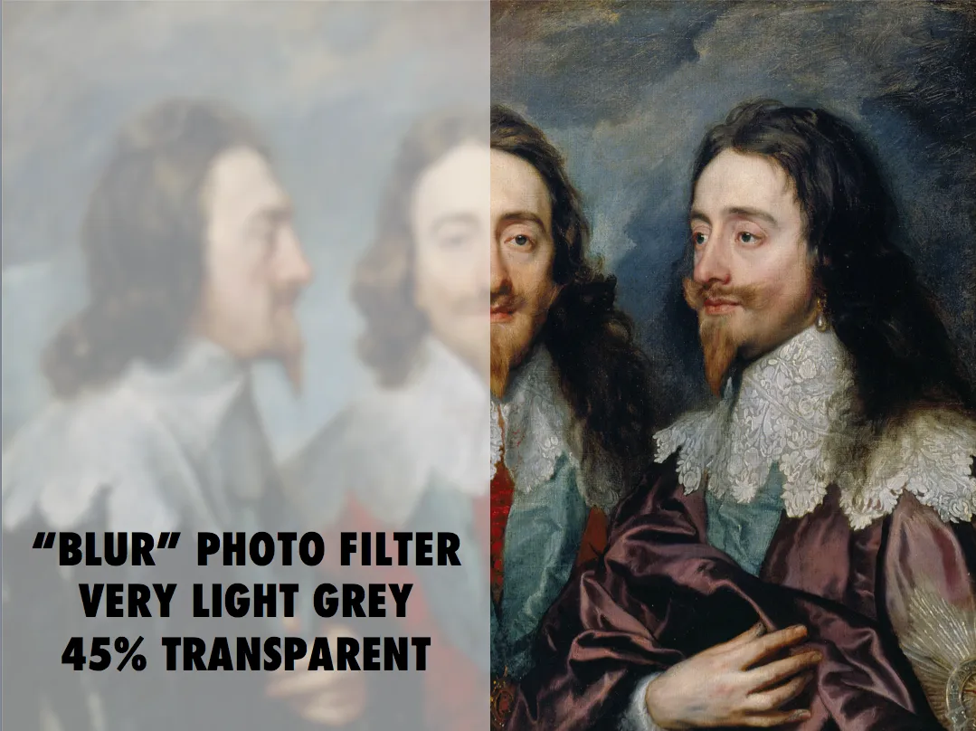
- Apply the “blur” photo filter to your background image
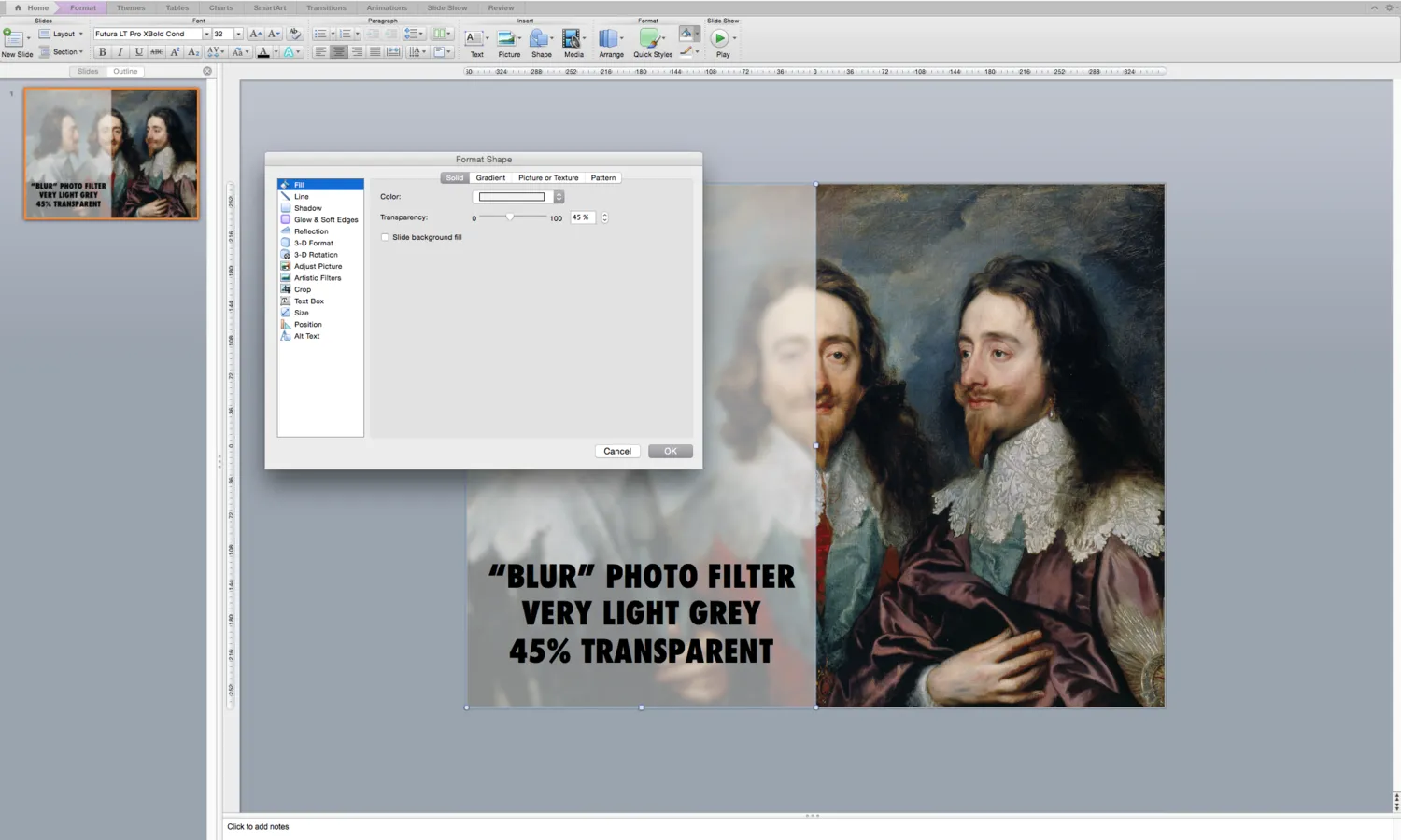
- Create a very light grey box
- Add 45% transparency


Frequent updates about all things presentations since 2008. Subscribe to never miss a post.
Follow these simple steps:
Strategy consultants or IT architects love the diagram-that-brings-it-all-together. Customer needs, key capabilities, competitive differentiations, routes to market, all glued together in harmony to describe that perfect concept. It makes perfect sense to you.
The problem: it is too much to digest for the person who sees the diagram for the first time.
One better approach is to start with stories for the individual bits of the concept, and only in the end stitch everything together. If you feel it hard to part with that diagram early in the presentation, you can put it up and jokingly brush it aside/apologise and say you are taking it a bit slower. After you have explained a component of the diagram you can slowly build the picture up step-by-step.
Art: Portrait of a Philosopher (Artist’s brother, Pavel Sergeyevich Popov), 1915
A few things are going on in startup land, especially for consumer facing apps:
What does all this mean for investor pitches?
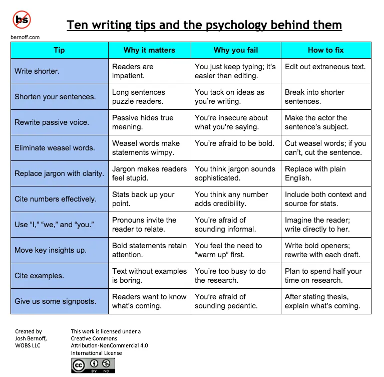
These 10 tips by Josh Bernoff to write better are spot on. In presentations, I would take it easy with the sign posts though.
Art: Bruno Liljefors (1860–1939), Weasel with Chaffinch, 1888
Things are changing over at Microsoft: Microsoft interfaces on new apps look great, and it is getting rid of old dogmas, opening up software to a wide range of platforms. At the same time, Apple (while still great) is taking the foot of the gas here and there.
Personally I am still a big Apple fan and will continue using their products. (Although I am one of the unlucky people who bought a Mac Book where the screen is completely peeling of, visit www.staingate.com to sign up for the petition if you suffer from this as well). But it is good to see that Microsoft is trying to compete.
Nicholas Chevallier, Race to the Market, 1880
Millions of web pages and PowerPoint presentations contain images of an empty Board room with plush leather seats. While this room might be the prettiest and most tidy one in your office, the image has appeared so frequently that lots of leather Board seats no longer radiate power.
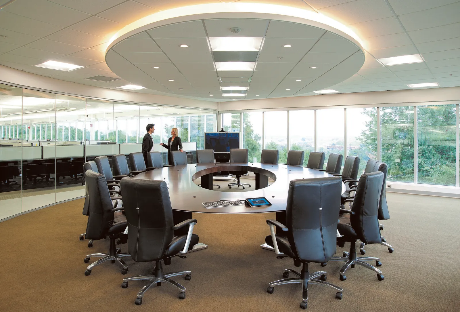
Image credit: the FAEF Board Room
News media usually go for the next alternative, the name tag at the front door. I think better images are those of the company in action, a truck delivering goods, a plane taking of on the runway, a store interior, an assembly line in action, a nice group photo of employees at work.
You can do better than the empty Board Room
Art: Vincent van Gogh, Bed room in Arles, 1888
I get this feedback from early SlideMagic beta testers. SlideMagic supports one accent colour, one font, and encourages you to work in a strict slide layout grid. For certain presentations, this feedback is valid. I think we will not see any Apple product launch presentations designed in SlideMagic (yet).
For 99% of presentations though, it is actually precisely what I tried to achieve:
Today, I would argue that PowerPoint presentations look more similar to each other than the SlideMagic decks: lists of bullet points on a white background using the standard Microsoft Office (olive, blue, red, green) colour scheme.
Below are examples how the same SlideMagic chart would look when used in different companies. You see the impact of consistent use of colours. All SlideMagic charts will be updated instantly after a colour and logo change.
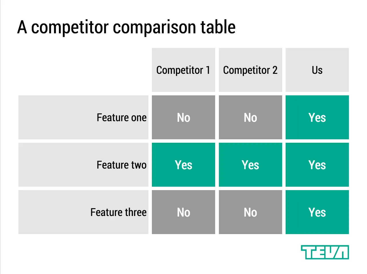
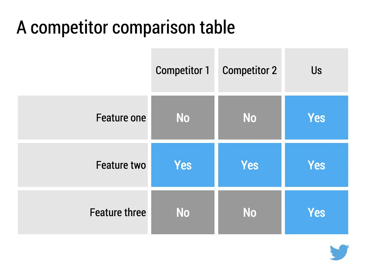
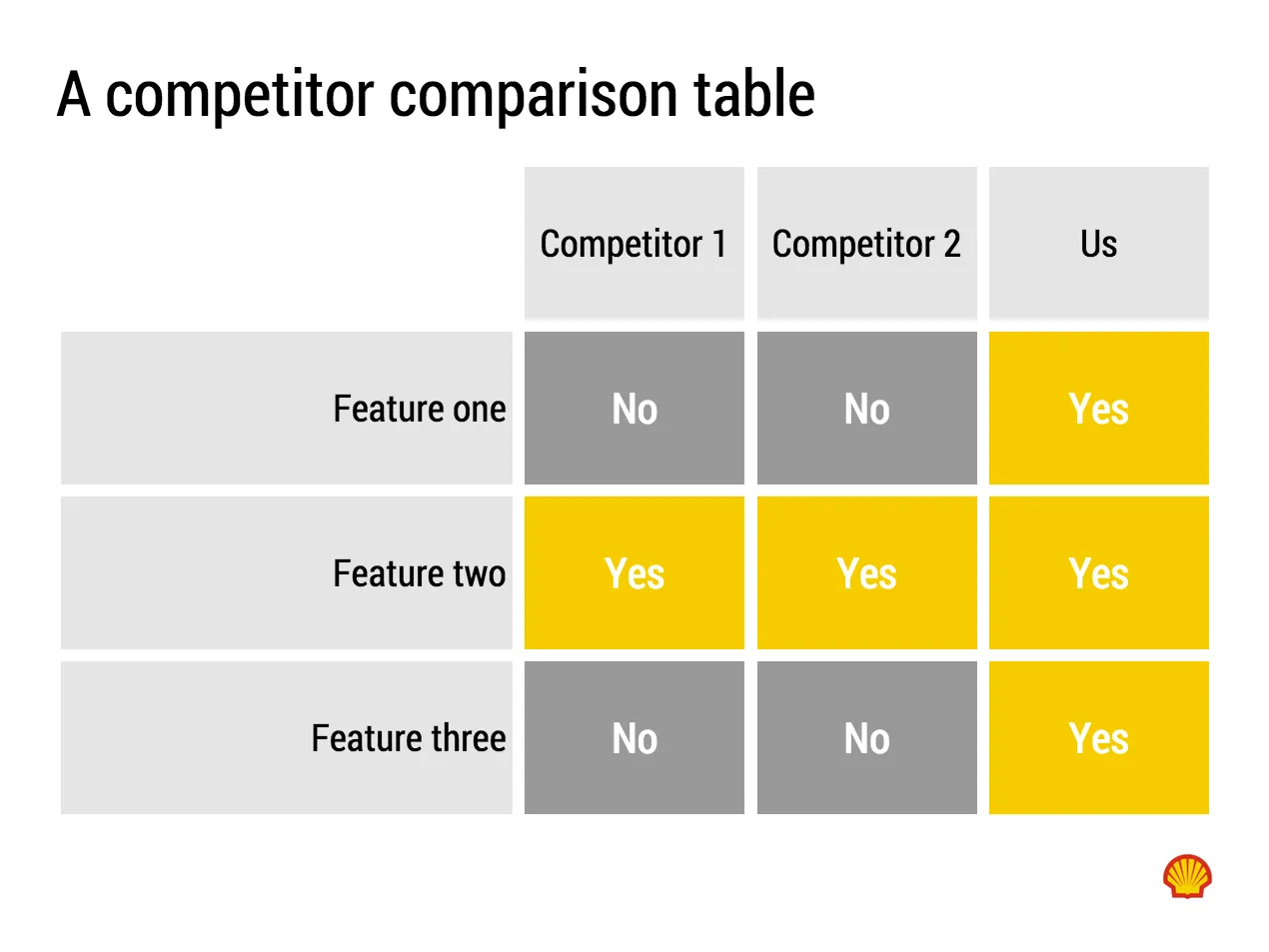

If you want to try SlideMagic for yourself, you can sign up here as a beta user.
Art: Salomon de Bray, The Twins Clara and Aelbert de Bray, 1646
Presentation templates in SlideMagic have 3 big advantages:
I want to add more templates.
Let me know what templates, concepts, you need. Put requests in the comments are send them to me at [email protected]. You can even send me PowerPoint slides if you want. If you have not done so, I will strip the slides of company specific information before publishing them in the SlideMagic template library.
Art: Henri Toulouse-Lautrec, Sescau photographe, 1896
In investor pitches there are usually 2 types of financial forecasts:
Why do investors want to see some sort of short-term budget?
A short term cost budget does not need to contain 25 lines of Excel, by month. A simple x% of revenues number is a bit too simple though.
Art: Marinus van Reymerswaele, The moneychanger and his wife (1539), Museo del Prado, Madrid
Repeating the whole story of your presentation on the last slide is boring. You want to end with a “boom” and quickly remind people of the most important message in the presentation. I usually do that with repeating a key visual (just one). Using (the cliche) that a picture says more than a 1,000 words, the repeated image brings back the full richness of the discussion you had in one millisecond. Much more efficient than writing a bullet point.
If you have to repeat multiple messages, here is another trick: use small screen shots of slides. At the end, the audience does not need to be able to read the entire slide anymore. The thumbnail is a quick visual reminder of the content. Below an example that I created in SlideMagic.

I have added this slide design to the template file of all slides I created for the blog. You can open it in the SlideMagic app here and use it for your own designs. Just change the images.
Art: The Flute Concert of Sanssouci by Adolph Menzel, 1852, depicts Frederick playing the flute in his music room at Sanssouci. C. P. E. Bach accompanies him on the harpsichord.


_1894.jpg)
